A Map to the Past
Introduction
This is a deeper exploration of mapping with a purpose. In this case, we are going to map the results of the 2016 Presidential Election. For a look at the maps we are going to do, take a look at this Washington Post article.
Preliminary Items
First Things First! Download the script and data set
Please download all of the materials needed for this walkthrough and put them all in a folder by themselves.
Set your Working Directory
Your working directory is simply where your script will look for anything it needs like external data sets. There are a few ways to go about doing this which we will cover. However for now, just do the following:
- Open up the included script by going to
File > Open Fileor double click the file itself if RStudio is your default program for opening.Rfiles. - To set your working directory:
- Go to the menu bar and select
Session > Set Working Directory > To Source File LocationOR - run
setwd(dirname(rstudioapi::getActiveDocumentContext()$path))1
Loading libraries
Go ahead and load these or install and then load them.
library(tidyverse)
library(patchwork)
library(RColorBrewer)
library(scales)
library(ggpubr)
We should first take a look at the new ones being used here
| Library | Description | Repository | Example |
|---|---|---|---|
tidyverse | Nope | Github | Tutorial |
patchwork | Allows for the differing layouts of completed visualizations | Github | Vignette |
RColorBrewer | Predefined palette originally based on map drawings | Github | Interactive |
scales | Provides greater functionality to manipulate scales within plots | Github | Vignette |
ggpubr | Gives predefined settings for publication quality plots | Github | Vignette |
Loading files
We’ll be using a R data file which for historical reasons either ends with .rdata or .rda. The nice aspect of using this format in lieu of a regular data set is that objects and full global environments can be saved. Generally this ensures that you or someone else is able to pick up in a screen exactly as it was before with all of the packages, variables, etc. ready to go. Think of it as a snapshot of exactly what an RStudio session looked like when it was saved as the data file.
To avoid any conflicts, let’s empty and refresh your Global Environment which you can access by clicking the Environment tab in the top window on the right. Now if there is something in there you absolutely need and cannot get back, then skip this step. If not, please clean it out using
rm(list = ls())We’ll be using the file election2016.Rdata. To load it up, run the following
load(election2016.RData)If that does not work, go to the actual data set, right click and open it with RStudio.
Again if you have familiarity with the structure of your directory, then use the appropriate path. Notice that you don’t have to say something like variable <- load("/data/election2016.RData") because you aren’t just loading up a data set!
Left field reminder to save your API key
We will not be using the Census API this time around but please save your key for future data pulls. You’ll likely receive a prompt to save it using
# Input your Census key generally

# Input your Census key for the tidycensus package
# Load the library
library(tidycensus)

# Save you
census_api_key("YOUR CENSUS API KEY", install = TRUE)

# Reload the .Renviron marker
readRenviron("~/.Renviron")
Walkthrough
Notes
The very first thing to mention here is that the states of Maine and Nebraska split electoral college votes. In 2016, Trump took all 5 of Nebraska’s votes while Maine was split with 3 for Clinton and 1 for Trump. As of result, the difference is used in the data set.
The columns that are used within the data set were pulled from the Federal Election Commission (FEC) API. Generally if you know how to use one API, most others follow the same structure so the FEC API is fair game for those of you who got somewhat comfortable with the Census API. For an ever growing list of available US government APIs, data.gov is a great place to go to.
Getting Ready
First take a look at the variables within the data set itself
names(election2016)## [1] "state" "votes" "st" "fips" "total_vote"
## [6] "vote_margin" "winner" "party" "pct_margin" "r_points"
## [11] "d_points" "pct_clinton" "pct_trump" "pct_johnson" "pct_other"
## [16] "clinton_vote" "trump_vote" "johnson_vote" "other_vote" "ev_dem"
## [21] "ev_rep" "ev_oth" "census" "region"or view the entire set in a spreadsheet like form
View(election2016) Since we’re looking at the general election, let’s go ahead and define the two major parties with colors
partyColors <- c("#2E74C0", "#CB454A") scales::show_col(partyColors)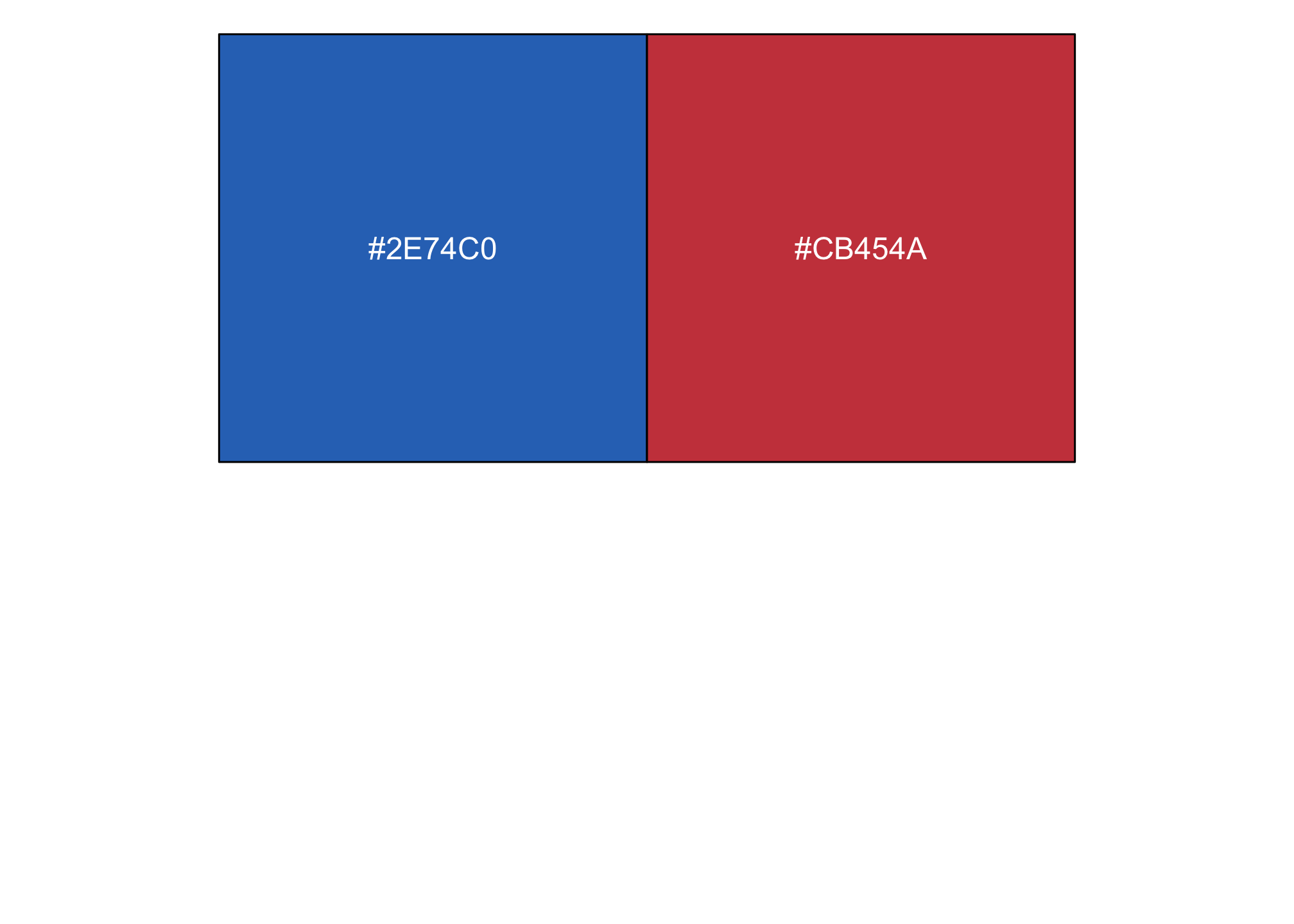
Part I: Lollipops
A lollipop plot, or Cleveland dot, is essentially a barplot’s cousin where the bar is transformed in a line and a dot at the top. Let’s draw one using the data.
Notice the ! here. It means not and in this R reads it like
- look at all values in the election2016 data set and then
- do not include the data point DC from the
st, or state column
ggplot(data = subset(election2016, !st %in% "DC"),
       mapping = aes(x = r_points,
                     xend=r_points,
                     y = reorder(state, r_points),
                     color = party)) +
  geom_vline(xintercept = 0, color = "gray30") +
  geom_point(size = 3) +
  scale_color_manual(values = partyColors)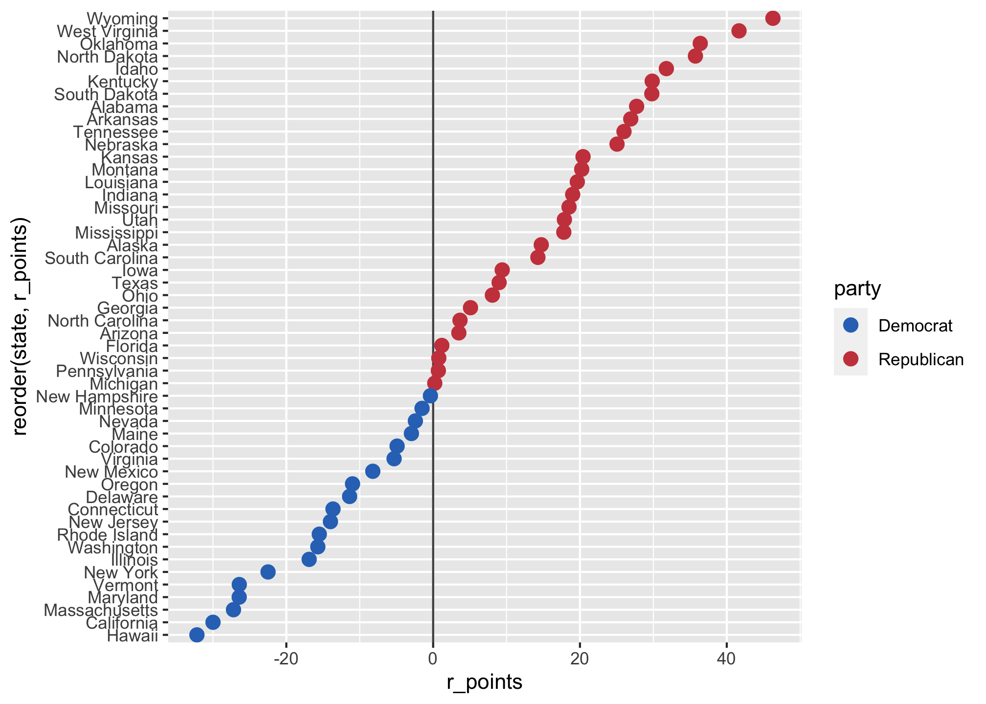
That’s not bad but it is pretty bland so let’s make it nicer
ggplot(data = subset(election2016, !st %in% "DC"),
       mapping = aes(x = r_points,
                     xend=r_points,
                     y = reorder(state, r_points),
                     color = party)) +
  geom_vline(xintercept = 0, color = "gray30") +
  geom_segment(aes(x = 0, y = state, xend = r_points,
                   yend = state), color = "grey70") +
  geom_point(shape = 21, size = 3, fill="white", stroke = 1) +
  scale_color_manual(values = partyColors) +
  scale_x_continuous(labels = function(x) paste0(abs(x), "%"), limits = c(-35, 50)) +
  theme_minimal() +
  theme(
    legend.position = "none",
    panel.border = element_blank(),
    axis.ticks = element_blank()
  ) +
  xlab(NULL) +
  ylab("State")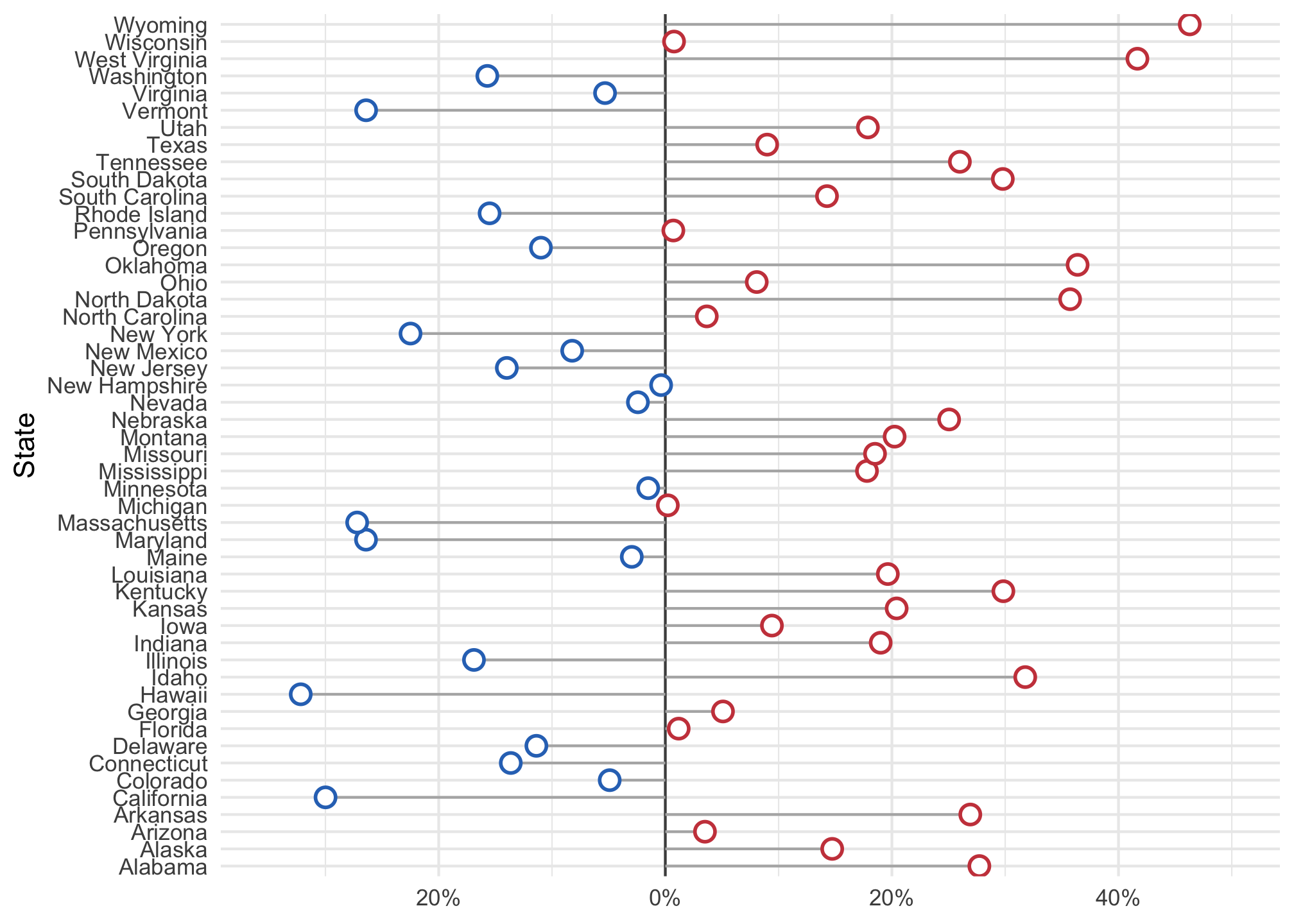
Oh no what happened? The states are in reverse alphabetical order. Think about how you can fix it to display the data in a better way, try it out and then see a solution using the dropdown below.
Better representation
ggplot(data = subset(election2016, !st %in% "DC"),
       mapping = aes(x = r_points,
                     xend=r_points,
                     y = reorder(state, r_points),
                     color = party)) +
  geom_vline(xintercept = 0, color = "gray30") +
  geom_segment(aes(x = 0, y = reorder(state, r_points), xend = r_points,
                   yend = reorder(state, r_points)), color = "grey70") +
  # Here is the fix but what do you think happened?
  geom_point(shape = 21, size = 3, fill="white", stroke = 1) +
  scale_color_manual(values = partyColors) +
  scale_x_continuous(labels = function(x) paste0(abs(x), "%"), limits = c(-35, 50)) +
  theme_minimal() +
  theme(
    legend.position = "none",
    panel.border = element_blank()
  ) +
  xlab("Party Affiliation") +
  ylab("State")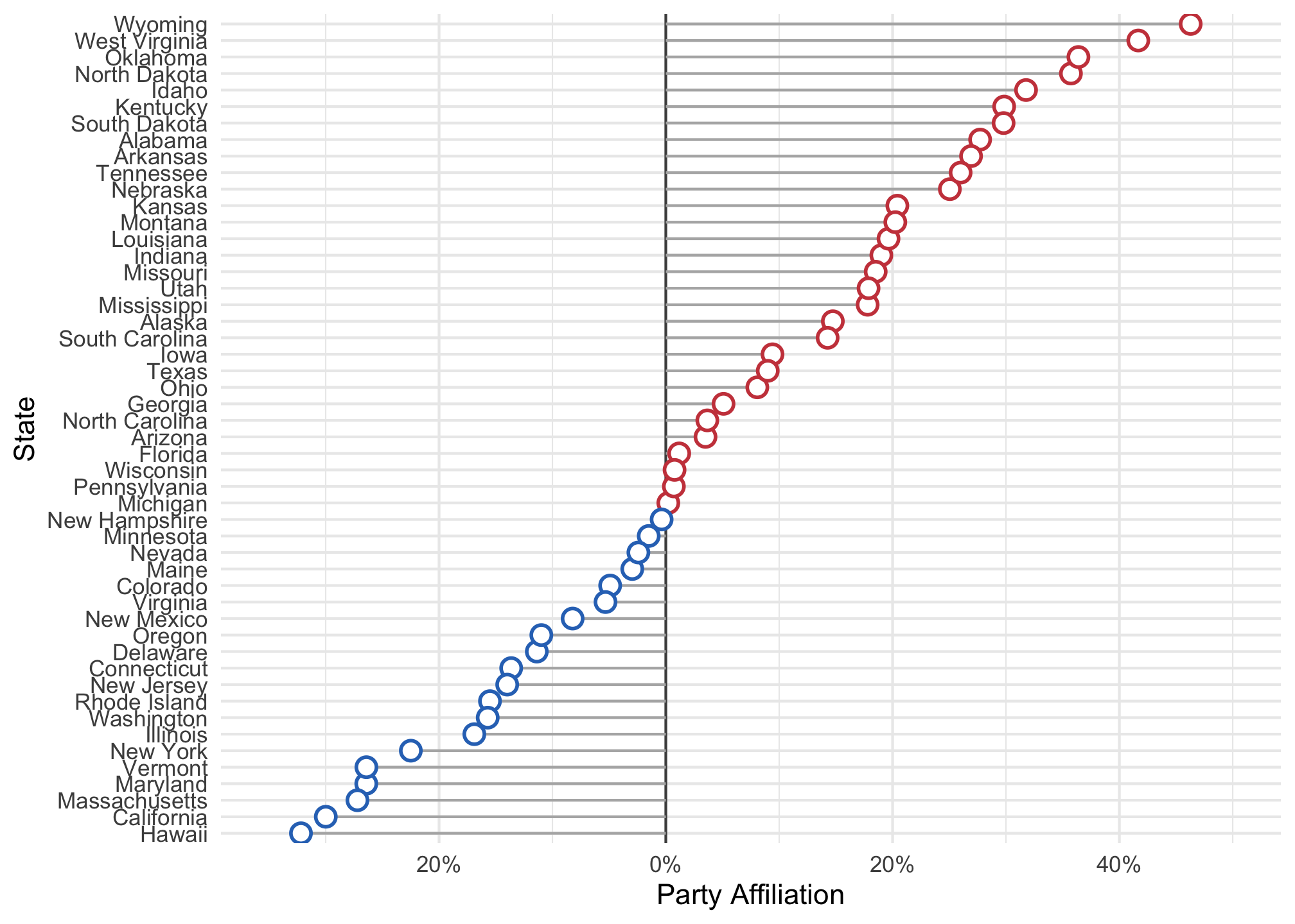
state by r_points, then you were correct and win eleventy billion points.Side Quest
We can make this plot prettier. First load (or install and load) the following library.
library(ggthemes)For more information about themes, please see the ggthemes vignette. Anyway, if you are aware of the data analyst and all around predictive guru Nate Silver who uses analytic and data visualizations for multiple reasons, then the website FiveThirtyEight - may be something familiar. We’ll redraw the plot above using a theme commonly found on the FiveThirtyEight website using the options scale_color_fivethirtyeight() and theme_fivethirtyeight().
ggplot(data = subset(election2016, !st %in% "DC"),
       mapping = aes(x = r_points,
                     xend = r_points,
                     y = reorder(state, r_points),
                     color = party)) +
  geom_vline(xintercept = 0, color = "gray30") +
  geom_segment(aes(x = 0, y = reorder(state, r_points), xend = r_points,
                   yend = reorder(state, r_points)), color = "#5e3c58") +
  geom_point(shape = 21, size = 3, fill="white", stroke = 1) +
  scale_x_continuous(labels = function(x) paste0(abs(x), "%"),
                     expand = c(0, 0), limits = c(-35, 50)) +
  theme(
    legend.position = "none",
    panel.border = element_blank(),
    panel.grid.major = element_blank(),
    panel.grid.minor = element_blank()
  ) +
  xlab("Party Affiliation") +
  ylab("State") +
  scale_color_fivethirtyeight() +
theme_fivethirtyeight() 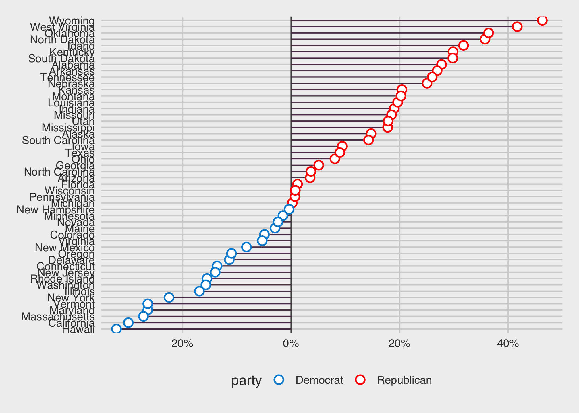
Part II: Choropleths
In a nutshell, choropleth comes from the Greek choros (area) and pleth (value). They distribute colors the map regions based on a measure. This is then used for comparisons using the relative value associated with each color of one region to another.
With that in mind, let’s get some map data…
library(maps)##
## Attaching package: 'maps'## The following object is masked from 'package:purrr':
##
## map…for all of the states…
state <- map_data("state")…and take a look.
head(state)## long lat group order region subregion
## 1 -87.46201 30.38968 1 1 alabama <NA>
## 2 -87.48493 30.37249 1 2 alabama <NA>
## 3 -87.52503 30.37249 1 3 alabama <NA>
## 4 -87.53076 30.33239 1 4 alabama <NA>
## 5 -87.57087 30.32665 1 5 alabama <NA>
## 6 -87.58806 30.32665 1 6 alabama <NA>That looks pretty big! We can check the dimensions by
dim(state)## [1] 15537 6This time we’re going to plot map data using a different set of commands…well sort of in the fact that were not flattening the plot, rather it’s being viewed as if on a globe.
ggplot(data = state,
            aes(x = long, y = lat,
                group = group, fill = region)) +
  geom_polygon(color = "gray90", size = 0.1) +
  coord_map(projection = "albers", lat0 = 39, lat1 = 45) +
  guides(fill = FALSE)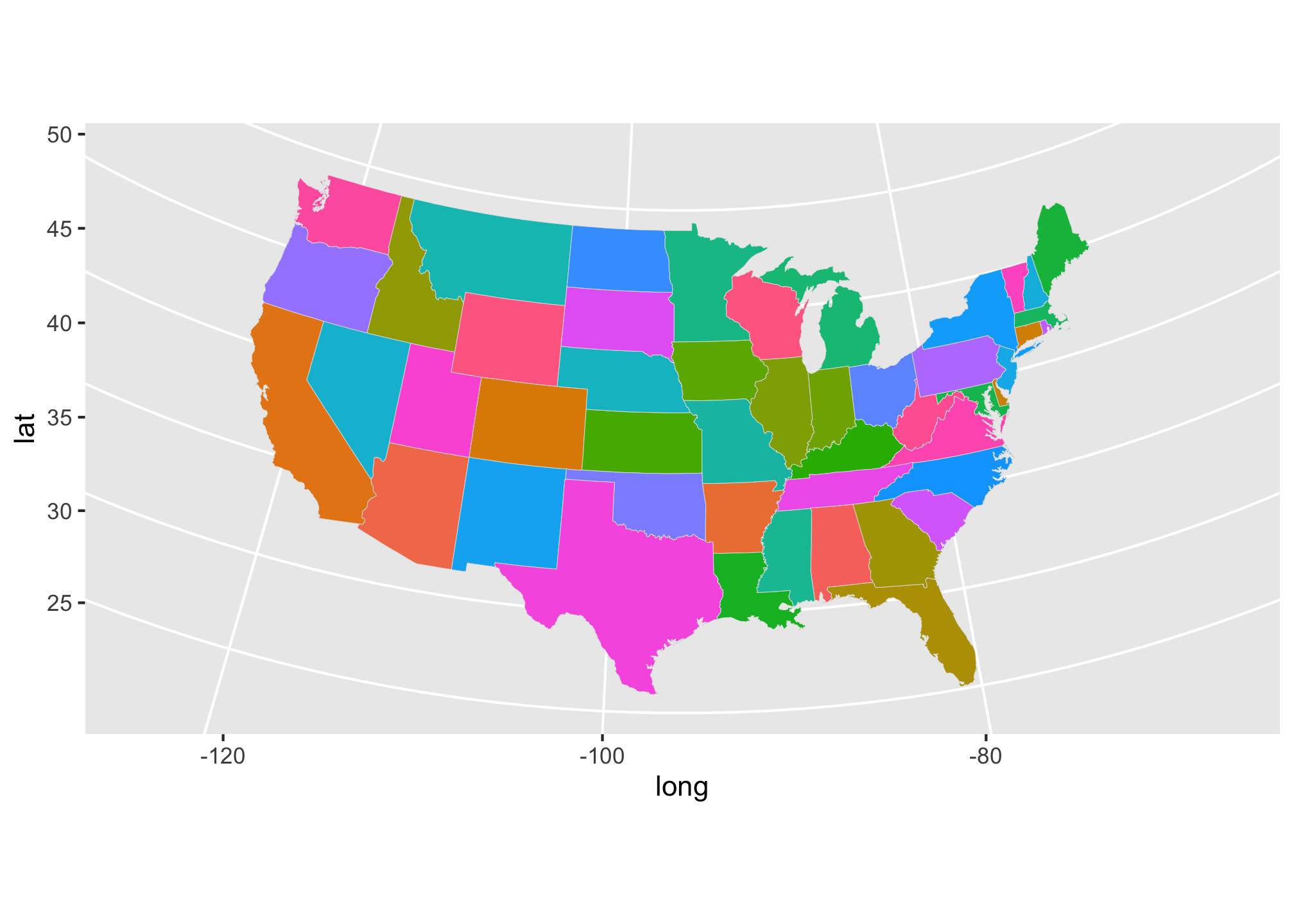
You probably noticed that the coordinates for latitude and longitude started where we defined them but you may not know about albers. I won’t get into the history but albers refers to the Albers projection which is the industry standard for how maps are constructed. Play around with some of the others some of which were noted in last week’s assignments page.
Anyway, we need to get our own data on to the map. First let’s lower the case of the column name
election2016$region <- tolower(election2016$state) # In this case we want the state level data to be primary source since election2016 data is dependent on states.
state_elec <- left_join(state, election2016) ## Joining, by = "region"Take a look at the result
head(state_elec)## long lat group order region subregion state votes st fips
## 1 -87.46201 30.38968 1 1 alabama <NA> Alabama 9 AL 1
## 2 -87.48493 30.37249 1 2 alabama <NA> Alabama 9 AL 1
## 3 -87.52503 30.37249 1 3 alabama <NA> Alabama 9 AL 1
## 4 -87.53076 30.33239 1 4 alabama <NA> Alabama 9 AL 1
## 5 -87.57087 30.32665 1 5 alabama <NA> Alabama 9 AL 1
## 6 -87.58806 30.32665 1 6 alabama <NA> Alabama 9 AL 1
## total_vote vote_margin winner party pct_margin r_points d_points
## 1 2123372 588708 Trump Republican 27.73 27.72 -27.72
## 2 2123372 588708 Trump Republican 27.73 27.72 -27.72
## 3 2123372 588708 Trump Republican 27.73 27.72 -27.72
## 4 2123372 588708 Trump Republican 27.73 27.72 -27.72
## 5 2123372 588708 Trump Republican 27.73 27.72 -27.72
## 6 2123372 588708 Trump Republican 27.73 27.72 -27.72
## pct_clinton pct_trump pct_johnson pct_other clinton_vote trump_vote
## 1 34.36 62.08 2.09 1.46 729547 1318255
## 2 34.36 62.08 2.09 1.46 729547 1318255
## 3 34.36 62.08 2.09 1.46 729547 1318255
## 4 34.36 62.08 2.09 1.46 729547 1318255
## 5 34.36 62.08 2.09 1.46 729547 1318255
## 6 34.36 62.08 2.09 1.46 729547 1318255
## johnson_vote other_vote ev_dem ev_rep ev_oth census
## 1 44467 31103 9 0 0 South
## 2 44467 31103 9 0 0 South
## 3 44467 31103 9 0 0 South
## 4 44467 31103 9 0 0 South
## 5 44467 31103 9 0 0 South
## 6 44467 31103 9 0 0 SouthHere’s a basic test plot.
ggplot(data = state_elec,
            aes(x = long, y = lat,
                group = group, fill = party)) +
      geom_polygon(color = "gray90", size = 0.1) +
coord_map(projection = "albers", lat0 = 39, lat1 = 45) 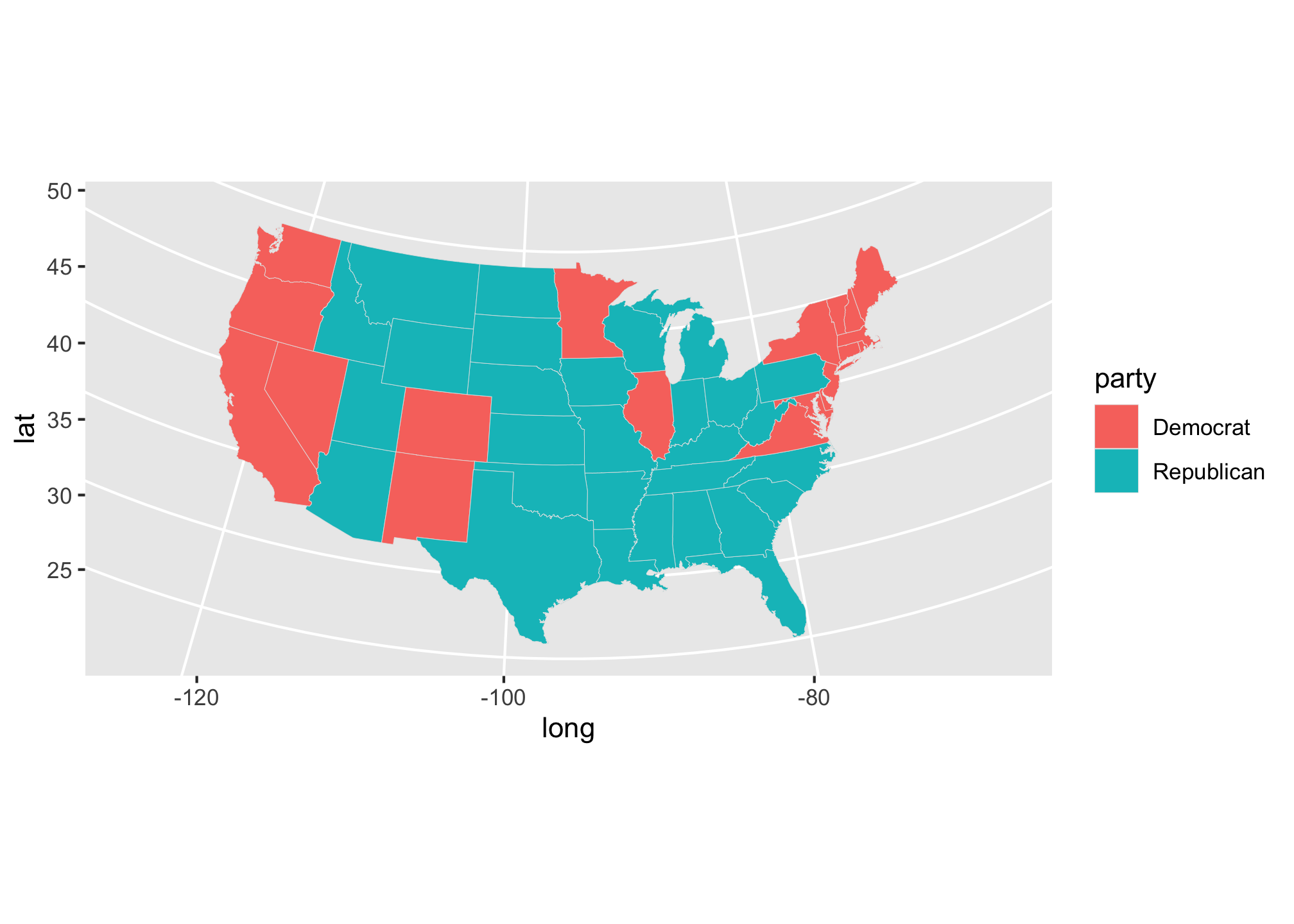
Let’s try it with the colors we assigned for each party.
ggplot(data = state_elec,
             mapping = aes(x = long, y = lat,
                           group = group, fill = party)) +
        geom_polygon(color = "gray90", size = 0.1) +
        coord_map(projection = "albers", lat0 = 39, lat1 = 45) +
        scale_fill_manual(values = partyColors) +
        labs(title = "2016 Presidential Election Results", fill = NULL) +
theme_map() 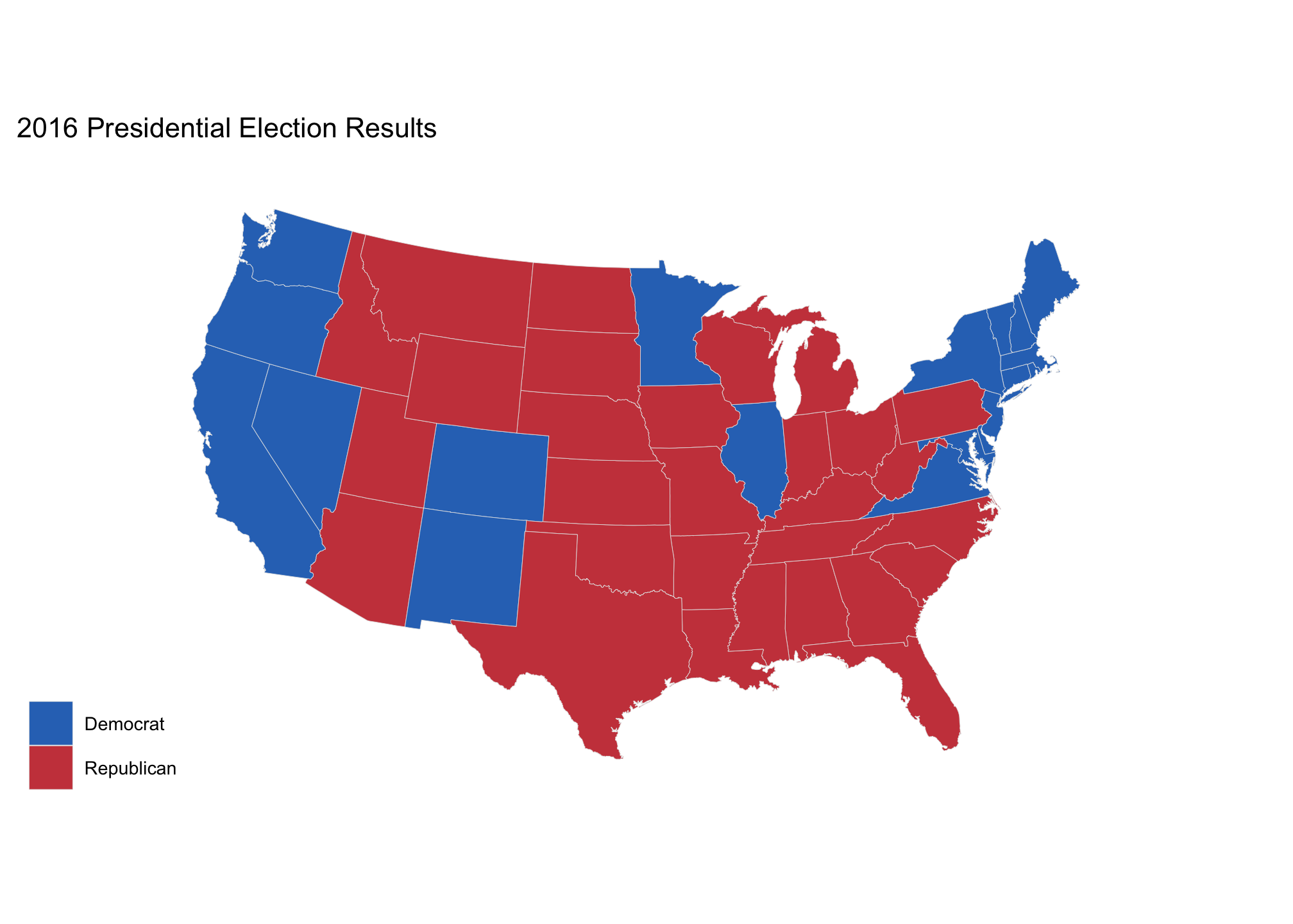
r better yet, why don’t we go crazy and use the five thirty eight theme!
ggplot(data = state_elec,
       mapping = aes(x = long, y = lat,
                     group = group, fill = party)) +
  geom_polygon(color = "gray90", size = 0.1) +
  coord_map(projection = "albers", lat0 = 39, lat1 = 45) +
  scale_fill_manual(values = partyColors) +
  labs(title = "2016 Presidential Election Results", fill = NULL) +
  theme_map()+
theme_fivethirtyeight() 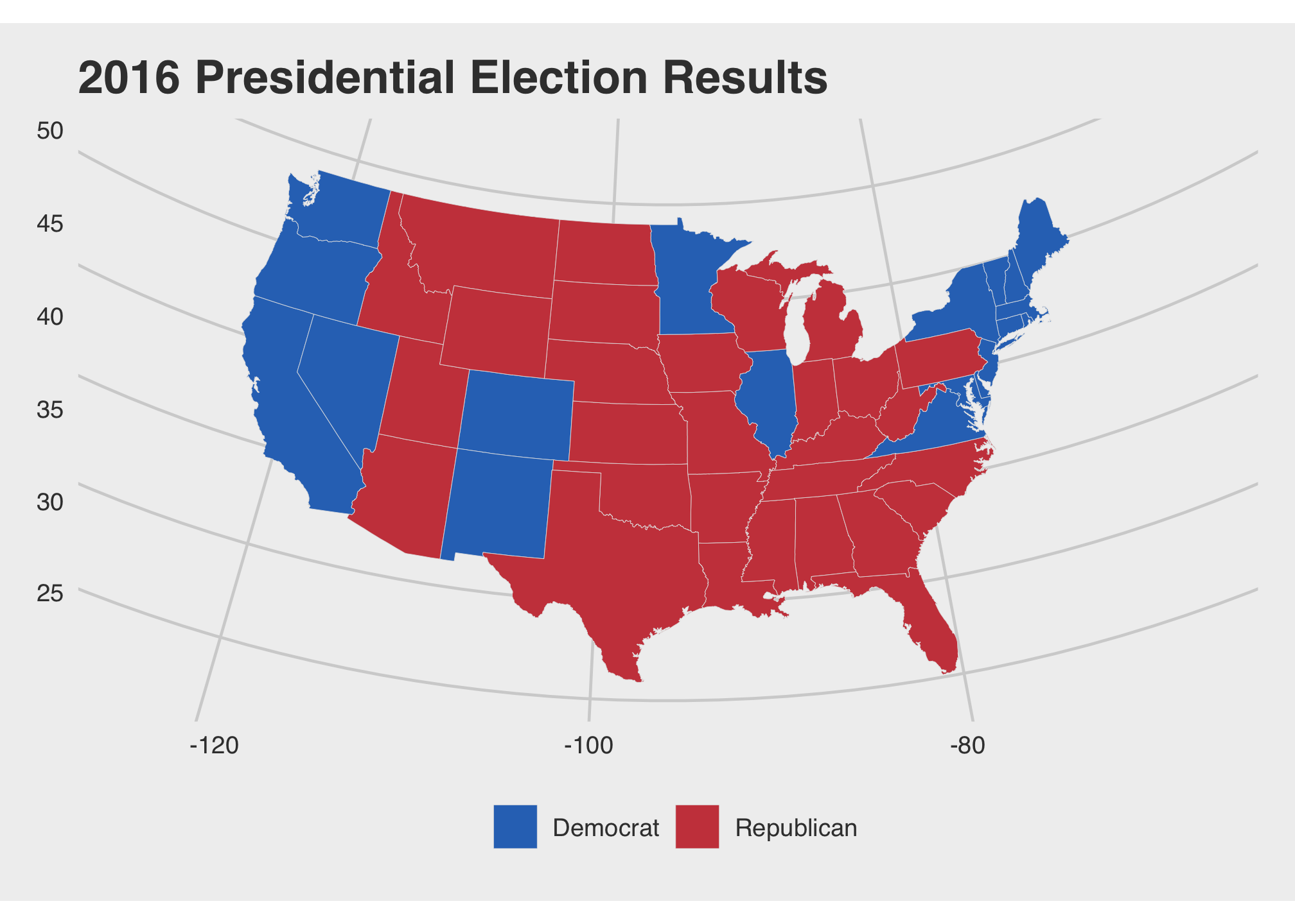
Now that you’ve recovered from that, there are many avenues we could explore using this data set. Here we’ll look at the individual candidates and their winnings by the popular vote.
Let’s look for Trump’s winnings…
tr1 <- ggplot(data = state_elec,
    mapping = aes(x = long, y = lat, group = group, fill = pct_trump)) +
    geom_polygon(color = "gray90", size = 0.1) +
    coord_map(projection = "albers", lat0 = 39, lat1 = 45) +
    theme_map() +
    theme_fivethirtyeight() +
    scale_fill_gradient(low = "white", high = "#CB454A") +
    labs(title = "Trump vote") +
    guides(fill = FALSE)
…and then for Clinton’s
cl1 <- ggplot(data = state_elec,
             mapping = aes(x = long, y = lat, group = group, fill = pct_clinton)) +
  geom_polygon(color = "gray90", size = 0.1) +
  coord_map(projection = "albers", lat0 = 39, lat1 = 45) +
  theme_map() +
  theme_fivethirtyeight() +
  scale_fill_gradient(low = "white", high = "#2E74C0") +
  labs(title = "Clinton vote") +
  guides(fill = FALSE)
And finally we’ll plot them both
tr1 + cl1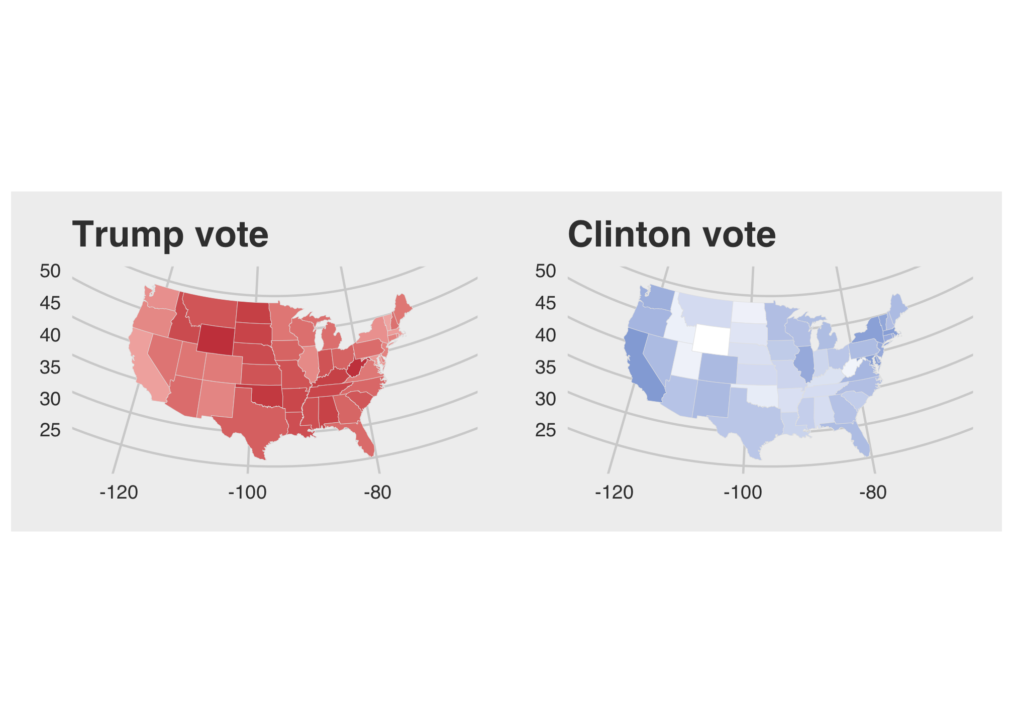
That looks pretty clean but something is off or maybe because I’m partially colorblind.The dense color distribution on the Trump map makes it appear that he won everywhere nearly everywhere and since we are looking at population data, Clinton won
nrow(filter(election2016, winner == "Clinton")) states. We found this by counting the number of rows after filtering the election2016 data set where the winner was Clinton. Now let’s try to take a look at the legends to get an idea of what may be going wrong. Again here are Trump’s winnings
tr2 <- ggplot(data = state_elec,
             mapping = aes(x = long, y = lat, group = group, fill = pct_trump)) +
  geom_polygon(color = "gray90", size = 0.1) +
  coord_map(projection = "albers", lat0 = 39, lat1 = 45) +
  theme_map() +
  theme_fivethirtyeight() +
   theme(
    axis.ticks = element_blank(),
    axis.text = element_blank(),
    panel.border = element_blank(),
    panel.grid.major = element_blank(),
    panel.grid.minor = element_blank(),
    panel.background = element_rect(fill = "#FFFFFF", color = "#FFFFFF"),
    plot.background = element_rect(fill = "#FFFFFF"),
    legend.background = element_rect(fill = "#FFFFFF")) +
  labs(title = "Trump vote", fill = "Percent") +
  scale_fill_gradient(low = "white", high = "#CB454A")
and Clinton’s winnings
# Clinton's winnings
cl2 <- ggplot(data = state_elec,
             mapping = aes(x = long, y = lat, group = group, fill = pct_clinton)) +
  geom_polygon(color = "gray90", size = 0.1) +
  coord_map(projection = "albers", lat0 = 39, lat1 = 45) +
  theme_map() +
  theme_fivethirtyeight() +
  theme(
    axis.ticks = element_blank(),
    axis.text = element_blank(),
    panel.border = element_blank(),
    panel.grid.major = element_blank(),
    panel.grid.minor = element_blank(),
    panel.background = element_rect(fill = "#FFFFFF", color = "#FFFFFF"),
    plot.background = element_rect(fill = "#FFFFFF"),
    legend.background = element_rect(fill = "#FFFFFF")) +
  labs(title = "Clinton vote", fill = "Percent") +
  scale_fill_gradient(low = "#FFFFFF", high = "#2E74C0")
And together
tr2 + cl2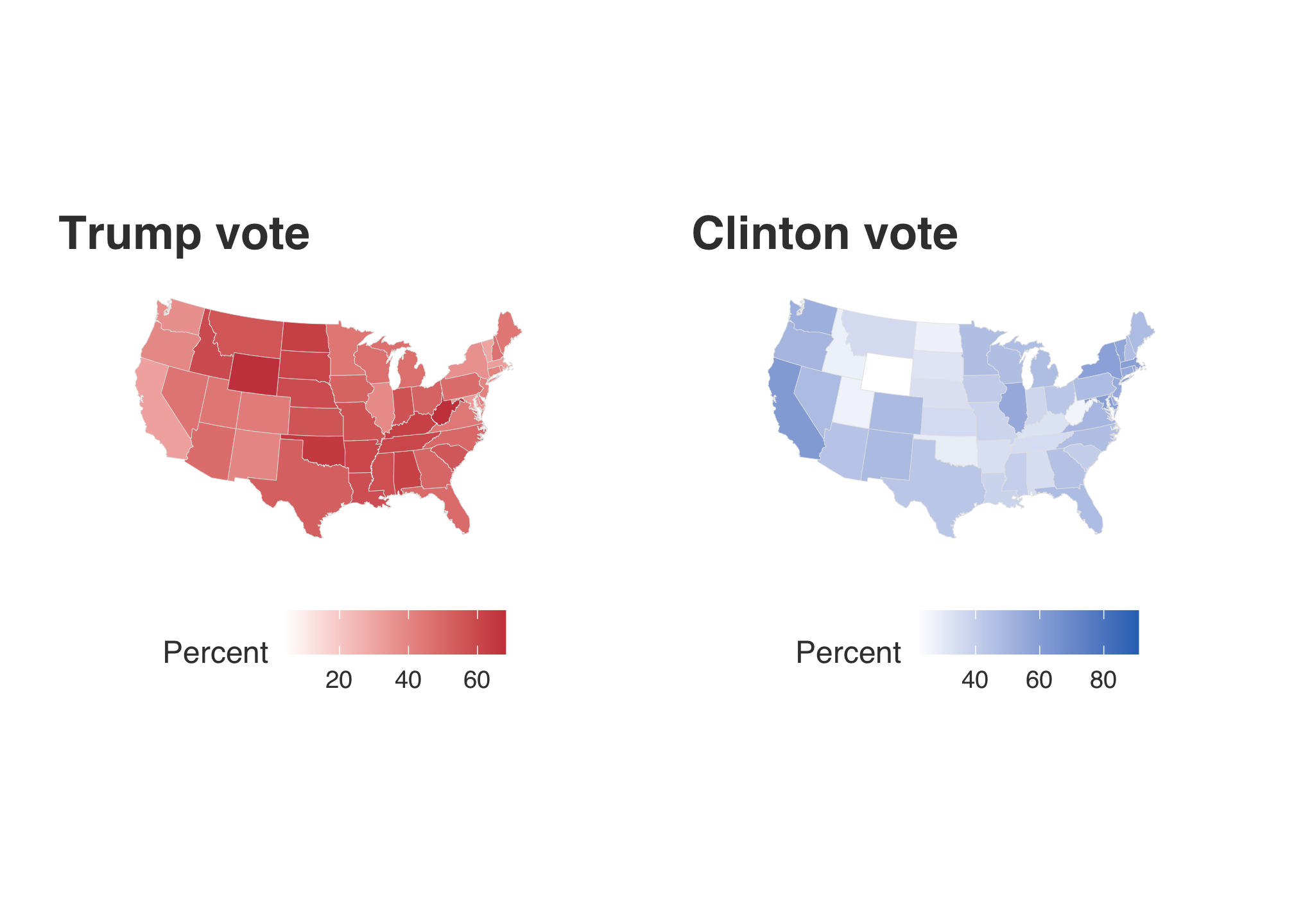
Ah the percents differ! The range indicated within Trump’s map is shorter than Clinton’s yielding the false representation. To compare them, they should be the same. To do this, we first check out the minimum and maximum values for each former candidate.
trrange <- range(election2016$pct_trump, na.rm = TRUE) # Check the range of Trump's percentagesclrange <- range(election2016$pct_clinton, na.rm = TRUE) # Check the range of Clinton's percentagesrange(trrange, clrange) # Check the range of both## [1] 4.09 90.86Well it looks like the standard 0-100% will probably work the best here.
tr3 <- ggplot(data = state_elec,
              mapping = aes(x = long, y = lat, group = group, fill = pct_trump)) +
  geom_polygon(color = "gray90", size = 0.1) +
  coord_map(projection = "albers", lat0 = 39, lat1 = 45) +
  theme_map() +
  theme_fivethirtyeight() +
  theme(
    axis.ticks = element_blank(),
    axis.text = element_blank(),
    panel.border = element_blank(),
    panel.grid.major = element_blank(),
    panel.grid.minor = element_blank(),
    panel.background = element_rect(fill = "#FFFFFF", color = "#FFFFFF"),
    plot.background = element_rect(fill = "#FFFFFF"),
    legend.background = element_rect(fill = "#FFFFFF")) +
  labs(title = "Trump vote", fill = "Percent") +
  scale_fill_gradient(limits=c(0, 100), low = "#FFFFFF", high = "#CB454A")
cl3 <- ggplot(data = state_elec,
mapping = aes(x = long, y = lat, group = group, fill = pct_clinton)) +
geom_polygon(color = "gray90", size = 0.1) +
coord_map(projection = "albers", lat0 = 39, lat1 = 45) +
theme_map() +
theme_fivethirtyeight() +
theme(
axis.ticks = element_blank(),
axis.text = element_blank(),
panel.border = element_blank(),
panel.grid.major = element_blank(),
panel.grid.minor = element_blank(),
panel.background = element_rect(fill = "#FFFFFF", color = "#FFFFFF"),
plot.background = element_rect(fill = "#FFFFFF"),
legend.background = element_rect(fill = "#FFFFFF")) +
labs(title = "Clinton vote", fill = "Percent") +
scale_fill_gradient(limits=c(0, 100), low = "#FFFFFF", high = "#2E74C0")# Plot them both
tr3 + cl3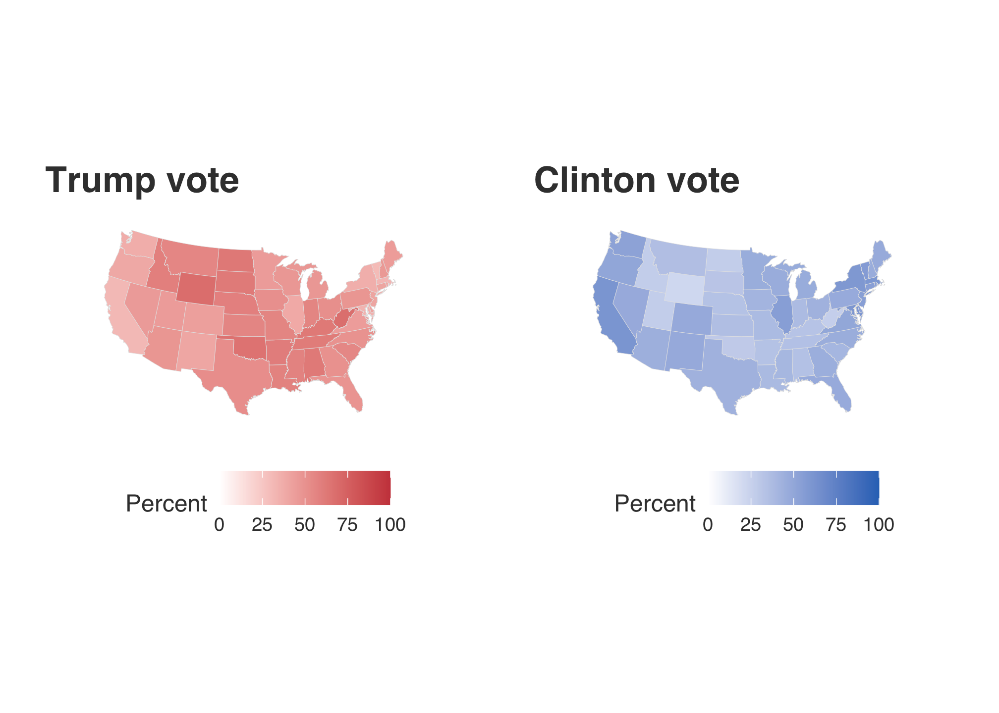
Now compare all four plots:
tr2 + cl2 + tr3 + cl3 + plot_layout(nrow = 2)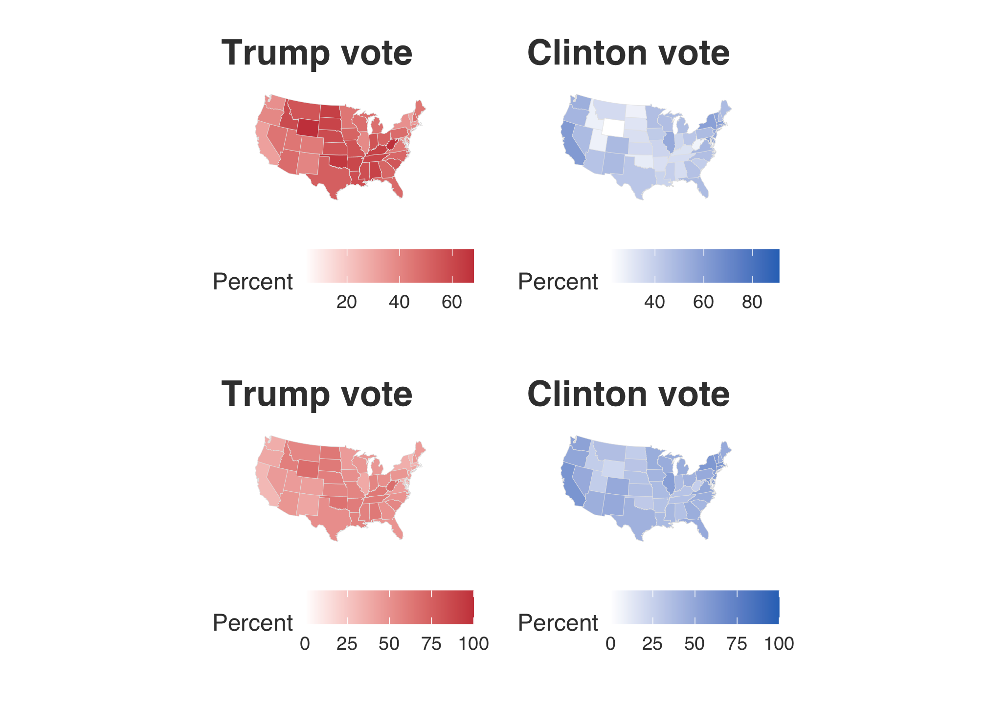
here! That looks better. Now that’s all fine and dandy but individual maps still only tell us about the performance of those candidates among st the states but not against each other. So what we really need to do is to care about the margin of wins. To do this, we can either pick the column d_points or r_points. Since the Democrats lost the general election in 2016 and there was a great deal of coverage regarding the popular vote, let’s choose the Republican points as the comparative baseline and use d_points.
lighter_map <-
  ggplot(data = state_elec,
         mapping = aes(x = long, y = lat, group = group, fill = d_points)) +
  geom_polygon(color = "gray90", size = 0.1) +
  coord_map(projection = "albers", lat0 = 39, lat1 = 45) +
  scale_fill_gradient2(
    low = "#CB454A", mid = scales::muted("purple"),
    high = "#2E74C0", breaks = c(-100, -75, -50,-25, 0, 25, 50, 75, 100),
    labels = c(100, 75, 50, 25, 0, 25, 50, 75, 100)) +
  theme_map() +
  theme_fivethirtyeight() +
  theme(
    axis.ticks = element_blank(),
    axis.text = element_blank(),
    panel.border = element_blank(),
    panel.grid.major = element_blank(),
    panel.grid.minor = element_blank()
  ) +
  labs(title = "Winning margins",
       subtitle = "(The Lighter Map)",
       fill = "Percent")
lighter_map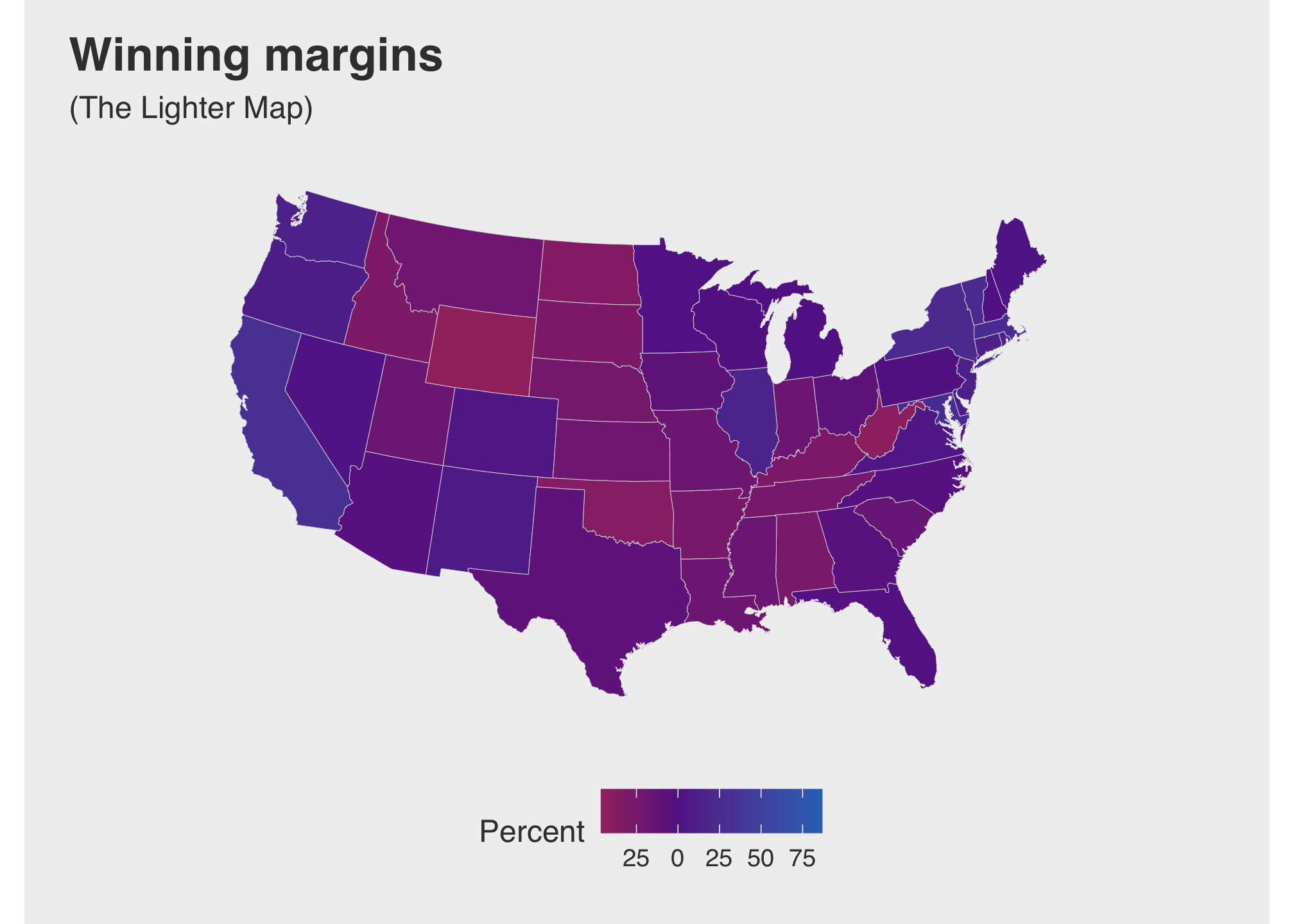
Take a moment to look at the map and code. Most of the items are probably familiar by now barring scale_fill_gradient2. There are many ways to apply gradients within ggplot. If you want to know more, look at the tidyverse page on scale gradients. Anyway, its seems a little hard to discern the difference between the choice of reds and blues, especially with purple being the middle color. Let’s try taking true reds and blues rather than a shade of them.
darker_map <-
ggplot(data = state_elec,
       mapping = aes(x = long, y = lat, group = group, fill = d_points)) +
  geom_polygon(color = "gray90", size = 0.1) +
  coord_map(projection = "albers", lat0 = 39, lat1 = 45) +
  scale_fill_gradient2(low = "red", mid = scales::muted("purple"),
                       high = "blue", breaks = c(-100, -75, -50,-25, 0, 25, 50, 75, 100),
                       labels = c(100, 75, 50, 25, 0, 25, 50, 75, 100)) +
  theme_map() +
  theme_fivethirtyeight() +
  theme(
    axis.ticks = element_blank(),
    axis.text = element_blank(),
    panel.border = element_blank(),
    panel.grid.major = element_blank(),
    panel.grid.minor = element_blank(),
    panel.background = element_rect(fill = "#FFFFFF", color = "#FFFFFF"),
    plot.background = element_rect(fill = "#FFFFFF"),
    legend.background = element_rect(fill = "#FFFFFF")) +
  labs(title = "Winning margins",
       subtitle = "(The Darker Map)",
       fill = "Percent")
darker_map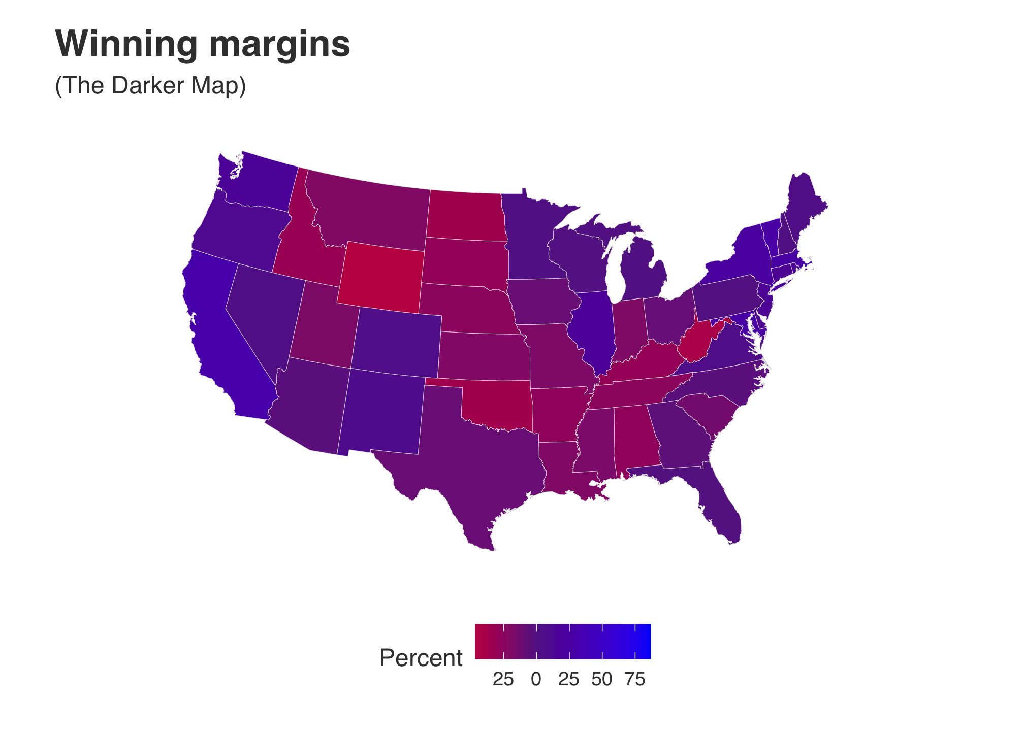
In this case, using the range we have includes everyone so there is no reason to stretch out the percentage which makes the coloring lighter. However, I still think that the colors are for The Darker Map are still not bright enough. Maybe the data set is skewing our results. Let’s find out.
# Grab the outliers
outliers = boxplot(election2016$d_points, plot=FALSE)$out
# Extract the row information from the original data frame
election2016[election2016$d_points %in% outliers,] ## # A tibble: 1 x 24
## state votes st fips total_vote vote_margin winner party pct_margin
## <chr> <int> <chr> <int> <int> <int> <chr> <chr> <dbl>
## 1 District of… 3 DC 11 311268 270107 Clint… Democ… 86.8
## # … with 15 more variables: r_points <dbl>, d_points <dbl>, pct_clinton <dbl>,
## # pct_trump <dbl>, pct_johnson <dbl>, pct_other <dbl>, clinton_vote <int>,
## # trump_vote <int>, johnson_vote <int>, other_vote <int>, ev_dem <int>,
## # ev_rep <int>, ev_oth <int>, census <chr>, region <chr>Well clearly Washington D.C. is the outlier here. What if we remove it…
darker_map_NODC <- ggplot(data = subset(state_elec,
                           !region %in% "district of columbia"),
             aes(x = long, y = lat, group = group, fill = d_points)) +
  geom_polygon(color = "gray90", size = 0.1) +
  coord_map(projection = "albers", lat0 = 39, lat1 = 45) +
  scale_fill_gradient2( low = "red", mid = scales::muted("purple"),
                        high = "blue", breaks = c(-100, -75, -50,-25, 0, 25, 50, 75, 100),
                        labels = c(100, 75, 50, 25, 0, 25, 50, 75, 100)) +
  theme_map() +
  theme_fivethirtyeight() +
  theme(
    axis.ticks = element_blank(),
    axis.text = element_blank(),
    panel.border = element_blank(),
    panel.grid.major = element_blank(),
    panel.grid.minor = element_blank(),
    panel.background = element_rect(fill = "#FFFFFF", color = "#FFFFFF"),
    plot.background = element_rect(fill = "#FFFFFF"),
    legend.background = element_rect(fill = "#FFFFFF")) +
  labs(title = "Winning margins",
                subtitle =str_wrap("(The Darker Map without Washington D.C.)",30),
       fill = "Percent")
…and re plot both darker maps to compare.
darker_map + darker_map_NODC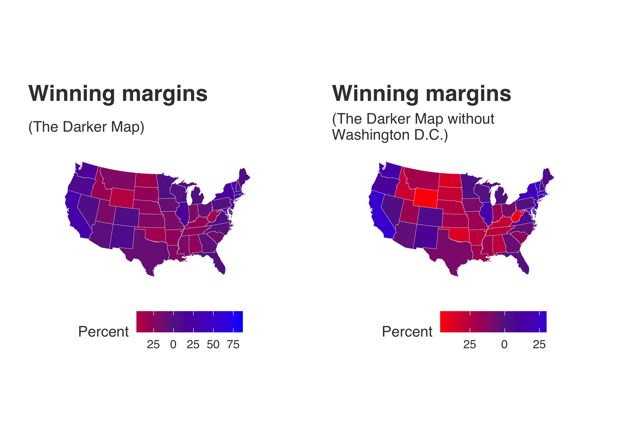
Now that made a huge difference mainly since the outlier (DC) was such an outlier that it was stretching the color distribution. You can see evidence of this by looking at the legends below each plot.
Part III: Choropleths with Blocks
For this part, please load the following libraries
library(devtools)## Loading required package: usethislibrary(statebins)
library(RColorBrewer)Then run devtools::install_github("hrbrmstr/statebins") and
library(statebins)On a side note, There is a version of the package statebins on CRAN but it lacks the functionality we need. More about the new version of statebins here. You do not have to comment it out after the first installation. Read the message if you attempt to run it again. However at some point there will be an official version posted to CRAN so it is recommended that you uninstall this by using remove.packages(statebins). If you get an odd error about ggplot2 being corrupt, restart your R Studio (make sure to save your work space!)
The RColorBrewer package
The RColorBrewer package is the most utilized collection of color palettes used in R. There is a lot of color theory which amazingly is quite interesting and grounded in science and history, but we simply do not have the bandwidth to cover that in this course. But if you’re interested, check out the PBS Eons clip below which addresses the Purple Earth Hypothesis.
For resources, a few sites you may wish to check out are listed below
You can see the entire set of palettes using
display.brewer.all()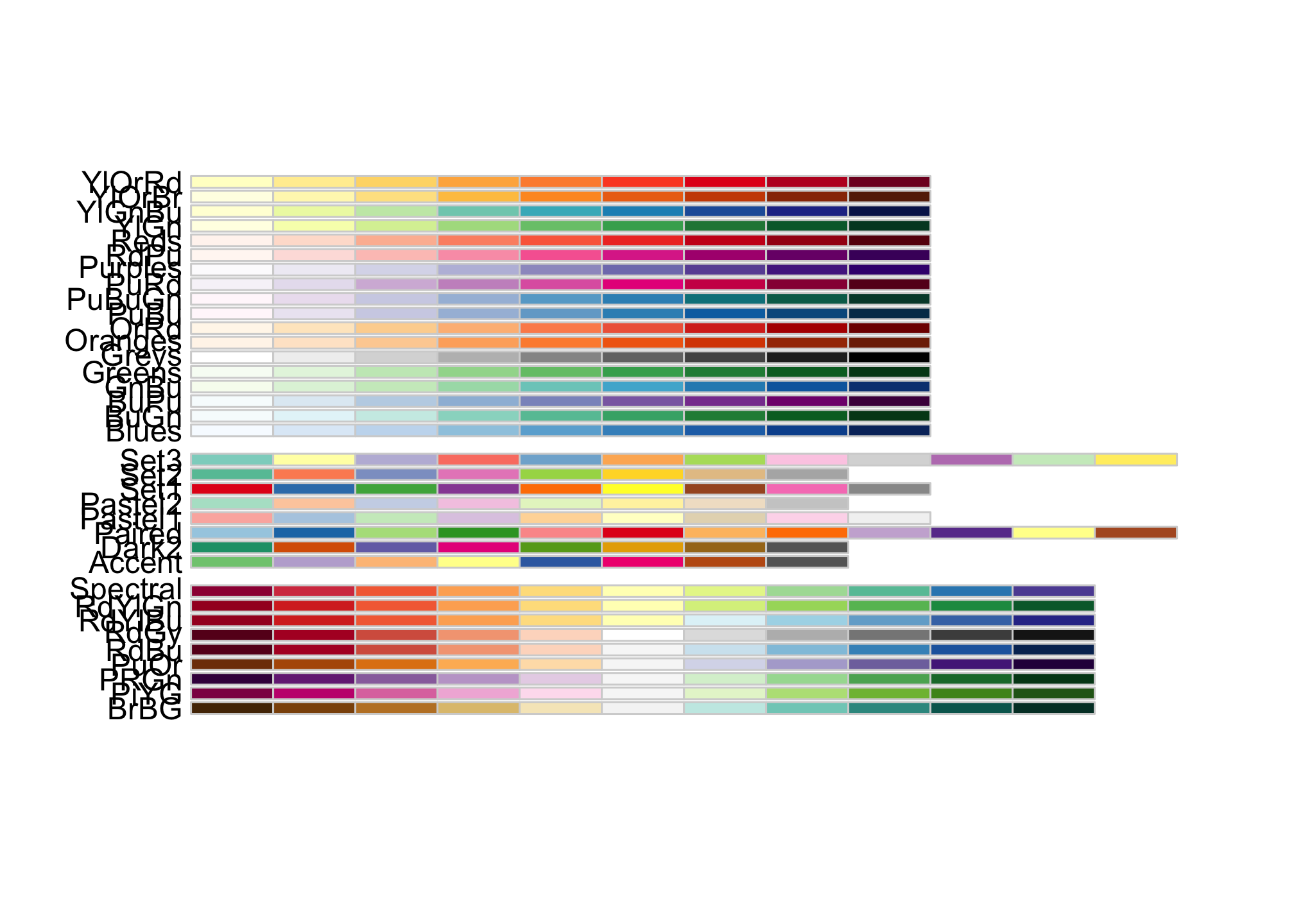 which probably looks better in R Studio than here.
Statebins
We’re going to be using the package statebins but the basic command does not come with a great deal of flexibility. For example
statebins(election2016, value_col="pct_trump", palette = "Reds", round=TRUE) +
  theme_statebins()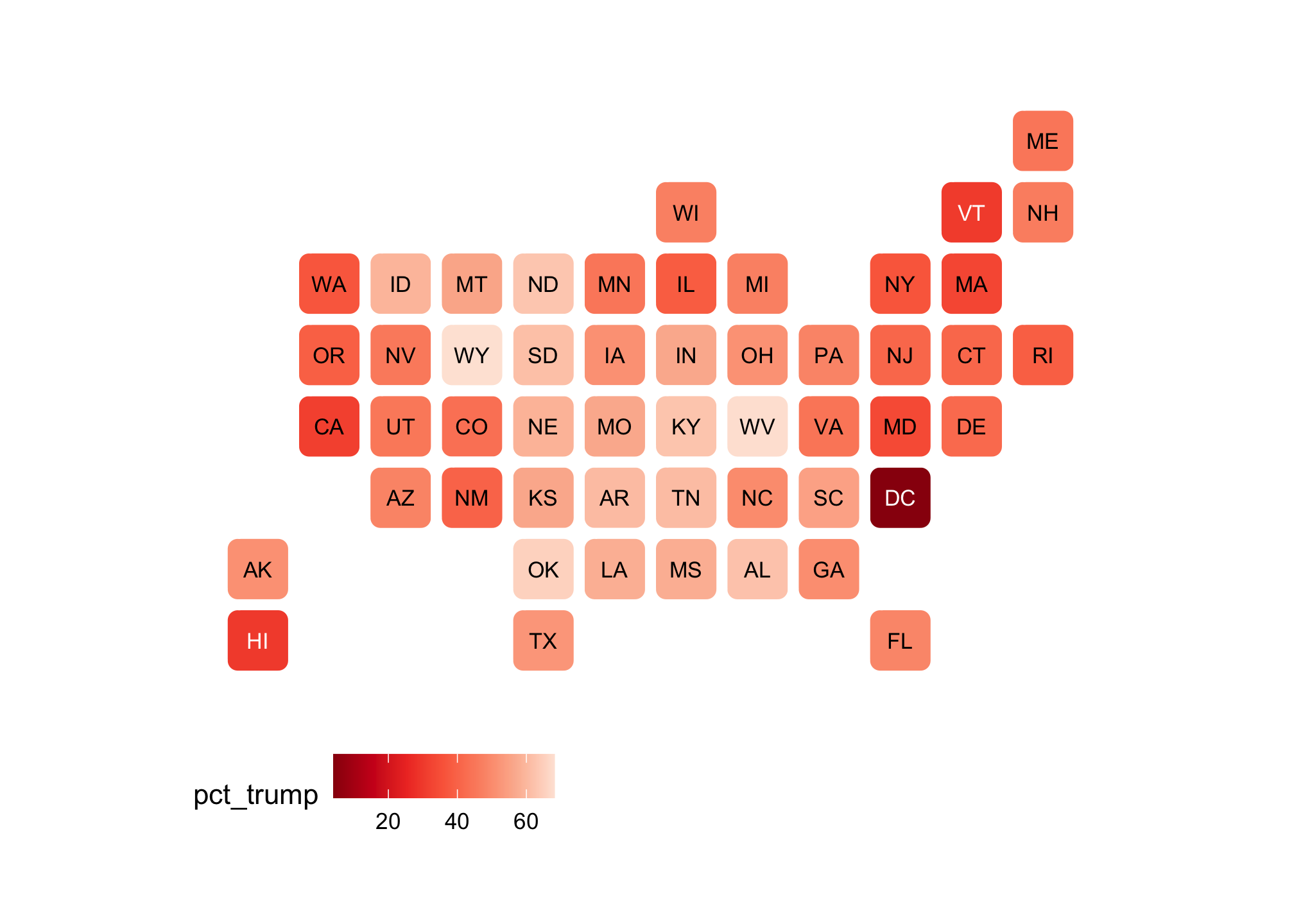
is built with the default color palette within R. While it’s fine, without hacking or overwriting the basic commands, we are unable make changes like expanding the limits on the legend. For that, we need the command geom_statebins which does not exist in the CRAN version at the time of this writing. With that command, we have the ability to to work within ggplot2. You should also be aware that ggplot really does not like the base R palette! Below, were going to use brewer.pal("all", "Reds") which calls the Reds palette from RColorBrewer
basicRedBrews <- brewer.pal("all", "Reds")## Warning in brewer.pal("all", "Reds"): n too large, allowed maximum for palette Reds is 9
## Returning the palette you asked for with that many colorsDid you catch the Warning? The RColorBrewer package is nice but limited. We have measures from 50 states but only have 9 colors to account for the differences.
show_col(basicRedBrews)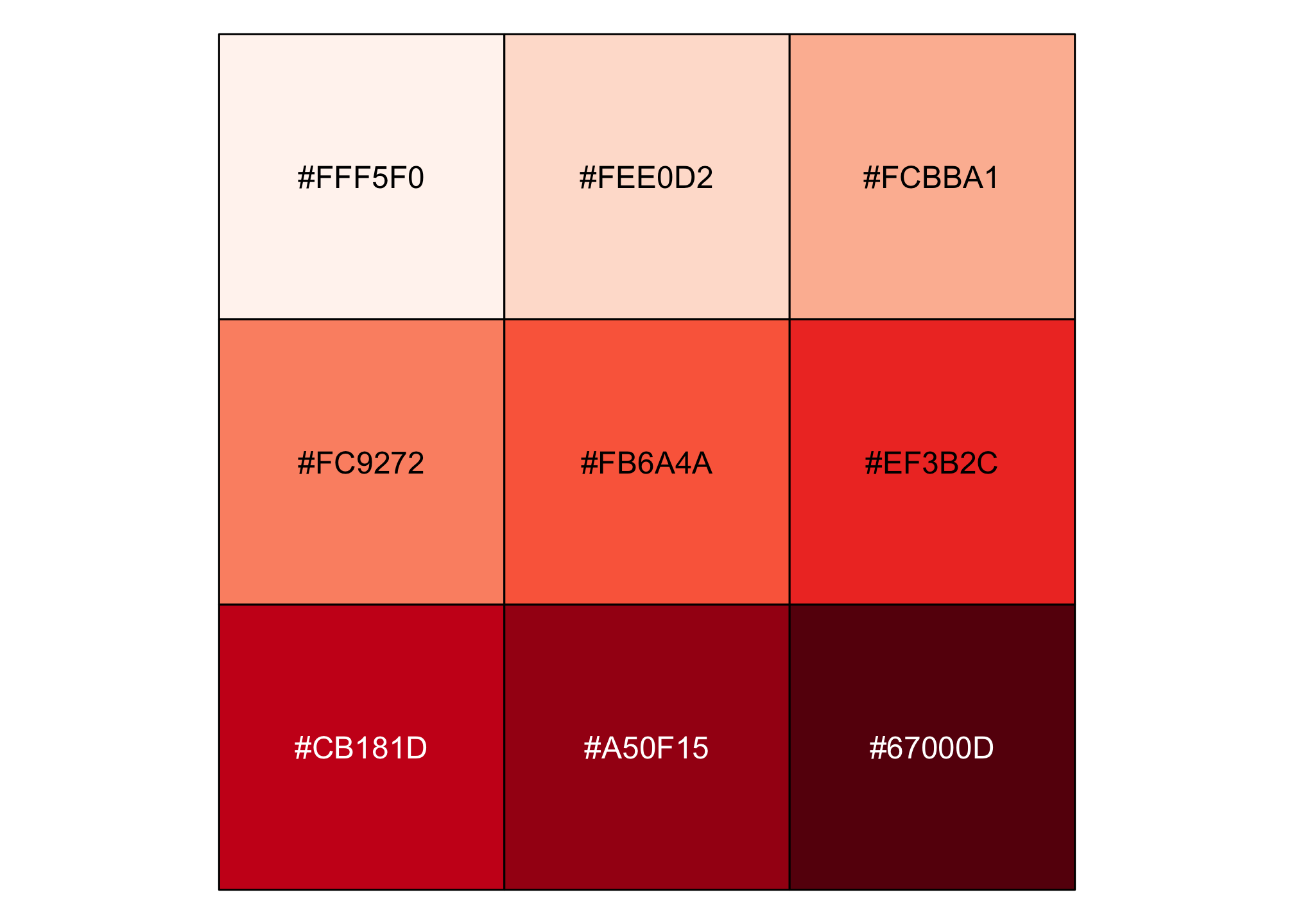
Now if we apply it to the plot below…
trumpNineRed <- ggplot(election2016, aes(state=state, fill=pct_trump)) +
             geom_statebins() +
             coord_equal() +
             theme_statebins() +
             scale_fill_gradientn(limits = c(0, 100), colors = brewer.pal("all", "Reds")) +
             labs(title = str_wrap("Trump 2016 Popular Vote Percent Distribution", 30),
             # Notice the text wrap via thge stringr package.
             subtitle ="(Nine Shades of Red)",
             # cough cough proper APA formatting cough cough
             fill = NULL)
## Warning in brewer.pal("all", "Reds"): n too large, allowed maximum for palette Reds is 9
## Returning the palette you asked for with that many colors…we get the same warning and the plot looks like
trumpNineRed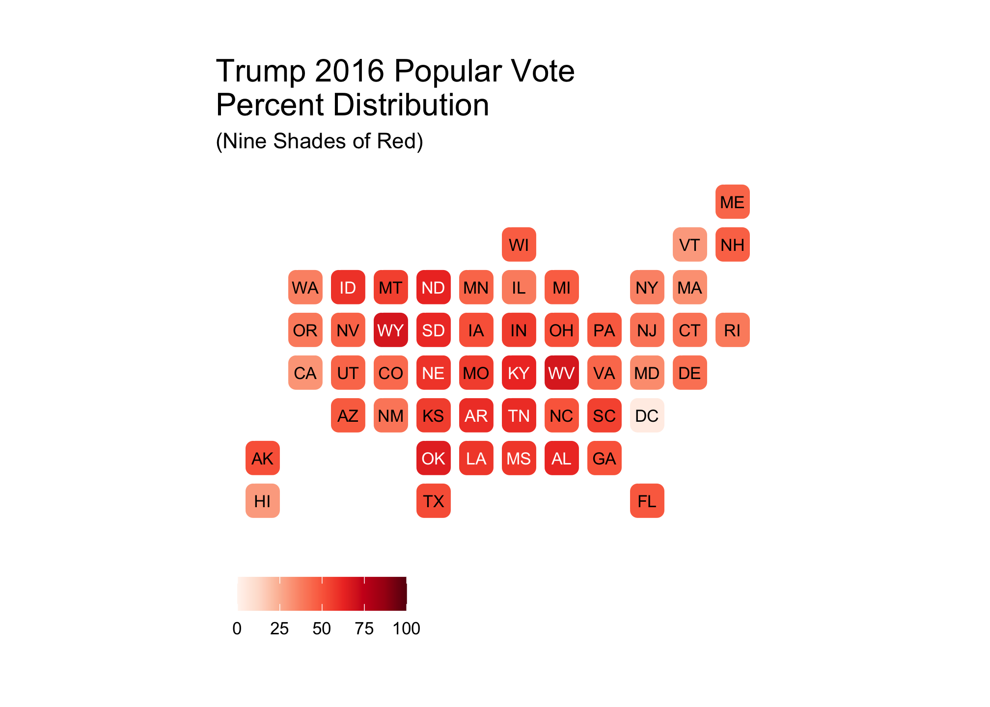
Now sometimes it is a good idea to have a small palette even if you have a large data set which I’ll address later on. However, let’s assume we want 50 colors, and in this case 50 shades of red (not to be confused with another color and what I can only assume is a terrible movie). Unless you really enjoy constructing palettes manually (which many people do!), there is a way to have R do it for you - enter the colorRampPalette command.
# Define a range of 50 colors based on the RColorBrewer Reds palette.
fiftyRedBrews <- colorRampPalette(basicRedBrews)(50)
show_col(fiftyRedBrews)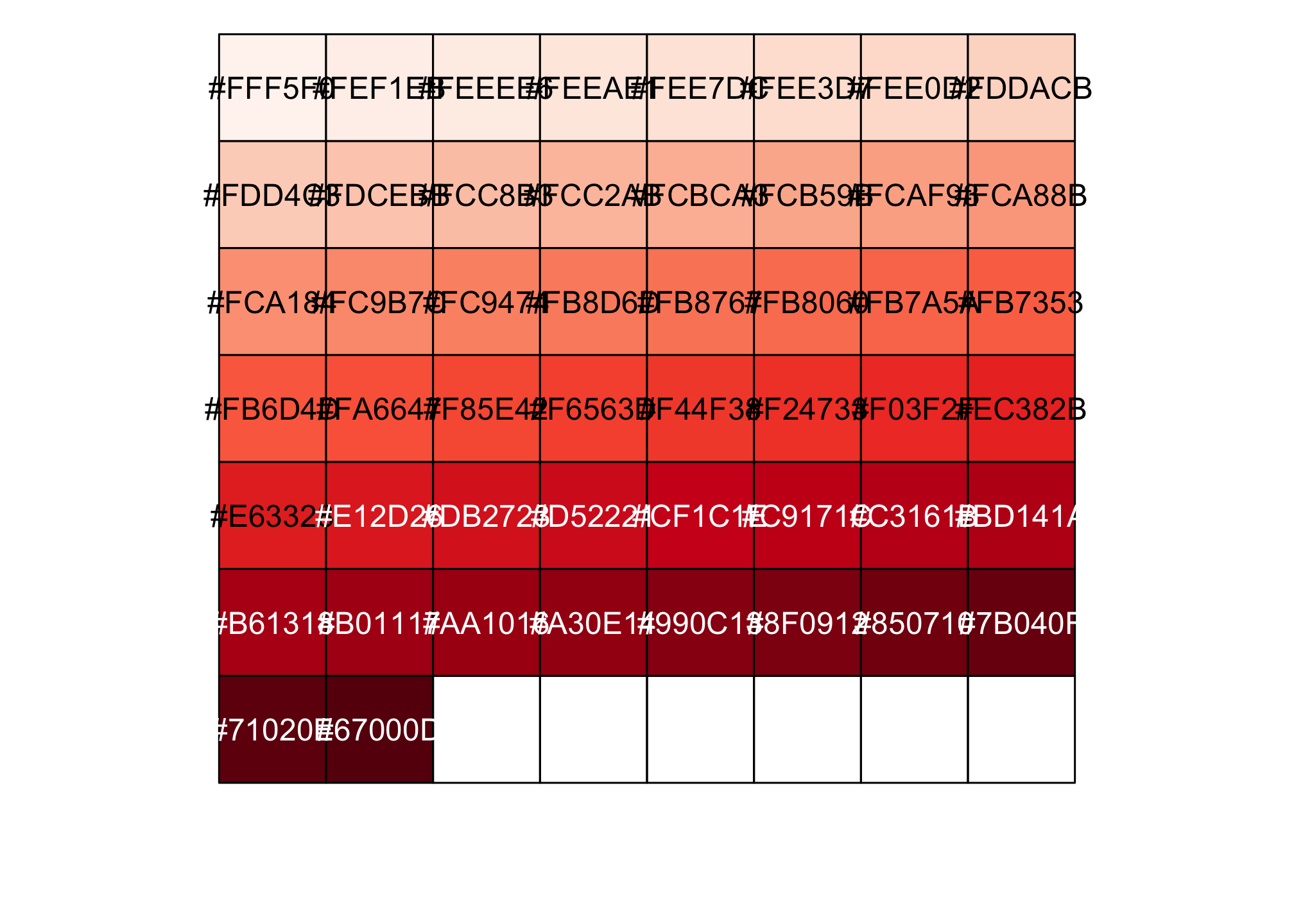
Now that’s more like it! So let’s try the plot from earlier again:
trumpFiftyRed <- ggplot(election2016, aes(state=state, fill=pct_trump)) +
  geom_statebins() +
  coord_equal() +
  theme_statebins() +
  scale_fill_gradientn(limits = c(0, 100), colors = fiftyRedBrews) +
  labs(title = str_wrap("Trump 2016 Popular Vote Percent Distribution", 30),
       subtitle ="(50 Shades of Red)",
       fill = NULL)
trumpFiftyRed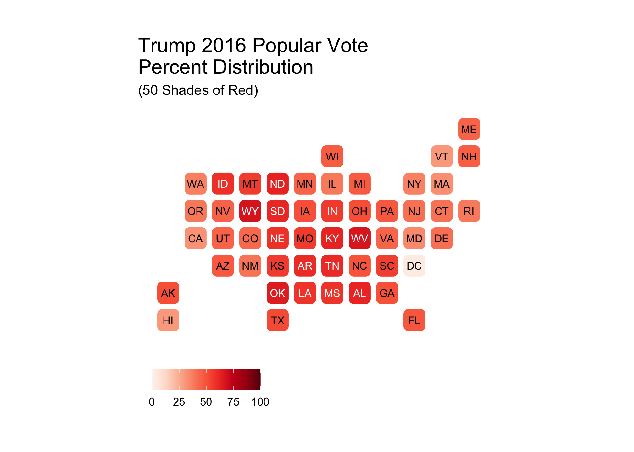
Now compare the other nine color plot versus this newer version with 50.
trumpNineRed + trumpFiftyRed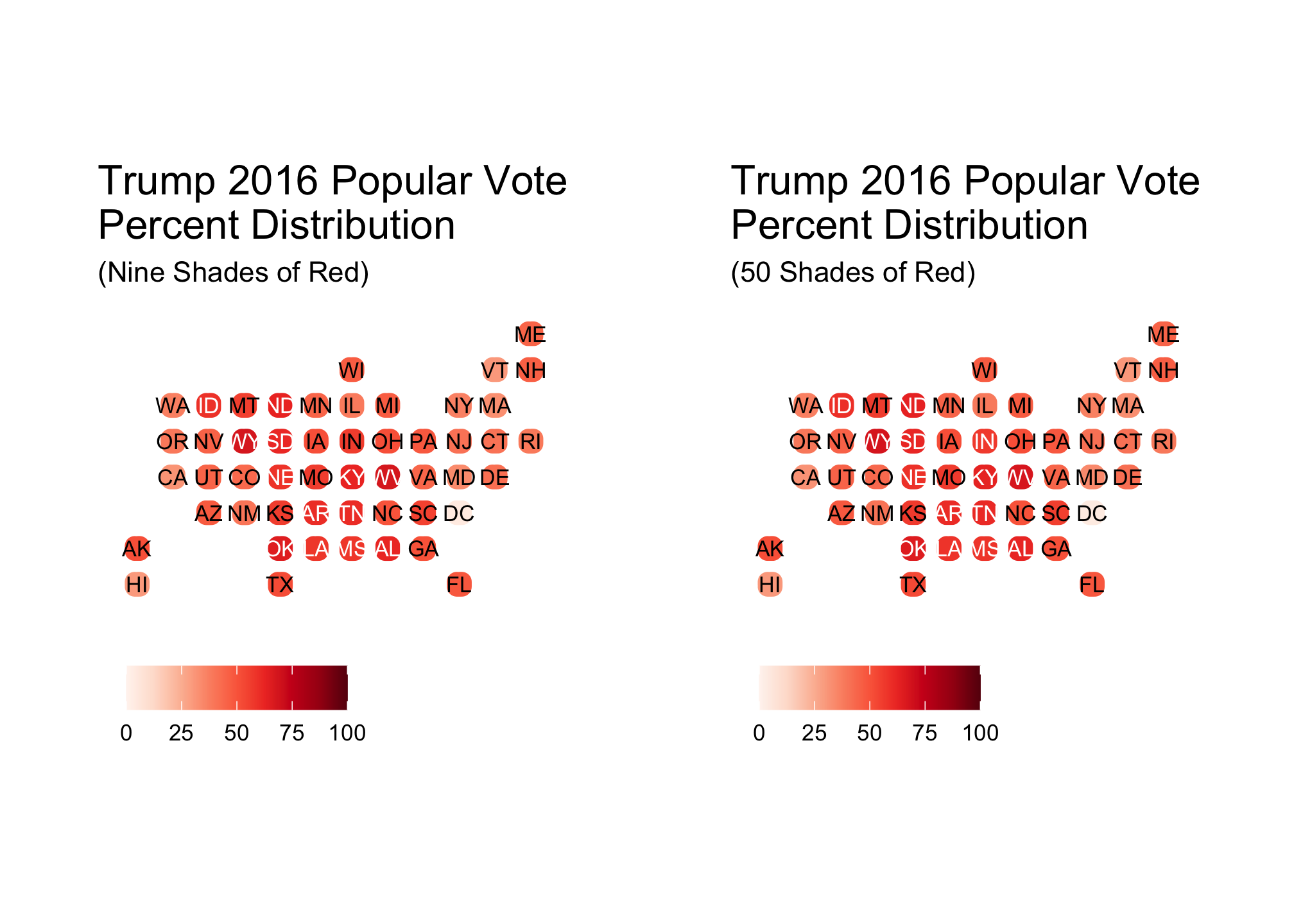 Did it make a difference? Well that depends on whom you ask. Even if I cannot see one, that does not imply that others cannot. With that said, there are situations where having a smaller palette makes sense. One example of this is when you want to explore groups
threeRedBrews <- brewer.pal(3, "Reds") # We're taking three evenly distributed colorsshow_col(threeRedBrews)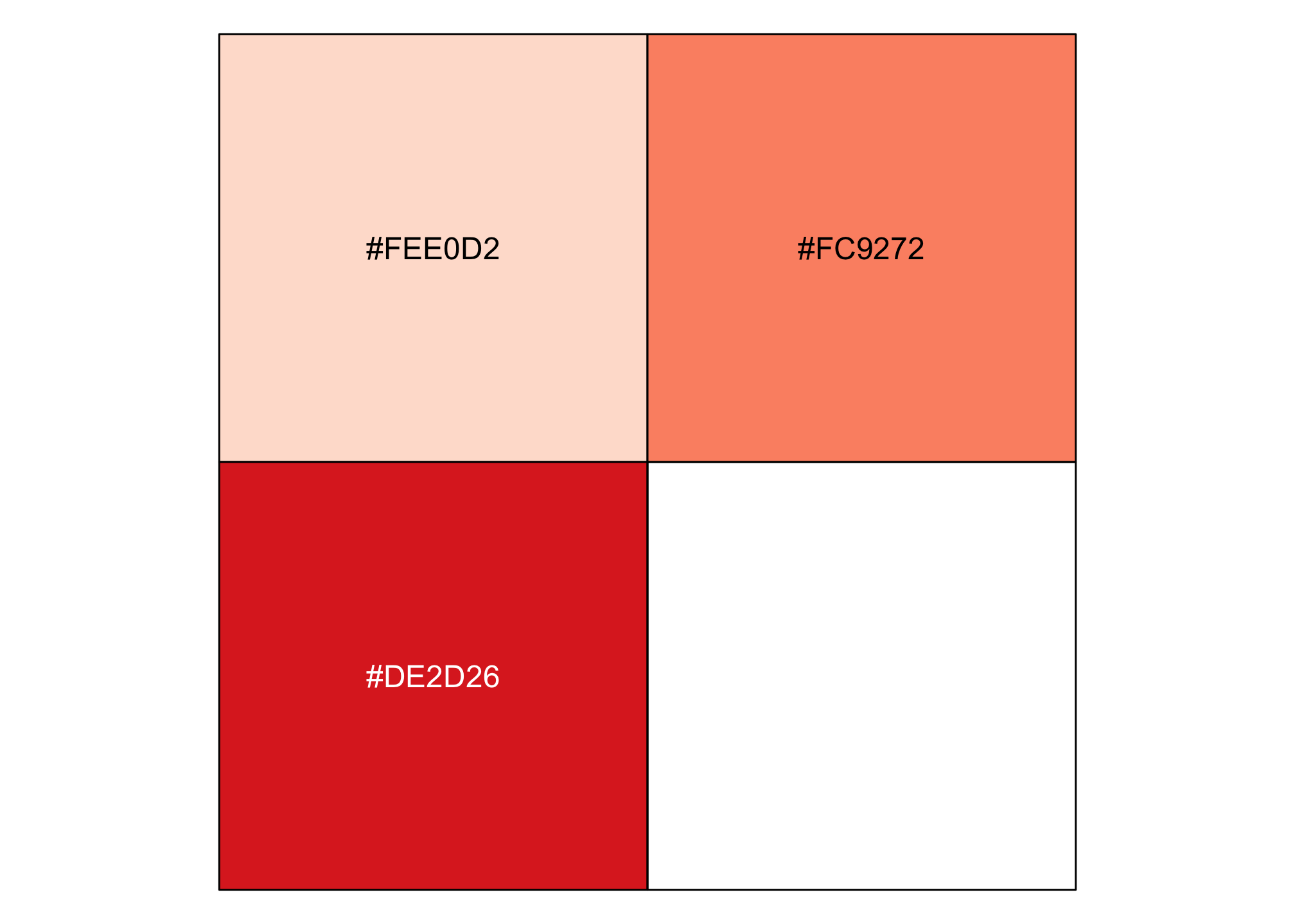
trumpThreeRed <- ggplot(election2016, aes(state=state, fill=pct_trump)) +
  geom_statebins() +
  coord_equal() + # If you run the ggplot and geom_statbins line, it looks rectangular.
  theme_statebins() + # This is akin to the base ggplot2 theme_minimal()
  scale_fill_gradientn(limits = c(0, 100), colors = threeRedBrews) +
  labs(title = str_wrap("Trump 2016 Popular Vote Percent Distribution",30),
       subtitle ="(Three Shades of Red)",
       fill = NULL)
trumpThreeRed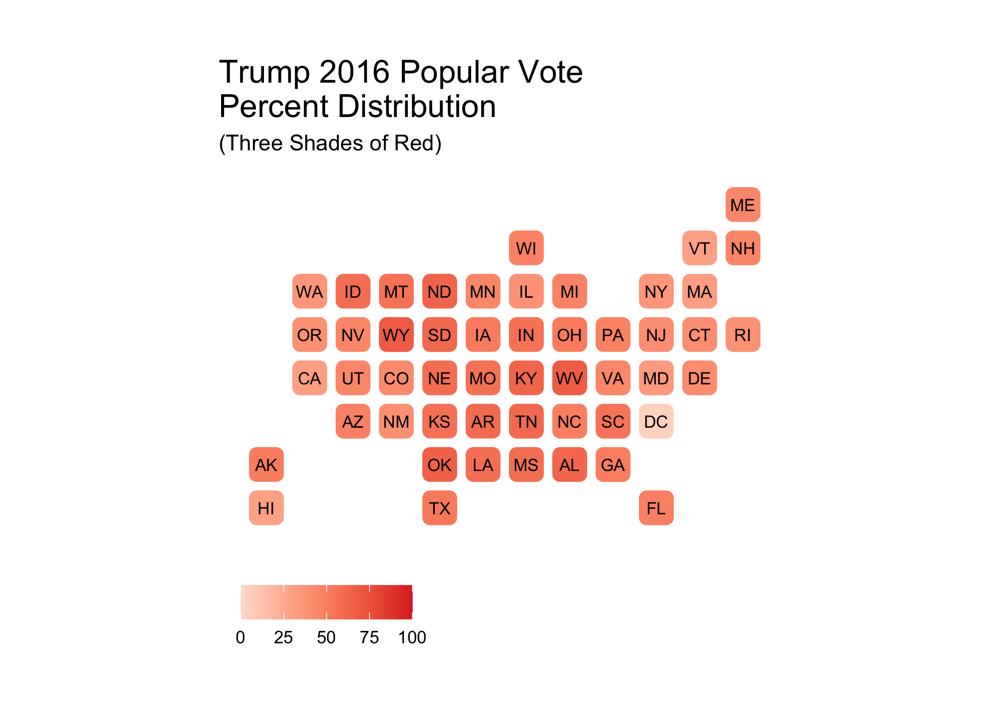
From the plot, there is an indication from the shading that the the Midwest and south went more for Trump than the coastal areas. This brings us to a good pointYour choice in palettes in both color and range are situationally dependent. In a nutshell, never plot blindly and always think about what you want people to see! Remember, you (should) know your data inside and out but is
that understanding translate over into your visualization and
visually appealing?
Also, never assume that the same ranges will give you similar results as we’ll see below. However, let’s perform the same type of plot for Clinton firsts.
basicBlueBrews <- brewer.pal("all", "Blues")## Warning in brewer.pal("all", "Blues"): n too large, allowed maximum for palette Blues is 9
## Returning the palette you asked for with that many colorsshow_col(basicBlueBrews)
fiftyBlueBrews <-
  colorRampPalette(basicBlueBrews)(50)
show_col(fiftyBlueBrews)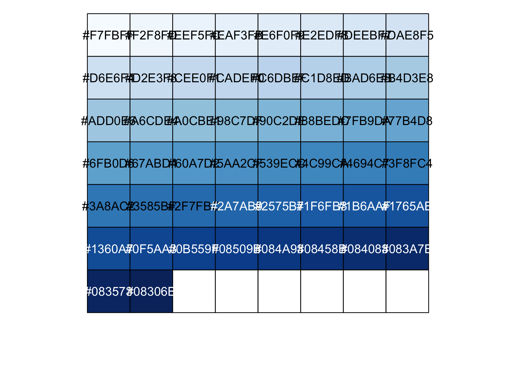
clintonFiftyBlue <-
  ggplot(election2016, aes(state=state, fill=pct_clinton)) +
  geom_statebins() +
  coord_equal() +
  theme_statebins() +
  scale_fill_gradientn(limits = c(0, 100), colors = fiftyBlueBrews) +
  labs(title = str_wrap("Clinton 2016 Popular Vote Percent Distribution", 30),
       subtitle ="(50 Shades of Blue)",
       fill = NULL)
clintonFiftyBlue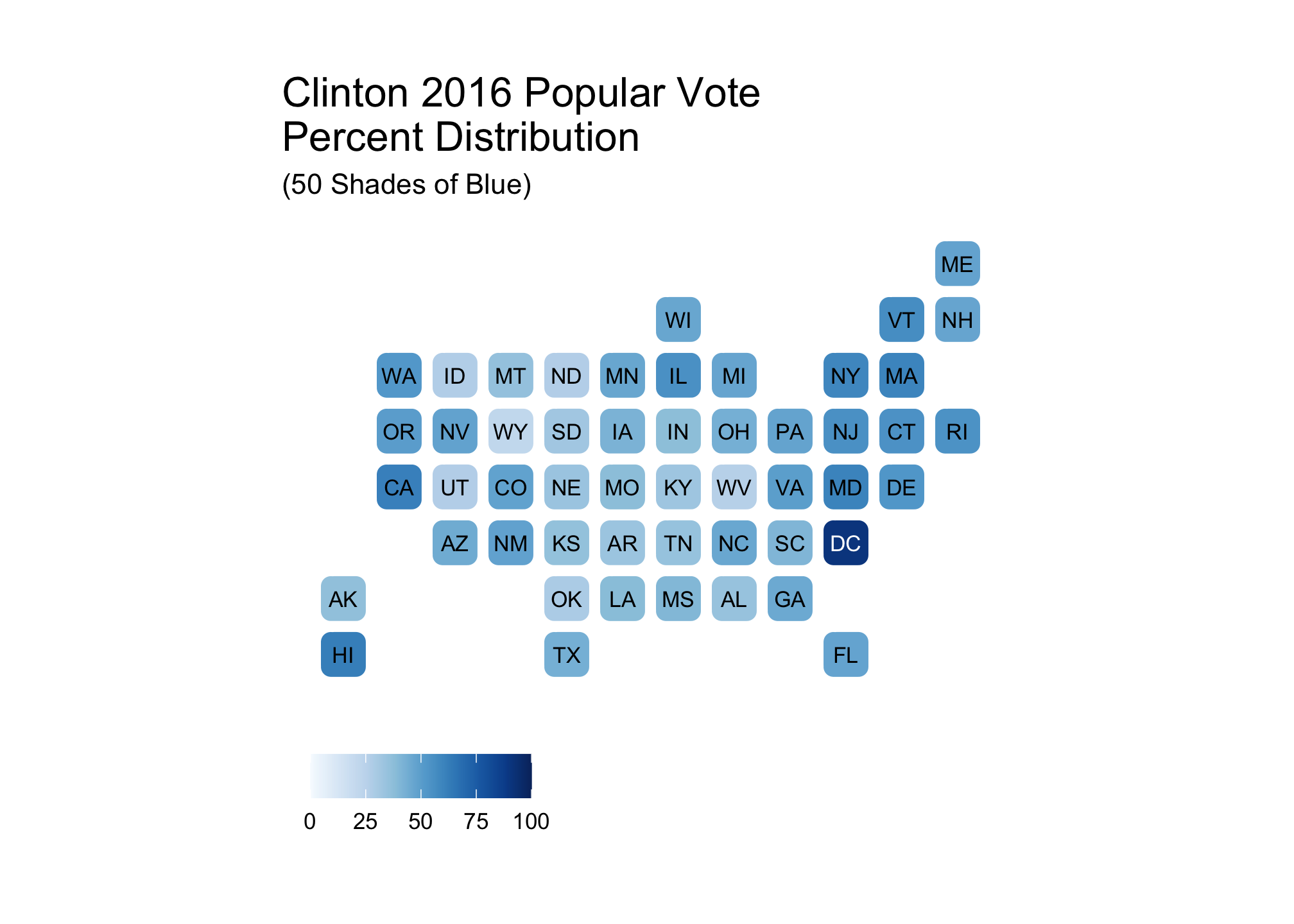
threeBlueBrews <- brewer.pal(3, "Blues")show_col(threeBlueBrews)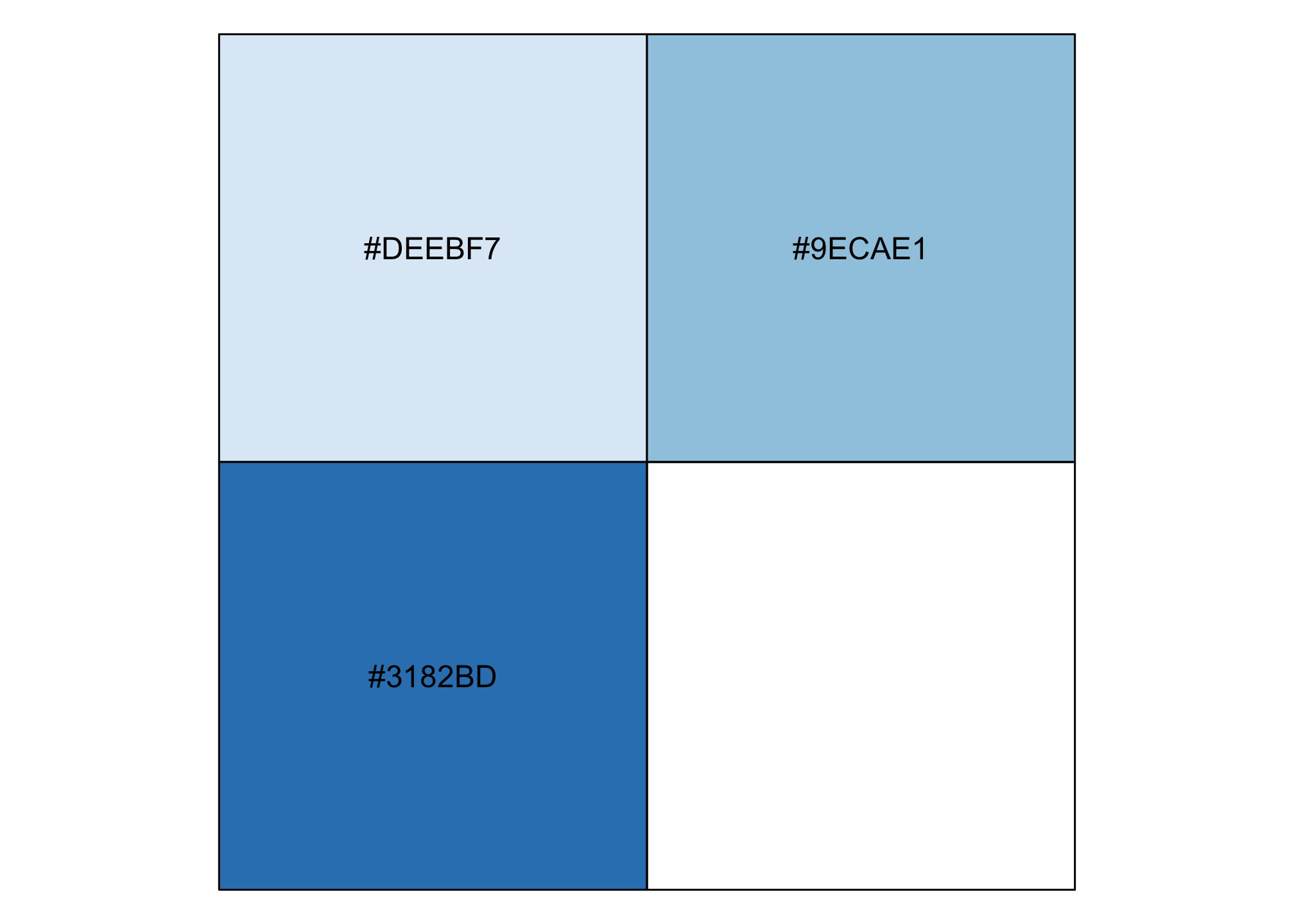
clintonThreeBlue <- ggplot(election2016, aes(state=state, fill=pct_clinton)) +
  geom_statebins() +
  coord_equal() +
  theme_statebins() +
  scale_fill_gradientn(limits = c(0, 100), colors = threeBlueBrews) +
  labs(title = str_wrap("Clinton 2016 Popular Vote Percent Distribution", 30),
       subtitle ="(Three Shades of Blue)",
       fill = NULL)
clintonThreeBlue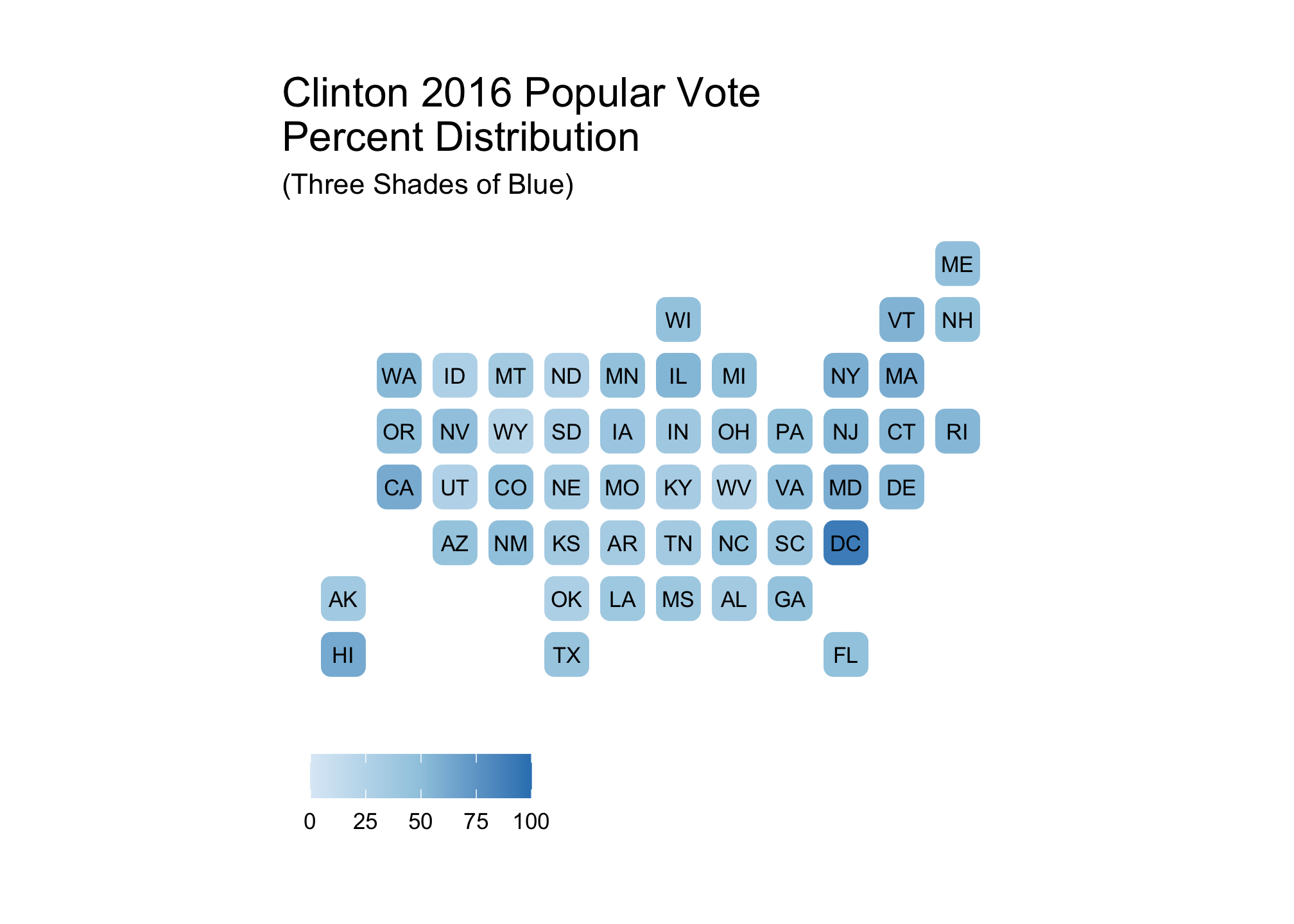
Now to view them all
trumpFiftyRed + clintonFiftyBlue + trumpThreeRed + clintonThreeBlue + plot_layout(ncol = 2)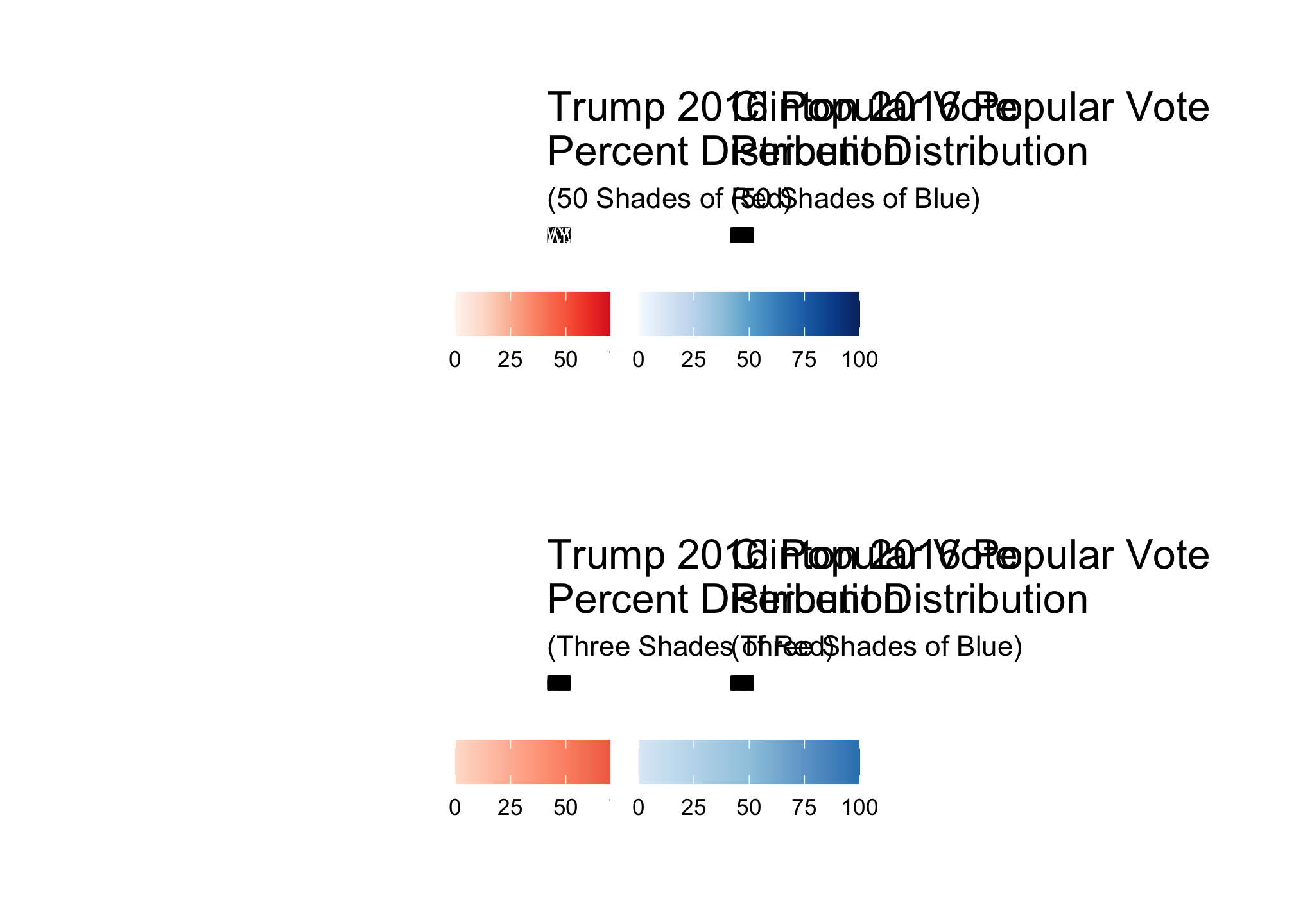
Looking at these, it appears that regional differences are best shown by clintonFiftyBlue and trumpThreeRed both of which clearly do not have the same number of colors and corresponding distributions.
trumpThreeRed + clintonFiftyBlue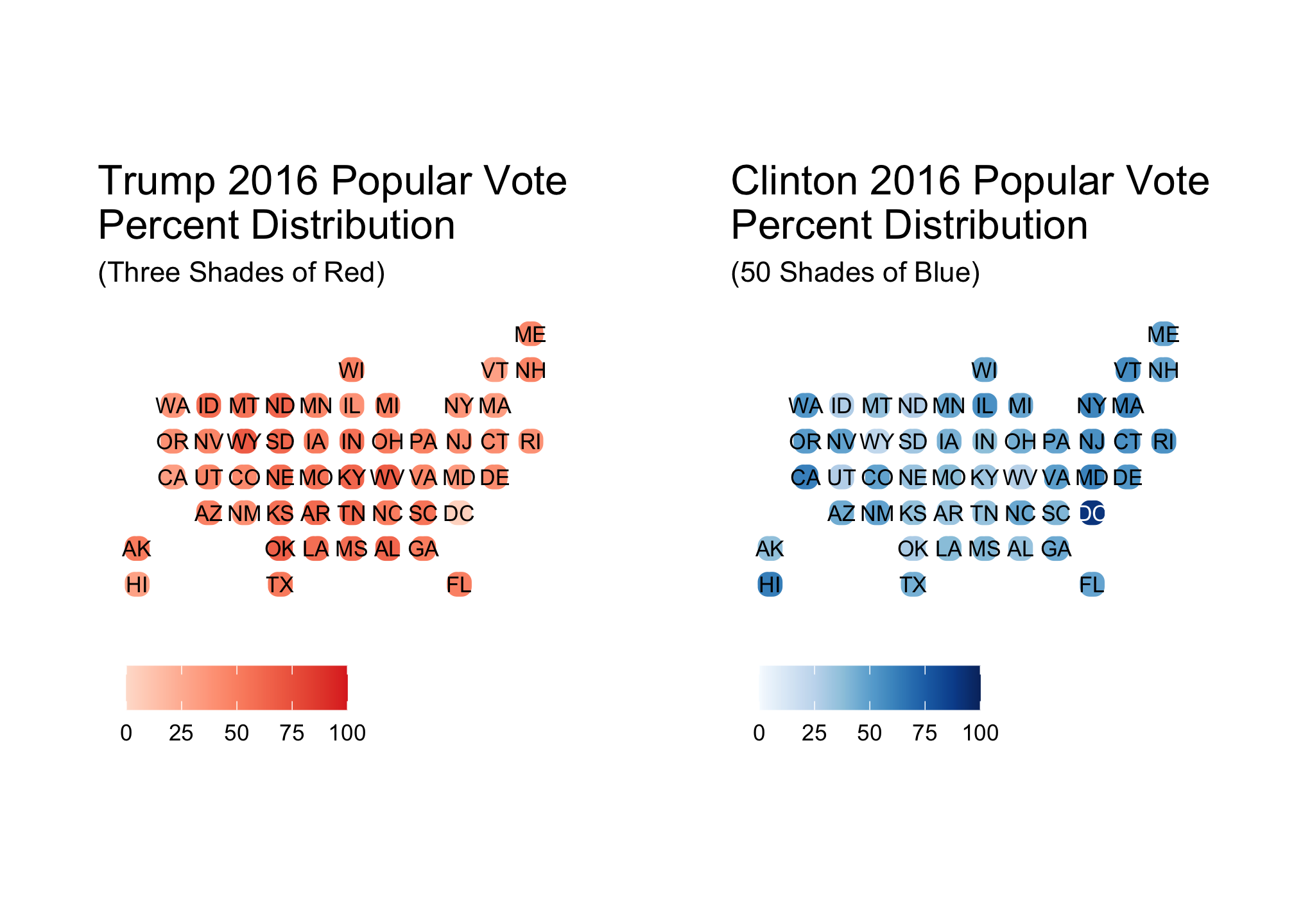
How can we know for sure? Let’s check out the distributions for each candidate beginning with Trump
ggplot(election2016) +
geom_bar(mapping = aes(x=state, y=pct_trump, fill = pct_trump), stat = "identity") +
scale_fill_gradientn(limits = c(0, 100), colors = threeRedBrews) +
facet_grid(~ census, drop = TRUE, scales = "free_x") +
theme_bw() +
theme(
axis.text = element_blank(),
axis.ticks = element_blank(),
panel.grid.major = element_blank(),
panel.grid.minor = element_blank(),
legend.position = "bottom"
) +
xlab("Regions") +
ylab("") +
labs(title = "2016 Presidential Results for Trump",
subtitle ="Distribution by US Region",
fill = NULL)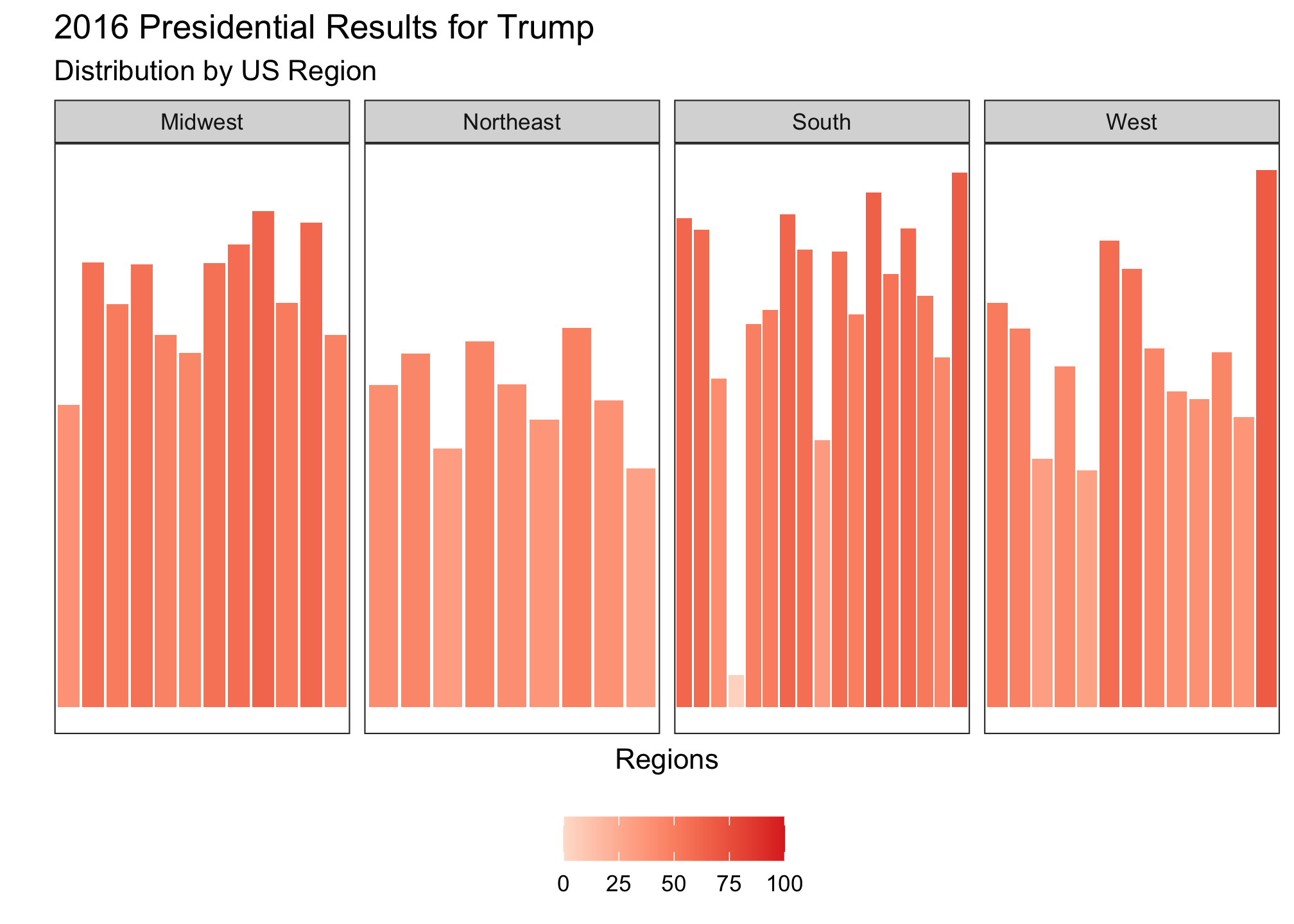 Trump’s darker reds are relatively consistent in the Midwest and South but split in the West. If we plot Clinton’s pattern, you would expect to see the opposite and that is exactly what is plotted.
ggplot(election2016) +
        geom_bar(mapping = aes(x=state, y=pct_clinton, fill = pct_clinton), stat = "identity") +
  scale_fill_gradientn(limits = c(0, 100), colors = fiftyBlueBrews) +
  facet_grid(~ census, drop = TRUE, scales = "free_x") +
  theme_bw() +
  theme(
    axis.text = element_blank(),
    axis.ticks = element_blank(),
    panel.grid.major = element_blank(),
    panel.grid.minor = element_blank(),
    legend.position = "bottom"
  ) +
  xlab("Regions") +
  ylab("") +
  labs(title = "2016 Presidential Results for Clinton",
       subtitle ="Distribution by US Region",
       fill = NULL)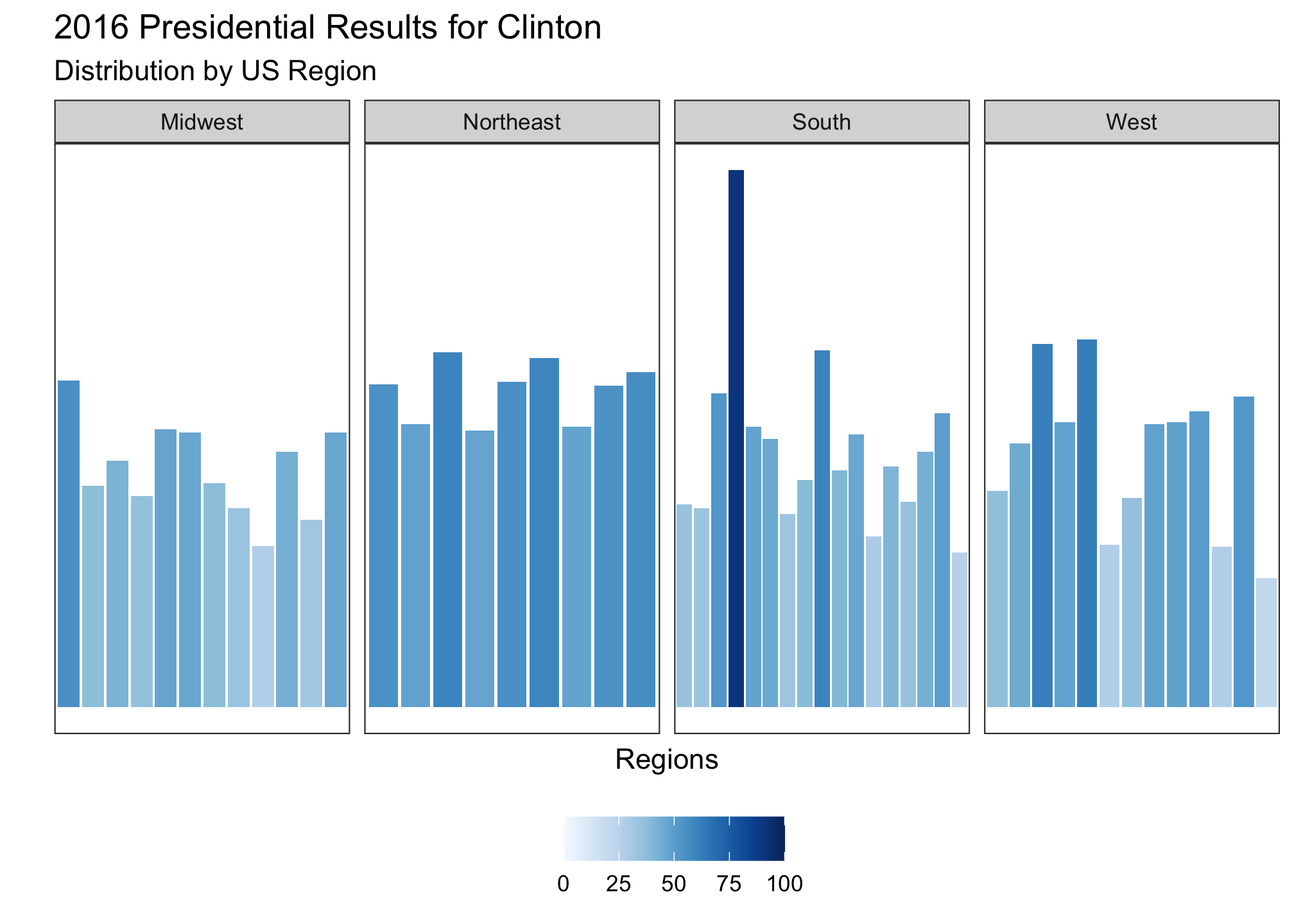
Clinton’s darker blues are reds are relatively consistent and concentrated in the Northeast but split in the West. Both of these make sense since Trump won handily in the Midwest and South while Clinton dominated the Northeast. But just to be sure, we’ll look at the comparative data set without DC (since it was an outlier).
ggplot(data = subset(election2016,
!region %in% "district of columbia"),
aes(state = state, fill = d_points)) +
geom_statebins() +
coord_equal() +
theme_statebins() +
scale_fill_gradient2(low = "red", mid = scales::muted("purple"),
high = "blue", breaks = c(-100, -75, -50,-25, 0, 25, 50, 75, 100),
labels = c(100, 75, 50, 25, 0, 25, 50, 75, 100)) +
labs(fill = NULL)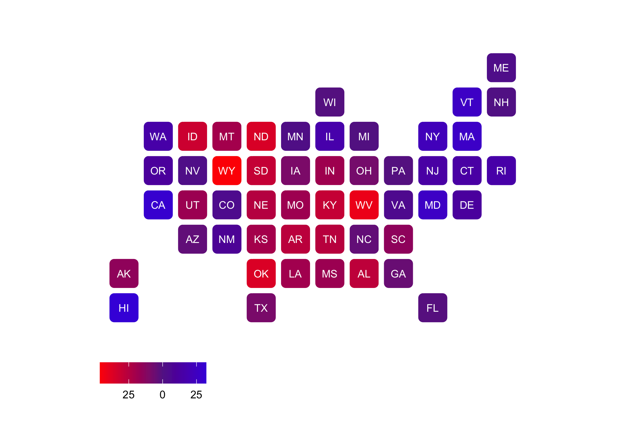 Sure, this is a method to see the states that are primarily Democrat or Republican. But its also a way to view how mixed (or purple) we are as a nation as well in terms of our voting.
Part IV: Augmenting Maps
Now staying on the 2016 election focus, we’re going to try to reproduce a better version of the results found in the last plot in Part III. What’s the problem? Well many people concentrate on the popular vote. Regardless of your stance on the electoral college, that representative system is what we currently live under and did shape the outcome of the 2016 presidential election. Recall that Clinton amassed
sum(election2016$clinton_vote)## [1] 65853625votes while Trump garnered
sum(election2016$trump_vote)## [1] 62985106votes which told us that Clinton won the popular vote by
sum(election2016$clinton_vote)-sum(election2016$trump_vote)## [1] 2868519votes. To explore the electoral college and its impact, a static ggplot map does not allow for more than three variables as we saw in a prior session. So we have to figure out another way to show size. Why don’t we do it by changing the size of the states?
First let’s get a relatively under utilized set of data from the maps package.
mapbase <- map_data("state.vbm") %>%
rename(state = region)  %>% # Rename the column region to state
  select_if(~sum(!is.na(.)) > 0) # Drop any columns where the entire set is NA
This .vbm data set is called a SpatialPolygonsDataFrame object in R (yes that’s the actual term) but in the real world, it is known as a Visibility Base Map. What is important here is that the state level longitudinal and latitudinal coordinates been adjusted such that the sizes are as proportionally equal to each other as possible while maintaining the overall shape of the United States. The original point of this was to have all the states be of equal sizes to be utilized as symbols. However, someone much more intelligent than me thought about using it to display demographic data as well. The set looks a bit different than the typical maps data set you have seen before, but its not far off
head(mapbase) # or View(mapbase)## long lat group order state
## 1 89 34 1 1 Alabama
## 2 96 34 1 2 Alabama
## 3 98 20 1 3 Alabama
## 4 91 20 1 4 Alabama
## 5 91 16 1 5 Alabama
## 6 89 17 1 6 AlabamaTake a look at the states now:
map("state.vbm", fill=T, col="white")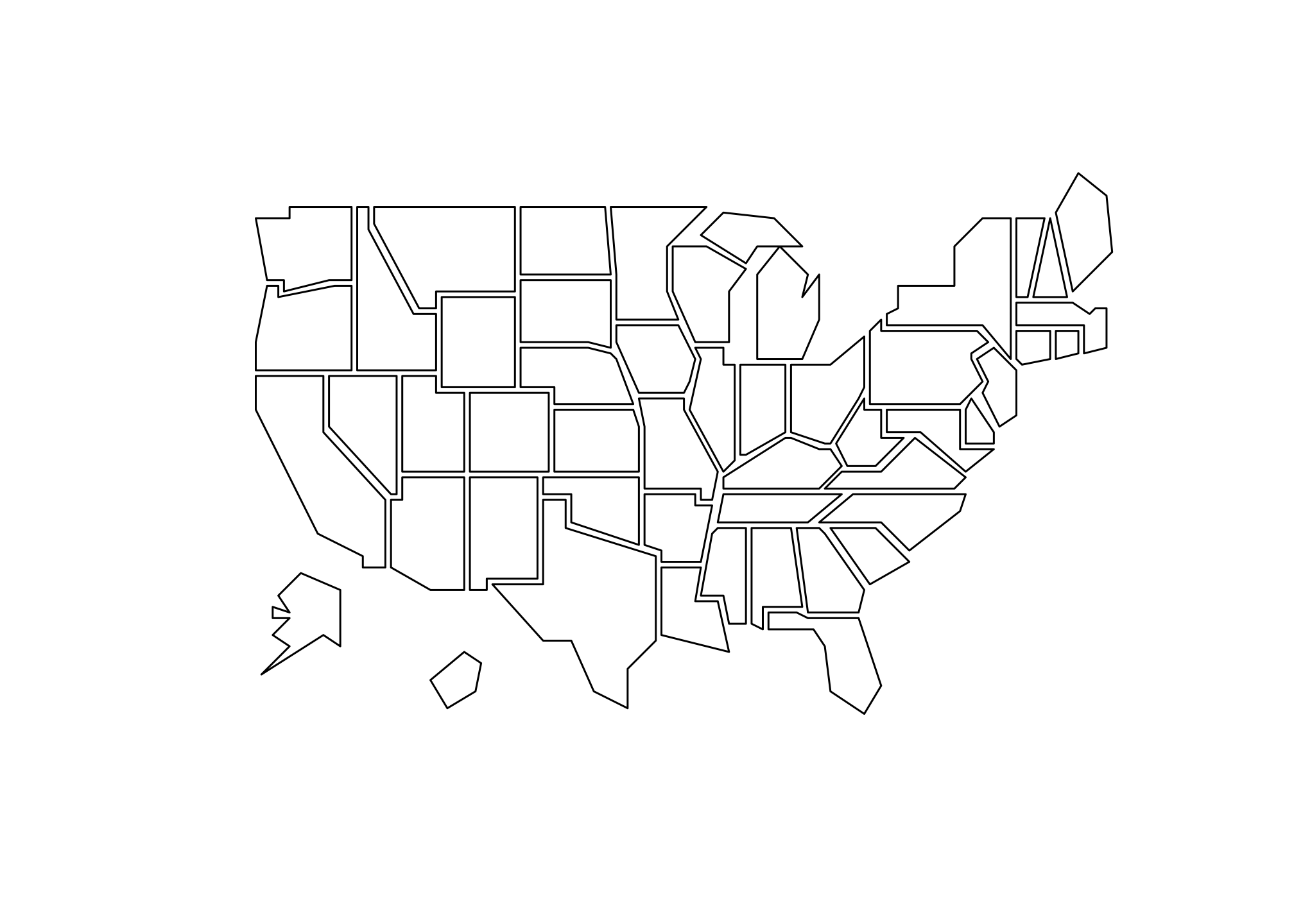
Or if you prefer a bit of color in your life:
RViridisD <- viridis_pal(option = "D")(50) # To view use show_col(RViridis)map("state.vbm", fill=T, col=RViridisD)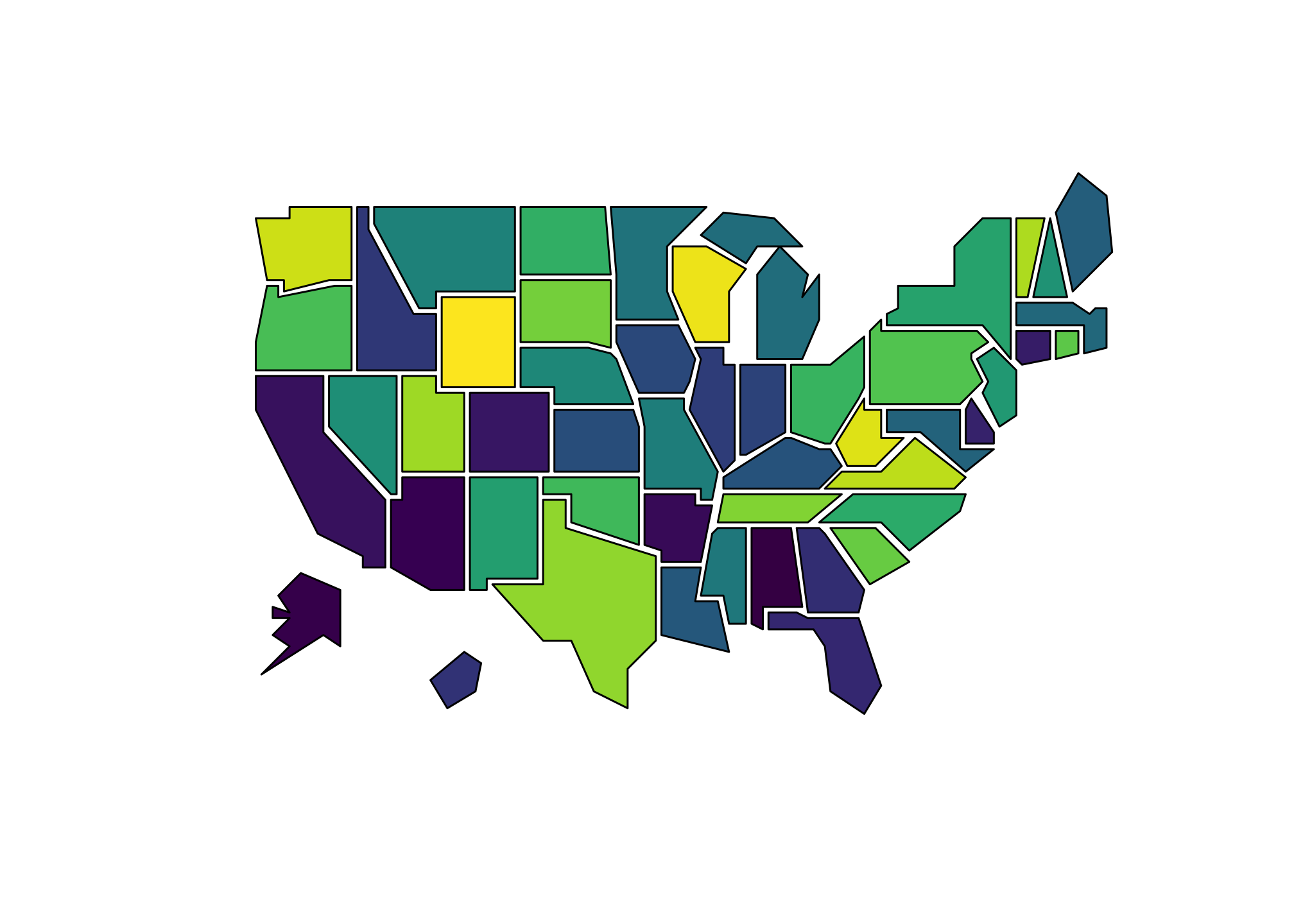
We could have used some other versions of the Viridis set. Try the above for options A, B, C, D, or E. Alternatively, you can use a site like this to generate small or large color palettes.
However I urge you to follow elements of proper color theory as outlined here with examples
This next data set state.vbm.center is made up centroids. These provide coordinates of the centers of the 50 states (in alphabetical order).
data(state.vbm.center) # This is a list. Do View(state.vbm.center) to see it.Now we have multiple data files so we have to join them somehow. First we’ll look at the set that was just pulled and use only what we need. Extra columns and general data points that we don’t need just add to the amount of time it takes for R to get things done.
Below we are going to convert the list state.vbm.center to a data frame using pipes and recall all those do is provide shortcuts for multiple regular R commands. The steps are as follows:
Call the
state.vbm.centerdata setForce (aka coerce) the list to a data frame
Add in state names which are given by the variable
statethat we renamed earlier.Pull everything into a variable called
truncated_map
truncated_map <- state.vbm.center %>%
                    as.data.frame() %>%
                    mutate(state = unique(mapbase$state))
Let’s take a look at what we did.
head(truncated_map) # or View(truncated_map)## x y state
## 1 93 27 Alabama
## 2 10 19 Alaska
## 3 32 34 Arizona
## 4 76 33 Arkansas
## 5 13 42 California
## 6 46 51 ColoradoRemember that truncated_map is simply a conversion of the list state.vbm.center to a data frame.
Now let’s merge some data sets by using joins. There are many ways to accomplish the end goal which is to put mapbase (state level map data), election2016 (our current data set with various types of election information by state except for electoral college votes), and truncated_map (the centroid data set) together into one cohesive data frame (or file if you prefer). You could arguably download all three and do it in say Excel but it would take quite a while and unless there has been a change in the recent version, it appears you have to do by coding in a language called Visual Basic within the software anyway. Joins are a great way to have computers handle that nonsense and in general, if you ever come across files that you need merged, this type of logic and command structure apples in that situation too!
OK here we go!
Step 1: Join mapbase (state level map data) with election2016 (current election data set) and call it merged_electoral
merged_electoral <-
  election2016 %>%
    filter(!st == "DC") %>%
# Since DC is not a state, it is not included in the map data set so we need to get rid
# of it.
      right_join(mapbase) %>%
# Its a right join since the mapbase data has the coordinates to draw our map
          select_if(~sum(!is.na(.)) > 0)
## Joining, by = "state"# Drop any columns where the entire set is NALet’s take a look at what we did.
head(merged_electoral) # or View(merged_electoral)## # A tibble: 6 x 28
## state votes st fips total_vote vote_margin winner party pct_margin
## <chr> <int> <chr> <int> <int> <int> <chr> <chr> <dbl>
## 1 Alabama 9 AL 1 2123372 588708 Trump Republican 27.7
## 2 Alabama 9 AL 1 2123372 588708 Trump Republican 27.7
## 3 Alabama 9 AL 1 2123372 588708 Trump Republican 27.7
## 4 Alabama 9 AL 1 2123372 588708 Trump Republican 27.7
## 5 Alabama 9 AL 1 2123372 588708 Trump Republican 27.7
## 6 Alabama 9 AL 1 2123372 588708 Trump Republican 27.7
## # … with 19 more variables: r_points <dbl>, d_points <dbl>, pct_clinton <dbl>,
## # pct_trump <dbl>, pct_johnson <dbl>, pct_other <dbl>, clinton_vote <int>,
## # trump_vote <int>, johnson_vote <int>, other_vote <int>, ev_dem <int>,
## # ev_rep <int>, ev_oth <int>, census <chr>, region <chr>, long <dbl>,
## # lat <dbl>, group <dbl>, order <int>Step 2: Join merged_electoral (state level map data with election data) with truncated_map (the centroid data set) and call it merged_map
merged_map <- merged_electoral %>%
                left_join(truncated_map) # Its a left join since again the
## Joining, by = "state" # merged_electoral data has the coordinates
# to draw our mapOK we’re done and have our full data set. Again, let’s take a look at what we did
head(merged_map) # or View(merged_map)## # A tibble: 6 x 30
## state votes st fips total_vote vote_margin winner party pct_margin
## <chr> <int> <chr> <int> <int> <int> <chr> <chr> <dbl>
## 1 Alabama 9 AL 1 2123372 588708 Trump Republican 27.7
## 2 Alabama 9 AL 1 2123372 588708 Trump Republican 27.7
## 3 Alabama 9 AL 1 2123372 588708 Trump Republican 27.7
## 4 Alabama 9 AL 1 2123372 588708 Trump Republican 27.7
## 5 Alabama 9 AL 1 2123372 588708 Trump Republican 27.7
## 6 Alabama 9 AL 1 2123372 588708 Trump Republican 27.7
## # … with 21 more variables: r_points <dbl>, d_points <dbl>, pct_clinton <dbl>,
## # pct_trump <dbl>, pct_johnson <dbl>, pct_other <dbl>, clinton_vote <int>,
## # trump_vote <int>, johnson_vote <int>, other_vote <int>, ev_dem <int>,
## # ev_rep <int>, ev_oth <int>, census <chr>, region <chr>, long <dbl>,
## # lat <dbl>, group <dbl>, order <int>, x <dbl>, y <dbl>Notice that we have two sets of coordinates now: The ones for the states (long and lat) which differ since those are used to draw the outline and the centroids (x and y) which do not differ except by state and are simply the center point of each state. We need to “scale” or make the standard outlines of the state given by long and lat by reducing the size of each proportionally. To do that, we need a starting point and an ending point.
Well we have the starting point which is just the standard outline of the state itself which we saw earlier
ggplot(merged_map, aes(long, lat, group = group, fill=state)) +
  geom_polygon(fill="#FFFFFF", color="#000000") +
  coord_fixed() +
  theme_minimal() +
  theme(
    axis.ticks = element_blank(),
    axis.text = element_blank(),
    panel.border = element_blank(),
    panel.grid.major = element_blank(),
    panel.grid.minor = element_blank()
  ) +
  guides(fill = FALSE) +
  xlab(NULL) +
  ylab(NULL)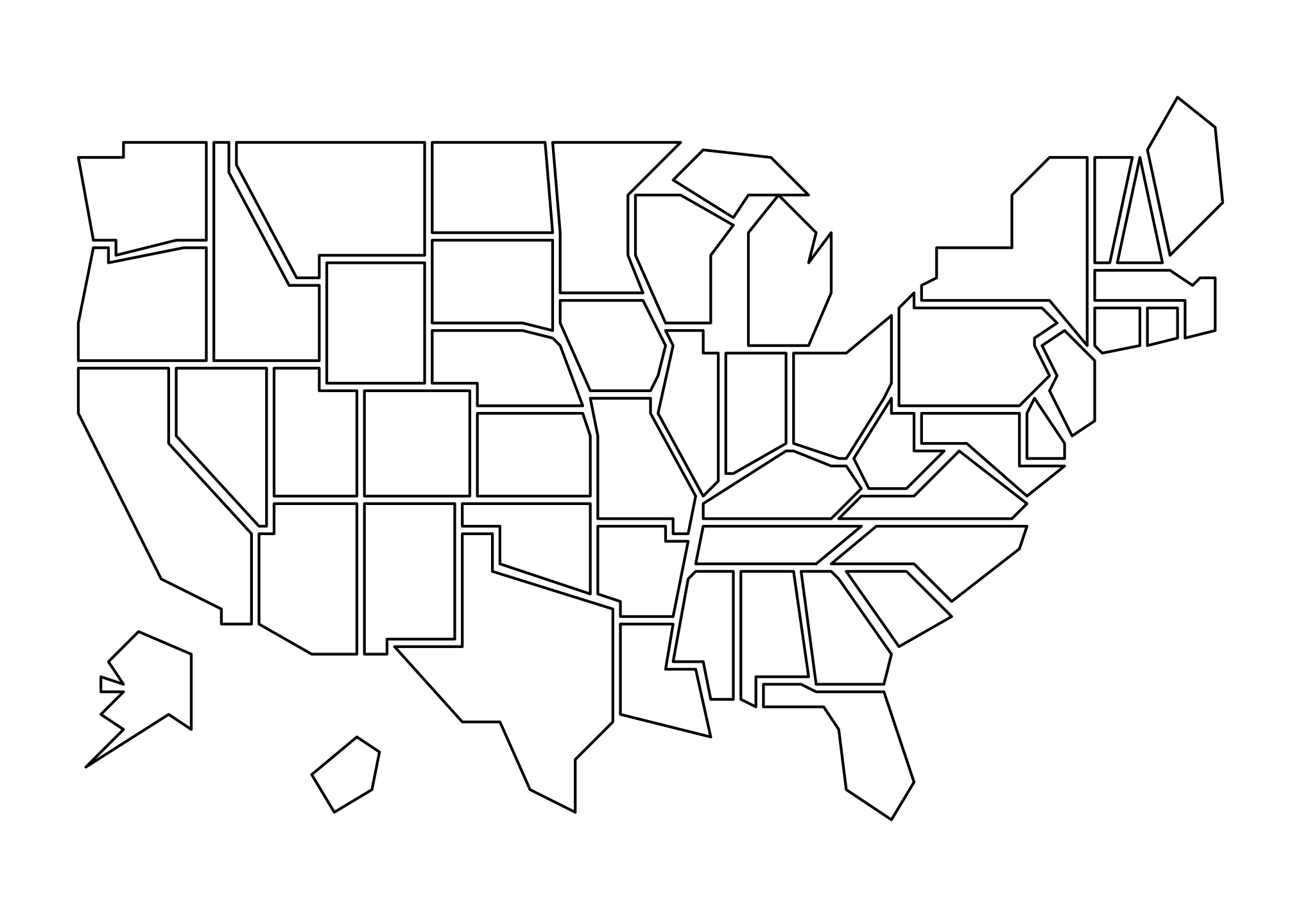
and we certainly have an ending point that are given by the centroids.
ggplot(merged_map, aes(x, y, group = group, fill=state)) +
  geom_point(color="#8b0a50", size=1) +
  coord_fixed() +
  theme_minimal() +
  theme(
    axis.ticks = element_blank(),
    axis.text = element_blank(),
    panel.border = element_blank(),
    panel.grid.major = element_blank(),
    panel.grid.minor = element_blank()
  ) +
  guides(fill = FALSE) +
  xlab(NULL) +
  ylab(NULL)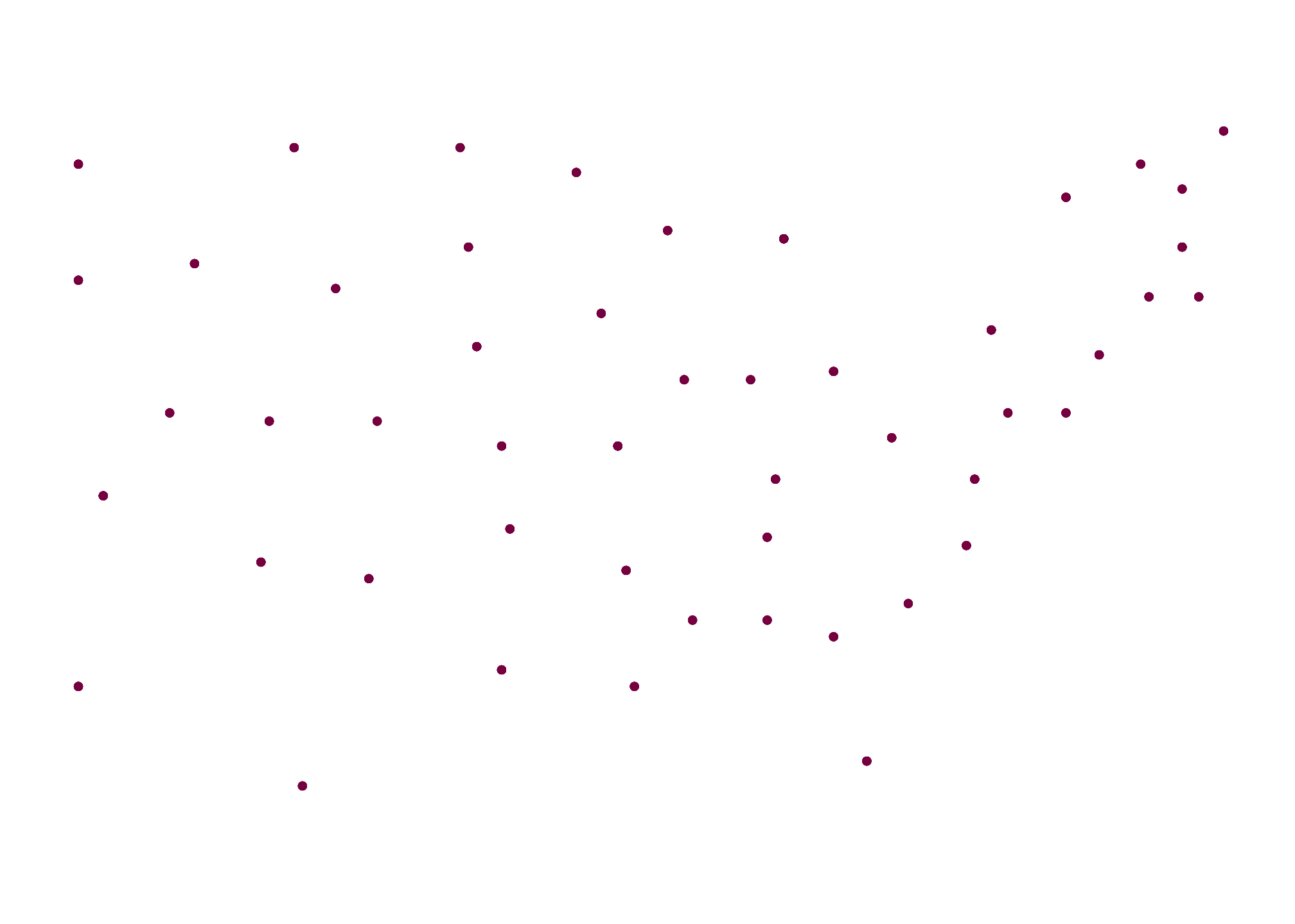
Again, these denote the center point of each state
ggplot(merged_map, aes(group = group, fill=state)) +
  geom_polygon(aes(long, lat), fill="#FFFFFF", color="#000000") +
  geom_point(aes(x, y), color="#8b0a50", size=1) +
  coord_fixed() +
  theme_minimal() +
  theme(
    axis.ticks = element_blank(),
    axis.text = element_blank(),
    panel.border = element_blank(),
    panel.grid.major = element_blank(),
    panel.grid.minor = element_blank()
  ) +
  guides(fill = FALSE) +
  xlab(NULL) +
  ylab(NULL)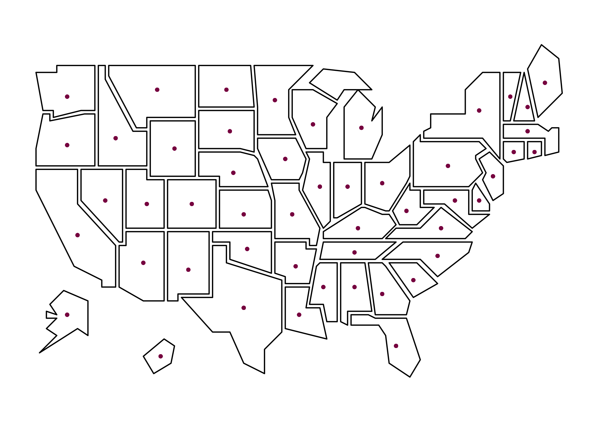
Which implies the largest any state representation can be is the outline and the smallest is the centroid. So within each state, we scale the long and lat points to be closer to the centroid by some factor which in this case are the electoral votes by state.
First we’ll do it for Trump…
Trump_rescaledByEC <- merged_map %>%
                  group_by(state) %>%
                  filter(party == "Republican") %>% # Only include where Republicans won
                  mutate(longscale = (votes*10/538)*(long - x) + x, # number of electoral votes x 10 divided by the total electoral votes
                  latscale = (votes*10/538)*(lat - y) + y)
…then view the result…
head(Trump_rescaledByEC) # or View(Trump_rescaledByEC)## # A tibble: 6 x 32
## # Groups: state [1]
## state votes st fips total_vote vote_margin winner party pct_margin
## <chr> <int> <chr> <int> <int> <int> <chr> <chr> <dbl>
## 1 Alabama 9 AL 1 2123372 588708 Trump Republican 27.7
## 2 Alabama 9 AL 1 2123372 588708 Trump Republican 27.7
## 3 Alabama 9 AL 1 2123372 588708 Trump Republican 27.7
## 4 Alabama 9 AL 1 2123372 588708 Trump Republican 27.7
## 5 Alabama 9 AL 1 2123372 588708 Trump Republican 27.7
## 6 Alabama 9 AL 1 2123372 588708 Trump Republican 27.7
## # … with 23 more variables: r_points <dbl>, d_points <dbl>, pct_clinton <dbl>,
## # pct_trump <dbl>, pct_johnson <dbl>, pct_other <dbl>, clinton_vote <int>,
## # trump_vote <int>, johnson_vote <int>, other_vote <int>, ev_dem <int>,
## # ev_rep <int>, ev_oth <int>, census <chr>, region <chr>, long <dbl>,
## # lat <dbl>, group <dbl>, order <int>, x <dbl>, y <dbl>, longscale <dbl>,
## # latscale <dbl>…and finally plot.
TrumpByState_EC <- ggplot(Trump_rescaledByEC, aes(long, lat, group = group, fill = pct_trump)) +
#  geom_path() + # Enable if you want to see the original outline
  geom_polygon(aes(longscale, latscale)) +
  coord_fixed() +
  theme_void() +
  scale_fill_gradientn(limits = c(0, 100), colors = threeRedBrews) +
  labs(title = str_wrap("Trump 2016 Popular Vote Resized by Electoral Vote For States Won", 30),
       fill = "Percent")
TrumpByState_EC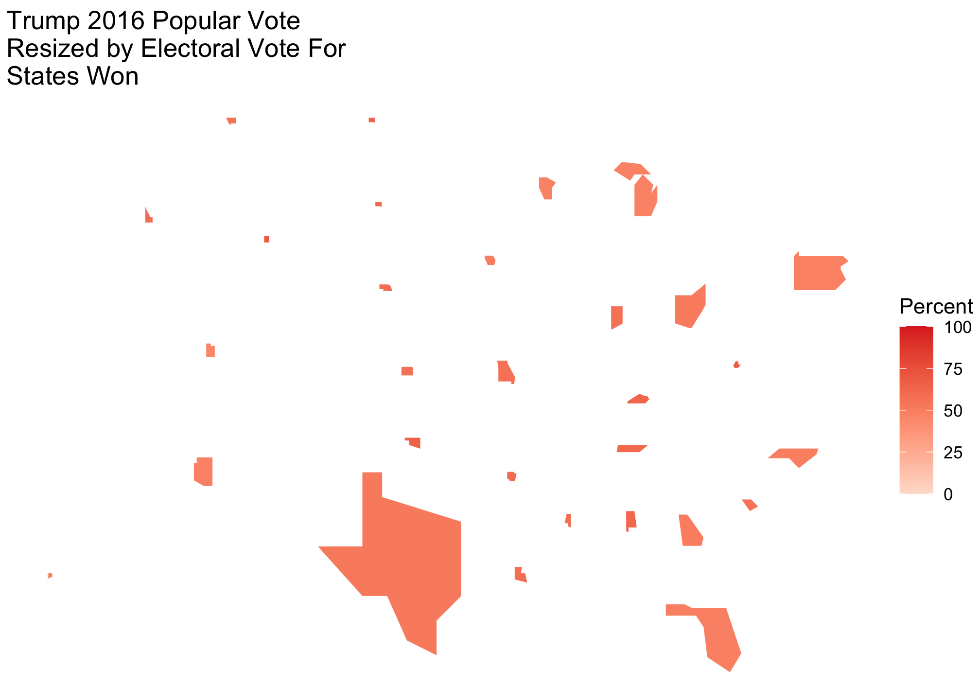
Now let’s do the same for Clinton…
Clinton_rescaledByEC <- merged_map %>%
  group_by(state) %>%
  filter(party == "Democrat") %>% # Only include where Democrats won
  mutate(longscale = (votes*10/538)*(long - x) + x,
         latscale = (votes*10/538)*(lat - y) + y)
…then view the result…
head(Clinton_rescaledByEC) # or View(Clinton_rescaledByECp)## # A tibble: 6 x 32
## # Groups: state [1]
## state votes st fips total_vote vote_margin winner party pct_margin
## <chr> <int> <chr> <int> <int> <int> <chr> <chr> <dbl>
## 1 California 55 CA 6 14237884 4269978 Clinton Democr… 30.0
## 2 California 55 CA 6 14237884 4269978 Clinton Democr… 30.0
## 3 California 55 CA 6 14237884 4269978 Clinton Democr… 30.0
## 4 California 55 CA 6 14237884 4269978 Clinton Democr… 30.0
## 5 California 55 CA 6 14237884 4269978 Clinton Democr… 30.0
## 6 California 55 CA 6 14237884 4269978 Clinton Democr… 30.0
## # … with 23 more variables: r_points <dbl>, d_points <dbl>, pct_clinton <dbl>,
## # pct_trump <dbl>, pct_johnson <dbl>, pct_other <dbl>, clinton_vote <int>,
## # trump_vote <int>, johnson_vote <int>, other_vote <int>, ev_dem <int>,
## # ev_rep <int>, ev_oth <int>, census <chr>, region <chr>, long <dbl>,
## # lat <dbl>, group <dbl>, order <int>, x <dbl>, y <dbl>, longscale <dbl>,
## # latscale <dbl>…and finally plot.
ClintonByState_EC <- ggplot(Clinton_rescaledByEC, aes(long, lat, group = group, fill = pct_clinton)) +
  #  geom_path() + # Enable if you want to see the original outline
  geom_polygon(aes(longscale, latscale)) +
  coord_fixed() +
  theme_void() +
  scale_fill_gradientn(limits = c(0, 100), colors = fiftyBlueBrews) +
  labs(title = str_wrap("Clinton 2016 Popular Vote Resized by Electoral Vote by State", 30),
       fill = "Percent")
ClintonByState_EC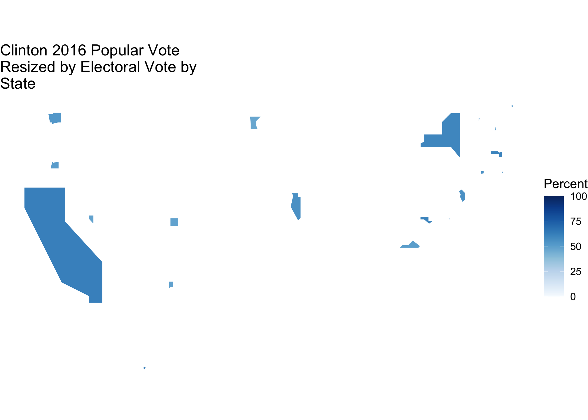
If we look at them both
TrumpByState_EC + ClintonByState_EC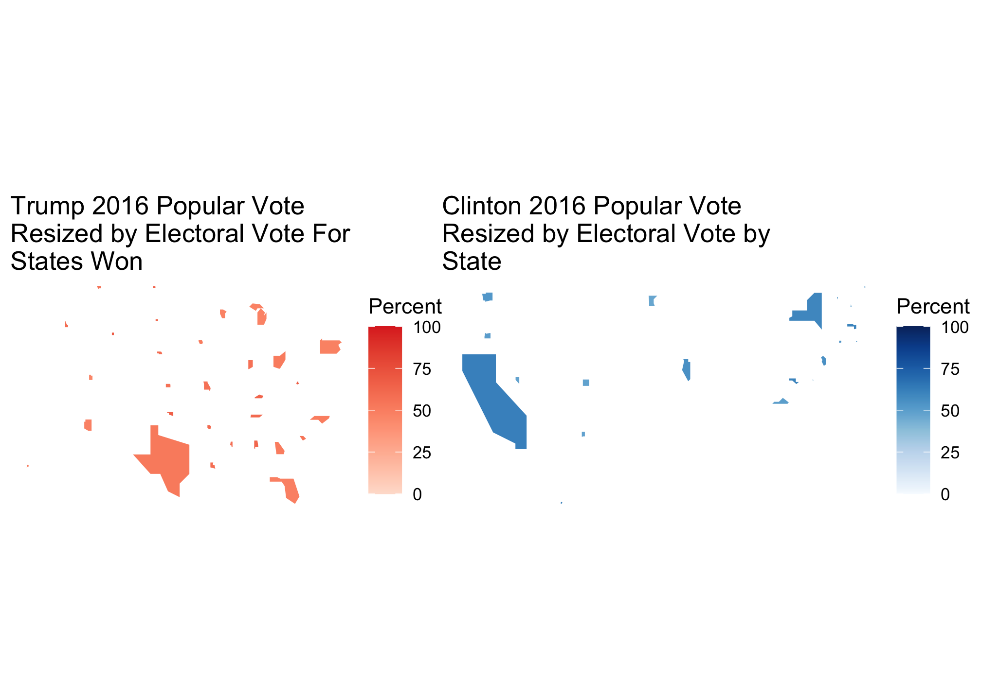
then we find indicators of how Trump won. Again this is nice but a side-by-side map is only good when assessing each candidate individually and comparisons take effort. I would personally rather be lazy so let’s view them both on the same map.
Here we simply do not subset the data by party
All_rescaledByEC <- merged_map %>%
  group_by(state) %>%
  mutate(longscale = (votes*10/538)*(long - x) + x,
         latscale = (votes*10/538)*(lat - y) + y)
Here’s what it looks like…
head(All_rescaledByEC) # or View(All_rescaledByEC)## # A tibble: 6 x 32
## # Groups: state [1]
## state votes st fips total_vote vote_margin winner party pct_margin
## <chr> <int> <chr> <int> <int> <int> <chr> <chr> <dbl>
## 1 Alabama 9 AL 1 2123372 588708 Trump Republican 27.7
## 2 Alabama 9 AL 1 2123372 588708 Trump Republican 27.7
## 3 Alabama 9 AL 1 2123372 588708 Trump Republican 27.7
## 4 Alabama 9 AL 1 2123372 588708 Trump Republican 27.7
## 5 Alabama 9 AL 1 2123372 588708 Trump Republican 27.7
## 6 Alabama 9 AL 1 2123372 588708 Trump Republican 27.7
## # … with 23 more variables: r_points <dbl>, d_points <dbl>, pct_clinton <dbl>,
## # pct_trump <dbl>, pct_johnson <dbl>, pct_other <dbl>, clinton_vote <int>,
## # trump_vote <int>, johnson_vote <int>, other_vote <int>, ev_dem <int>,
## # ev_rep <int>, ev_oth <int>, census <chr>, region <chr>, long <dbl>,
## # lat <dbl>, group <dbl>, order <int>, x <dbl>, y <dbl>, longscale <dbl>,
## # latscale <dbl>…and here’s the plot.
AllByState_EC <- ggplot(All_rescaledByEC, aes(long, lat, group=group, fill=winner)) +
  #  geom_path() + # Enable if you want to see the original outline
  geom_polygon(aes(longscale, latscale)) +
  coord_fixed() +
  theme_void() +
  scale_fill_manual(values= partyColors) +
  labs(title = "States Won by Each Party",
       subtitle ="with each resized by electoral votes",
       fill = NULL) +
  theme_map()+
  theme_statebins() +
  theme(
    axis.ticks = element_blank(),
    axis.text = element_blank(),
    panel.border = element_blank(),
    panel.grid.major = element_blank(),
    panel.grid.minor = element_blank()
  ) +
  xlab("") +
  ylab("")
AllByState_EC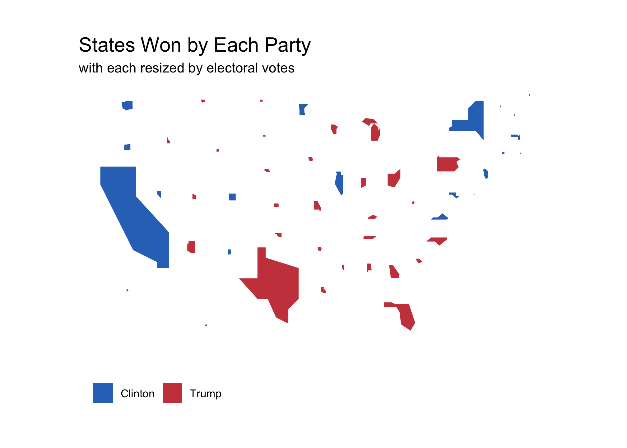
But what about the margins you ask? No you didn’t ask. Well here is a plot of those anyway
MarginsByState_EC <- ggplot(data = All_rescaledByEC, aes(long, lat, group=group, fill = d_points)) +
  geom_polygon(aes(longscale, latscale)) +
 # geom_polygon(color = "gray90", size = 0.1) +
  coord_fixed() +
# coord_map(projection = "albers", lat0 = 39, lat1 = -20) +
  scale_fill_gradient2( low = "red", mid = scales::muted("purple"),
                        high = "blue", breaks = c(-100, -75, -50,-25, 0, 25, 50, 75, 100),
                        labels = c(100, 75, 50, 25, 0, 25, 50, 75, 100)) +
  theme_map() +
  theme_statebins() +
  theme(
    axis.ticks = element_blank(),
    axis.text = element_blank(),
    panel.border = element_blank(),
    panel.grid.major = element_blank(),
    panel.grid.minor = element_blank()
  ) +
  labs(title = "Winning margins by Popular Vote",
       subtitle ="with each state resized by electoral votes",
       fill = "Percent")  +
  xlab("") +
  ylab("")
MarginsByState_EC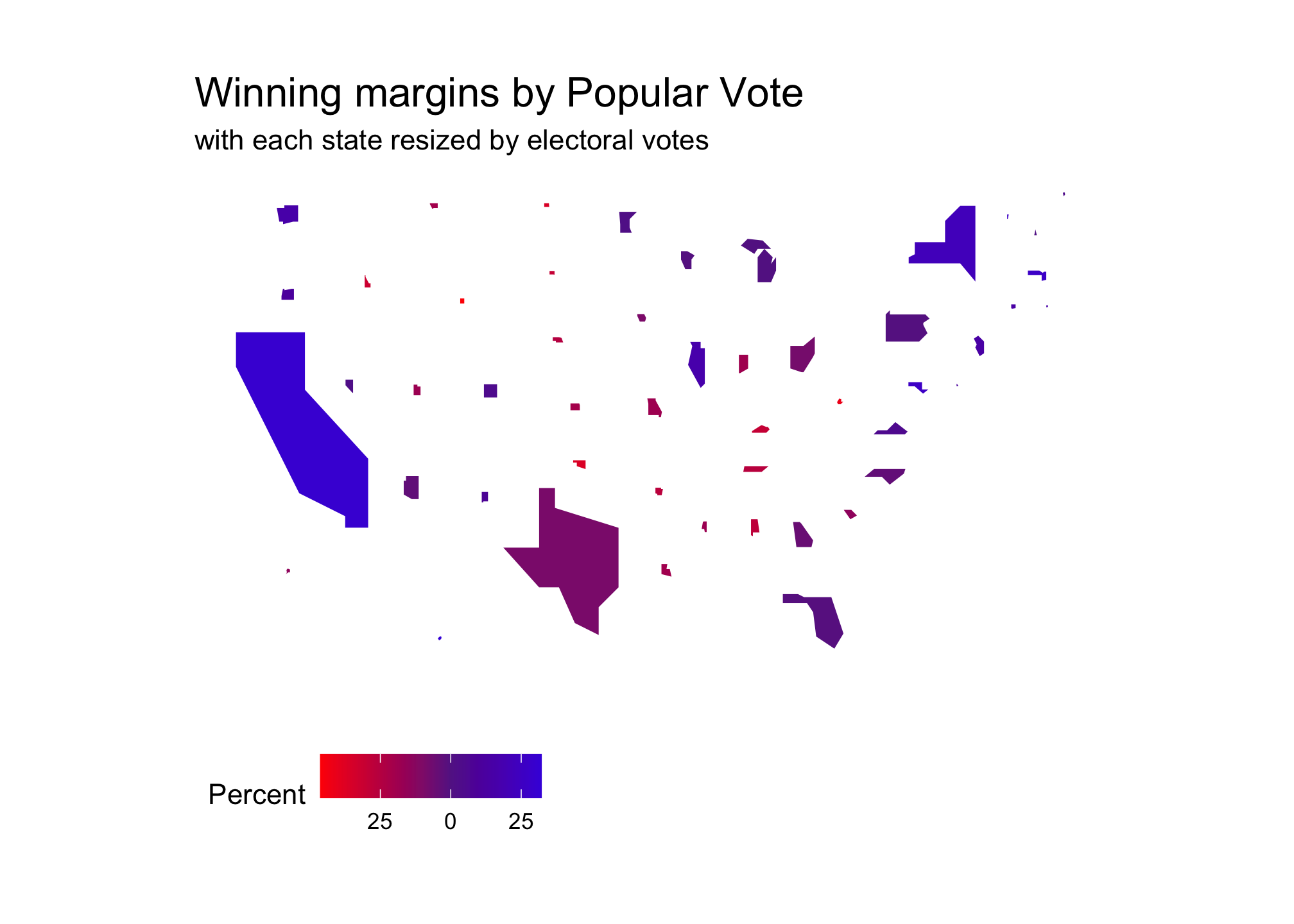
And just to compare both for fun…yes I said fun:
AllByState_EC + MarginsByState_EC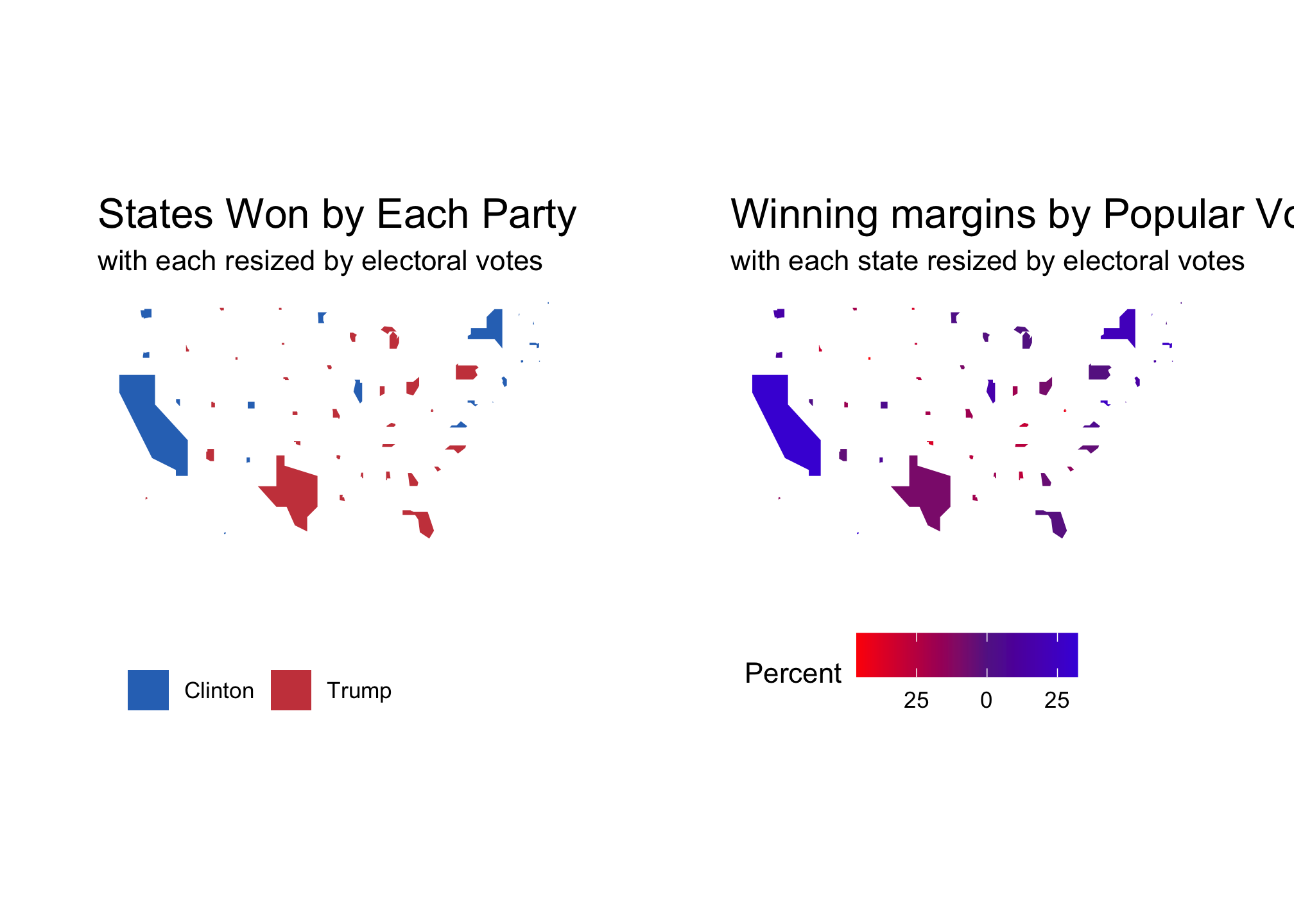
Consider just pasting it at the top of your script and leaving it there. Please note that this will not work in an Rmarkdown file or Shiny app.↩︎