Making Copies
Getting Prepped
First Things First! Set your Working Directory
Your working directory is simply where your script will look for anything it needs like external data sets. There are a few ways to go about doing this which we will cover. However for now, just do the following:
- Open up a new script by going to
File > New File > R Script. - Save it in a preferably empty folder as whatever you want.
- Go to the menu bar and select
Session > Set Working Directory > To Source File Location.
Download the script
Copying and pasting syntax from a browser can cause problems. To avoid this issue, please download a script with all of the needed code presented in this walkthrough.
Read the Submission Directions
On a separate document (WORD or PDF), answer the questions in parts 1, 2, and 4. You may work alone of together in groups of up to three people and submit one task on eCampus by the end of class today.
Load Up Some Libraries
Please go ahead and download the libraries below you don’t have and load them up
library(tidyverse)Part 1: More ggplotting
Scenario: Do cars with big engines use more fuel than cars with small engines?
OK so you probably know the answer but let’s make the justification as precise as possible.
Let’s use the mpg data frame found in ggplot2.
The data frame contains observations collected by the US Environment Protection Agency on 38 car models. To see all of the unique values, we can run
unique(mpg$manufacturer)## [1] "audi" "chevrolet" "dodge" "ford" "honda"
## [6] "hyundai" "jeep" "land rover" "lincoln" "mercury"
## [11] "nissan" "pontiac" "subaru" "toyota" "volkswagen"which is equivalent to the following as a tibble
mpg %>%
  select(manufacturer) %>%
  distinct()
## # A tibble: 15 x 1
## manufacturer
## <chr>
## 1 audi
## 2 chevrolet
## 3 dodge
## 4 ford
## 5 honda
## 6 hyundai
## 7 jeep
## 8 land rover
## 9 lincoln
## 10 mercury
## 11 nissan
## 12 pontiac
## 13 subaru
## 14 toyota
## 15 volkswagenFinding variables
We can use glimpse to see more about each variable
glimpse(mpg)## Rows: 234
## Columns: 11
## $ manufacturer <chr> "audi", "audi", "audi", "audi", "audi", "audi", "audi", …
## $ model <chr> "a4", "a4", "a4", "a4", "a4", "a4", "a4", "a4 quattro", …
## $ displ <dbl> 1.8, 1.8, 2.0, 2.0, 2.8, 2.8, 3.1, 1.8, 1.8, 2.0, 2.0, 2…
## $ year <int> 1999, 1999, 2008, 2008, 1999, 1999, 2008, 1999, 1999, 20…
## $ cyl <int> 4, 4, 4, 4, 6, 6, 6, 4, 4, 4, 4, 6, 6, 6, 6, 6, 6, 8, 8,…
## $ trans <chr> "auto(l5)", "manual(m5)", "manual(m6)", "auto(av)", "aut…
## $ drv <chr> "f", "f", "f", "f", "f", "f", "f", "4", "4", "4", "4", "…
## $ cty <int> 18, 21, 20, 21, 16, 18, 18, 18, 16, 20, 19, 15, 17, 17, …
## $ hwy <int> 29, 29, 31, 30, 26, 26, 27, 26, 25, 28, 27, 25, 25, 25, …
## $ fl <chr> "p", "p", "p", "p", "p", "p", "p", "p", "p", "p", "p", "…
## $ class <chr> "compact", "compact", "compact", "compact", "compact", "…Getting counts
We can use a quick(ish) plot of the manufacturers and how many of each is represented in the data set1
ggplot(mpg, aes(x = manufacturer, fill = manufacturer)) +
  geom_bar() +
  geom_text(stat = 'count',
             aes(label = after_stat(count)),
             vjust = -0.5) +
  theme_minimal() +
  theme(axis.text.x = element_text(angle = 45,
                                   vjust = 1.3,
hjust = 1)) 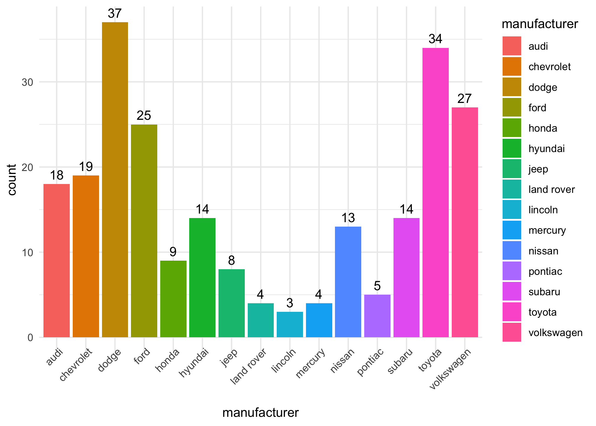
but sometimes its just easier to use dplyr
mpg %>%
  select(manufacturer) %>%
  group_by(manufacturer) %>%
  tally() %>%
  ungroup()
## # A tibble: 15 x 2
## manufacturer n
## * <chr> <int>
## 1 audi 18
## 2 chevrolet 19
## 3 dodge 37
## 4 ford 25
## 5 honda 9
## 6 hyundai 14
## 7 jeep 8
## 8 land rover 4
## 9 lincoln 3
## 10 mercury 4
## 11 nissan 13
## 12 pontiac 5
## 13 subaru 14
## 14 toyota 34
## 15 volkswagen 27which is basically saying
Get the `mpg` tibble %>%
  Only show me the column `manufacturer` %>%
   Perform any wrangling by car manufacturer %>%
   Count by car manufacturer %>%
   Dont do any more wrangling by car manufacturer
The last step is somewhat important. R remembers certain things and grouping is one of them so its a good idea to ungroup() columns unless you know that is needed.
So what would happen if we didn’t group? Well let’s see
mpg %>%
  select(manufacturer) %>%
  tally()
## # A tibble: 1 x 1
## n
## <int>
## 1 234It just gave us a full count of all cars. So grouping is a lifesaver if you want to perform any operations by the values in a column.
Example: Using R to Test Hypotheses
Notice from the output
names(mpg)## [1] "manufacturer" "model" "displ" "year" "cyl"
## [6] "trans" "drv" "cty" "hwy" "fl"
## [11] "class"that
displ: a car’s engine size in liters.hwy: a car’s fuel efficiency on the highway, in miles per gallon (mpg).
Hypothesis
In all cases, a car with a low fuel efficiency consumes more fuel than a car with a high fuel efficiency when they travel the same distance.
Exploring the Data
Let’s take the variables displ and hwy and try to use them in plots
ggplot(data = mpg) +
  geom_point(aes(x = displ, y = hwy))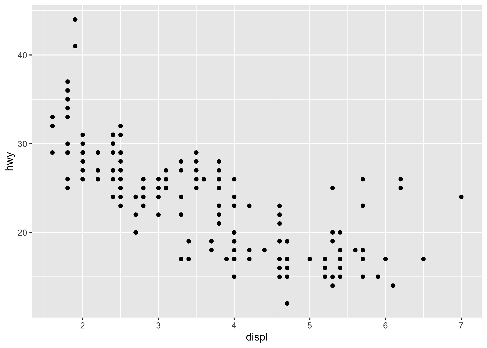
So what happened here? Well we simply put displ on the x-axis and hwy on the y-axis to compare them using points. The plot shows a negative relationship between engine size (displ) and fuel efficiency (hwy). In other words, cars with big engines use more fuel. Does this confirm or refute the hypothesis about fuel efficiency and engine size?
Part 1 Questions for You to Turn In
- Run
ggplot(data = mpg). What do you see and why is it that way? - How many rows are in mpg? How many columns?
- What does the drv variable describe?
- Make a scatterplot of
hwyvscyl. - What happens if you make a scatterplot of
classvsdrv? Is the plot useful? Why or why not?
Part 2: Aesthetics
Aesthetics are more than just coloring a plot, you can define directions, shapes, sizes, types, and provide a useful way to bring in a third variable into a static two dimensional image.
So how is this done? Well in a nutshell you can add a third variable to a two dimensional scatterplot by mapping it to an aesthetic. Recall that an aesthetic is a visual property of the objects in your plot.
You can convey information about your data by mapping the aesthetics in your plot to the variables in your dataset. For example, you can map the colors of your points to the class variable to reveal the class of each car.
ggplot(data = mpg) +
geom_point(mapping = aes(x = displ, y = hwy, color = class)) 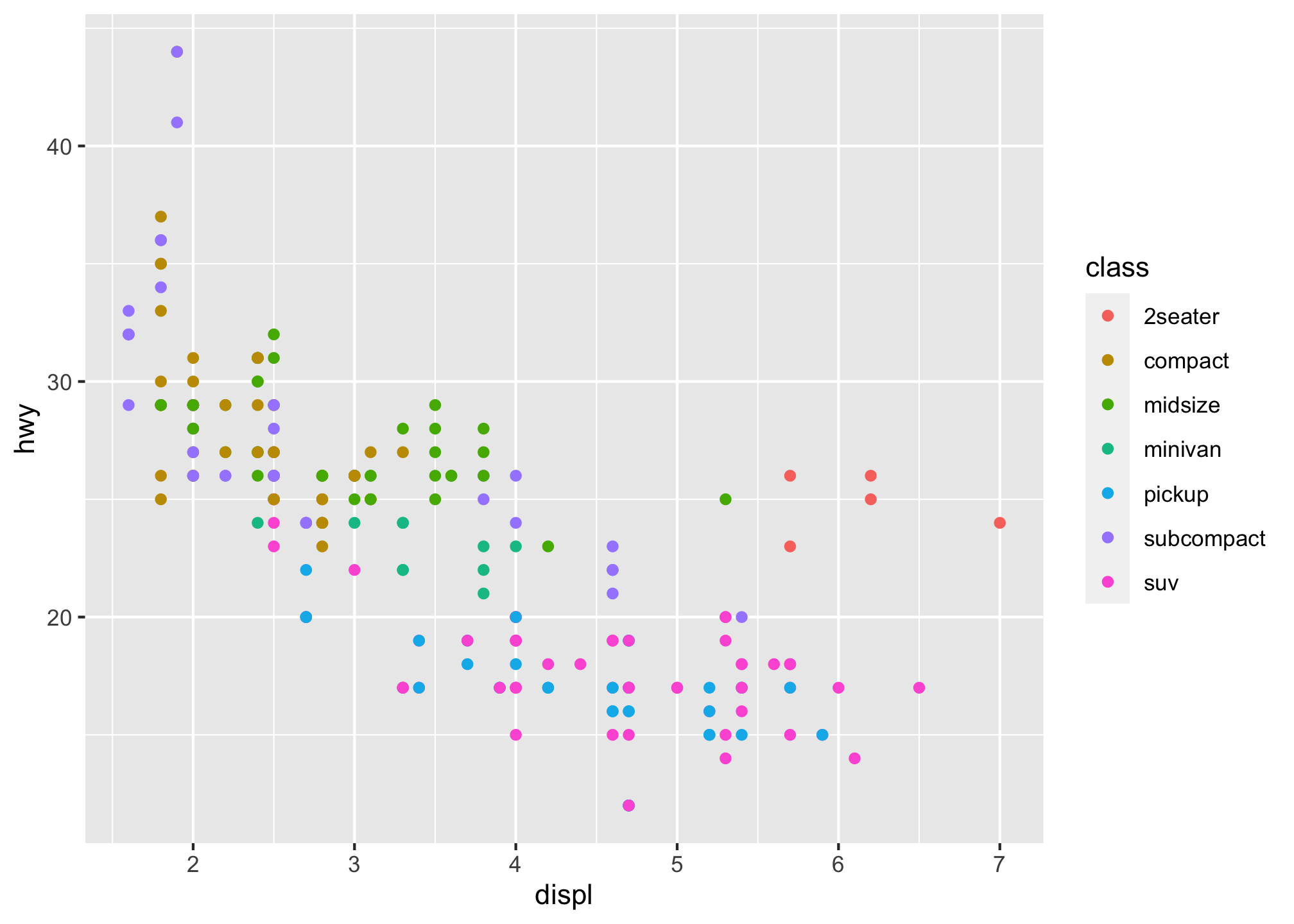 or if you like British English,
 colour can be used interchangeably
As a reminder, to map an aesthetic to a variable, associate the name of the aesthetic to the name of the variable inside aes(). ggplot2 will automatically assign a unique level of the aesthetic - here a unique color - to each unique value of the variable, a process known as scaling.
ggplot2 will also add a legend that explains which levels correspond to which values but you can turn that off as well.
With that said, we mapped class to the color aesthetic, and though pretty2 that may not be the best method since the graphic is a bit hard to decipher immediately. Instead, we could have mapped class to the size aesthetic in the same way.
ggplot(data = mpg) +
  geom_point(mapping = aes(x = displ, y = hwy, size = class))
## Warning: Using size for a discrete variable is not advised.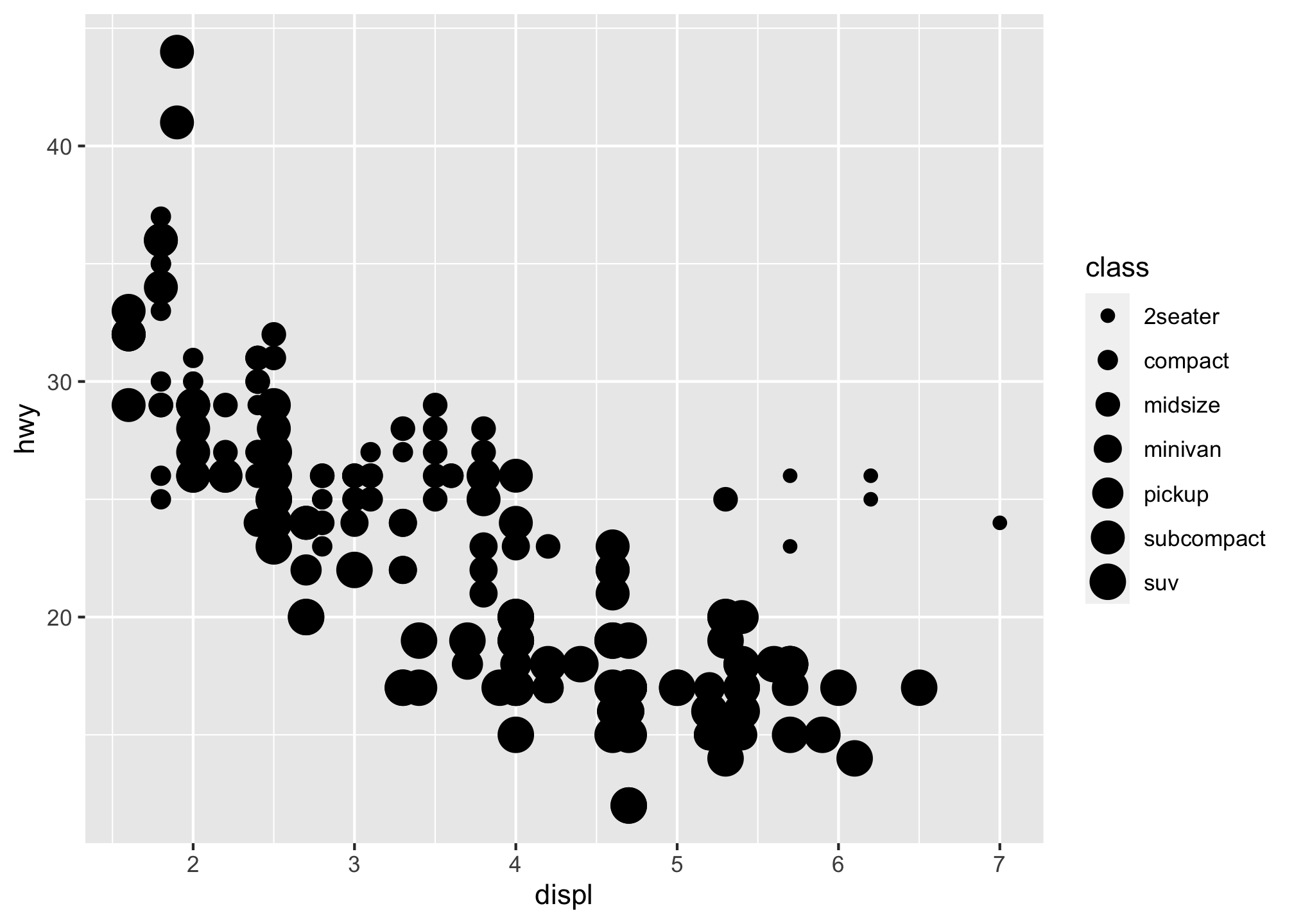
So what’s up with the warning? In this case, the exact size of each point would reveal its class affiliation. So the warning is telling us that mapping an unordered variable (class) to an ordered aesthetic (size) is not a good idea.
Basically you are trying to plot a categorical variable - the manufacturers of cars - against a continuous variable - a vehicle’s fuel efficiency on the highway - and its telling you that you probably shouldn’t do that3.
Ok well let’s try something else to distinguish the types of vehicles.
What about the alpha level better known as transparency, or how much of the color can you see through?
ggplot(data = mpg) +
  geom_point(mapping = aes(x = displ, y = hwy, alpha = class))
## Warning: Using alpha for a discrete variable is not advised.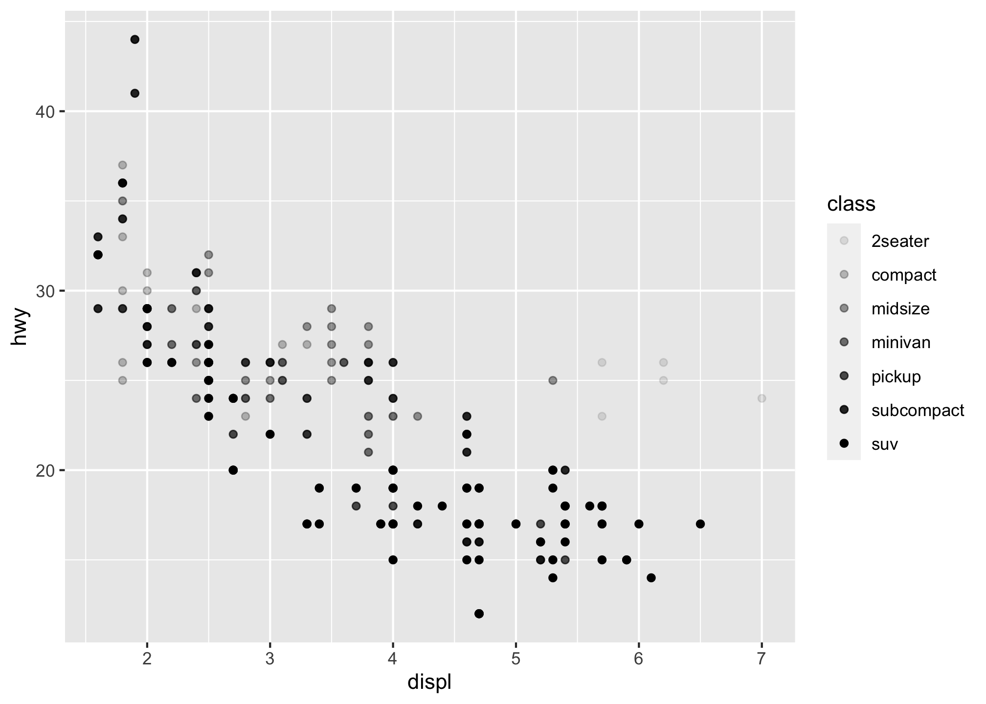
No? Maybe the shape then
ggplot(data = mpg) +
  geom_point(mapping = aes(x = displ, y = hwy, shape = class))
## Warning: The shape palette can deal with a maximum of 6 discrete values because
## more than 6 becomes difficult to discriminate; you have 7. Consider
## specifying shapes manually if you must have them.## Warning: Removed 62 rows containing missing values (geom_point).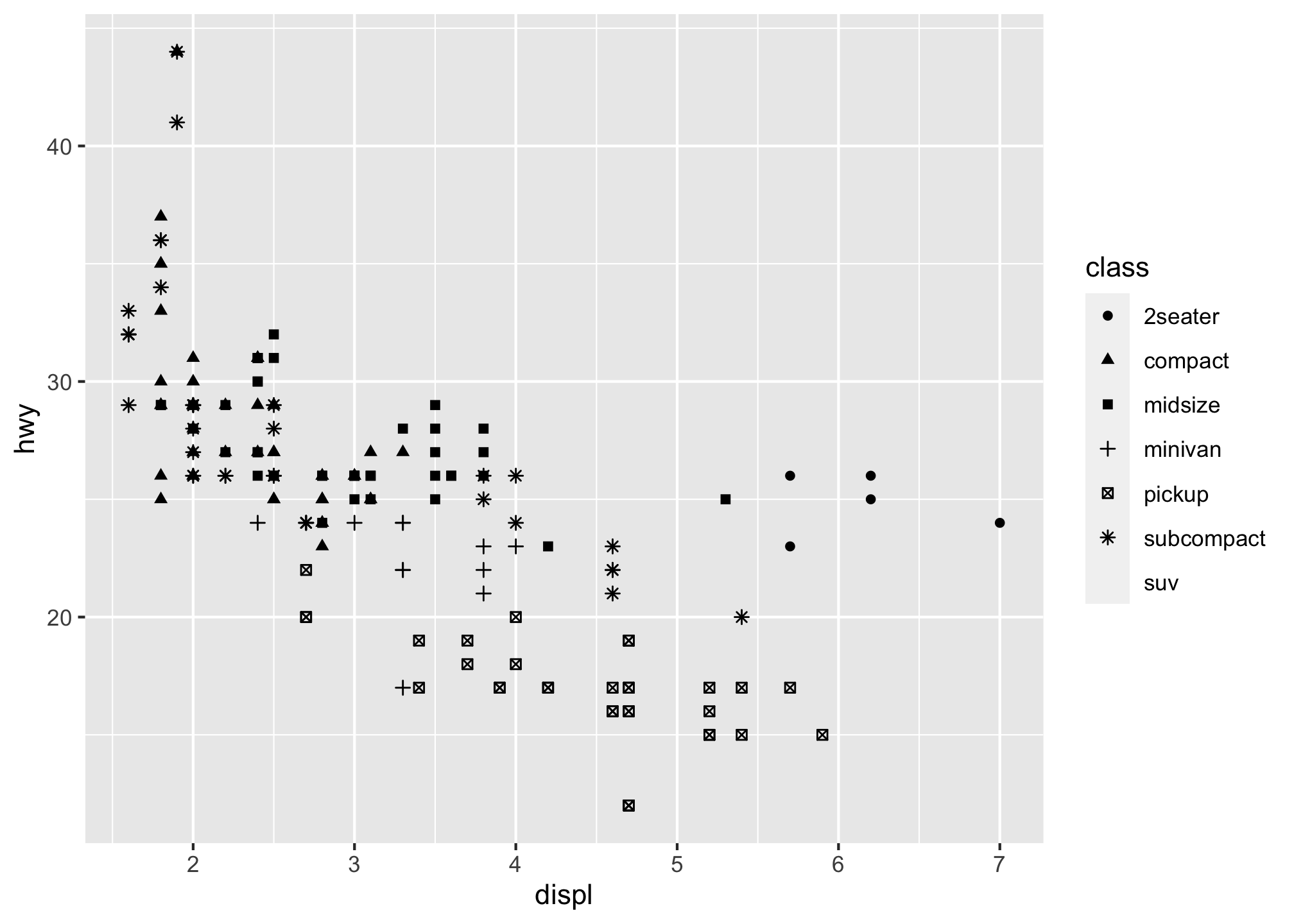
Uh oh. Something is missing from the plot! So what happened to the SUVs? ggplot2 will only use six shapes at a time. By default, additional groups will go unplotted when you use the shape aesthetic so remember this and you’ll save yourself from throwing a computer.
If you are a controlling person, you can also set the aesthetic properties of your geom manually. For example, we can make all of the points in our plot blue
ggplot(data = mpg) +
  geom_point(mapping = aes(x = displ, y = hwy), color = "blue")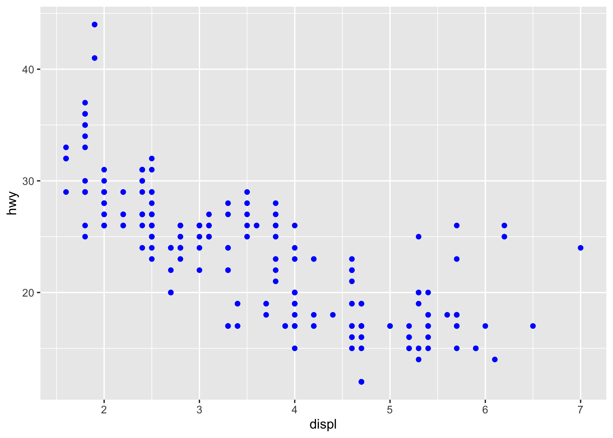
or even WVU Blue
ggplot(data = mpg) +
  geom_point(mapping = aes(x = displ, y = hwy), color = "#002855")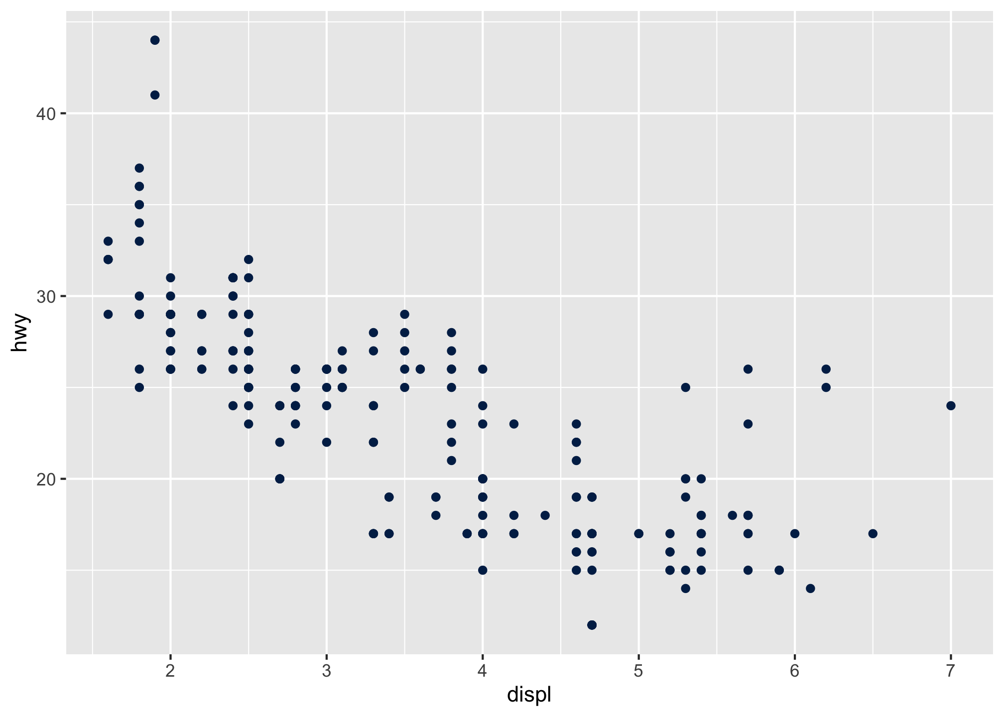
Part 2 Questions for You to Turn In
- Run the following:
ggplot(data = mpg) +
  geom_point(mapping = aes(x = displ, y = hwy,
                           color = "blue"))
Why are the points not blue? What has gone wrong with this code and what is it actually doing?
- Which variables in
mpgare
- categorical?
- continuous?
Map a continuous variable to color, size, and shape. How do these aesthetics behave differently for categorical vs. continuous variables?
Briefly describe happens if you map the same variable to multiple aesthetics?
What does the stroke aesthetic do? What shapes does it work with? (Hint: you could use
?geom_point)What happens if you map an aesthetic to something other than a variable name, like
aes(colour = displ < 5)?
Part 3: Grouping
Maybe you’d like to use multiple colors. Let try something fun based off of this palette
ggplot(data = mpg) +
  geom_point(mapping = aes(x = displ, y = hwy),
             color = c("#34738f", "#122f3d", "#be3e2b", "#ed8a45", "#f6de6c"))
Uh oh. That didn’t work. Why not?
Well to ggplot there are 234 different data points and it doesn’t know how you want that color palette distributed. By the power of mathematics, 5 < 234 so you get an error. To fix it, you either assign 1 color to every data point or 234 different colors. Neither of these sound great. So what can we do?
Well we can group by category. That may help. If you run
mpg$class## [1] "compact" "compact" "compact" "compact" "compact"
## [6] "compact" "compact" "compact" "compact" "compact"
## [11] "compact" "compact" "compact" "compact" "compact"
## [16] "midsize" "midsize" "midsize" "suv" "suv"
## [21] "suv" "suv" "suv" "2seater" "2seater"
## [26] "2seater" "2seater" "2seater" "suv" "suv"
## [31] "suv" "suv" "midsize" "midsize" "midsize"
## [36] "midsize" "midsize" "minivan" "minivan" "minivan"
## [41] "minivan" "minivan" "minivan" "minivan" "minivan"
## [46] "minivan" "minivan" "minivan" "pickup" "pickup"
## [51] "pickup" "pickup" "pickup" "pickup" "pickup"
## [56] "pickup" "pickup" "suv" "suv" "suv"
## [61] "suv" "suv" "suv" "suv" "pickup"
## [66] "pickup" "pickup" "pickup" "pickup" "pickup"
## [71] "pickup" "pickup" "pickup" "pickup" "suv"
## [76] "suv" "suv" "suv" "suv" "suv"
## [81] "suv" "suv" "suv" "pickup" "pickup"
## [86] "pickup" "pickup" "pickup" "pickup" "pickup"
## [91] "subcompact" "subcompact" "subcompact" "subcompact" "subcompact"
## [96] "subcompact" "subcompact" "subcompact" "subcompact" "subcompact"
## [101] "subcompact" "subcompact" "subcompact" "subcompact" "subcompact"
## [106] "subcompact" "subcompact" "subcompact" "midsize" "midsize"
## [111] "midsize" "midsize" "midsize" "midsize" "midsize"
## [116] "subcompact" "subcompact" "subcompact" "subcompact" "subcompact"
## [121] "subcompact" "subcompact" "suv" "suv" "suv"
## [126] "suv" "suv" "suv" "suv" "suv"
## [131] "suv" "suv" "suv" "suv" "suv"
## [136] "suv" "suv" "suv" "suv" "suv"
## [141] "suv" "compact" "compact" "midsize" "midsize"
## [146] "midsize" "midsize" "midsize" "midsize" "midsize"
## [151] "suv" "suv" "suv" "suv" "midsize"
## [156] "midsize" "midsize" "midsize" "midsize" "suv"
## [161] "suv" "suv" "suv" "suv" "suv"
## [166] "subcompact" "subcompact" "subcompact" "subcompact" "compact"
## [171] "compact" "compact" "compact" "suv" "suv"
## [176] "suv" "suv" "suv" "suv" "midsize"
## [181] "midsize" "midsize" "midsize" "midsize" "midsize"
## [186] "midsize" "compact" "compact" "compact" "compact"
## [191] "compact" "compact" "compact" "compact" "compact"
## [196] "compact" "compact" "compact" "suv" "suv"
## [201] "pickup" "pickup" "pickup" "pickup" "pickup"
## [206] "pickup" "pickup" "compact" "compact" "compact"
## [211] "compact" "compact" "compact" "compact" "compact"
## [216] "compact" "compact" "compact" "compact" "compact"
## [221] "compact" "subcompact" "subcompact" "subcompact" "subcompact"
## [226] "subcompact" "subcompact" "midsize" "midsize" "midsize"
## [231] "midsize" "midsize" "midsize" "midsize"that doesn’t help you much in figuring out the types of vehicles we have (yes we did find it before by plotting but assume we hadn’t). Unless you like to clean this type of mess, we simply want to find the unique values and moreover, for coloring purposes, how many we have.
Again to find a list of unique values, we can run
unique(mpg$class)## [1] "compact" "midsize" "suv" "2seater" "minivan"
## [6] "pickup" "subcompact"Well that’s better but I’m lazy and don’t want to count so let’s find the number of unique values
length(unique(mpg$class))## [1] 7Oh good! There are 7 so that implies when we plot by class (type of vehicle), we need to have seven colors.
ggplot(data = mpg) +
  geom_point(mapping = aes(x = displ, y = hwy, color = class))
which we did earlier. But to fill it with what we want, we need to override the default colors
ggplot(data = mpg) +
  geom_point(mapping = aes(x = displ, y = hwy,
                           color = class)) +
  scale_color_manual(values = c("#490A3D", "#BD1550", "#E97F02", "#F8CA00", "#8A9B0F", "#95C7D8", "#FFBFF5"))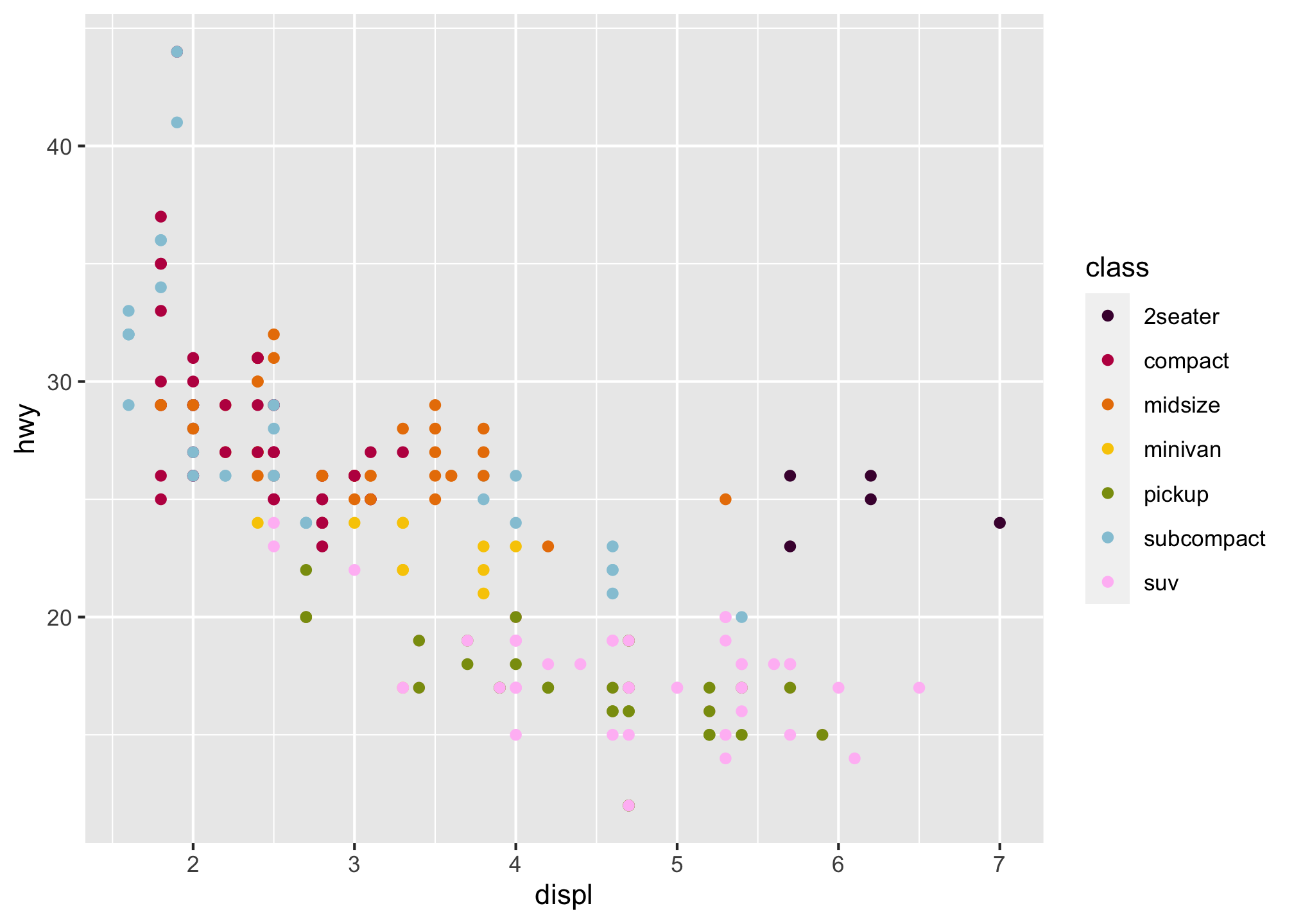
Note that since the class variable (type of vehicle) is discrete, we can use scale_color_manual(). Other discrete scales in ggplot can be found here
Continuous variables use other scales and you can fins more about that and other scales can be found here
Now those dots are pretty small. Let’s make them bigger.
ggplot(data = mpg) +
  geom_point(mapping = aes(x = displ, y = hwy, color = class), size = 2) +
  scale_color_manual(values = c("#490A3D", "#BD1550", "#E97F02", "#F8CA00", "#8A9B0F", "#95C7D8", "#FFBFF5"))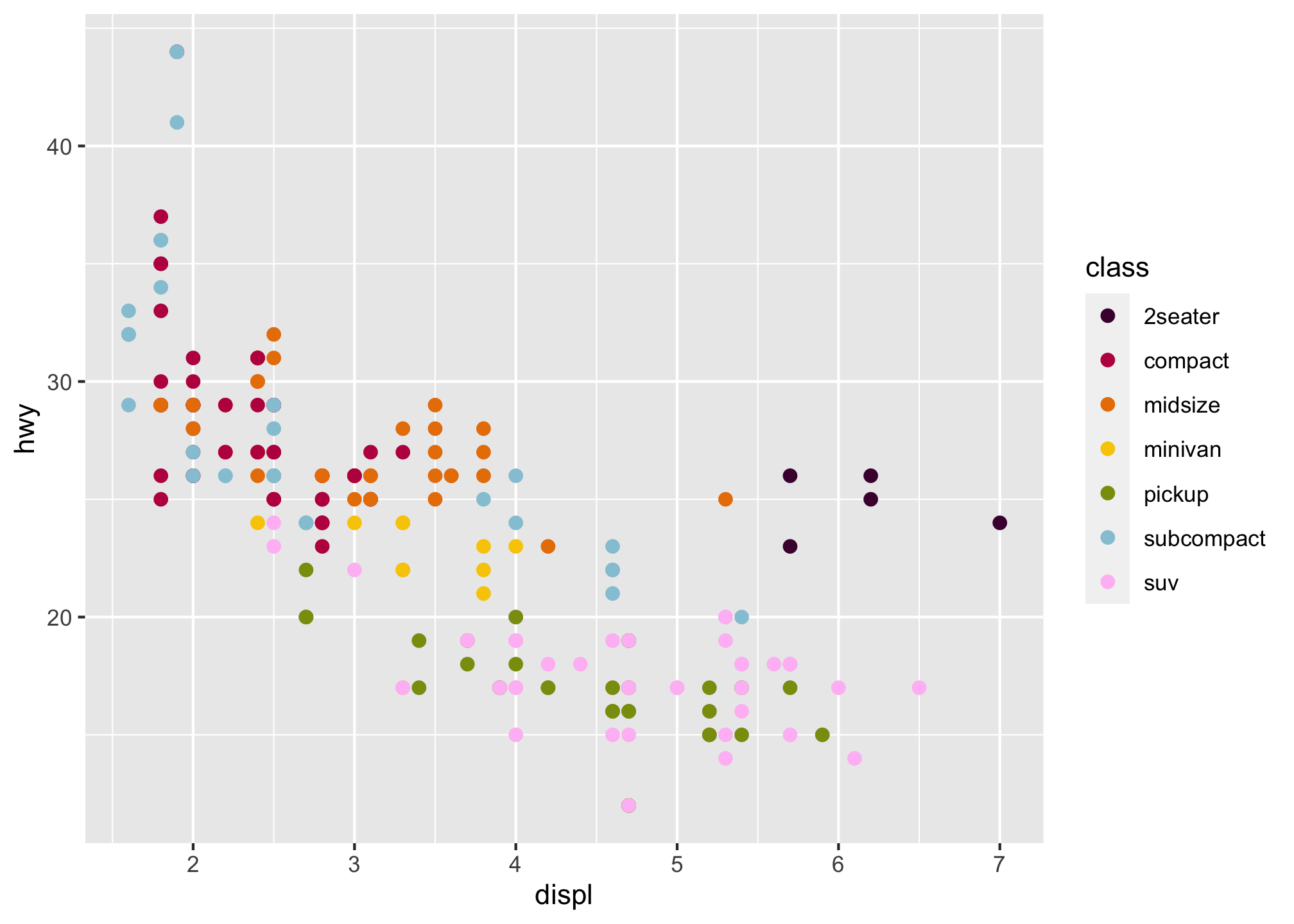
That does look better but why is the size now within the geom_point aesthetic? If you don’t know, that’s ok! We’ll get to that later but for now, think about it.
NOTE
You’re writing code so you will get errors! But one common problem when creating ggplot2 graphics is to put the + in the wrong place:
It has to come at the end of the line, not the start. In other words, make sure you haven’t accidentally written code like this
ggplot(data = mpg)
+ geom_point(mapping = aes(x = displ, y = hwy))
If you’re still stuck, try the help. You can get help about any R function by running ?function_name in the console, or selecting the function name and pressing F1 in RStudio. Don’t worry if the help doesn’t seem that helpful - instead skip down to the examples and look for examples that may match what you’re trying to do. For the aesthetics, run
?aes
Part 4: Facets
Another way to add additional variables is with aesthetics. Another way, particularly useful for categorical variables, is to split your plot into facets, subplots that each display one subset of the data set.
To facet your plot by a single variable, you can use facet_wrap() or facet_grid(). Let’s fow now just concentrate on wrapping the data set.
The first argument of facet_wrap() should be a formula, which you create with ~ followed by a variable name - here “formula” is the name of a data structure in R, not a synonym for an “equation”.
The variable that you pass to facet_wrap() should be discrete so it can essentially be split apart.
ggplot(data = mpg) +
  geom_point(mapping = aes(x = displ, y = hwy, color = class), size = 2) +
  scale_color_manual(values = c("#490A3D", "#BD1550", "#E97F02", "#F8CA00", "#8A9B0F", "#95C7D8", "#FFBFF5")) +
 facet_wrap(~ class, nrow = 2)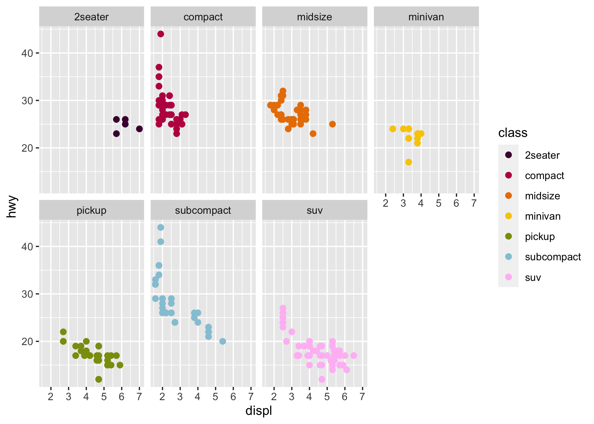
To facet your plot on the combination of two variables, use facet_grid() to your plot The first argument
of this is also a formula. This time the formula should contain two variable names separated by a ~.
ggplot(data = mpg) +
  geom_point(mapping = aes(x = displ, y = hwy, color = class), size = 2) +
  scale_color_manual(values = c("#490A3D", "#BD1550", "#E97F02", "#F8CA00", "#8A9B0F", "#95C7D8", "#FFBFF5")) +
  facet_grid(drv ~ cyl)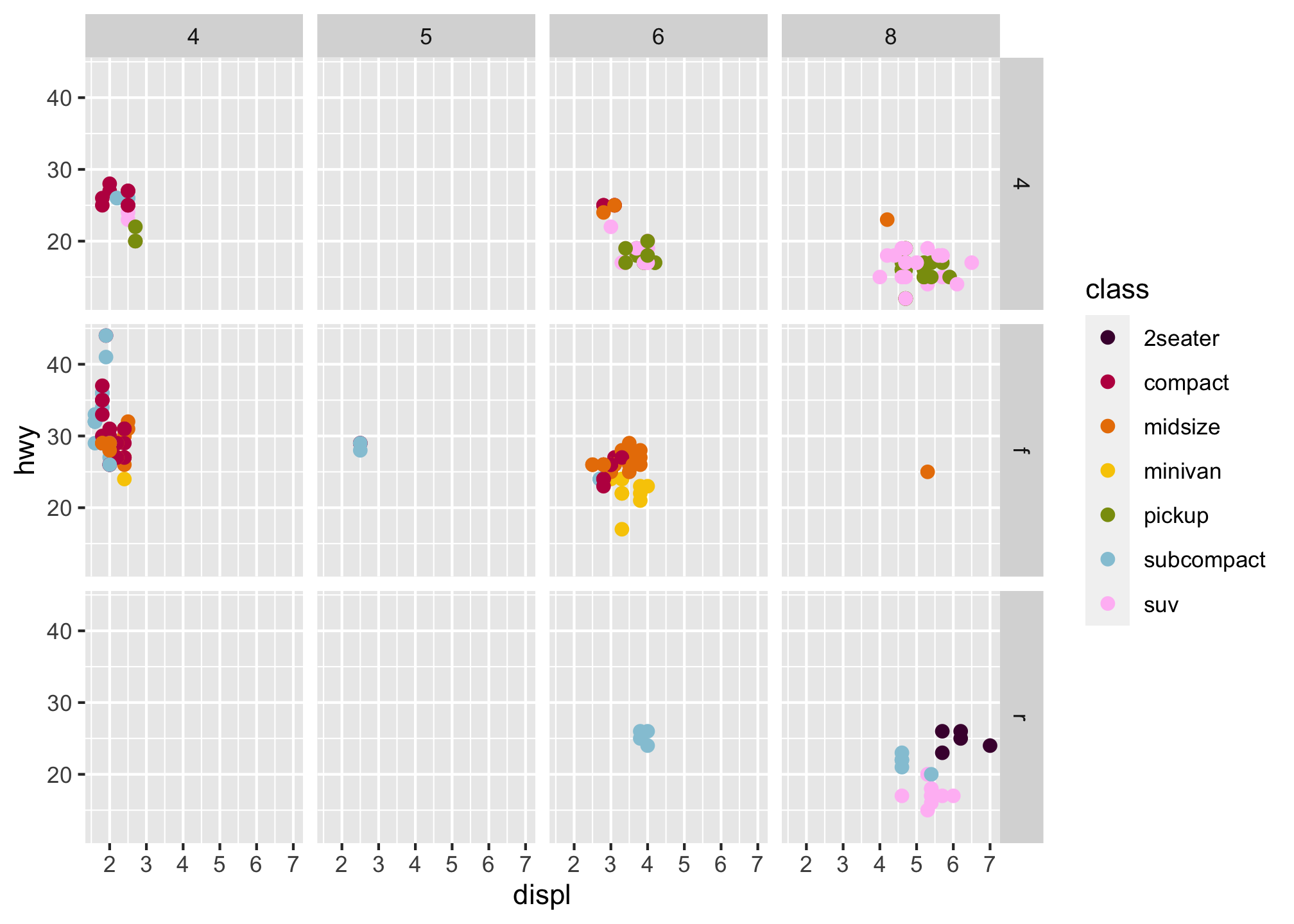
If you prefer to not facet particular rows or columns, you can just use a . instead of a variable name to imply the entire data set
ggplot(data = mpg) +
  geom_point(mapping = aes(x = displ, y = hwy, color = class), size = 2) +
  scale_color_manual(values = c("#490A3D", "#BD1550", "#E97F02", "#F8CA00", "#8A9B0F", "#95C7D8", "#FFBFF5")) +
  facet_grid(. ~ cyl)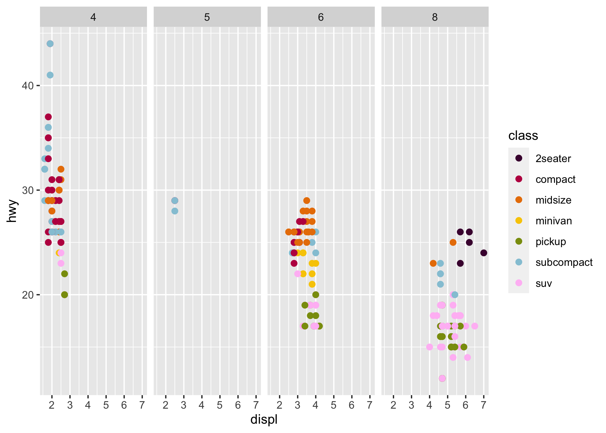
Part 4 Questions for You to Turn In
What happens if you facet on a continuous variable?
What do the empty cells in plot with
facet_grid(drv ~ cyl)mean? How do they relate to this plot?
ggplot(data = mpg) +
geom_point(mapping = aes(x = drv, y = cyl))- What plots does the following code make? What does . do?
- Plot 1
ggplot(data = mpg) +
  geom_point(mapping = aes(x = displ, y = hwy)) +
facet_grid(drv ~ .)- Plot 2
ggplot(data = mpg) +
  geom_point(mapping = aes(x = displ, y = hwy)) +
facet_grid(. ~ cyl)- Take the faceted plot below and compare it to the one with color you did earlier
ggplot(data = mpg) +
  geom_point(mapping = aes(x = displ, y = hwy)) +
  facet_wrap(~ class, nrow = 2)
What are the advantages to using faceting instead of the color aesthetic? What are the disadvantages? How might the balance change if you had a larger dataset?
Read
?facet_wrap. What doesnrowdo? What doesncoldo? What other options control the layout of the individual panels? Why doesn’tfacet_grid()havenrowandncolarguments (aka options)?When using
facet_grid()you should usually put the variable with more unique levels in the columns. Why?