Tidy Themes
Getting Prepped
First Things First! Set your Working Directory
Your working directory is simply where your script will look for anything it needs like external data sets. There are a few ways to go about doing this which we will cover. However for now, just do the following:
- Open up a new script by going to
File > New File > R Script. - Save it in a preferably empty folder as whatever you want.
- Go to the menu bar and select
Session > Set Working Directory > To Source File Location.
Download the script
Copying and pasting syntax from a browser can cause problems. To avoid this issue, please download a script with all of the needed code presented in this walkthrough.
Load Up Some Libraries
Please go ahead and download the libraries below you don’t have and load them up
library(tidyverse)
library(viridis)
library(RColorBrewer)
library(ggthemes)
library(ggtext)
Using Themes in ggwhatever
One of the nice aspects of ggplot is in the fact that you can edit most of the aesthetics. While aes() let’s you define where those aesthetics lie and the scale family of commands allows for coloring and how the data is represented, how a plot is displayed is found by theme.
You can do this either manually or using a prepackaged approach where theme options are already defined. In certain situations you can even use both.
Cleaning and Inspecting Data
Let’s use a cleaned version of the income data set.
income_data <- read_csv("income.csv")##
## ── Column specification ────────────────────────────────────────────────────────
## cols(
## Location = col_character(),
## Lower_2000 = col_double(),
## Middle_2000 = col_double(),
## Upper_2000 = col_double(),
## Lower_2014 = col_double(),
## Middle_2014 = col_double(),
## Upper_2014 = col_double()
## )Always Inspect your Data!1
We can inspect the column names using the names() command
names(income_data)## [1] "Location" "Lower_2000" "Middle_2000" "Upper_2000" "Lower_2014"
## [6] "Middle_2014" "Upper_2014"and what type they are using str() or glimpse()
glimpse(income_data)## Rows: 229
## Columns: 7
## $ Location <chr> "Akron, OH", "Albany-Schenectady-Troy, NY", "Albuquerque,…
## $ Lower_2000 <dbl> 19.9, 22.1, 28.6, 23.0, 32.3, 22.0, 21.9, 33.0, 20.0, 29.…
## $ Middle_2000 <dbl> 59.8, 60.1, 55.4, 60.7, 54.7, 58.2, 51.2, 54.6, 56.0, 59.…
## $ Upper_2000 <dbl> 20.3, 17.8, 16.0, 16.2, 13.0, 19.8, 26.9, 12.4, 23.9, 11.…
## $ Lower_2014 <dbl> 24.5, 20.2, 33.0, 25.2, 27.4, 20.3, 25.6, 33.6, 27.0, 30.…
## $ Middle_2014 <dbl> 54.6, 55.1, 50.7, 55.7, 52.6, 55.5, 49.3, 50.5, 50.5, 52.…
## $ Upper_2014 <dbl> 20.9, 24.8, 16.3, 19.1, 20.0, 24.2, 25.1, 16.0, 22.6, 17.…Well 229 rows is a ton of data and a bar plot would look terrible!
ggplot(income_data, aes(x = Location,
                        y = Lower_2000,
                        fill = Lower_2000)) +
       geom_bar(stat = "identity") +
       xlab("City and State") +
       ylab("Average Income in 2000 Lower Class")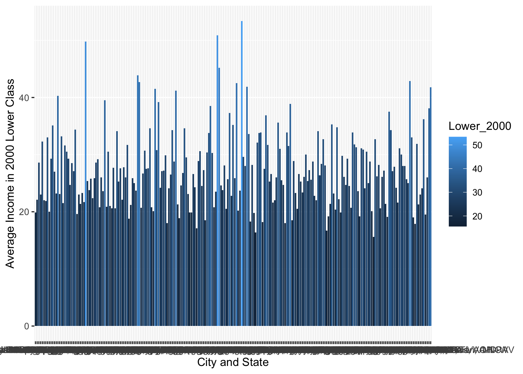
Wrangling Data by Reduction2
For simplicity sakes, let’s try just looking at the top 10 highest values in the Lower_2000 column using slice_max()3 command.
not_top10_income_data <- income_data %>%
                         select(Location, Lower_2000) %>%
                         slice_max(Lower_2000, n = 10); not_top10_income_data
## # A tibble: 10 x 2
## Location Lower_2000
## <chr> <dbl>
## 1 McAllen-Edinburg-Mission, TX 53.4
## 2 Laredo, TX 50.9
## 3 Brownsville-Harlingen, TX 49.8
## 4 Las Cruces, NM 45.2
## 5 El Centro, CA 43.9
## 6 Visalia-Porterville, CA 42.9
## 7 El Paso, TX 42.7
## 8 Madera, CA 42.5
## 9 Merced, CA 41.9
## 10 Yuma, AZ 41.8Now please note that this is not equivalent to another function we’ve gone over: head() which would only return the top 10 rows, not the top 10 highest values.
top10_income_data <- income_data %>%
                     select(Location, Lower_2000) %>%
                     head(10); top10_income_data
## # A tibble: 10 x 2
## Location Lower_2000
## <chr> <dbl>
## 1 Akron, OH 19.9
## 2 Albany-Schenectady-Troy, NY 22.1
## 3 Albuquerque, NM 28.6
## 4 Allentown-Bethlehem-Easton, PA-NJ 23
## 5 Amarillo, TX 32.3
## 6 Anchorage, AK 22
## 7 Ann Arbor, MI 21.9
## 8 Anniston-Oxford-Jacksonville, AL 33
## 9 Atlanta-Sandy Springs-Roswell, GA 20
## 10 Atlantic City-Hammonton, NJ 29.3Now let’s plot the wrangled data set
ggplot(top10_income_data, aes(x = Location,
                              y = Lower_2000,
                              fill = Lower_2000)) +
       geom_bar(stat = "identity") +
       xlab("Top 10 Cities and States") +
       ylab("Average Income in 2000 Lower Class")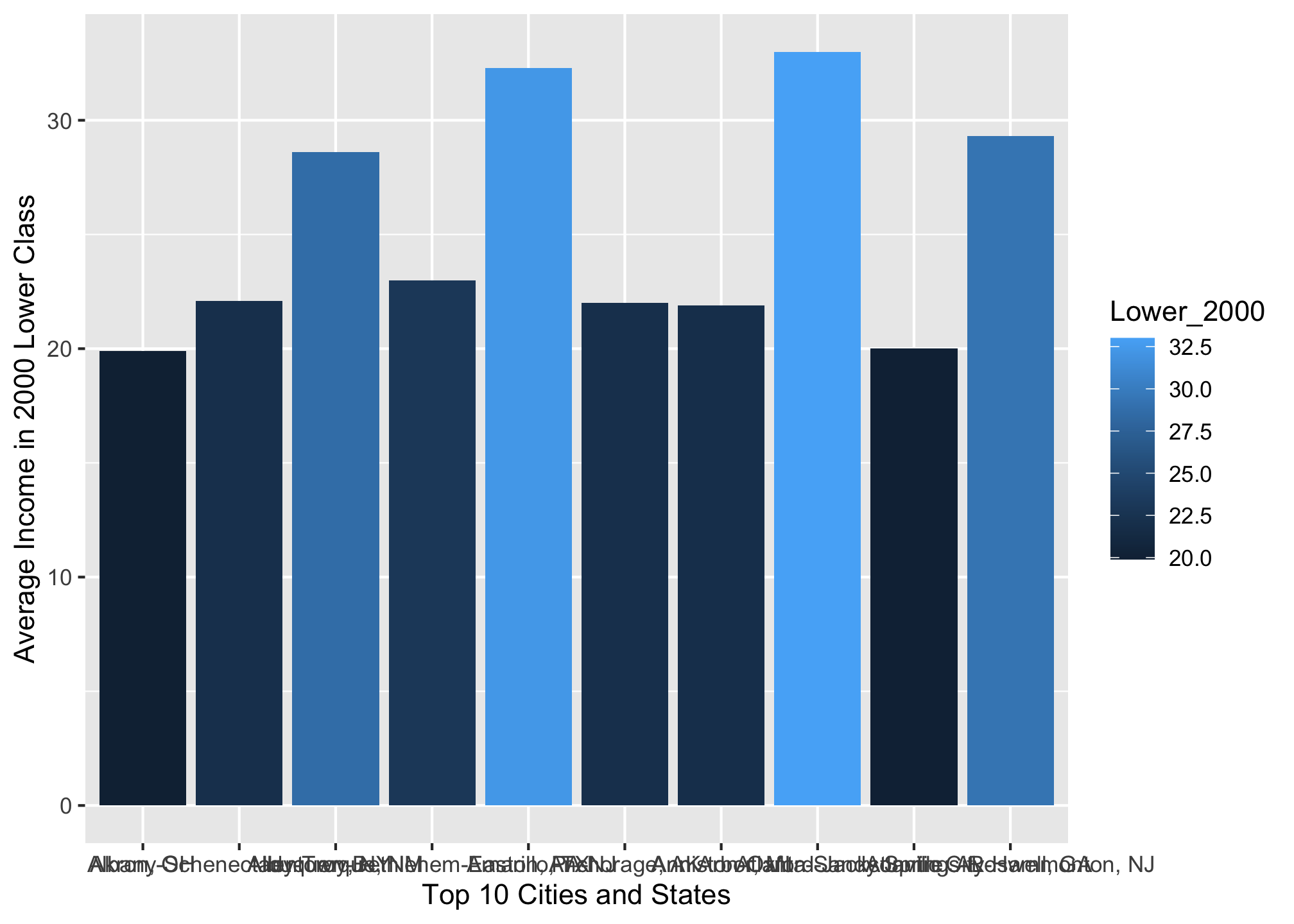
That looks good but it could be better. Recall with a scale command you can color the bars
ggplot(top10_income_data, aes(x = Location,
                              y = Lower_2000,
                              fill = Lower_2000)) +
       geom_bar(stat = "identity") +
       scale_fill_viridis_c() +
       xlab("Top 10 Cities and States") +
       ylab("Average Income in 2000 Lower Class")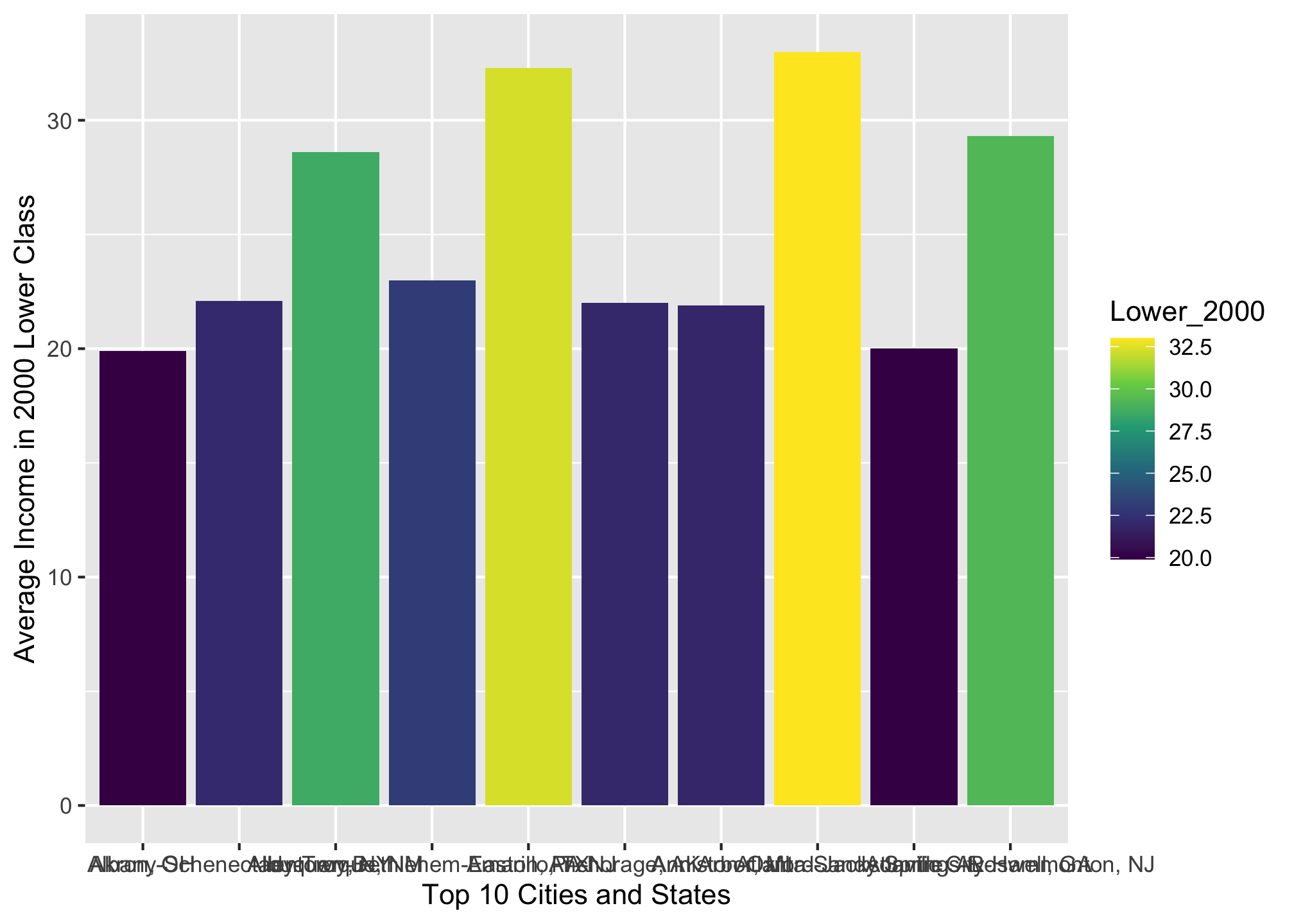
Well the colors are arguably better, though there are other palettes the viridis package provides. We can also reorder the bars from greatest to least or vice versa using the reorder() command4
ggplot(top10_income_data, aes(x = reorder(Location, -Lower_2000),
                              y = Lower_2000,
                              fill = Lower_2000)) +
       geom_bar(stat = "identity") +
       scale_fill_viridis_c() +
       xlab("Top 10 Cities and States") +
       ylab("Average Income in 2000 Lower Class")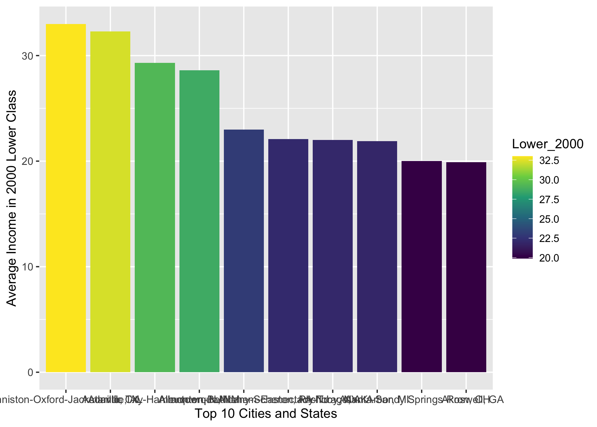
ggplot(top10_income_data, aes(x = reorder(Location, Lower_2000),
                              y = Lower_2000,
                              fill = Lower_2000)) +
       geom_bar(stat = "identity") +
       scale_fill_viridis_c() +
       xlab("Top 10 Cities and States") +
       ylab("Average Income in 2000 Lower Class")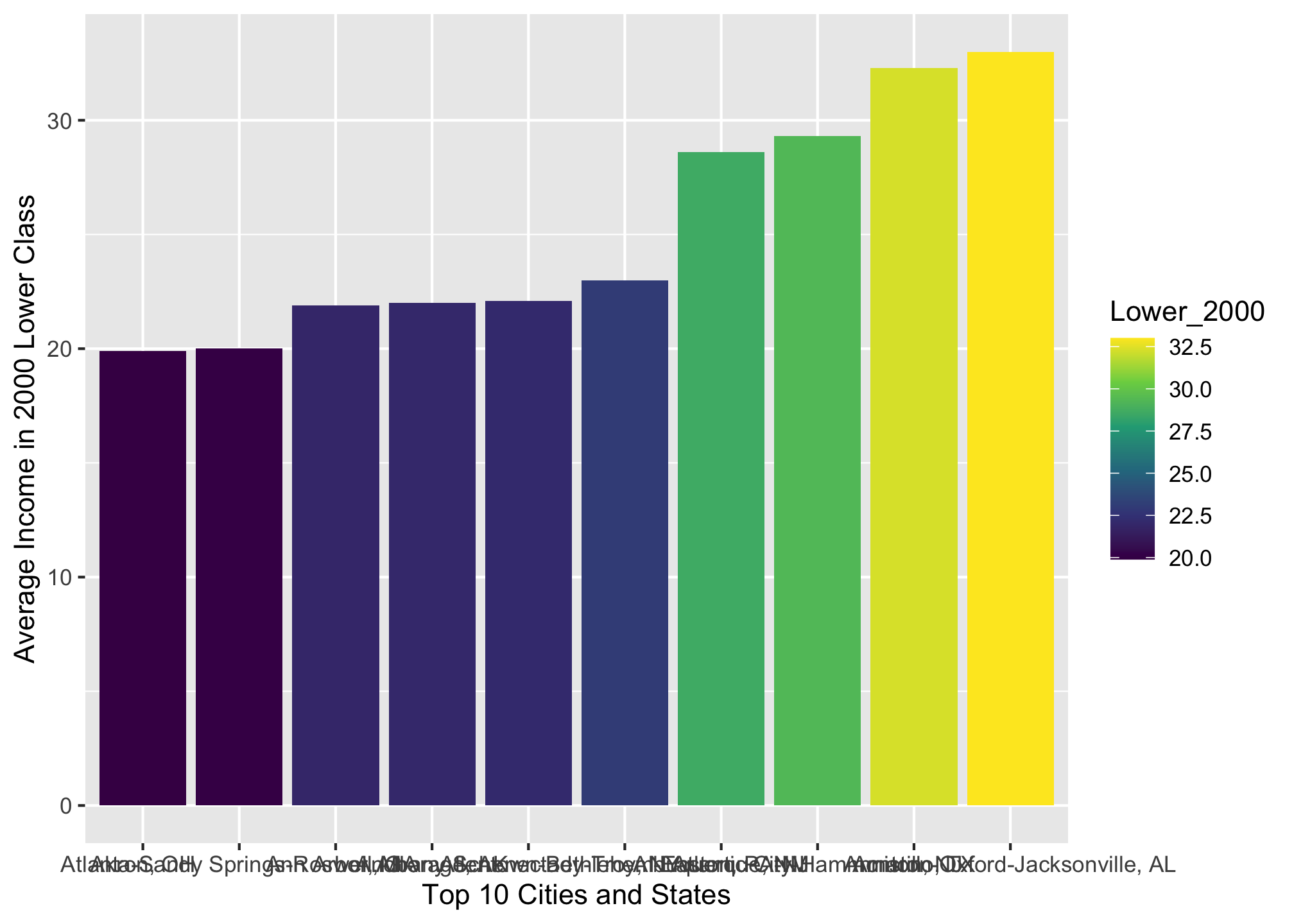
Well that’s great but with the grey background, overlapping text on the axis, etc., its certainly not really presentation worthy. Luckily we can use the theme() option to edit it!
Manual Approach
If you like controlling every little aspect of an experience, then you may be a ggplot control freak and the manual approach is perfect!
To get a feel for what options you have, try running the following
?themeScroll down to Usage to see the commands and Arguments to see a description of each. If you don’t like the tiny Help window or find it convoluted, try giving the tidyverse Reference site a look. It has some additional examples as well, though they may or may not be helpful depending on your needs.
In the following, we’ll use the descending data set and themes() to fix it up a bit
ggplot(top10_income_data, aes(x = reorder(Location, -Lower_2000),
                              y = Lower_2000,
                              fill = Lower_2000)) +
       geom_bar(stat = "identity") +
       scale_fill_viridis_c() +
       theme(axis.text.x = element_text(angle = 33,
                                        face = "bold",
                                        vjust = 0.5),
             axis.title = element_text(size = 14,
                                       face = "bold"),
             legend.position = "right",
             legend.direction = "vertical",
             panel.grid.minor.x = element_blank(),
             panel.grid.minor.y = element_line(),
             panel.grid.major.x = element_blank(),
             panel.grid.major.y = element_line()) +
       xlab("Top 10 Cities and States") +
       ylab("Average Income in 2000 Lower Class")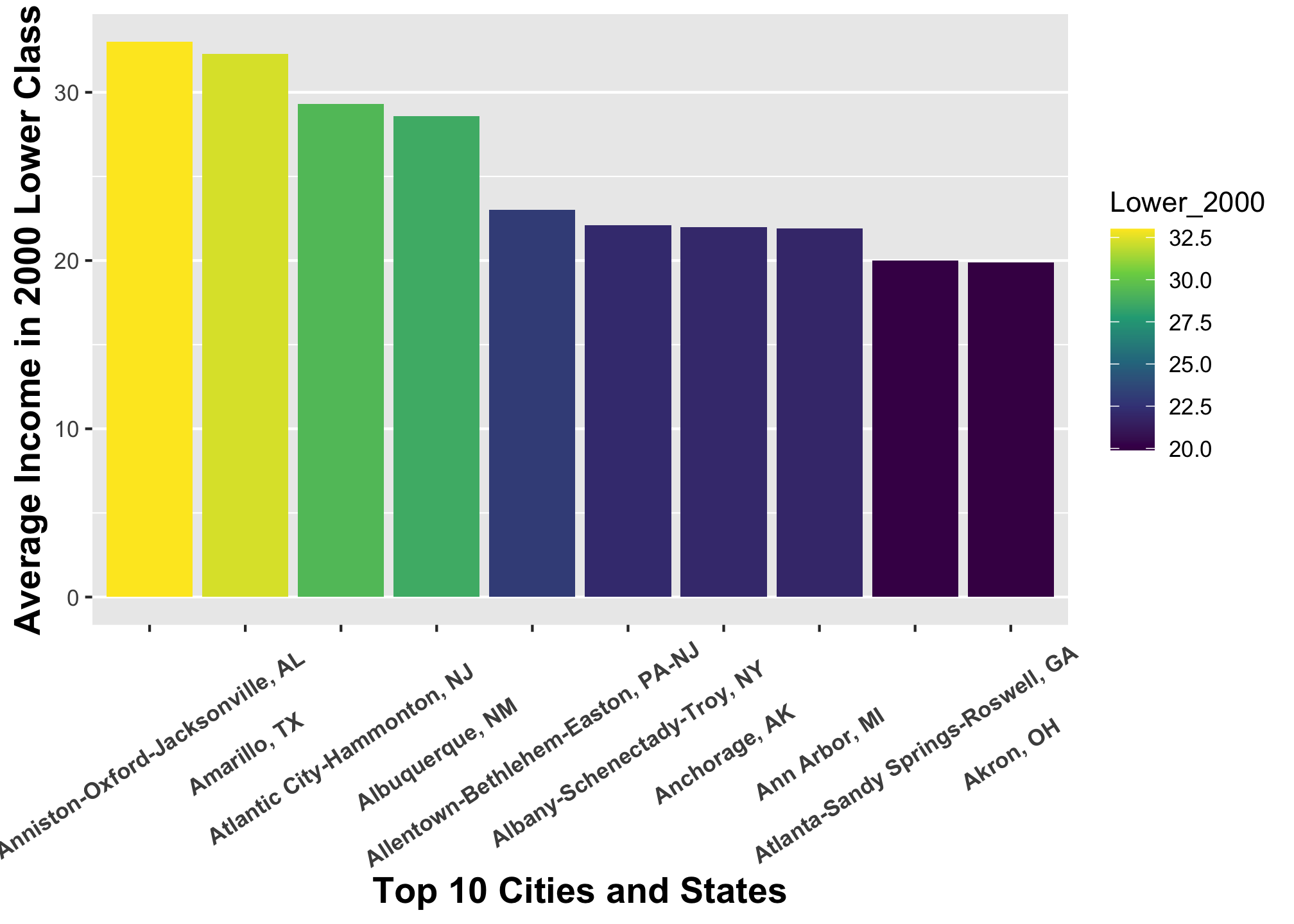
Well that’s slightly better but its certainly flawed. For example, it is not immediately clear which values on the x-axis goes where. We can do a lot more and we’ll get to it in a bit.
If you would like to have more of a drag and drop experience while learning themes in ggplot2, consider downloading and running the package esquisse.
Prepackaged Approach
If you fine with having someone else mostly control an experience allowing you to tinker here and there, then you may be a ggplot doodler and the prepackaged approach is likely a great fit!
It may be that you don’t like the default ggplot output but would rather not go through the process of editing every little thing. In these cases you can use predefined themes within ggplot2 or ggthemes package, though there are others. You can see how the the original top10_income_data set looks with these themes.
Default in ggplot2
ggplot(top10_income_data, aes(x = reorder(Location, -Lower_2000),
                              y = Lower_2000,
                              fill = Lower_2000)) +
       geom_bar(stat = "identity") +
       theme_grey() + # or theme_gray()
       xlab("Top 10 Cities and States") +
       ylab("Average Income in 2000 Lower Class")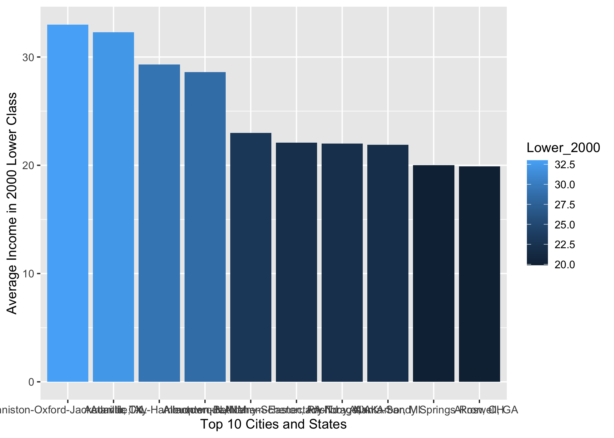
ggplot(top10_income_data, aes(x = reorder(Location, -Lower_2000),
                              y = Lower_2000,
                              fill = Lower_2000)) +
       geom_bar(stat = "identity") +
       theme_bw() +
       xlab("Top 10 Cities and States") +
       ylab("Average Income in 2000 Lower Class")
ggplot(top10_income_data, aes(x = reorder(Location, -Lower_2000),
                              y = Lower_2000,
                              fill = Lower_2000)) +
       geom_bar(stat = "identity") +
       theme_linedraw() +
       xlab("Top 10 Cities and States") +
       ylab("Average Income in 2000 Lower Class")
ggplot(top10_income_data, aes(x = reorder(Location, -Lower_2000),
                              y = Lower_2000,
                              fill = Lower_2000)) +
       geom_bar(stat = "identity") +
       theme_light() +
       xlab("Top 10 Cities and States") +
       ylab("Average Income in 2000 Lower Class")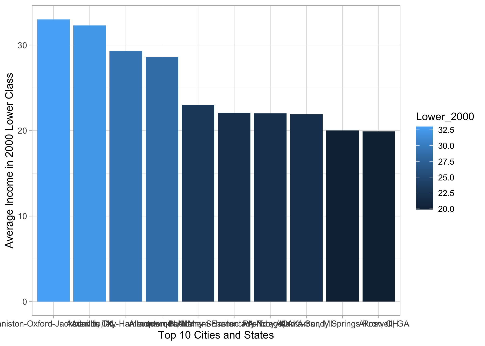
ggplot(top10_income_data, aes(x = reorder(Location, -Lower_2000),
                              y = Lower_2000,
                              fill = Lower_2000)) +
       geom_bar(stat = "identity") +
       theme_dark() +
       xlab("Top 10 Cities and States") +
       ylab("Average Income in 2000 Lower Class")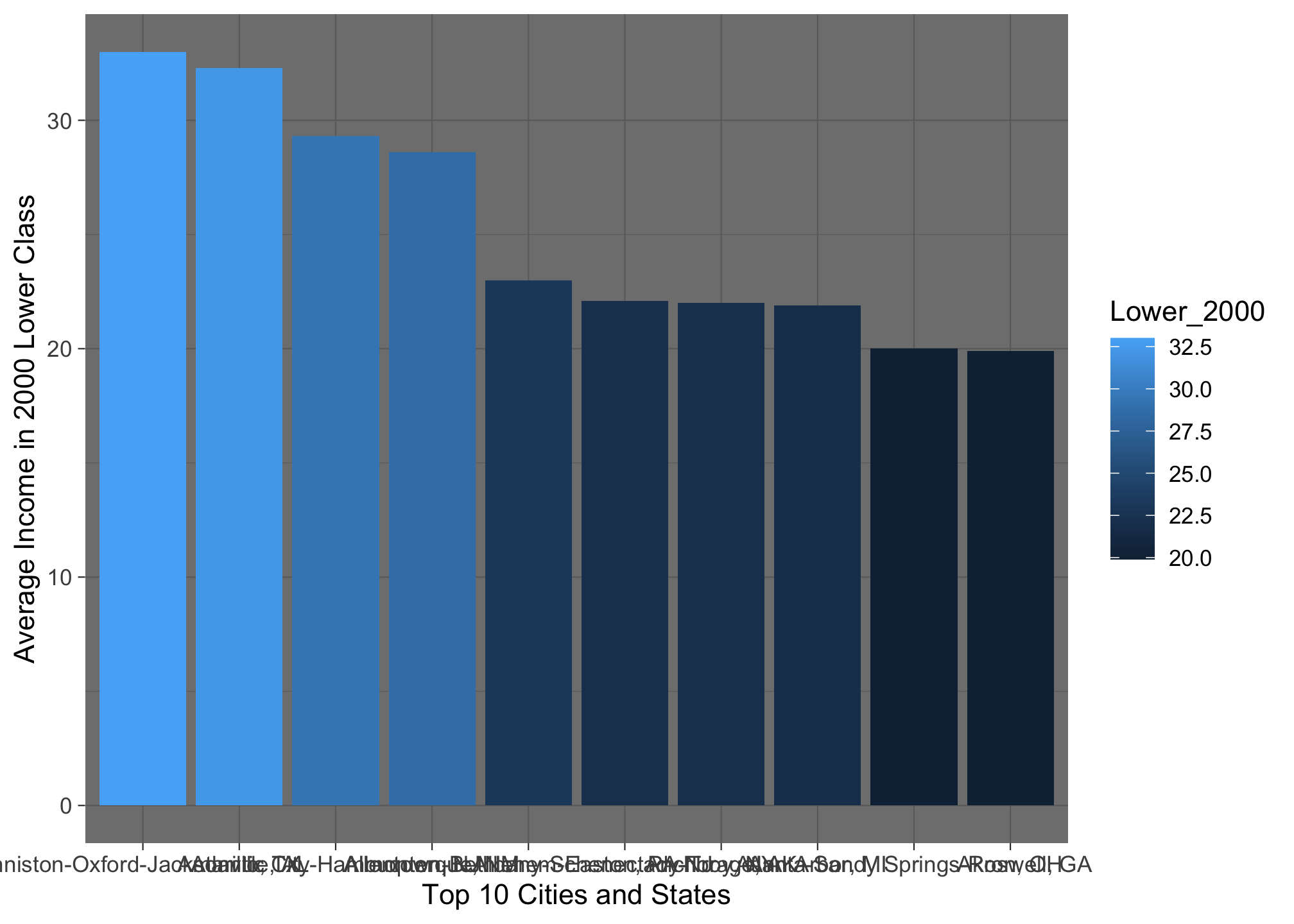
ggplot(top10_income_data, aes(x = reorder(Location, -Lower_2000),
                              y = Lower_2000,
                              fill = Lower_2000)) +
       geom_bar(stat = "identity") +
       theme_minimal() +
       xlab("Top 10 Cities and States") +
       ylab("Average Income in 2000 Lower Class")
ggplot(top10_income_data, aes(x = reorder(Location, -Lower_2000),
                              y = Lower_2000,
                              fill = Lower_2000)) +
       geom_bar(stat = "identity") +
       theme_classic() +
       xlab("Top 10 Cities and States") +
       ylab("Average Income in 2000 Lower Class")
ggplot(top10_income_data, aes(x = reorder(Location, -Lower_2000),
                              y = Lower_2000,
                              fill = Lower_2000)) +
       geom_bar(stat = "identity") +
       theme_void() +
       xlab("Top 10 Cities and States") +
       ylab("Average Income in 2000 Lower Class")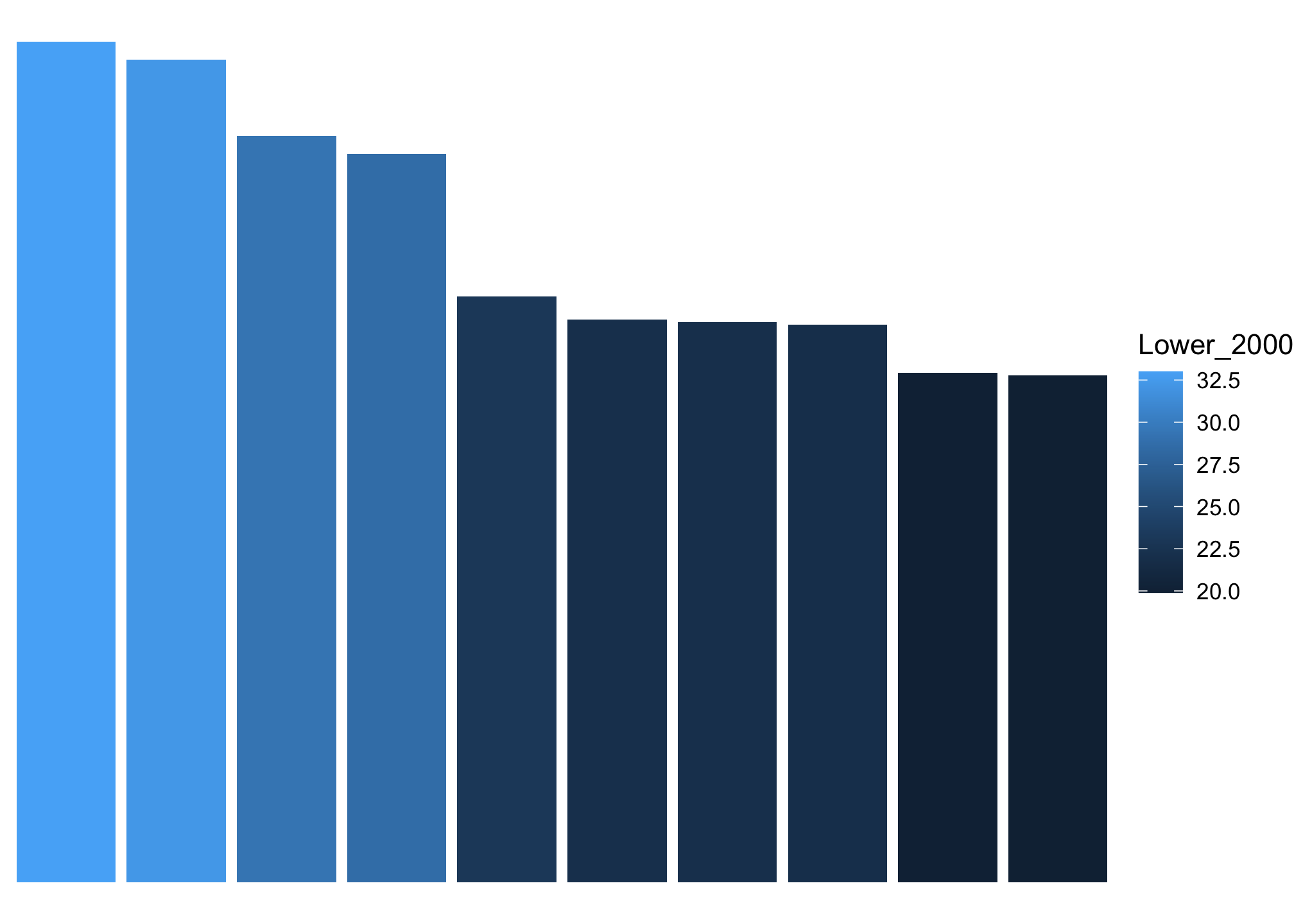
Using ggthemes
ggplot(top10_income_data, aes(x = reorder(Location, -Lower_2000),
                              y = Lower_2000,
                              fill = Lower_2000)) +
       geom_bar(stat = "identity") +
       theme_few() +
       xlab("Top 10 Cities and States") +
       ylab("Average Income in 2000 Lower Class")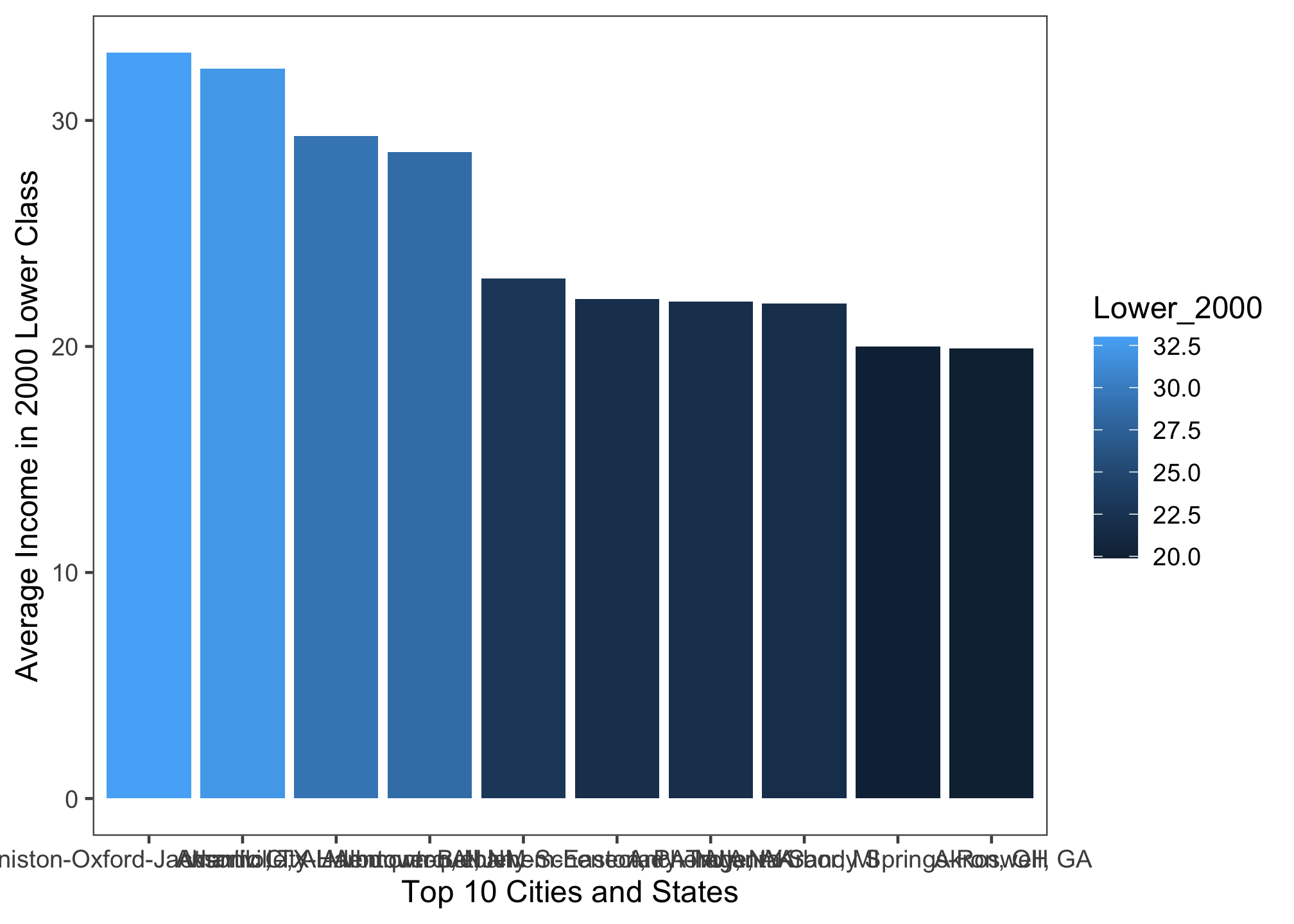
ggplot(top10_income_data, aes(x = reorder(Location, -Lower_2000),
                              y = Lower_2000,
                              fill = Lower_2000)) +
       geom_bar(stat = "identity") +
       theme_fivethirtyeight() +
       xlab("Top 10 Cities and States") +
       ylab("Average Income in 2000 Lower Class")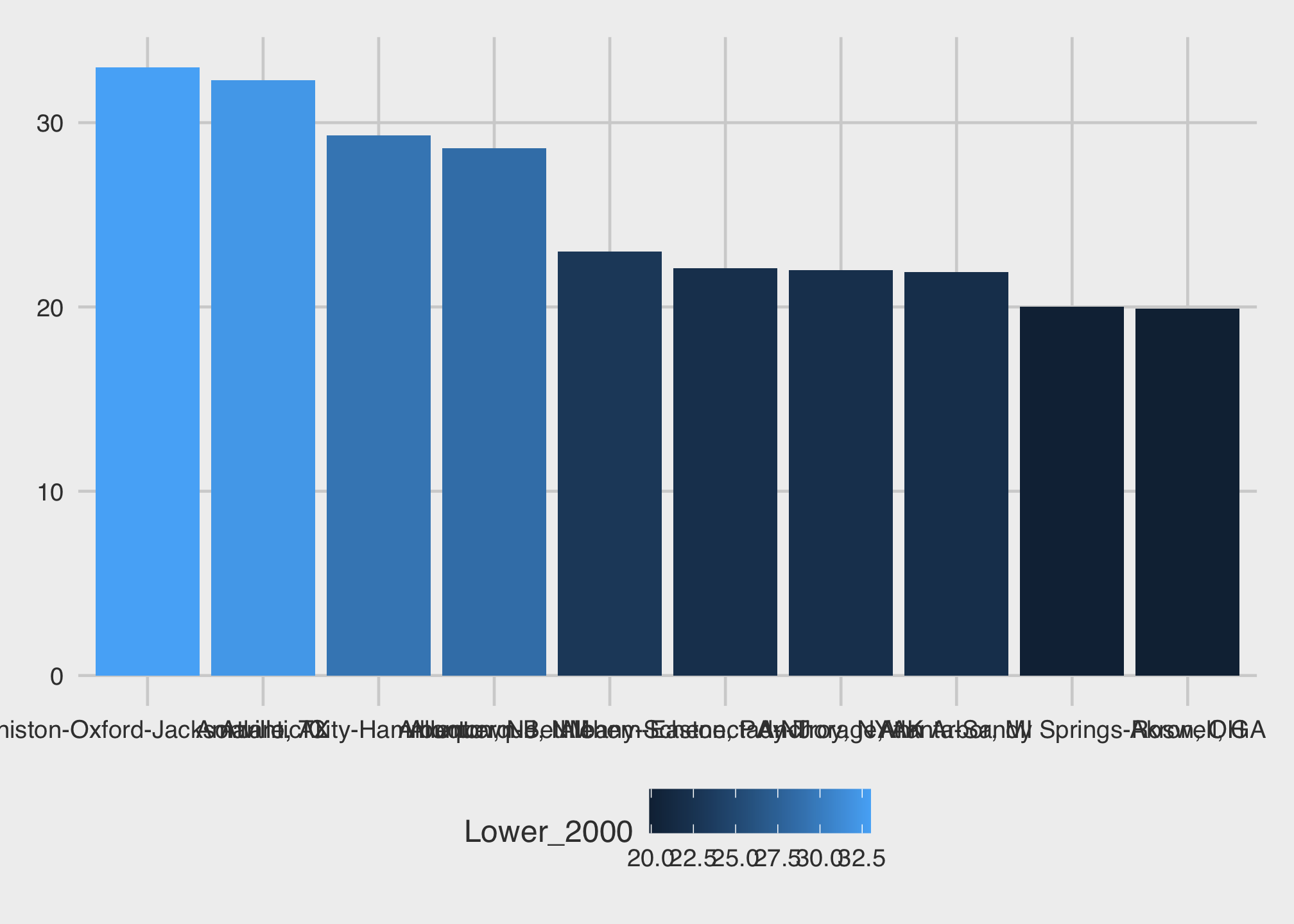
ggplot(top10_income_data, aes(x = reorder(Location, -Lower_2000),
                              y = Lower_2000,
                              fill = Lower_2000)) +
       geom_bar(stat = "identity") +
       theme_gdocs() +
       xlab("Top 10 Cities and States") +
       ylab("Average Income in 2000 Lower Class")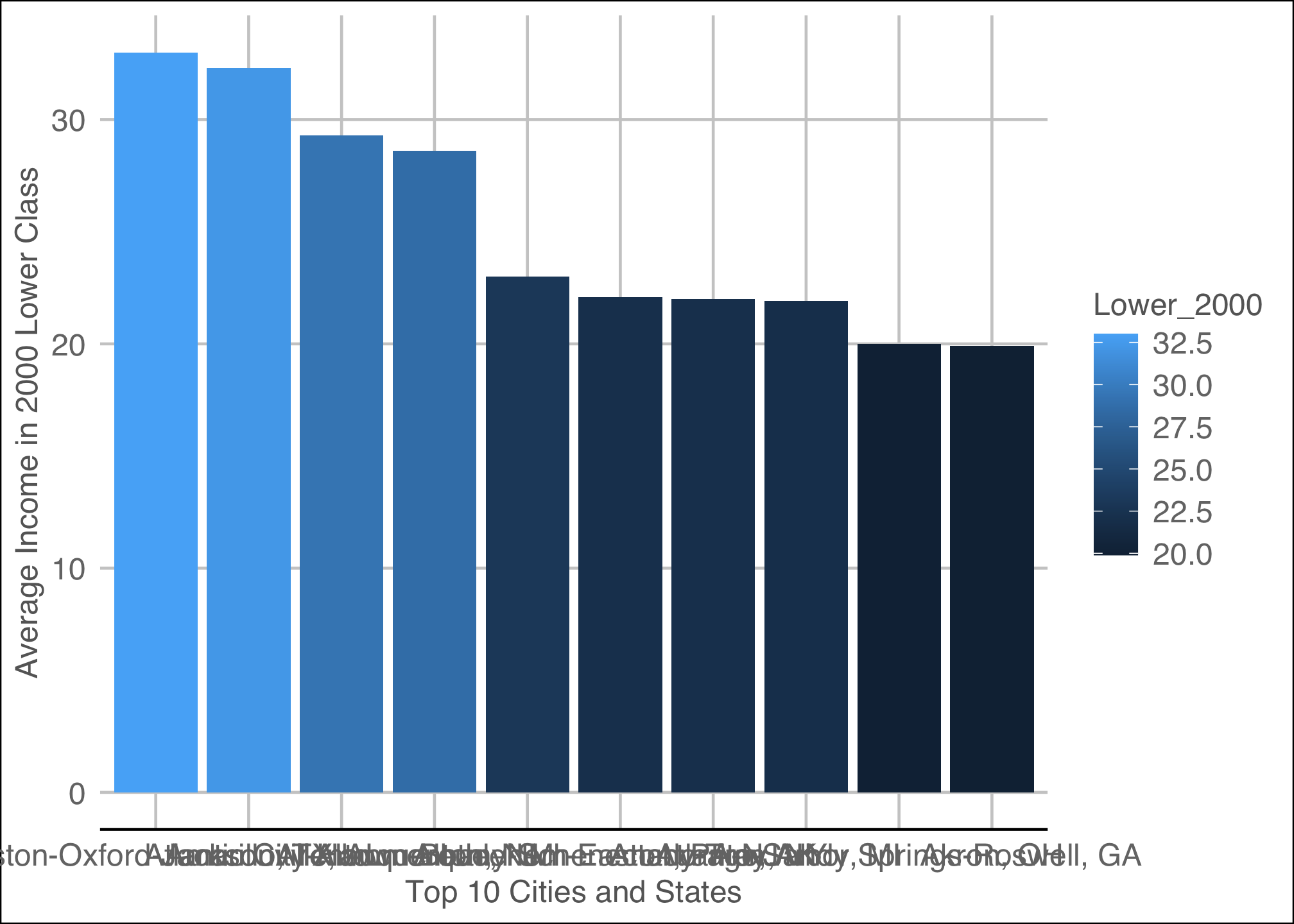
ggplot(top10_income_data, aes(x = reorder(Location, -Lower_2000),
                              y = Lower_2000,
                              fill = Lower_2000)) +
       geom_bar(stat = "identity") +
       theme_hc() +
       xlab("Top 10 Cities and States") +
       ylab("Average Income in 2000 Lower Class")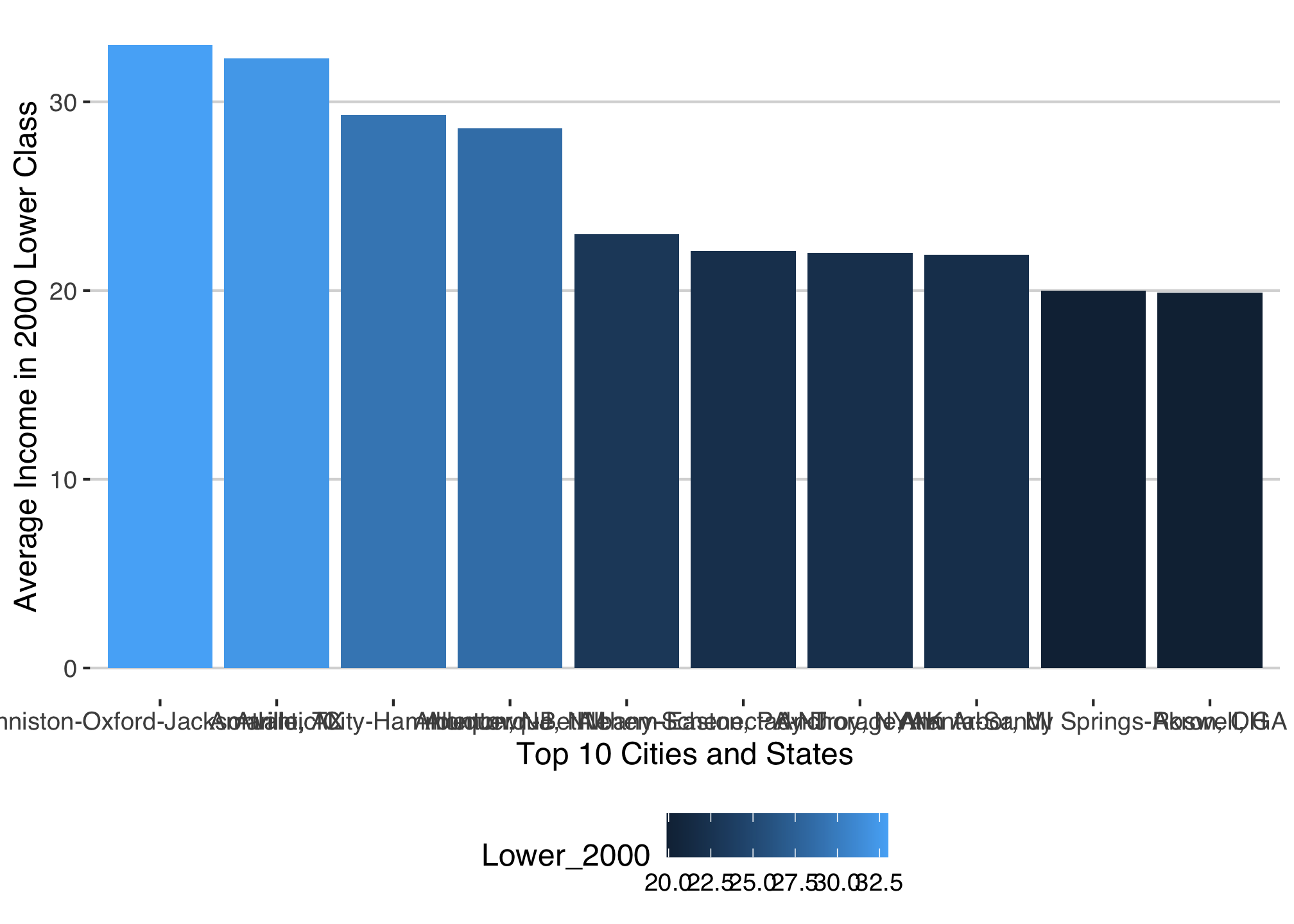
ggplot(top10_income_data, aes(x = reorder(Location, -Lower_2000),
                              y = Lower_2000,
                              fill = Lower_2000)) +
       geom_bar(stat = "identity") +
       theme_igray() +
       xlab("Top 10 Cities and States") +
       ylab("Average Income in 2000 Lower Class")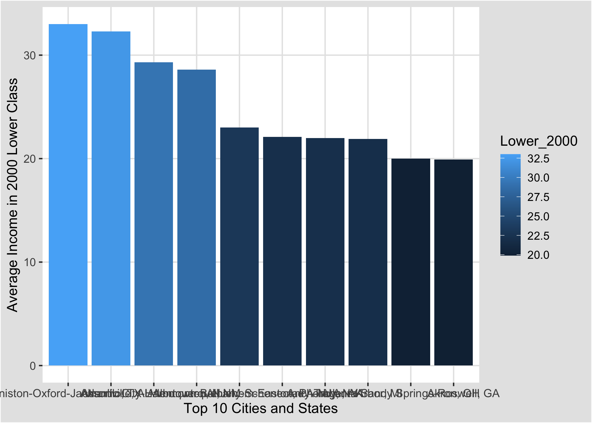
ggplot(top10_income_data, aes(x = reorder(Location, -Lower_2000),
                              y = Lower_2000,
                              fill = Lower_2000)) +
       geom_bar(stat = "identity") +
       theme_solarized() +
       xlab("Top 10 Cities and States") +
       ylab("Average Income in 2000 Lower Class")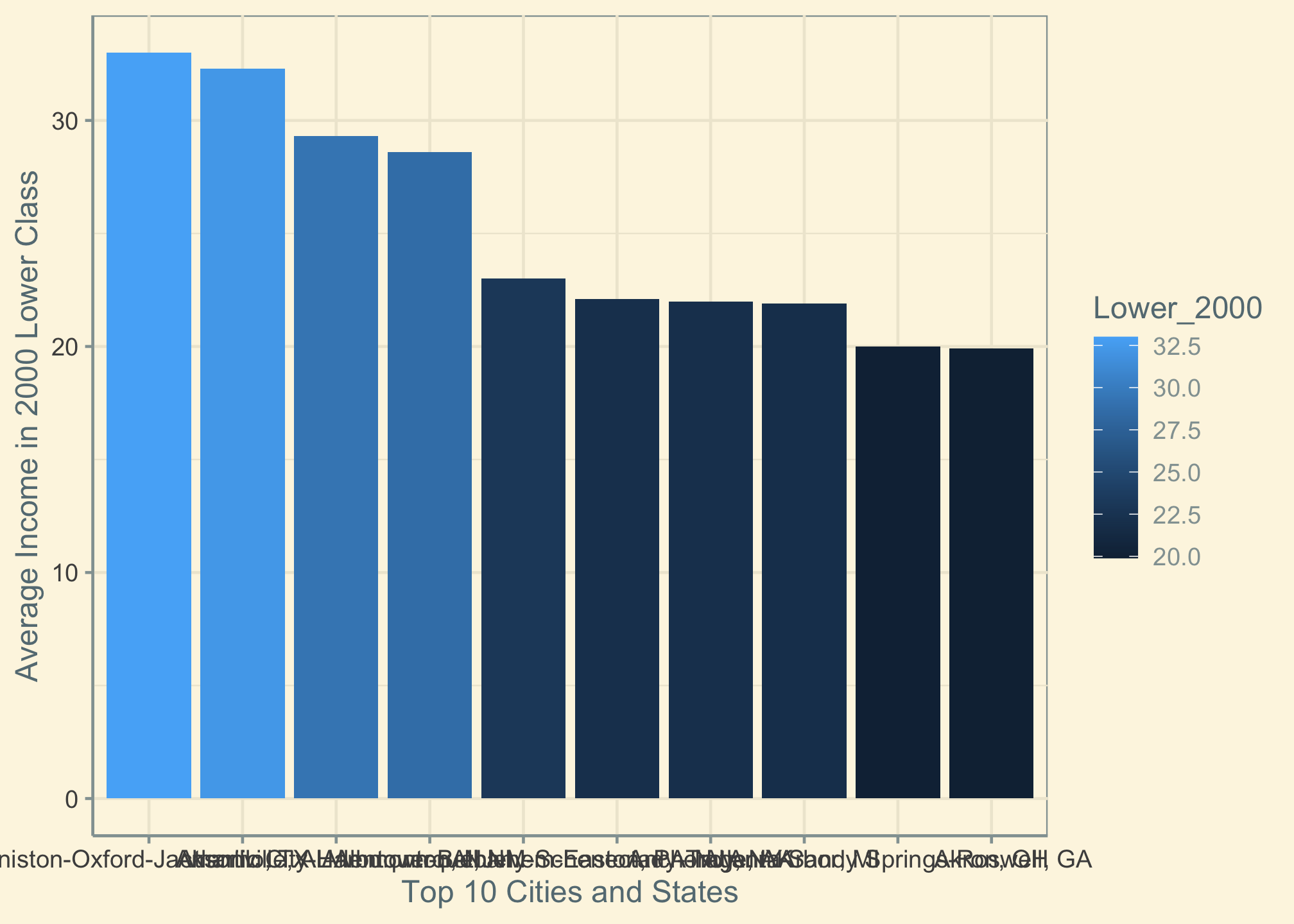
ggplot(top10_income_data, aes(x = reorder(Location, -Lower_2000),
                              y = Lower_2000,
                              fill = Lower_2000)) +
       geom_bar(stat = "identity") +
       theme_solid() +
       xlab("Top 10 Cities and States") +
       ylab("Average Income in 2000 Lower Class")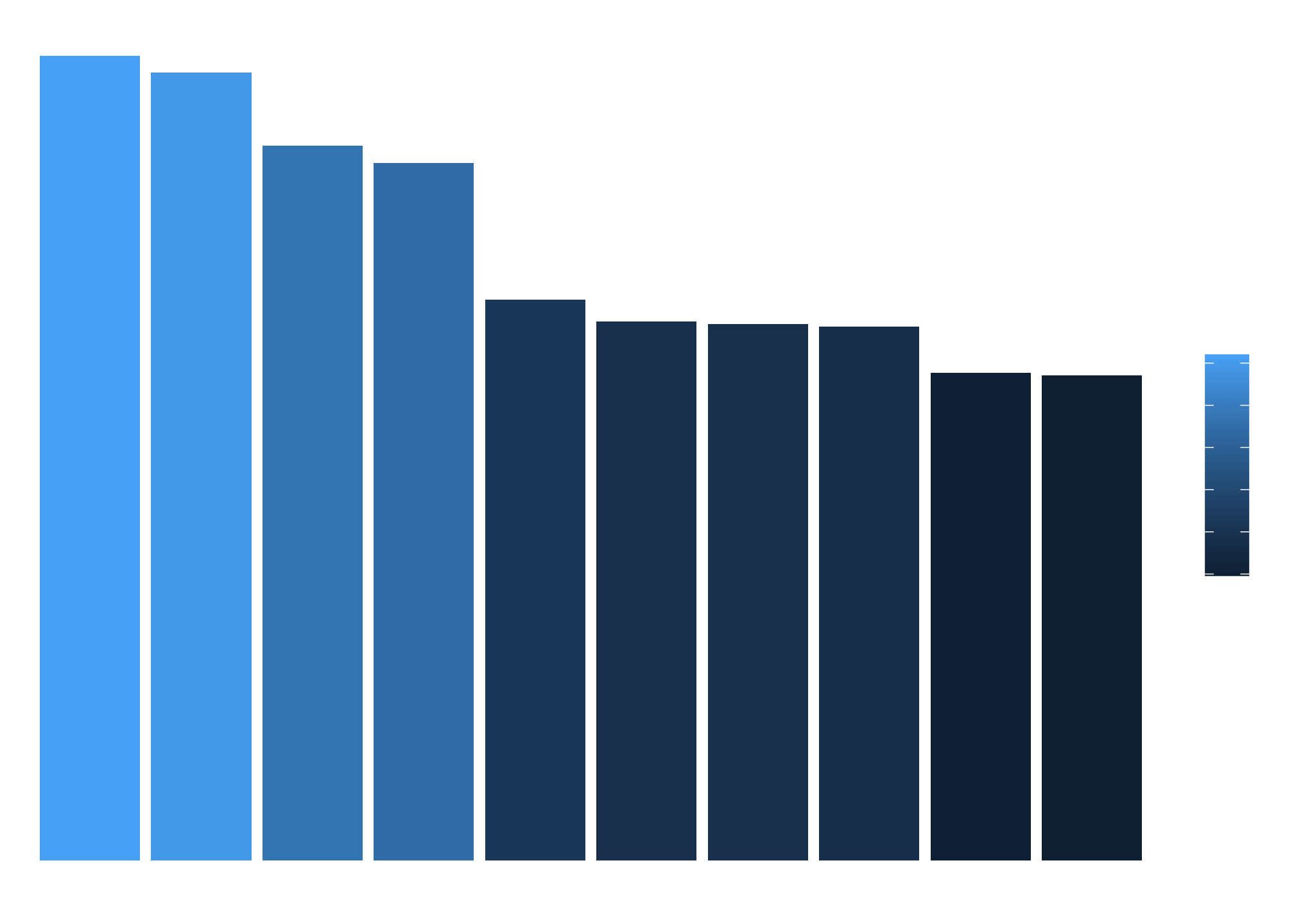
ggplot(top10_income_data, aes(x = reorder(Location, -Lower_2000),
                              y = Lower_2000,
                              fill = Lower_2000)) +
       geom_bar(stat = "identity") +
       theme_tufte() +
       xlab("Top 10 Cities and States") +
       ylab("Average Income in 2000 Lower Class")
ggplot(top10_income_data, aes(x = reorder(Location, -Lower_2000),
                              y = Lower_2000,
                              fill = Lower_2000)) +
       geom_bar(stat = "identity") +
       theme_tufte() +
       xlab("Top 10 Cities and States") +
       ylab("Average Income in 2000 Lower Class")
ggplot(top10_income_data, aes(x = reorder(Location, -Lower_2000),
                              y = Lower_2000,
                              fill = Lower_2000)) +
       geom_bar(stat = "identity") +
       theme_wsj() +
       xlab("Top 10 Cities and States") +
       ylab("Average Income in 2000 Lower Class")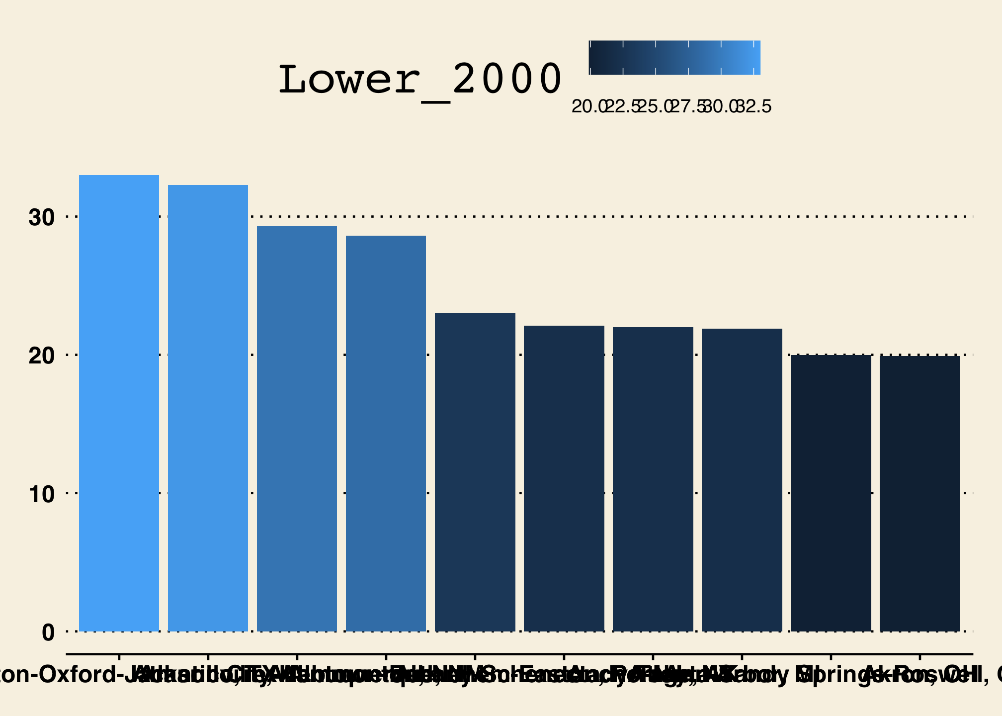
ggplot(top10_income_data, aes(x = reorder(Location, -Lower_2000),
                              y = Lower_2000,
                              fill = Lower_2000)) +
       geom_bar(stat = "identity") +
       theme_excel() +
       xlab("Top 10 Cities and States") +
       ylab("Average Income in 2000 Lower Class")
The Nearly Everyone Does This Approach
If you are great with controlling when needed and allowing others to control an experience, then the traditional path of least resistance outlook on ggplot will do just fine!
You can in many circumstances combine manual and prepackaged themes together. The extent to which you can do this often varies by theme. In any case, let’s see the fivethirtyeight theme with some manual edits.
ggplot(top10_income_data, aes(x = reorder(Location, -Lower_2000),
                              y = Lower_2000,
                              fill = Lower_2000)) +
       geom_bar(position = 'dodge',
                stat = "identity") +
       scale_fill_viridis_c() +
       theme_fivethirtyeight() +
       theme(axis.text.x = element_text(angle = 45,
                                        vjust = 0.5),
             legend.position = "right",
             legend.direction = "vertical") +
       xlab("Top 10 Cities and States") +
       ylab("Average Income in 2000 Lower Class") +
       guides(fill=guide_legend(title="Income"))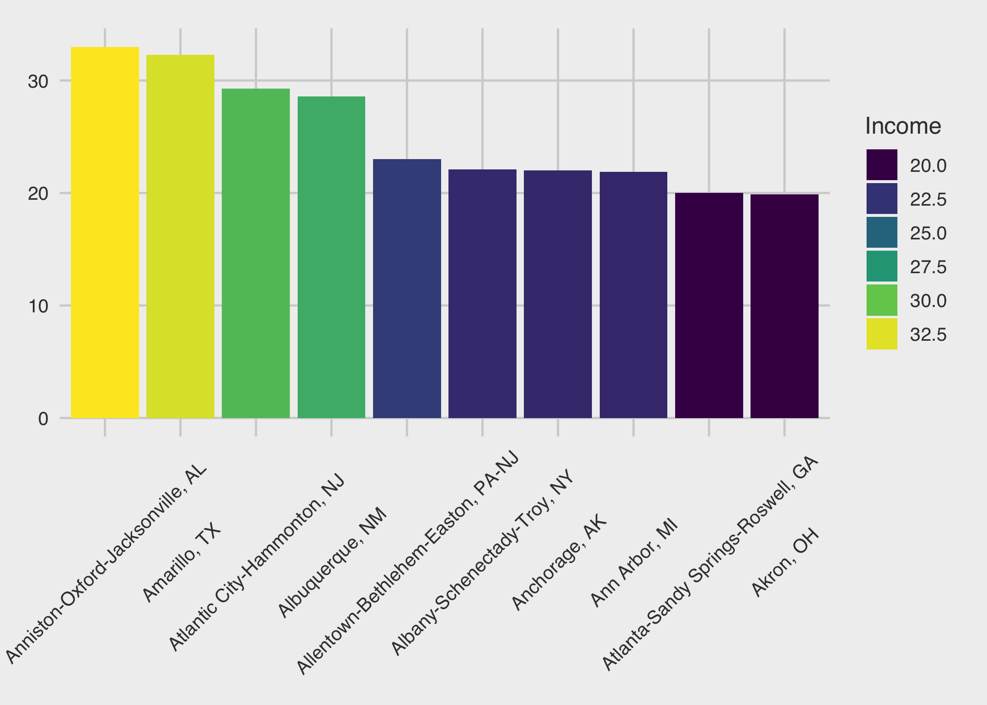
Or sometimes controlling the text itself is nice too but we’ll cover that soon. In the meantime, here’s a preview
ggplot(top10_income_data, aes(x = reorder(Location, -Lower_2000),
                              y = Lower_2000,
                              fill = Lower_2000)) +
       geom_bar(position = 'dodge',
                width = 0.9,
                stat = "identity",
                color = "#FFFFFF") +
       geom_richtext(aes(label = Location),
                     color = "#FFFFFF",
                     position = position_dodge(width = 0.9),
                     hjust = 0,
                     vjust = -0.1,
                     angle = 45,
                     fontface = "bold",
                     show.legend = FALSE) +
       scale_fill_gradient(low = "#52bf90",
                           high = "#317256") +
       theme_minimal() +
       theme(axis.text.x = element_blank(),
             axis.title = element_text(size = 14,
                                       face = "bold"),
             legend.position = "right",
             legend.direction = "vertical",
             panel.grid.minor.x = element_blank(),
             panel.grid.minor.y = element_line(),
             panel.grid.major.x = element_blank(),
             panel.grid.major.y = element_line()) +
       xlab("Top 10 Cities and States") +
       ylab("Average Income in 2000 Lower Class") +
       guides(fill = guide_legend(title = "Income",
                                  reverse = TRUE)) +
       expand_limits(x=c(0,14),
                     y=c(0, 60))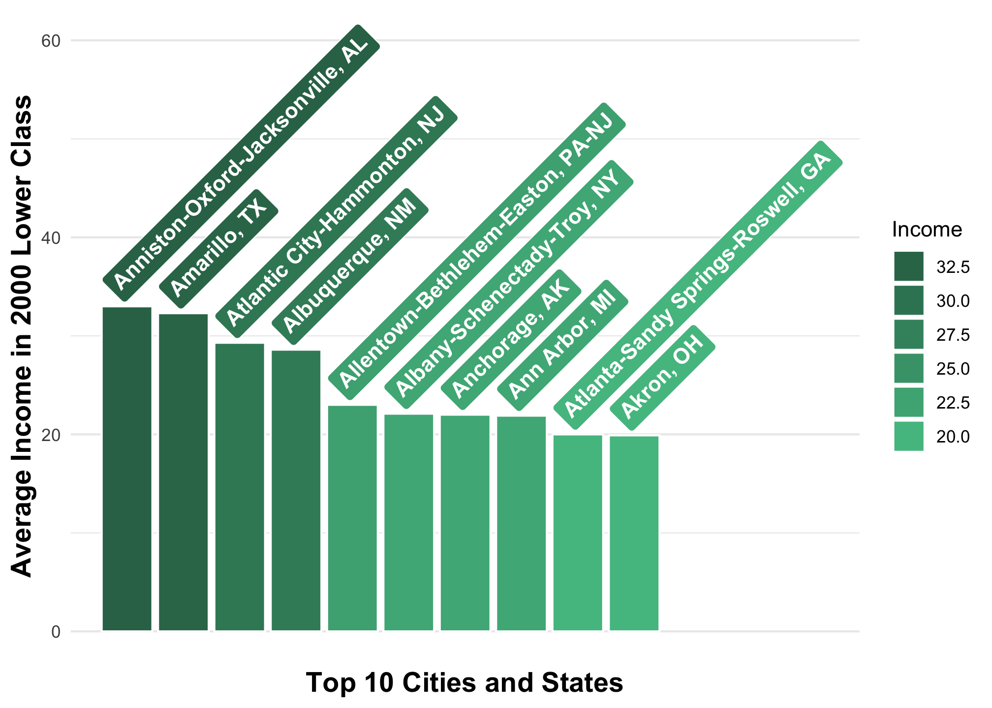
This includes opening up the data set and viewing a corresponding codebook if available.↩︎
While you’ve likely heard it before many many many times, it is generally unethical, not to mention statistically destructive to throw out any data without using proper methodology and reasoning↩︎
or you can use
slice_min()for the lowest values↩︎We can actually do this in many ways. This particular method is called the
data.tableapproach.↩︎For some reason↩︎