ggplotting
Getting Prepped
First Things First! Set your Working Directory
Your working directory is simply where your script will look for anything it needs like external data sets. There are a few ways to go about doing this which we will cover. However for now, just do the following:
- Open up a new script by going to
File > New File > R Script. - Save it in a preferably empty folder as whatever you want.
- Go to the menu bar and select
Session > Set Working Directory > To Source File Location.
Download the script
Copying and pasting syntax from a browser can cause problems. To avoid this issue, please download a script with all of the needed code presented in this walkthrough.
Load Up Some Libraries
Please go ahead and download the libraries below you don’t have and load them up
library(ggplot2)
library(cowplot)
library(RColorBrewer)
Its All About Layers
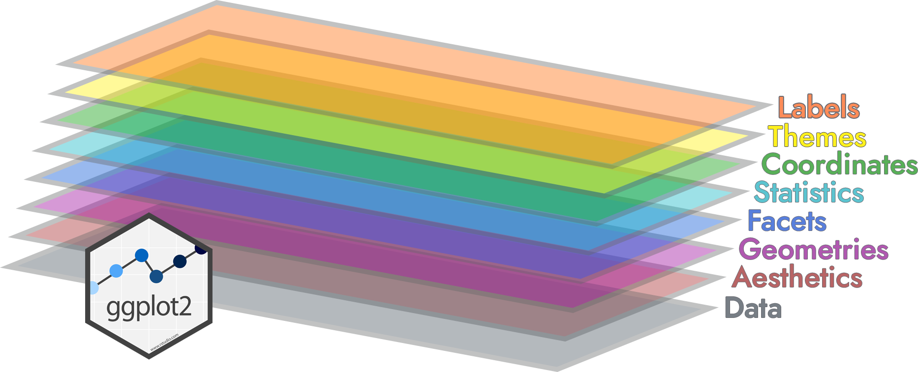
ggplot runs on layers1
We’ll work on this throughout the term, but here is a basic picture of the framework
Example: Diamonds
We’ll use the diamonds data set that’s included in ggplot, in particular we’ll start with this plot with a bunch of foundational commands
ggplot() +
  layer(
    data = diamonds,
    mapping = aes(x = carat, y = price),
    geom = "point",
    stat = "identity",
    position = "identity" ) +
  scale_y_continuous() +
  scale_x_continuous() +
  coord_cartesian()
which can be condensed to
ggplot(data = diamonds,
  mapping = aes(x = carat, y = price)) +
  geom_point()
You can get lazy about arguments, in that x and y are always the first arguments to aes so we often drop the argument names
ggplot(diamonds, aes(carat, price)) +
  geom_point()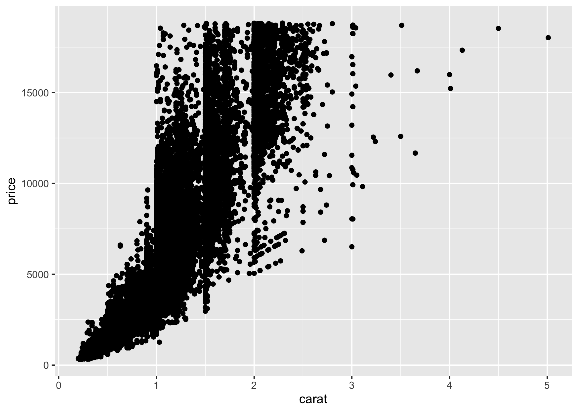
Another Example: Bar Plots
First we’ll make up a totally fake data set. Please pay close attention to the structure and what everything means.
data <- structure(list(V1 = c(34.88372093,
                              35.07751938,
                              35.27131783,
                              35.46511628,
                              35.65891473,
                              35.85271318),
                       V2 = c(0.00029997,
                              0.00019998,
                              0.00029997,
                              0.00029997,
                              0.00069993,
                              0.00069993)),
                      .Names = c("Perc", "Prop"),
                  row.names = c(NA, 6L),
                  class = "data.frame")
and view it!
View(data)The above says: I want a structure a list with two columns with variable Names V1 and V2 with the associated values in columns (given by c). Moreover, I want to name those columns Prop and Perc, with no row names (NA) and of length 6 (6 rows given by 6L). Finally, and possibly most importantly, it has to be a data frame!
Now let’s look at a barplot of the data using
- Base R
barplot(data$Perc,
        data$Perc,
        xlab="Percentage",
        ylab="Proportion")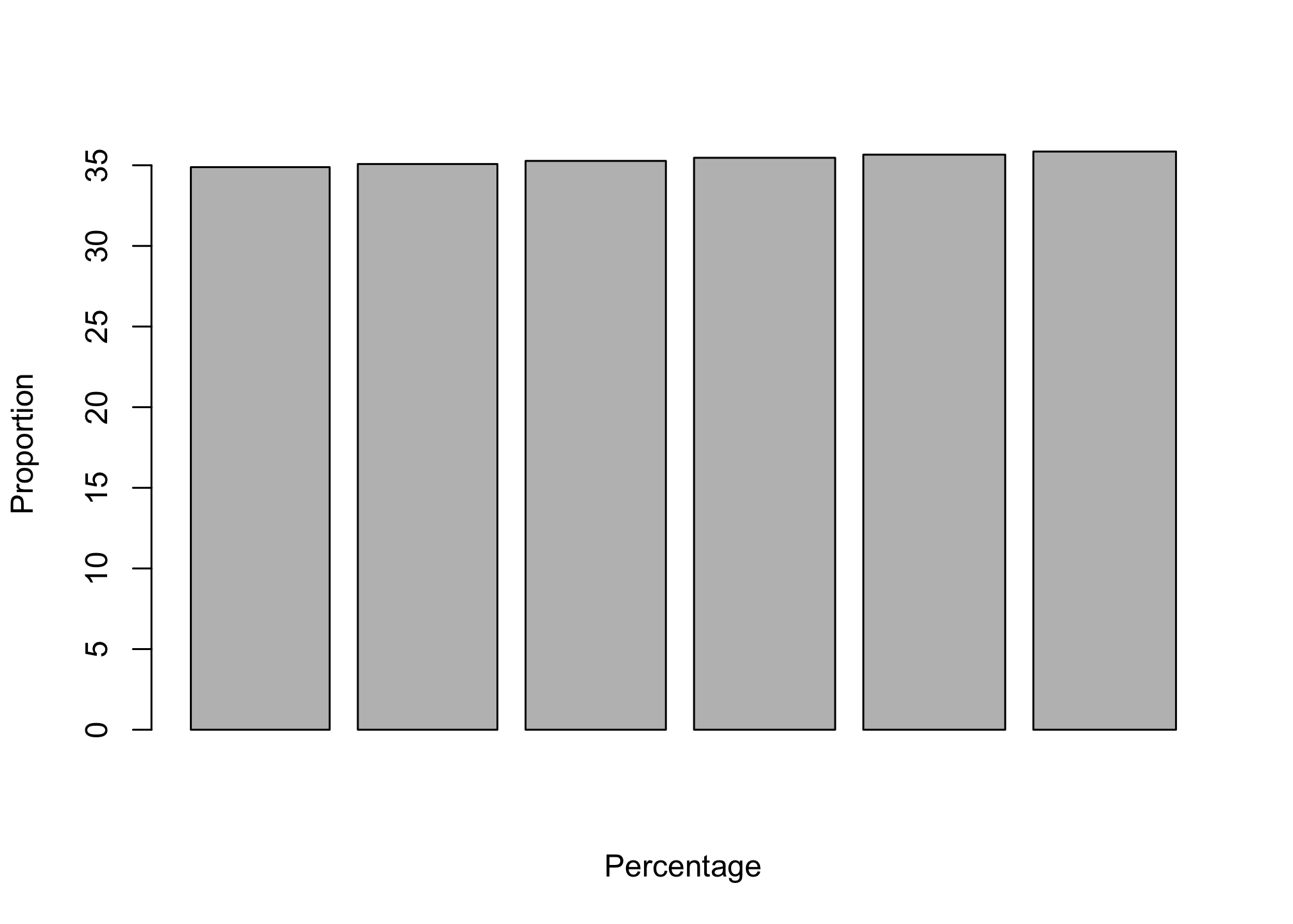
- ggplot
ggplot(data, aes(x=Perc, y=Prop)) +
  geom_bar(stat="identity") +
  labs(x="Percentage", y="Proportion")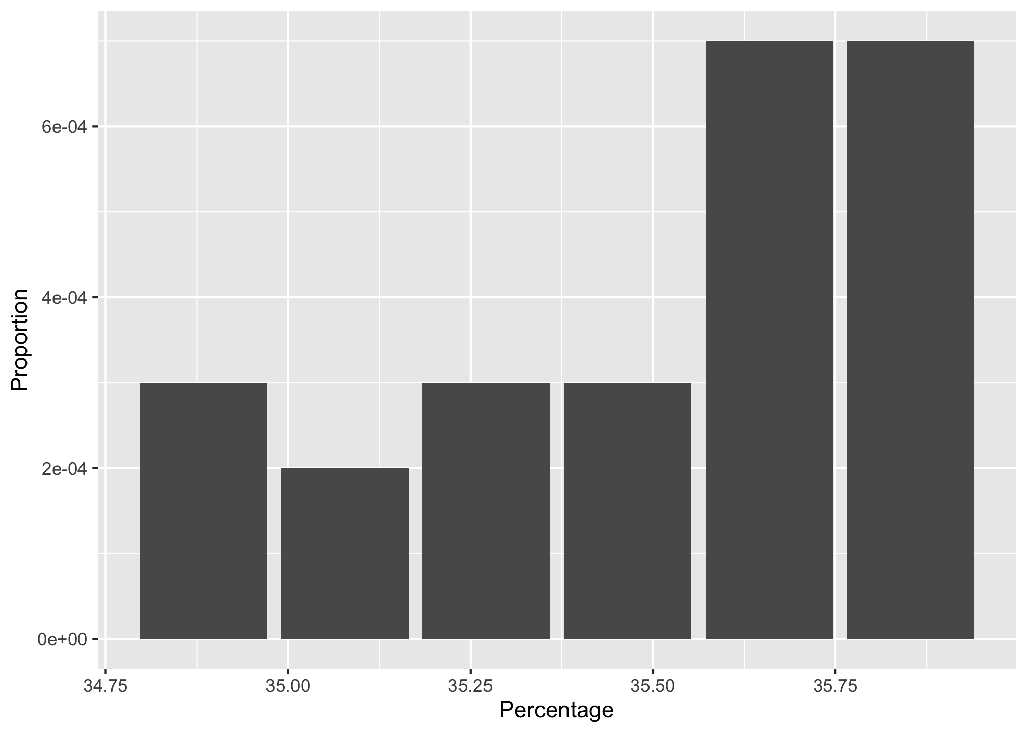
Now let’s try colors by using the Perc column
ggplot(data, aes(x=Perc, y=Prop, fill = Perc)) +
  geom_bar(stat="identity") +
  labs(x="Percentage", y="Proportion") +
  scale_color_brewer()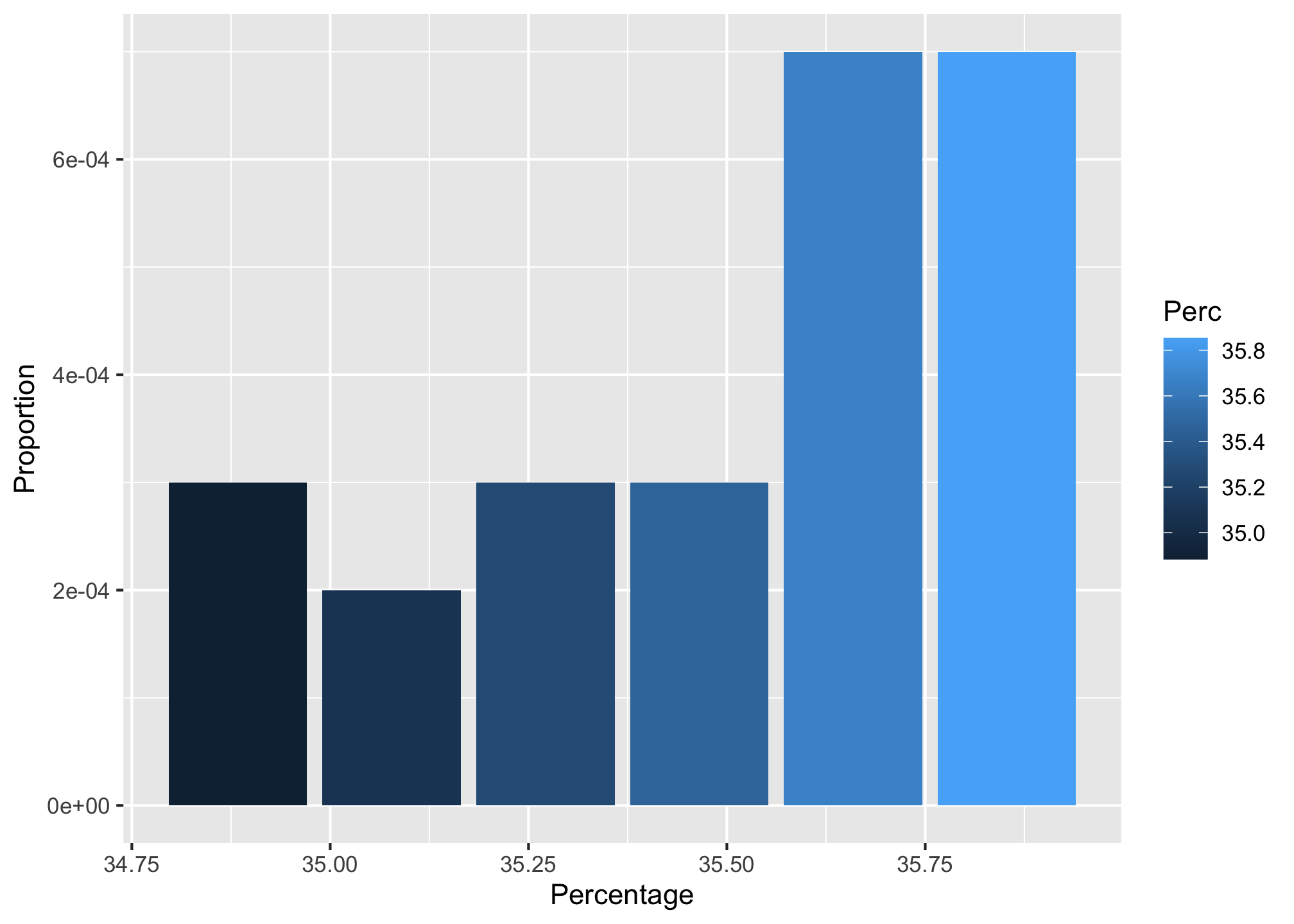
Yet Another Example: More Bar Plots!
Please download the libraries below you don’t have and load them up
library(xlsx)           # for reading in Excel data
library(magrittr)       # for easier syntax in one or two areas
library(gridExtra)      # old method for generating some comparison plots
library(patchwork)      # new method for generating some comparison plots
library(ggplot2)        # for generating the visualizations
library(viridis)        # because colors are fun!
We’ll use the mtcars data set. It is a standard example set that comprises fuel consumption and 10 aspects of automobile design and performance for 32 automobiles.
head(mtcars)## mpg cyl disp hp drat wt qsec vs am gear carb
## Mazda RX4 21.0 6 160 110 3.90 2.620 16.46 0 1 4 4
## Mazda RX4 Wag 21.0 6 160 110 3.90 2.875 17.02 0 1 4 4
## Datsun 710 22.8 4 108 93 3.85 2.320 18.61 1 1 4 1
## Hornet 4 Drive 21.4 6 258 110 3.08 3.215 19.44 1 0 3 1
## Hornet Sportabout 18.7 8 360 175 3.15 3.440 17.02 0 0 3 2
## Valiant 18.1 6 225 105 2.76 3.460 20.22 1 0 3 1If we wanted to get the count of vehicles that have 4, 6 and 8 cylinders we can simply identify the x-axis variable and apply geom_bar(). This, by default will plot the count of 4, 6, and 8 cylinder vehicles in the data set. However, note that if the variable is numeric it may be interpreted as a continuous variable. This is the case in the first plot you will do below which is why the x-axis is continuous in nature. However, we can force the cylinder variable to a categorical (factor) variable by applying x = factor(cyl) using the second plot you will do below which produces a discrete x-axis.
# x-axis as continuous
p1 <- ggplot(mtcars, aes(x = cyl)) +
  geom_bar() +
  ggtitle("Fig. A: x-axis as a continuous variable")

# x-axis as discrete
p2 <- ggplot(mtcars, aes(x = factor(cyl))) +
  geom_bar() +
  ggtitle("Fig B: x-axis as a discrete (factor) variable")
We’ll see how to deal with the cut off text later
We’ll display the results in two ways
- Using the gridExtra package
grid.arrange(p1, p2, ncol = 2)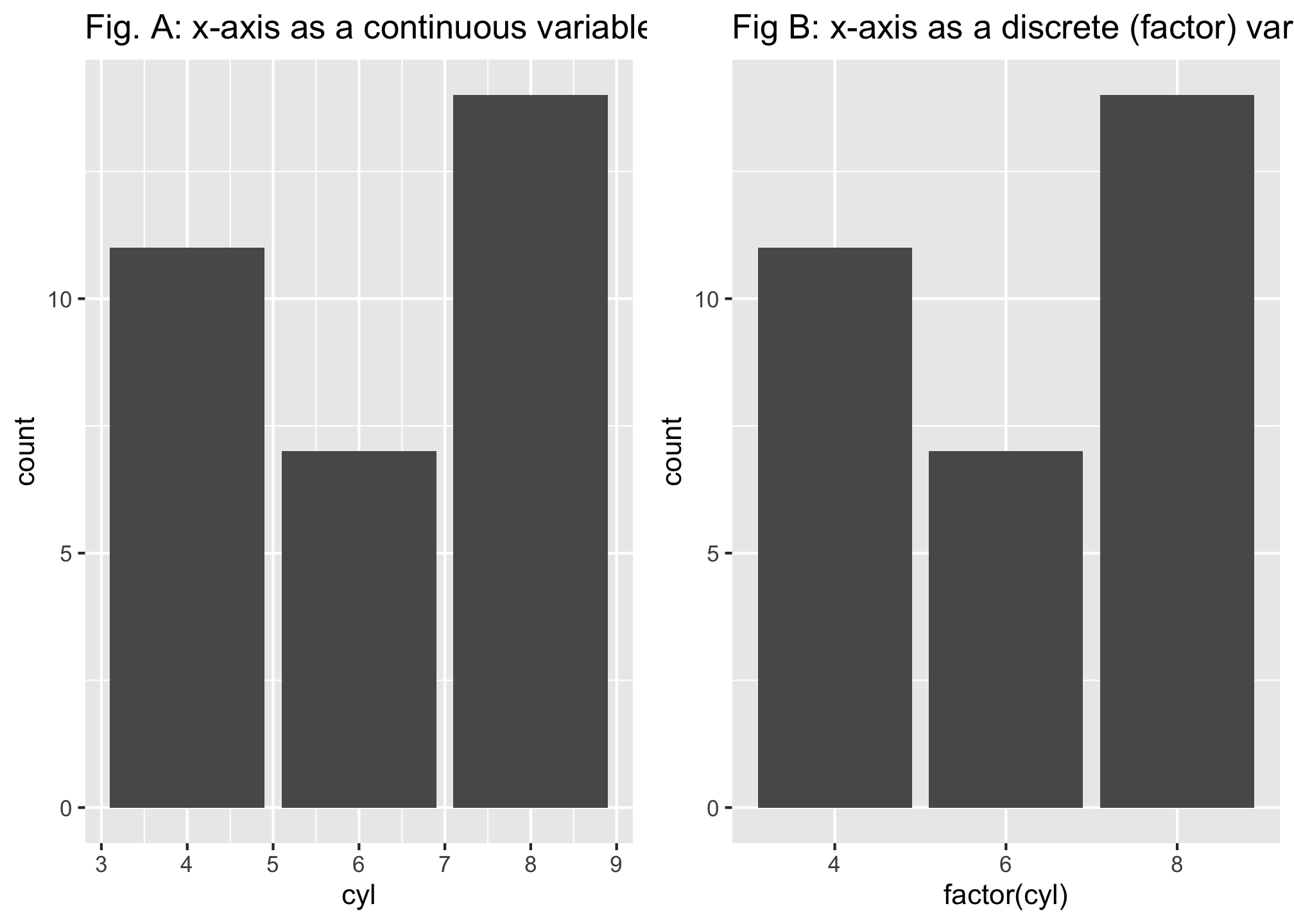
- Using the patchwork package
p1 + p2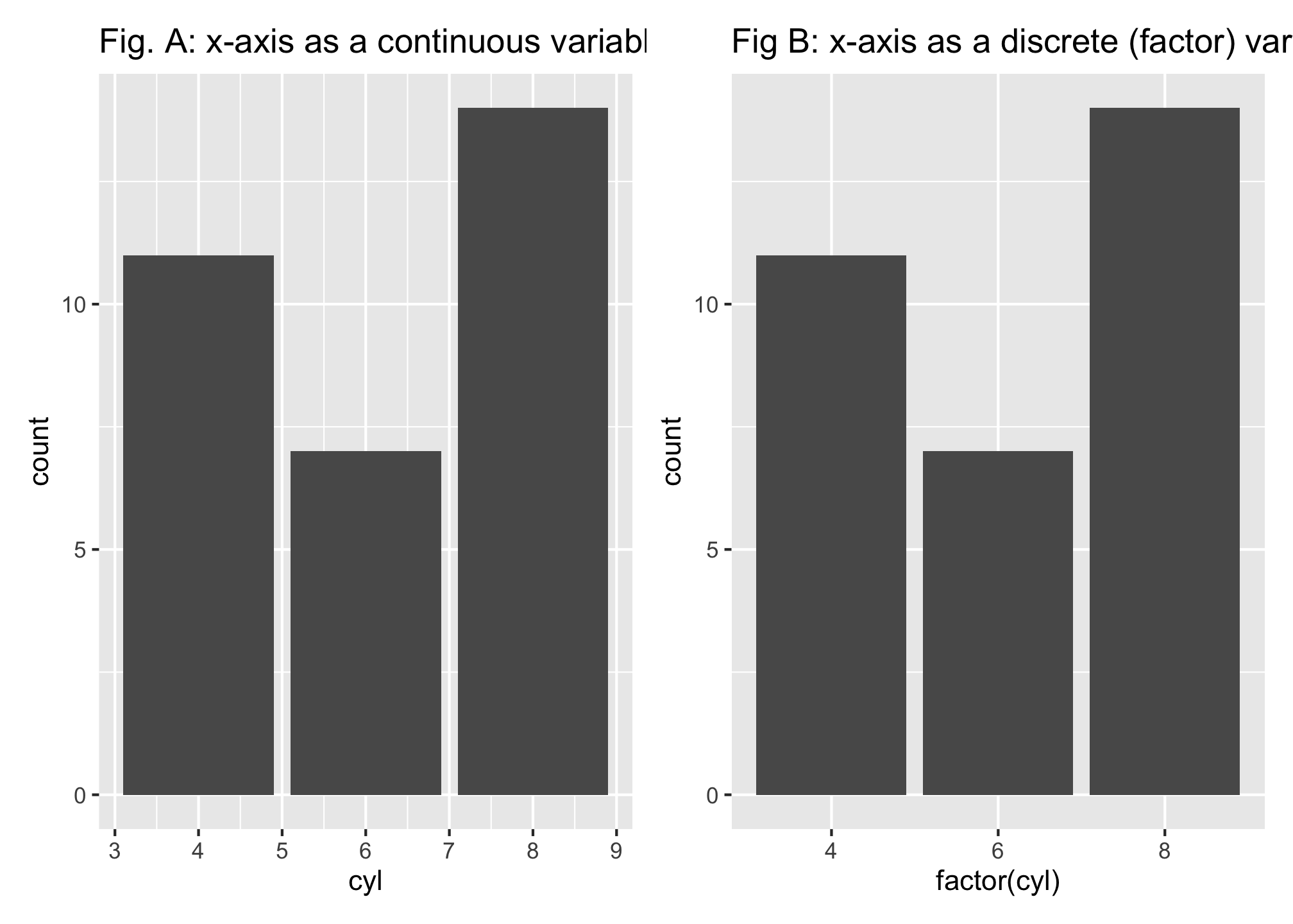
Although the default width of the bars is aesthetically pleasing, you do have the ability to adjust this attribute by setting the width in geom_bar(). The default width is 0.9;
- smaller values (min width of 0) make the bars narrower and
- larger values (max width of 1) make the bars wider.
Here are some examples
e1 <- ggplot(mtcars, aes(x = factor(cyl))) +
  geom_bar(width = .5) +
  ggtitle("bar width = 0.5")

e2 <- ggplot(mtcars, aes(x = factor(cyl))) +
  geom_bar(width = .75) +
  ggtitle("bar width = 0.75")

e3 <- ggplot(mtcars, aes(x = factor(cyl))) +
  geom_bar(width = .9) +
  ggtitle("bar width = 0.9")

e4 <- ggplot(mtcars, aes(x = factor(cyl))) +
  geom_bar(width = .99) +
  ggtitle("bar width = 0.99")
e1 + e2 + e3 + e4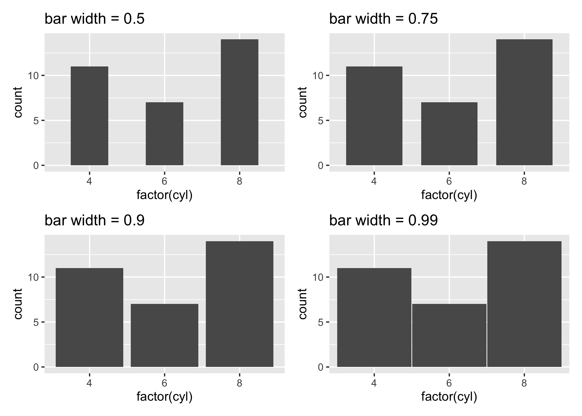
e1 + e2 + e3 + e4 + plot_layout(ncol = 1)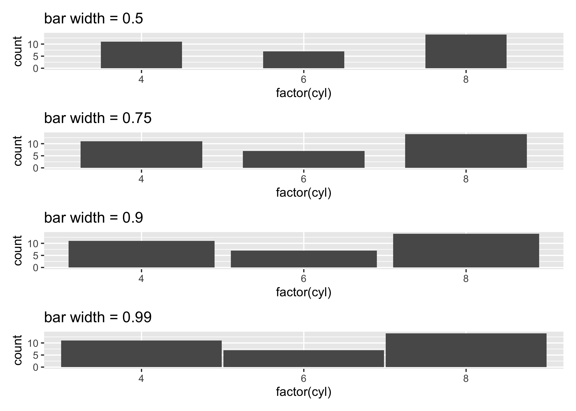
e1 + e2 + e3 + e4 + plot_layout(nrow = 1)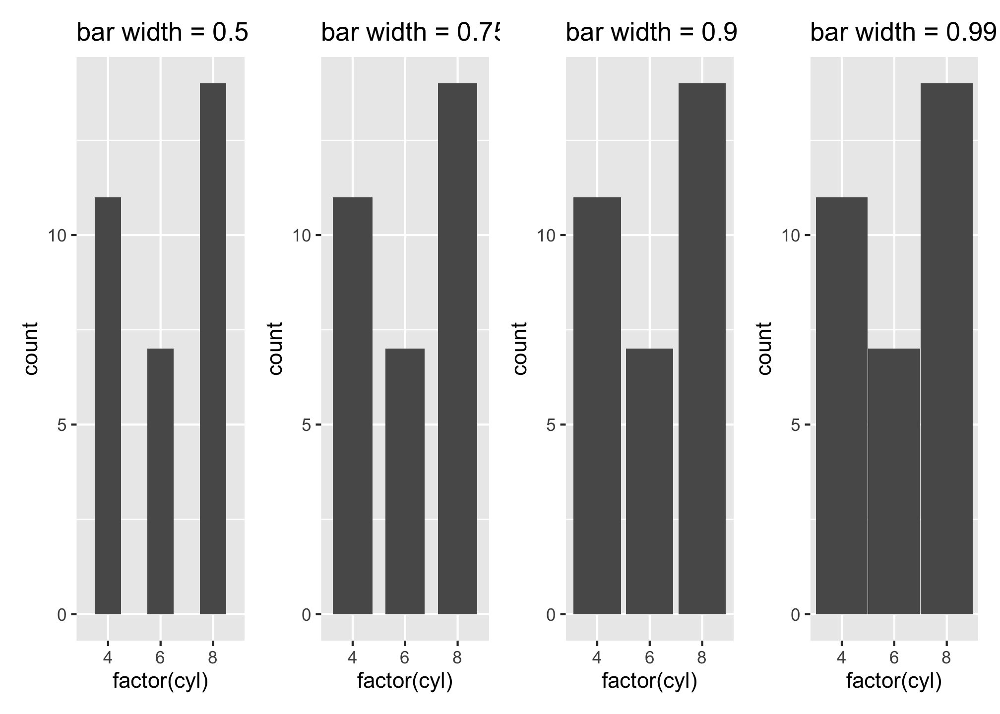
Take a look at some more examples over at the patchwork vignette.
We can also adjust the fill and outline colors of the bars along with the opacity by applying fill, color, and alpha arguments respectively in the geom_bar() function.
ggplot(mtcars, aes(x = factor(cyl))) +
  geom_bar(fill = "dodgerblue",
           color = "grey40",
           alpha = 0.5)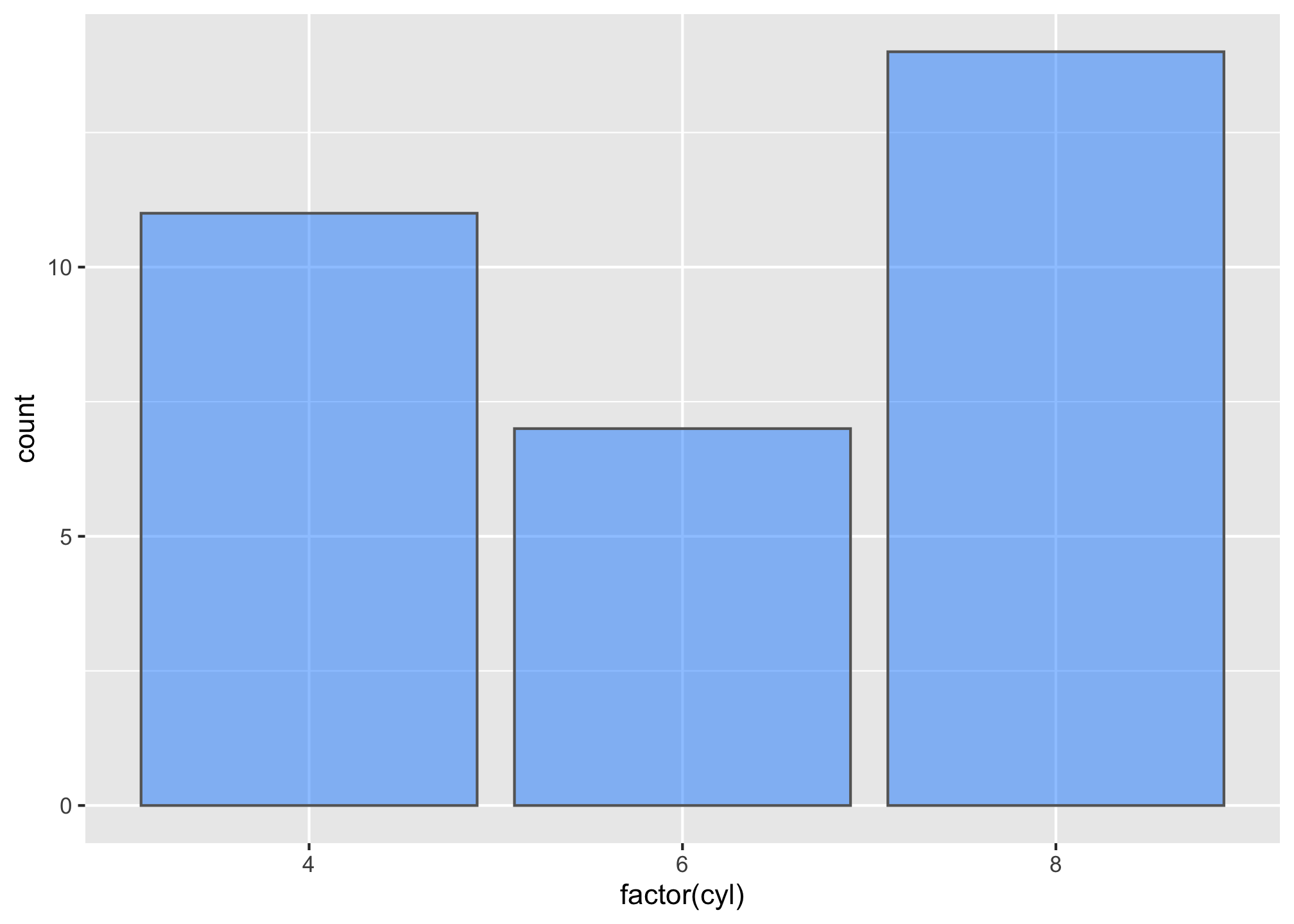
There are also times when we want to plot many categories along the x-axis and the length of the names make it difficult to read. One approach to resolving this issue is to use axis.text.x argument within the theme() function to rotate the text.
t1 <- ggplot(mtcars, aes(x = row.names(mtcars), y = mpg)) +
  geom_bar(stat = "identity") +
  ggtitle("Fig. A: Default x-axis")

t1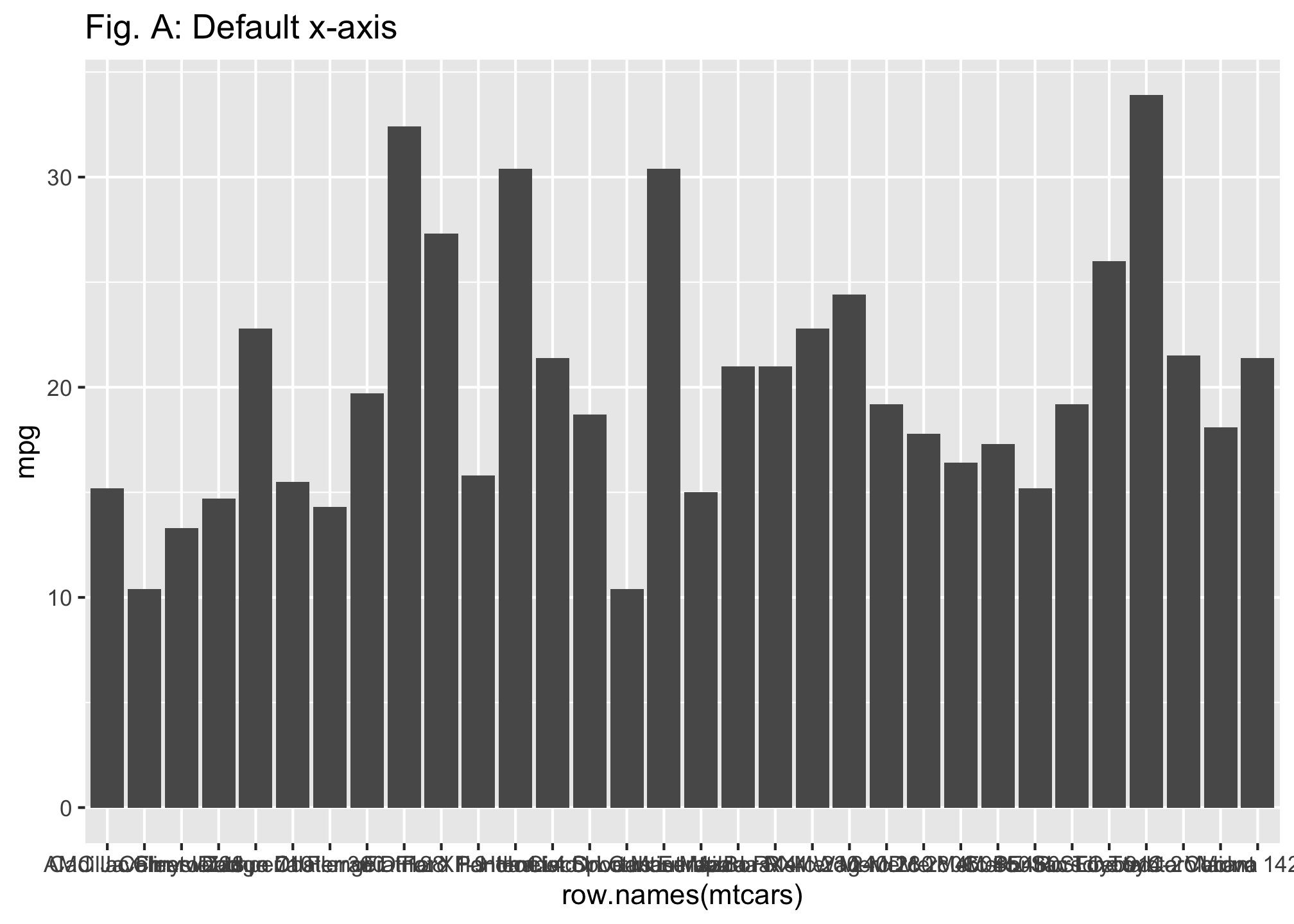
t2 <- ggplot(mtcars, aes(x = row.names(mtcars), y = mpg)) +
  geom_bar(stat = "identity") +
  theme(axis.text.x = element_text(angle = 90, hjust = 1, vjust = .5)) +
  ggtitle("Fig. B: Rotated x-axis")

t2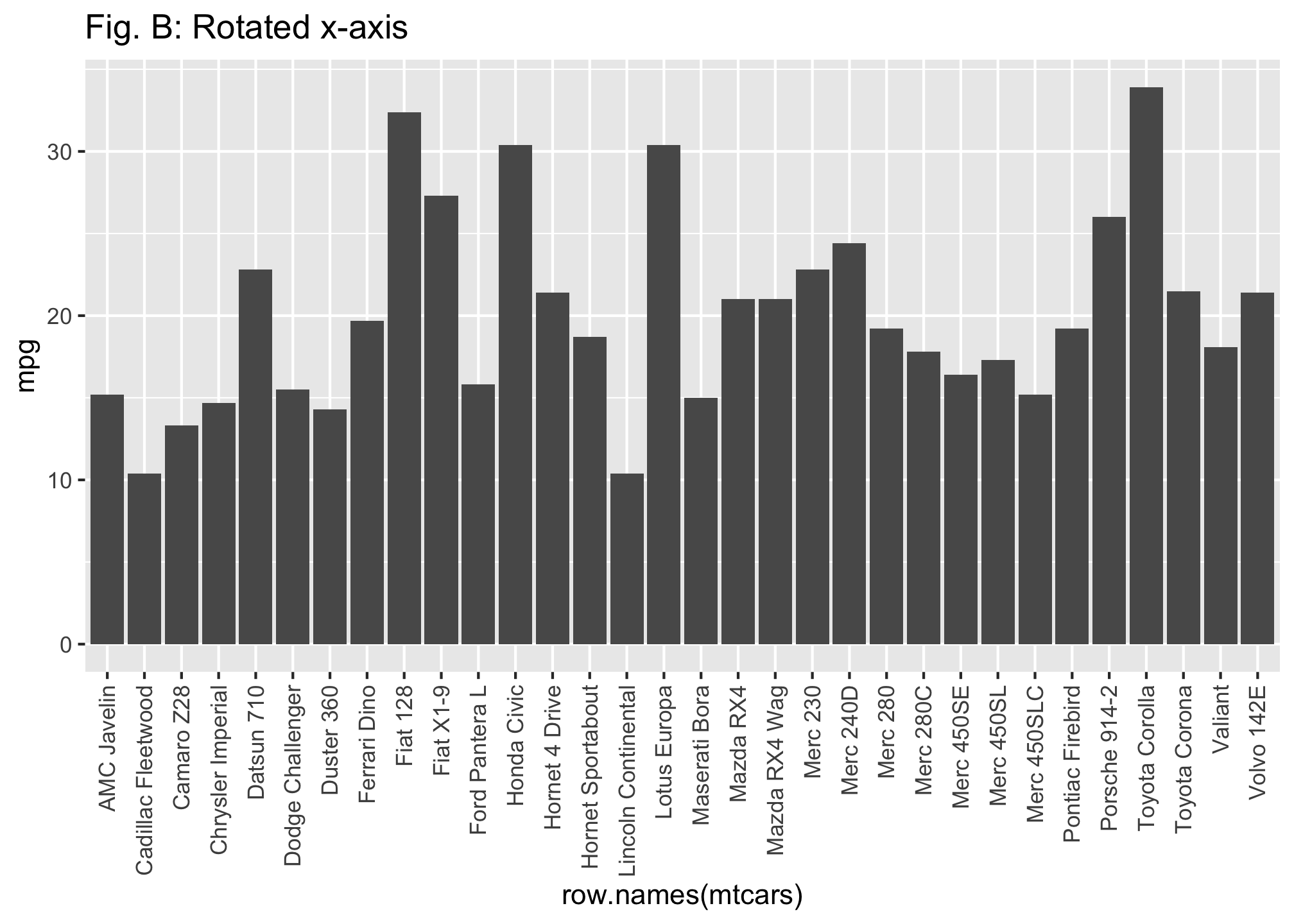
t1 + t2 + plot_layout(ncol = 1)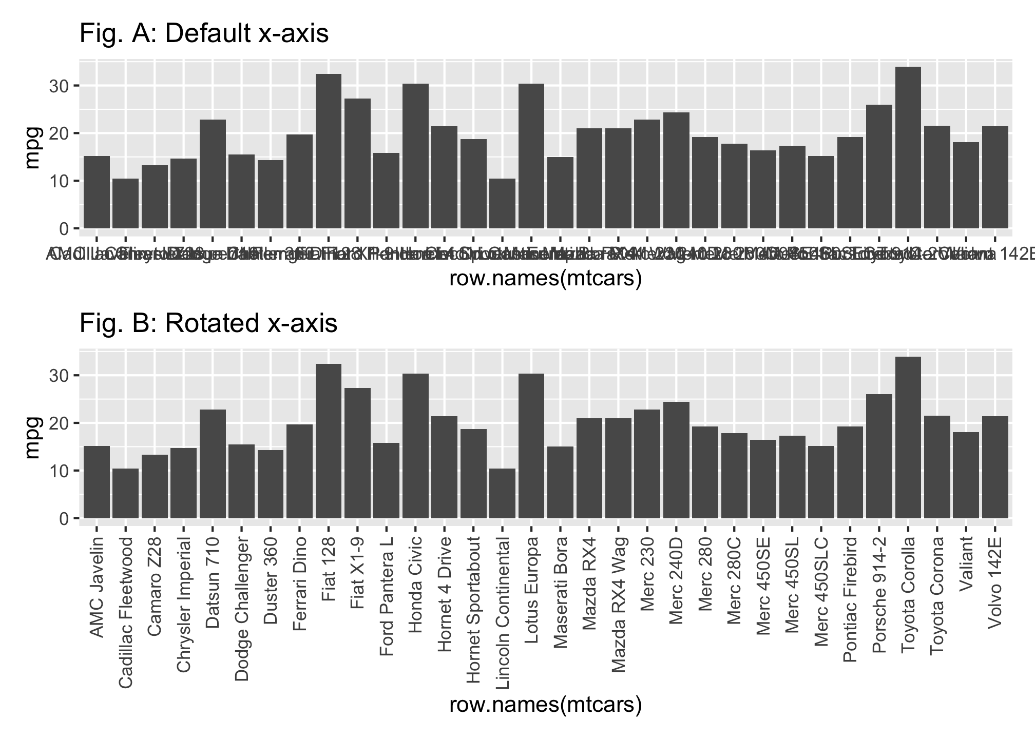
However, you may hate to read rotated x-axis labels since it can be difficult. In cases like these rotated bar charts are far more appealing. We can rotate the axes by applying the coord_flip() function, which flips the x and y coordinates. To make this even easier to digest we can order the vehicles based on their mpg values as illustrated in the second plot you’ll do below. To do this just reorder the x variable by applying the reorder() function.
r1 <- ggplot(mtcars, aes(x = row.names(mtcars), mpg)) +
  geom_bar(stat = "identity") +
  coord_flip() +
  ggtitle("Fig. A: Default rotated x-axis")

# order bars
r2 <- ggplot(mtcars, aes(x = reorder(row.names(mtcars), mpg), y = mpg)) +
  geom_bar(stat = "identity") +
  coord_flip() +
  ggtitle("Fig. B: Rotated ordered x-axis")

r1 + r2 + plot_layout(nrow = 1)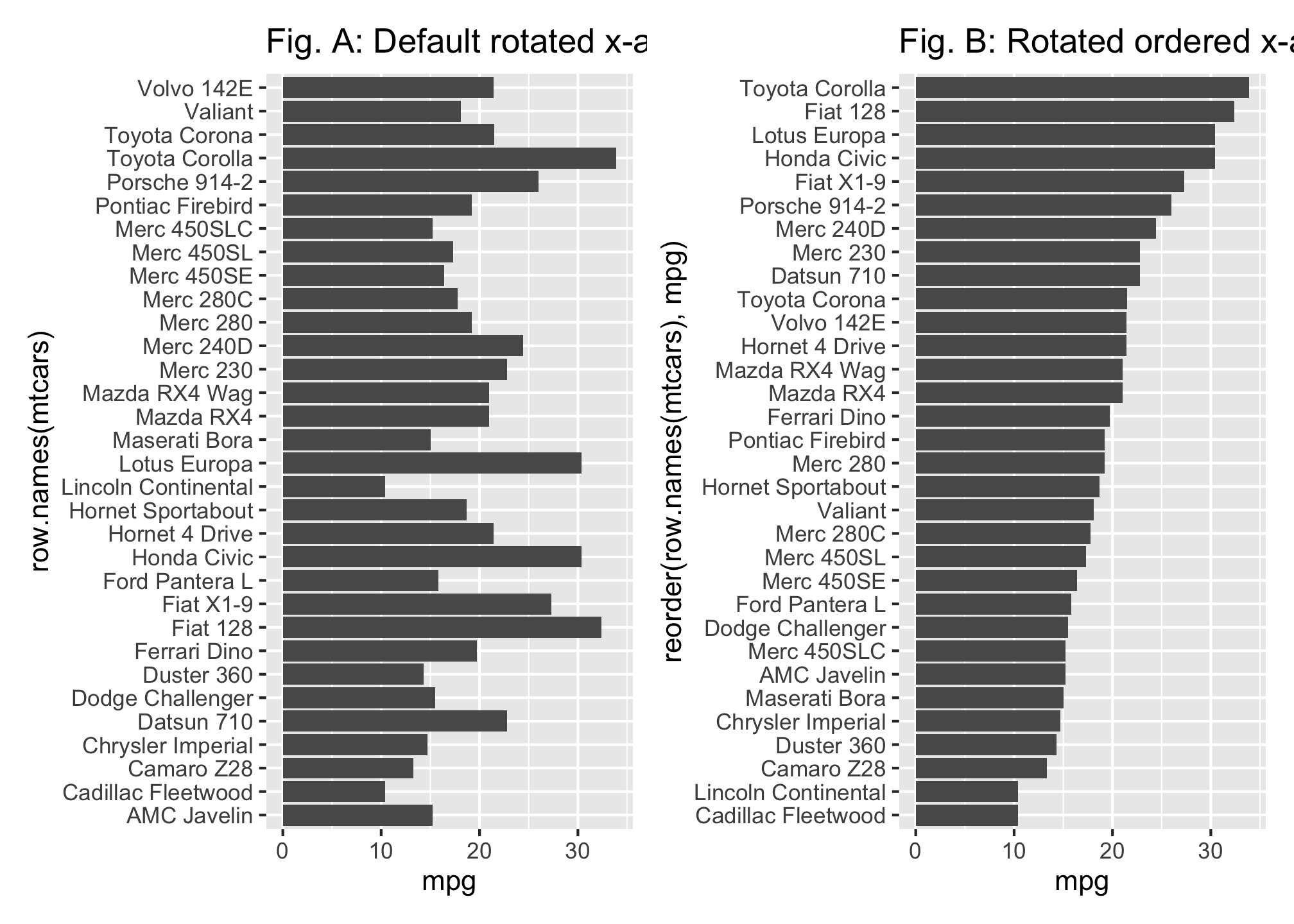
Comparisons Using Bar Charts
Sometimes we want to compare different groups across the categorical variables of interest. This is primarily done via color, side-by-side bars, or stacked bars. To add a color dimension we simply add a fill argument to our first line of code to tell R what variable we want to use to color our bars.
In this example we compare mpg across all the vehicles but also color the vehicles based on number of cylinders. R will use default color codings but you can
- set the colors manually using scale_fill_manual as in the second plot you’ll do. But you can also
- use
scale_fill_brewerto color with preset color schemes (see more about ColorBrewer here) and - many others! (if you type
scale_fillinto your RStudio Help search field you will see all the possibilities)
Let’s compare mpg across all cars and color based on cyl
m1 <- ggplot(mtcars, aes(x = reorder(row.names(mtcars), mpg), y = mpg, fill = factor(cyl))) +
  geom_bar(stat = "identity") +
  coord_flip() +
  theme_minimal() +
  ggtitle("Fig. A: Default fill colors")

m2 <- ggplot(mtcars, aes(x = reorder(row.names(mtcars), mpg), y = mpg, fill = factor(cyl))) +
  scale_fill_manual(values = c("#e5f5e0", "#a1d99b", "#31a354")) +
  geom_bar(stat = "identity") +
  coord_flip() +
  theme_minimal() +
  ggtitle("Fig. B: Manually set fill colors")


m1 + m2 + plot_layout(ncol = 2)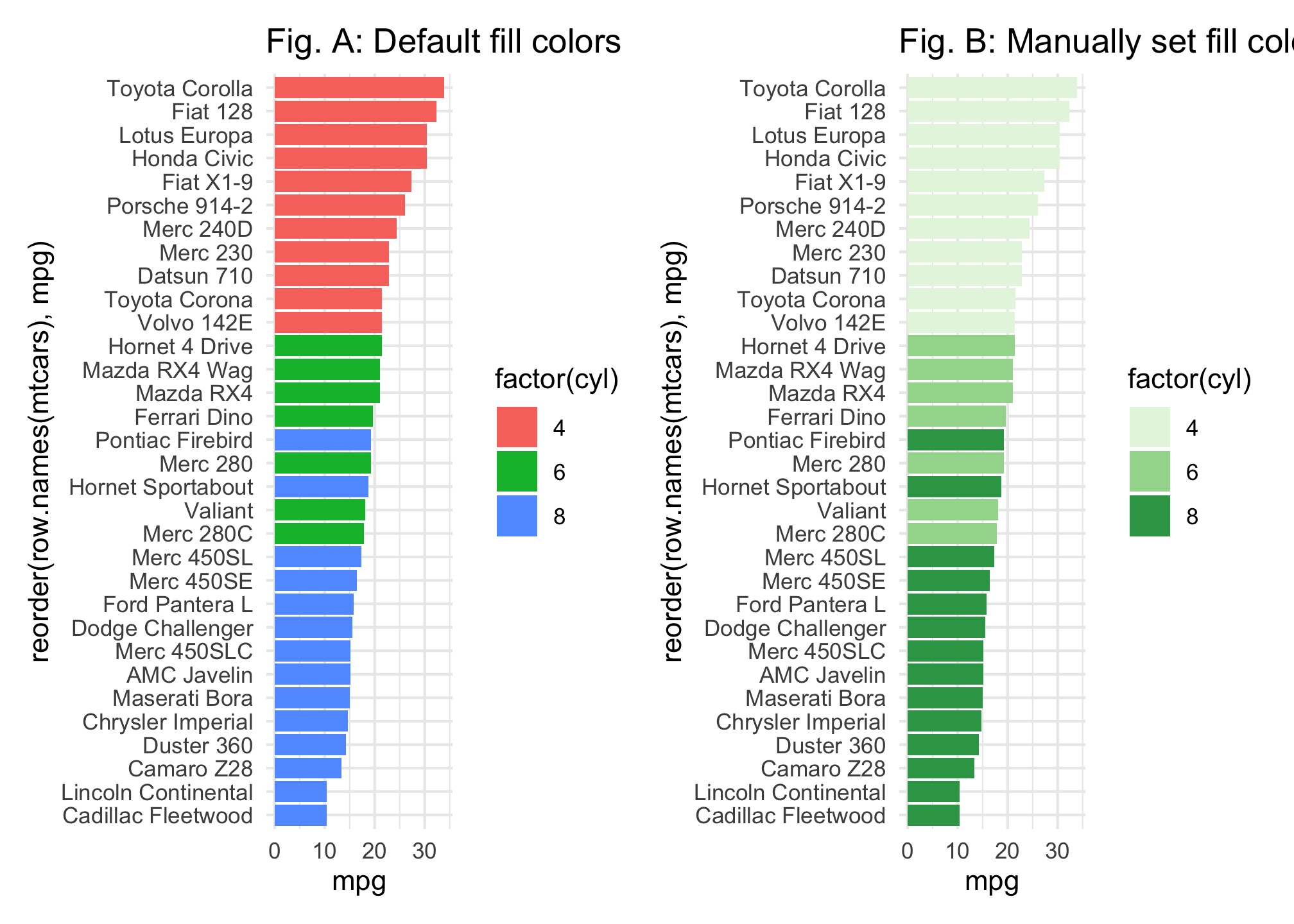
We can also use side-by-side bars to make comparisons. Say we want to compare the average mpg for cars across the different 4, 6, and 8 cylinder categories but also assess the impact that transmission (variable am where 0 = automatic, 1 = manual) has. we apply the fill argument to color bars based on transmission type then include the position = "dodge" in the geom_bar() function. This tells R to have two bars for each cylinder type, color fill each bar based on the type of transmission and then adjust (aka “dodge”) the position of the bars so that they are side-by-side.
t1 <- ggplot(mtcars, aes(factor(cyl), mpg, fill = factor(am))) +
  geom_bar(stat = "identity", position = "dodge") +
  ggtitle("Default color comparison")

# more pleasing colors
t2 <- ggplot(mtcars, aes(factor(cyl), mpg, fill = factor(am))) +
  geom_bar(stat = "identity", position = "dodge") +
  scale_fill_brewer(palette = "Pastel1") +
  ggtitle("Adjusted color comparison")

t1 + t2 + plot_layout(ncol = 2)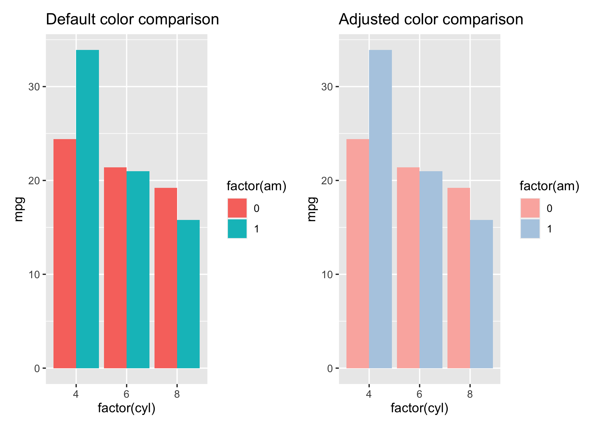
You can adjust the dodge width by incorporating the position = position_dodge(width = x) argument in the geom_bar() function. By default, the width is 0.90 and a lower value will create overlap of your side-by-side bars and a larger value will create spacing between the bars.
l1 <- ggplot(mtcars, aes(factor(cyl), mpg, fill = factor(am))) +
  geom_bar(stat = "identity", position = "dodge") +
  ggtitle("Default dodge positioning") +
  theme(legend.position = "none")

l2 <- ggplot(mtcars, aes(factor(cyl), mpg, fill = factor(am))) +
  geom_bar(stat = "identity", position = position_dodge(width = .5)) +
  ggtitle("Overlap of side-by-side bars") +
  theme(legend.position = "none")

l3 <- ggplot(mtcars, aes(factor(cyl), mpg, fill = factor(am))) +
  geom_bar(stat = "identity", position = position_dodge(width = 1)) +
  ggtitle("Spacing between side-by-side bars") +
  labs(fill = "AM") +
  theme(legend.position = c(1,1), legend.justification = c(1,1),
        legend.background = element_blank())


l1 + l2 + l3 + plot_layout(ncol = 3)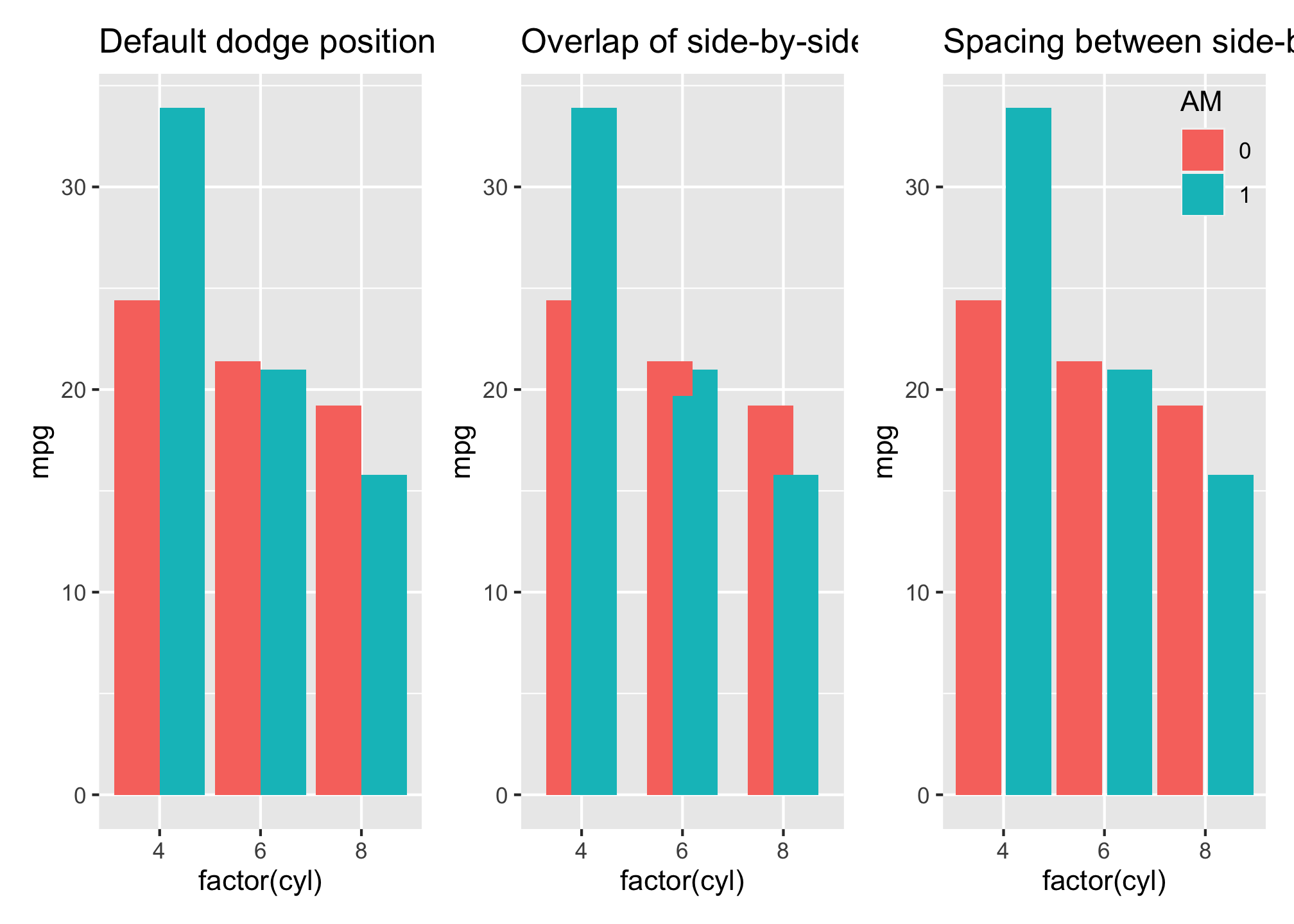
Stacked bars are the third common approach to compare groups with bar charts. By default, when you introduce a variable to color fill with in the first line, if you enter no other arguments ggplot will produce a stacked bar chart.
ggplot(mtcars, aes(factor(cyl), mpg, fill = factor(am))) +
  geom_bar(stat = "identity")
Unfortunately, the way ggplot color codes the bars is opposite to how the colors are displayed in the legend. We can resolve this two different ways; either reverse the legend with the arguments displayed in the guides() function in your first plotbelow. or specify the direction of the levels when transforming the transmission (am) variable into a factor as displayed in the first line of code in Fig B. Both will align the legend color coding layout to the color coding of the stacked bars but each option also helps determine which color is top versus on the bottom.
# reverse legend color coding layout
q1 <- ggplot(mtcars, aes(factor(cyl), mpg, fill = factor(am))) +
  geom_bar(stat = "identity") +
  guides(fill = guide_legend(reverse = TRUE)) +
  labs(fill = "am") +
  ggtitle("Fig A: Reverse legend")

# or reverse stacking order by changing the factor levels
q2 <- ggplot(mtcars, aes(factor(cyl), mpg, fill = factor(am, levels = c(1, 0)))) +
  geom_bar(stat = "identity") +
  labs(fill = "am") +
  ggtitle("Fig B: Specify levels")

q1 + q2 + plot_layout(ncol = 2)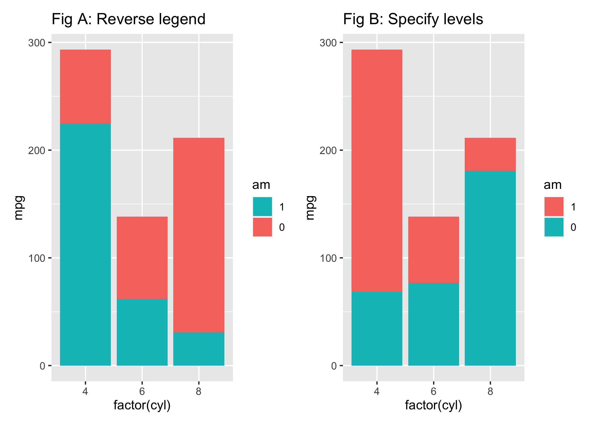
As before we can change the color of our stacked bars by incorporating one of the many scale_fill_xxxx arguments. Here I manually specify the colors to apply with scale_fill_manual().
ggplot(mtcars, aes(factor(cyl), mpg, fill = factor(am, levels = c(1, 0)))) +
  geom_bar(stat = "identity") +
  scale_fill_manual(values = c("#a1d99b", "#31a354")) +
  labs(fill = "AM")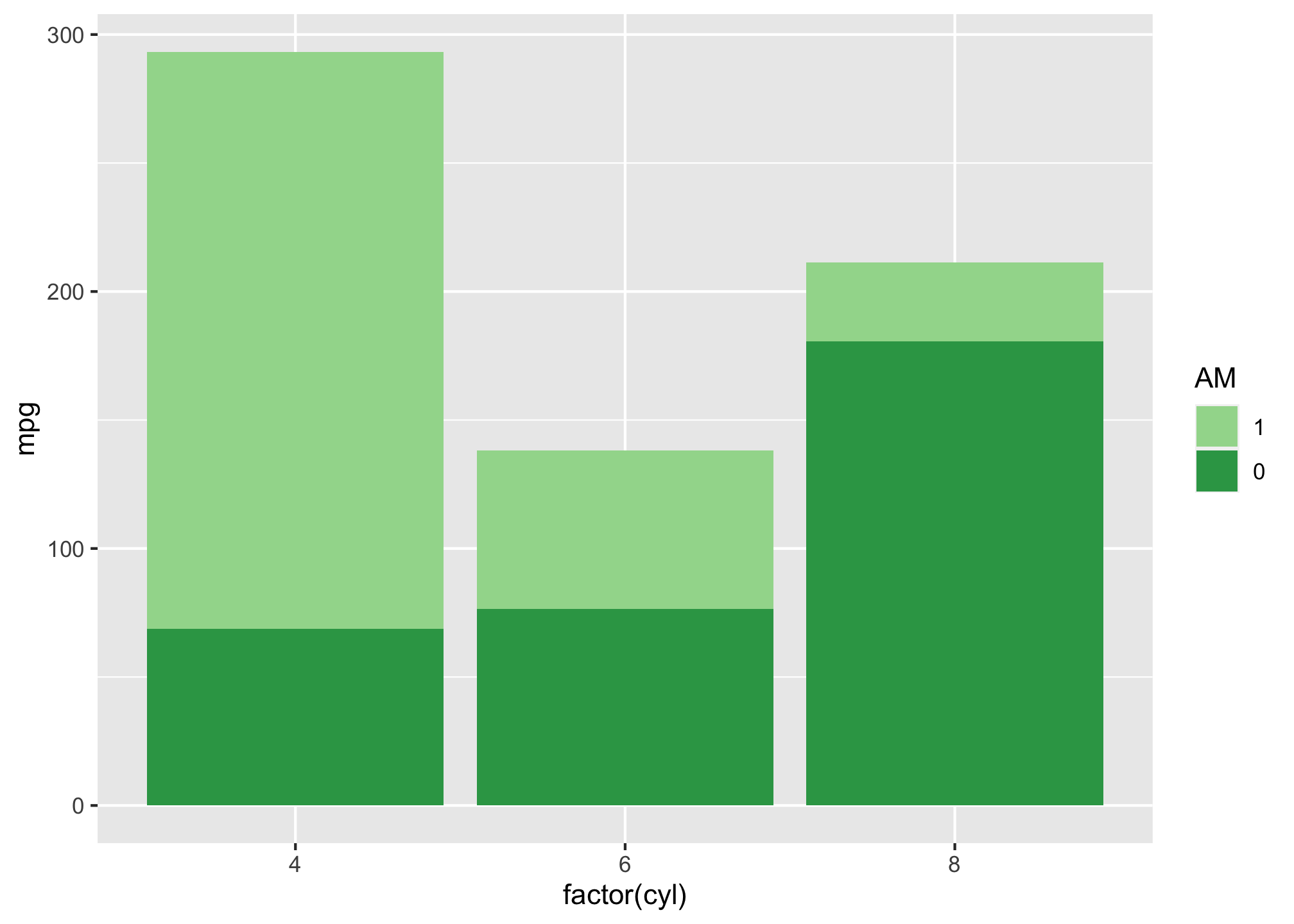
Adding Values
Often, it is helpful to provide labels/markers on the bar charts to help the reader interpret the results correctly or just to make it easier to read the graphic. For instance, we can add the actual mpg value to the following vertical bar chart by incorporating the geom_text() function and telling the function to label each bar with the mpg value. I can also tell ggplot to nudge the values left or right sit within or outside the bar and also color the text.
p1 <- ggplot(mtcars, aes(reorder(row.names(mtcars), mpg), mpg)) +
  geom_bar(stat = "identity") +
  coord_flip() +
  geom_text(aes(label = mpg), nudge_y = 2)

p2 <- ggplot(mtcars, aes(reorder(row.names(mtcars), mpg), mpg)) +
  geom_bar(stat = "identity") +
  coord_flip() +
  geom_text(aes(label = mpg), nudge_y = -2, color = "white")

p1 + p2 + plot_layout(ncol = 2)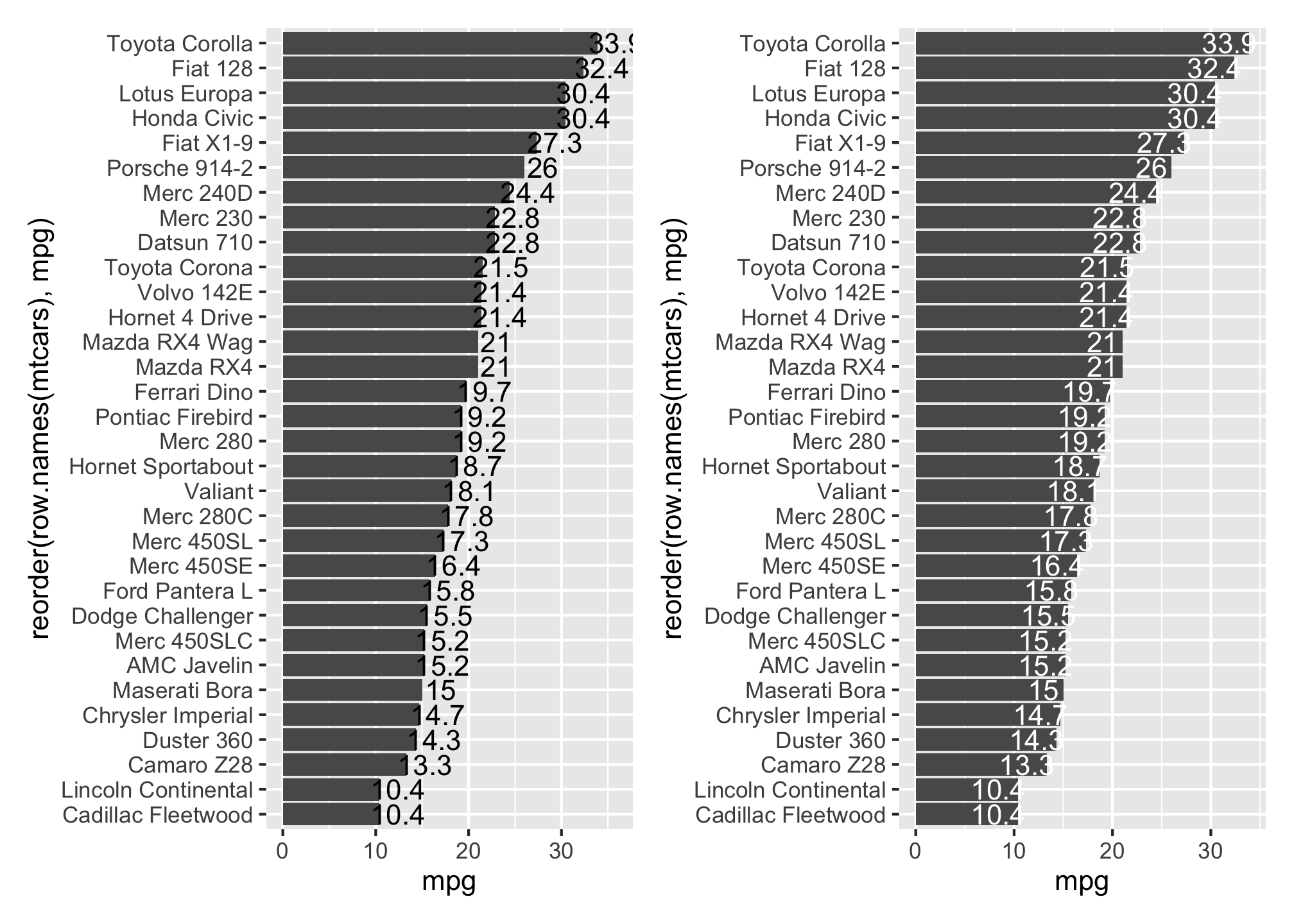
Labeling grouped bars is similar, however, we need to add a position = position_dodge(0.9) argument to the geom_text() function to tell ggplot to adjust the text location. By default, the values will be centered on the top of the bar but you can adjust the text to the top of the bar by including a vjust = 0.5 argument or adjust the text to within the bar with vjust = 1.5
p1 <- ggplot(mtcars, aes(factor(cyl), mpg, fill = factor(am))) +
  geom_bar(stat = "identity", position = "dodge") +
  geom_text(aes(label = round(mpg, 1)), position = position_dodge(0.9)) +
  ggtitle("Fig A: Default text alignment")

p2 <- ggplot(mtcars, aes(factor(cyl), mpg, fill = factor(am))) +
  geom_bar(stat = "identity", position = "dodge") +
  geom_text(aes(label = round(mpg, 1)), position = position_dodge(0.9),
            vjust = 1.5, color = "white") +
  ggtitle("Fig B: Adjusted text alignment")

p1 + p2 + plot_layout(ncol = 2)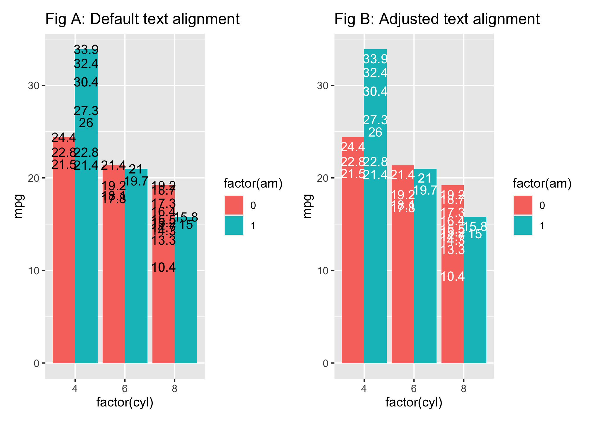
You can change the colors palettes using hex (aka hexidecimal) colors! Take a look here for an example. In this case, we’ll be using the viridis color set.
p1 <- ggplot(mtcars, aes(factor(cyl), mpg, fill = factor(am))) +
  geom_bar(stat = "identity", position = "dodge") +
  geom_text(aes(label = round(mpg, 1)), position = position_dodge(0.9)) +
  ggtitle("Fig A: Default text alignment")

p2 <- ggplot(mtcars, aes(factor(cyl), mpg, fill = factor(am))) +
  geom_bar(stat = "identity", position = "dodge") +
  scale_fill_viridis_c(option = "D") +
  geom_text(aes(label = round(mpg, 1)), position = position_dodge(0.9),
            vjust = 1.5, color = "white") +
  ggtitle("Fig B: Adjusted text alignment")

p2
*Uh oh! Did you see something that said ## Error: Discrete value supplied to continuous scale?
The error says that we tried to add a continuous scale to discrete values! Well we could use this by either
- Getting rid of the factor
p2 <- ggplot(mtcars, aes(factor(cyl), mpg, fill = am)) +
  geom_bar(stat = "identity", position = "dodge") +
  scale_fill_viridis_c(option = "D") +
  geom_text(aes(label = round(mpg, 1)), position = position_dodge(0.9),
            vjust = 1.5, color = "white") +
  ggtitle("Fig B: Adjusted text alignment")

p2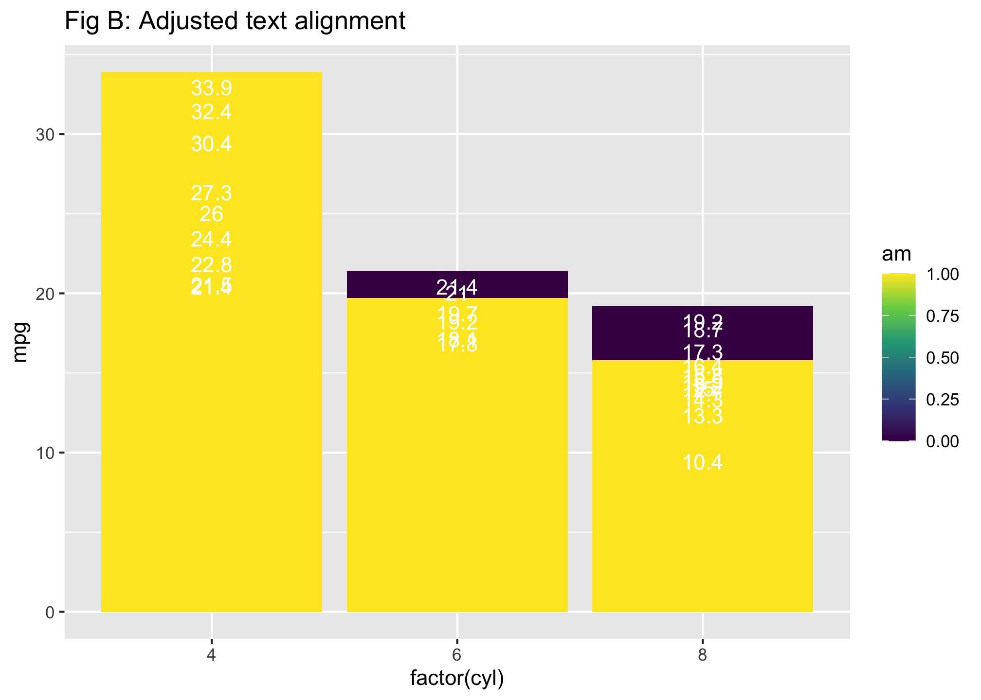
- Changing the type of scaling
p2 <- ggplot(mtcars, aes(factor(cyl), mpg, fill = factor(am))) +
  geom_bar(stat = "identity", position = "dodge") +
  scale_fill_viridis_d(option = "D") +
  geom_text(aes(label = round(mpg, 1)), position = position_dodge(0.9),
            vjust = 1.5, color = "white") +
  ggtitle("Fig B: Adjusted text alignment")

p2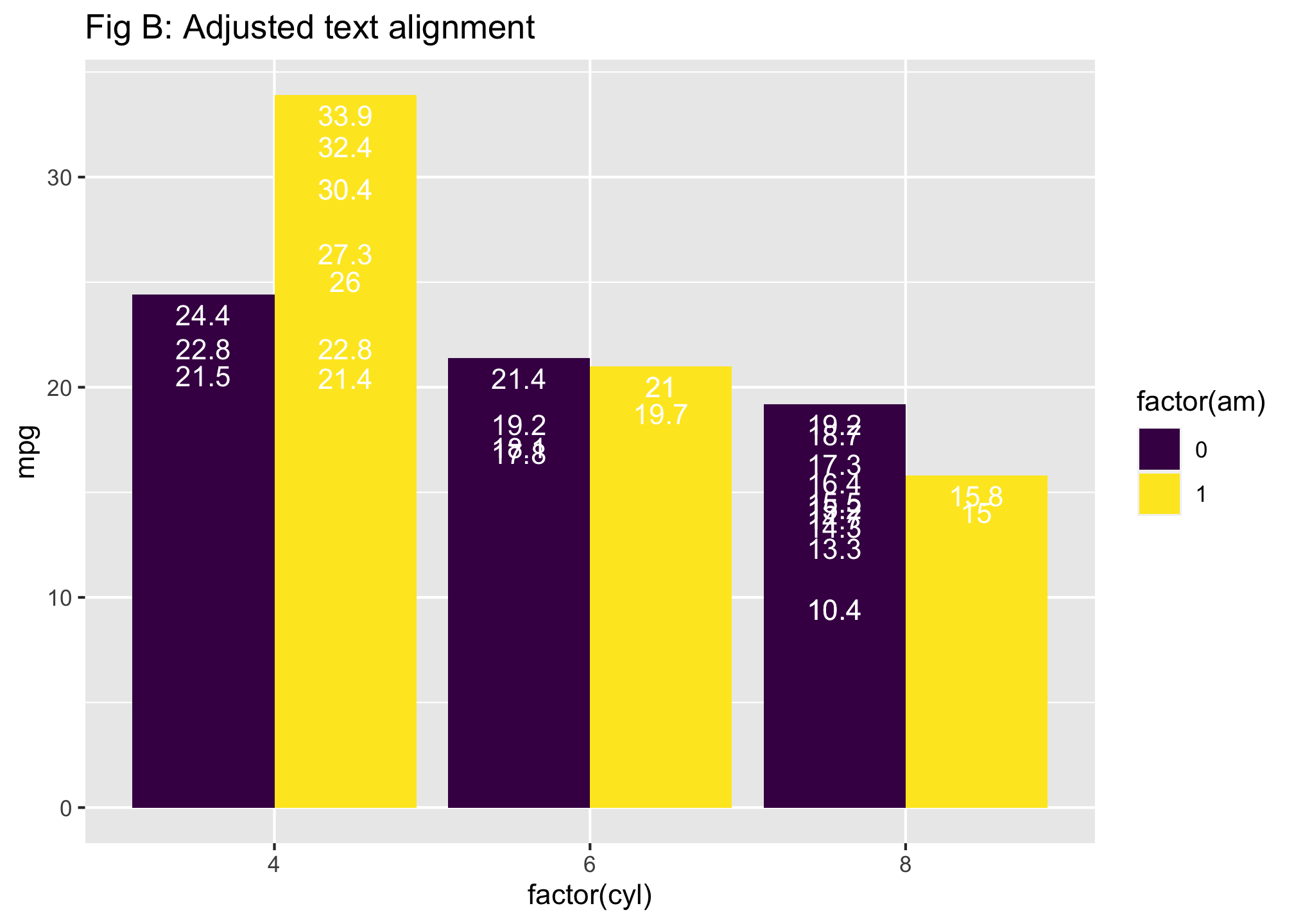
Notice that the plots are different! Your fill and color variables define how the plot will look!
Much like Adobe Photoshop for those of you who may be familiar with that software.↩︎