Base R is a Thing
Getting Prepped
First Things First! Set your Working Directory
Your working directory is simply where your script will look for anything it needs like external data sets. There are a few ways to go about doing this which we will cover. However for now, just do the following:
- Open up a new script by going to
File > New File > R Script. - Save it in a preferably empty folder as whatever you want.
- Go to the menu bar and select
Session > Set Working Directory > To Source File Location.
Download the script
Copying and pasting syntax from a browser can cause problems. To avoid this issue, please download a script with all of the needed code presented in this walkthrough.
Foundational Structures
Akin to how atoms were viewed as the building blocks of life, these are the basic structures of R.
vector - The very basic structure of R where one type of information can be stored. These are given by a single row or column of things that have to be the same data type.
nothing_vector <- c()

nothing_vector
## NULLnumber_vector <- c(1,2,3,4,5) number_vector## [1] 1 2 3 4 5character_vector <- c( "Oban", "Macallan", "Pittyvaich", "Balblair", "Glenmorangie" ) character_vector## [1] "Oban" "Macallan" "Pittyvaich" "Balblair" "Glenmorangie"object - These are the different ways you can structure your data to do something with it. All objects are made up of one or more vectors.
Data Types
There are six types of data that R can read on its own without the help of any other piece of software. These are known as atomic vectors where atomic means the vector only holds data of a single type
- character: “a”, “swc”
- numeric: 2, 15.5
- integer: 2L (the L tells R to store this as an integer)
- logical: TRUE, FALSE
- complex: 1+4i (complex numbers with real and imaginary parts)1
- raw: 01010010
Classes
A class is the blueprint that helps to create an object. These are
matrix - A two-dimensional object made up of rows and columns. These are essentially a bunch of vectors stacked on top or beside each other that have to be the same data type.
some_matrix <- matrix(c(1,1,2,3,5,8), nrow = 2, ncol = 3)

some_matrix
## [,1] [,2] [,3] ## [1,] 1 2 5 ## [2,] 1 3 8array - A three-dimensional object made up of a bunch of matrices that have to be the same data type.
some_array <- array(1, dim = c(2, 3, 3))

some_array
## , , 1 ## ## [,1] [,2] [,3] ## [1,] 1 1 1 ## [2,] 1 1 1 ## ## , , 2 ## ## [,1] [,2] [,3] ## [1,] 1 1 1 ## [2,] 1 1 1 ## ## , , 3 ## ## [,1] [,2] [,3] ## [1,] 1 1 1 ## [2,] 1 1 1dataframe - Similar to a matrix, BUT columns can vary by data type.
some_df <- data.frame(col1 = 1:3,
                 col2 = c("take", "a", "nap"),
                 col3 = c(TRUE, FALSE, TRUE),
                 col4 = c(1.5, 3.2, pi))

some_df
## col1 col2 col3 col4 ## 1 1 take TRUE 1.500000 ## 2 2 a FALSE 3.200000 ## 3 3 nap TRUE 3.141593list - A set of objects.
some_list <-list(1,2,3,4,5)

some_list
## [[1]] ## [1] 1 ## ## [[2]] ## [1] 2 ## ## [[3]] ## [1] 3 ## ## [[4]] ## [1] 4 ## ## [[5]] ## [1] 5
Example: 100% Fake Data
height <- c(145,167,176,123,150)
weight <- c(51,63,64,40,55)
Both height and weight are called variables because they have been assigned a bunch of stuff which in this case are integers. Well we have these, might as well do something with them.
height <- c(145, 167, 176, 123, 150)
weight <- c(51, 63, 64, 40, 55)

plot(height,weight)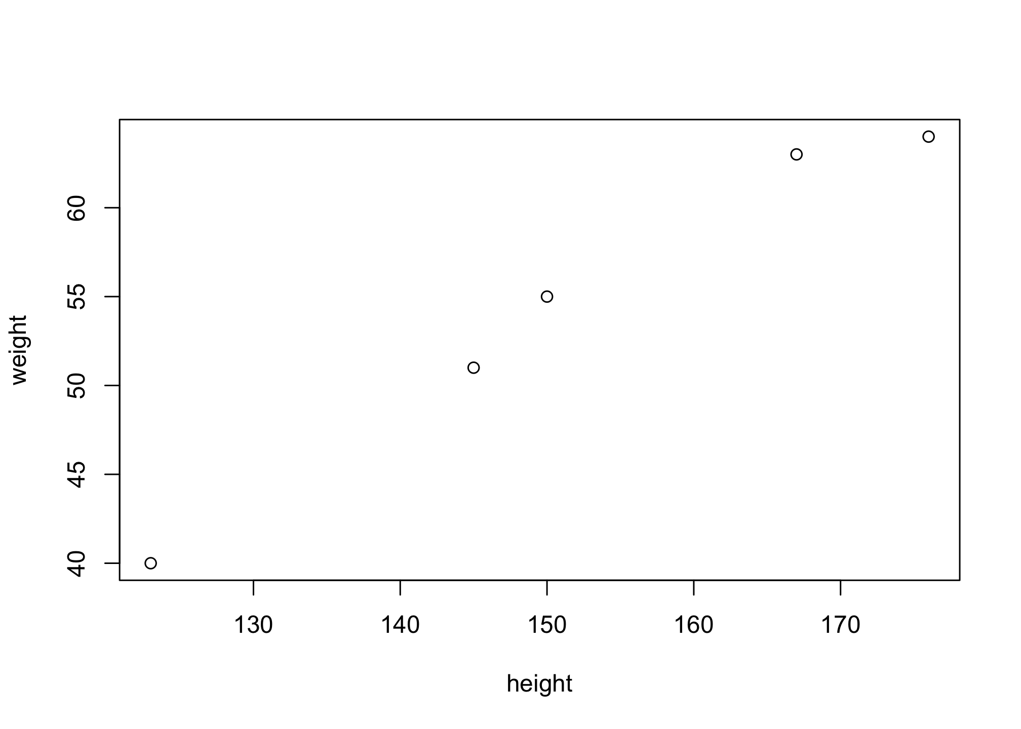
Well that wasn’t exciting at all was it? It’ll get interesting soon.
R provides many functions to examine features of vectors and other objects, for example
class()- what kind of object is it (high-level)?typeof()- what is the object’s data type (low-level)?length()- how long is it? What about two dimensional objects?attributes()- does it have any metadata? (underlying set of data that describes and gives information about other data)
class(weight) # Yup there are numbers so numeric makes sense.## [1] "numeric"typeof(weight) # You see the term 'double' here but you may also see 'single' or 'integer'. All this refers to is the precision of the number and you can assume they are all integers.## [1] "double"length(weight) # There are 5 objects in weight so length(weight) = 5 makes sense.## [1] 5attributes(weight) # Null since there isn't any other information except for what you see.## NULLData Frames - A Format You Absolutely Want
We want all of our data to be in this form. A data frame is a table or a two-dimensional array-like structure in which each column contains values of one variable and each row contains one set of values from each column. Characteristics of a data frame are as follows and in no particular order:
- The column names should be non-empty.
- The row names should be unique.
- The data stored in a data frame can be of numeric, factor or character type.
- Each column should contain same number of data items.
NOTE: You can always check if a variable is a data frame by is.data.frame(whatever)
Importing and Viewing Data
Read in the file USpop2010to2017.csv that has data on US population estimates from 2010 to 2017. You can do this in multiple ways but for now and since you’re getting used to menu. To bring in the file, go to the Environment tab in the upper right window and then Import Dataset > From Text (readr) > Browse to find your file and load it in. Before clicking on the Import button, name the variable population under Import options. You should get an output similar to the one shown below.
But know that we will be moving away from the idea of using a mouse/trackpad to do things because it wastes time and is generally disruptive. Instead we’ll use the file’s relative path, that is the locations of all other files in comparison to your script to bring in data. If the USpop2010to2017.csv data set is in the same folder as your script, then run the following command
population <- read.csv("USpop2010to2017.csv",
                       header = TRUE,
                       stringsAsFactors = TRUE)
Now take a look at the file by running
population## Census_ID Collection_year Total_Pop Male_Pop Female_Pop Estimate
## 1 POPESTIMATE2010 2010 309338421 152082993 157255428 N
## 2 POPESTIMATE2011 2011 311644280 153242210 158402070 Y
## 3 POPESTIMATE2012 2012 313993272 154452348 159540924 Y
## 4 POPESTIMATE2013 2013 316234505 155596820 160637685 Y
## 5 POPESTIMATE2014 2014 318622525 156807419 161815106 Y
## 6 POPESTIMATE2015 2015 321039839 158048153 162991686 Y
## 7 POPESTIMATE2016 2016 323405935 159243817 164162118 Y
## 8 POPESTIMATE2017 2017 325719178 160408119 165311059 YWell that is long and annoying. We can use the head() command to make it only display six lines.
head(population)## Census_ID Collection_year Total_Pop Male_Pop Female_Pop Estimate
## 1 POPESTIMATE2010 2010 309338421 152082993 157255428 N
## 2 POPESTIMATE2011 2011 311644280 153242210 158402070 Y
## 3 POPESTIMATE2012 2012 313993272 154452348 159540924 Y
## 4 POPESTIMATE2013 2013 316234505 155596820 160637685 Y
## 5 POPESTIMATE2014 2014 318622525 156807419 161815106 Y
## 6 POPESTIMATE2015 2015 321039839 158048153 162991686 Yor any number actually
head(population, 4)## Census_ID Collection_year Total_Pop Male_Pop Female_Pop Estimate
## 1 POPESTIMATE2010 2010 309338421 152082993 157255428 N
## 2 POPESTIMATE2011 2011 311644280 153242210 158402070 Y
## 3 POPESTIMATE2012 2012 313993272 154452348 159540924 Y
## 4 POPESTIMATE2013 2013 316234505 155596820 160637685 YYou can actually look at the entire dataset in a spreadsheet like window by using
View(population)If you want to know more about how a data set is made up you can use the command str() or glimpse(). This essentially asks R for information about the internal structure of any set of data.
str(population)## 'data.frame': 8 obs. of 6 variables:
## $ Census_ID : chr "POPESTIMATE2010" "POPESTIMATE2011" "POPESTIMATE2012" "POPESTIMATE2013" ...
## $ Collection_year: int 2010 2011 2012 2013 2014 2015 2016 2017
## $ Total_Pop : int 309338421 311644280 313993272 316234505 318622525 321039839 323405935 325719178
## $ Male_Pop : int 152082993 153242210 154452348 155596820 156807419 158048153 159243817 160408119
## $ Female_Pop : int 157255428 158402070 159540924 160637685 161815106 162991686 164162118 165311059
## $ Estimate : chr "N" "Y" "Y" "Y" ...glimpse(population)## Rows: 8
## Columns: 6
## $ Census_ID <chr> "POPESTIMATE2010", "POPESTIMATE2011", "POPESTIMATE201…
## $ Collection_year <int> 2010, 2011, 2012, 2013, 2014, 2015, 2016, 2017
## $ Total_Pop <int> 309338421, 311644280, 313993272, 316234505, 318622525…
## $ Male_Pop <int> 152082993, 153242210, 154452348, 155596820, 156807419…
## $ Female_Pop <int> 157255428, 158402070, 159540924, 160637685, 161815106…
## $ Estimate <chr> "N", "Y", "Y", "Y", "Y", "Y", "Y", "Y"This may seem like a mess but it actually tells you a lot. First thing you should notice is that all of the columns are laid out into lines to be “easily” readable but the structure of the data set does not change! Here is some other important things in no particular order:
- We have an 8 x 5 matrix (aka a data set with 8 columns and 5 rows)
- It is a data frame with variables given by
$. More about this below. - The first column is a character vector (made up only of strings of text).
- The remaining columns are integer vectors (made up only of numbers in the form of integers).
- You may be wondering why we skipped over the
factorsandlevels. That’s a bit complicated for this session but we will get to it because they play an important role in visualizing the data.
Looking at Variables in a Data Frame
To call a variable in the dataframe, we use the $ notation.
population$Census_ID## [1] "POPESTIMATE2010" "POPESTIMATE2011" "POPESTIMATE2012" "POPESTIMATE2013"
## [5] "POPESTIMATE2014" "POPESTIMATE2015" "POPESTIMATE2016" "POPESTIMATE2017"Now try to use the same method for the other two columns.
Solutions
population$Collection_year## [1] 2010 2011 2012 2013 2014 2015 2016 2017population$Total_Pop## [1] 309338421 311644280 313993272 316234505 318622525 321039839 323405935
## [8] 325719178population$Male_Pop## [1] 152082993 153242210 154452348 155596820 156807419 158048153 159243817
## [8] 160408119population$Female_Pop## [1] 157255428 158402070 159540924 160637685 161815106 162991686 164162118
## [8] 165311059Assigning Variables
Now let’s call these something because writing those out over and over is annoying
census <- population$Census_ID

census
## [1] "POPESTIMATE2010" "POPESTIMATE2011" "POPESTIMATE2012" "POPESTIMATE2013"
## [5] "POPESTIMATE2014" "POPESTIMATE2015" "POPESTIMATE2016" "POPESTIMATE2017"or to do this quicker, use a semicolon ;.
census <- population$Census_ID; census## [1] "POPESTIMATE2010" "POPESTIMATE2011" "POPESTIMATE2012" "POPESTIMATE2013"
## [5] "POPESTIMATE2014" "POPESTIMATE2015" "POPESTIMATE2016" "POPESTIMATE2017"Now try to use the same method for the other columns by using the variables year, total, male and female, respectively.
Solutions
year <- population$Collection_year; year## [1] 2010 2011 2012 2013 2014 2015 2016 2017total <- population$Total_Pop; total## [1] 309338421 311644280 313993272 316234505 318622525 321039839 323405935
## [8] 325719178male <- population$Male_Pop; male## [1] 152082993 153242210 154452348 155596820 156807419 158048153 159243817
## [8] 160408119female <- population$Female_Pop; female## [1] 157255428 158402070 159540924 160637685 161815106 162991686 164162118
## [8] 165311059Basic Visualizations
Let’s plot these
plot(year, total)
# Notice that the x-axis variable goes first!
OK well that’s better but it looks funny - the y-axis looks like the output on a mid 90s calculator that couldn’t handle exponents. So we’re going to divide and round. Since everything is in hundreds of millions in our data set, let’s divide each column by one hundred million but keep the original figures.
# We don't divide anything in census because it just contains the original variables
census <- population$Census_ID

# We don't want to divide anything here because this column has data on years
year <- population$Collection_year

# These are the actual data so that's where we'll reduce.
tinytotal <- population$Total_Pop/100000000
tinymale <- population$Male_Pop/100000000
tinyfemale <- population$Female_Pop/100000000
Now that these are proportionally smaller, let’s hope the visuals are more understandable
plot(year, tinytotal) 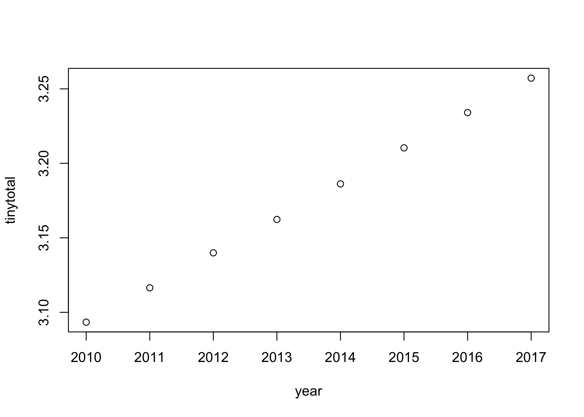
Looks much better but let’s change the axis labels to be more descriptive.
plot(year, tinytotal,
     xlab = "Years",
ylab = "Number of People (in hundreds of millions)") 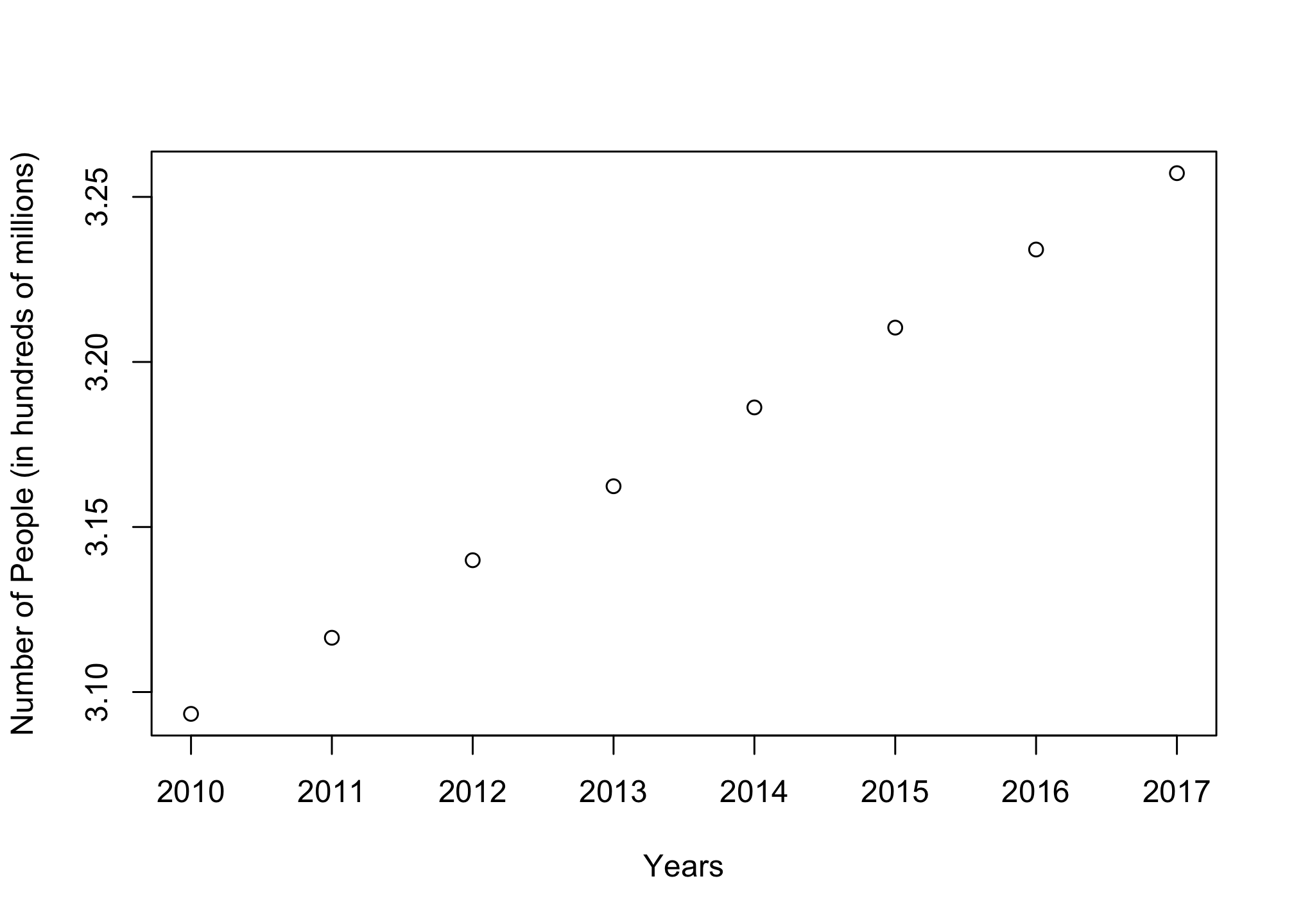
That’s good but the size of the labels should be bigger.
plot(year, tinytotal,
     xlab = "Years",
     ylab = "Number of People (in hundreds of millions)",
cex.lab = 1.5) 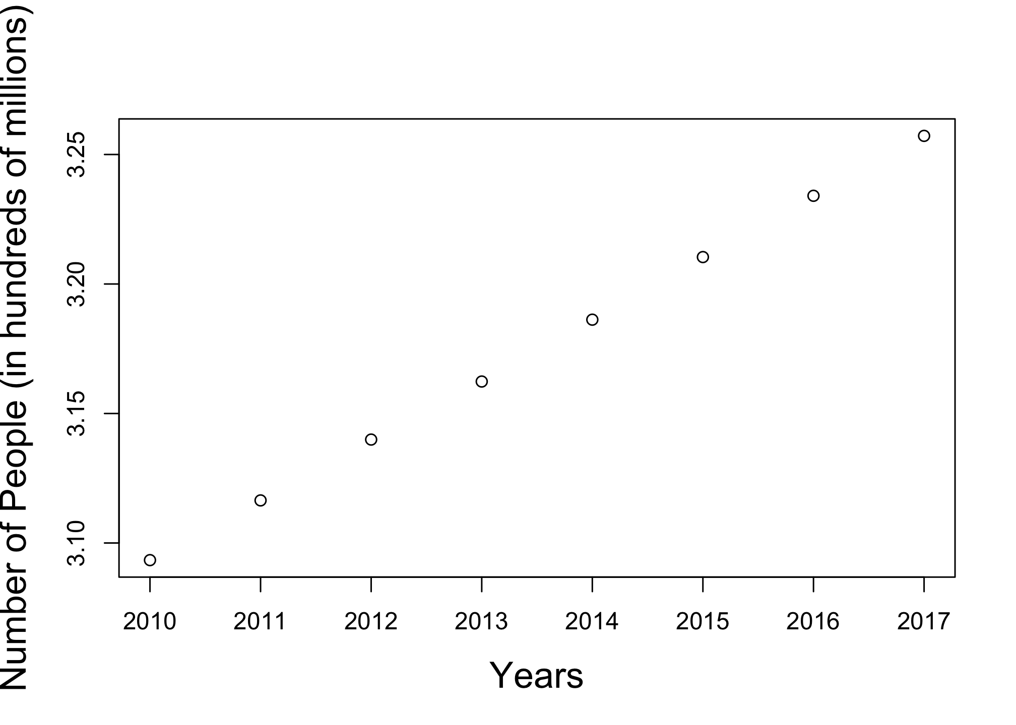
Well its bland so how about a little color?
plot(year, tinytotal,
     xlab = "Years",
     ylab = "Number of People(in hundreds of millions)",
     cex.lab = 1.5,
     col.lab="#ee4035",
     col="#7bc043")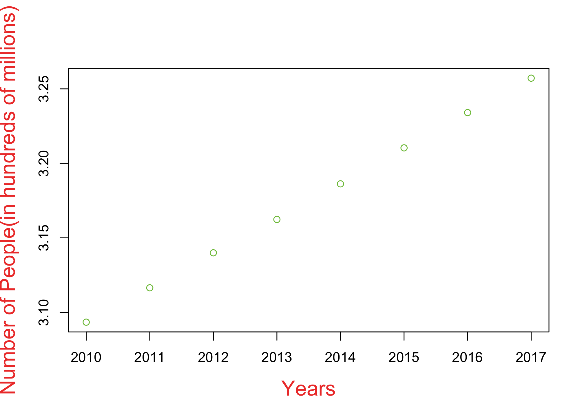
Sure but those dots are difficult to see. Let’s make them different.
plot(year, tinytotal,
     xlab = "Years",
     ylab = "Number of People(in hundreds of millions)",
     cex.lab = 1.5,
     col.lab="#ee4035",
     col="#7bc043",
     pch = 19)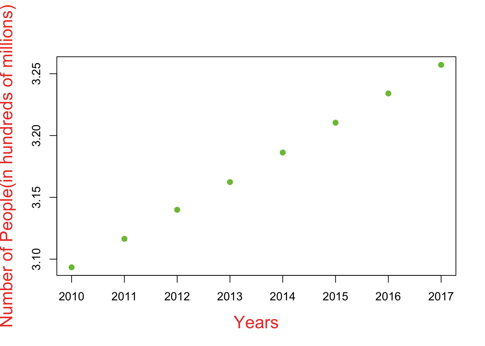
No bigger!
plot(year, tinytotal,
     xlab = "Years",
     ylab = "Number of People (in hundreds of millions)",
     cex.lab = 1.5,
     col.lab="#ee4035",
     col="#7bc043",
     pch = 19,
     cex = 1.5)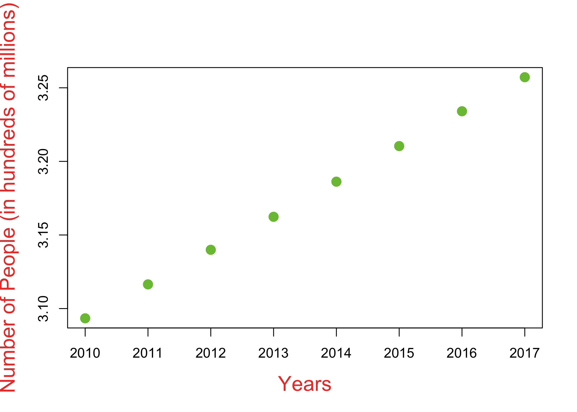
I said bigger dammit!
plot(year, tinytotal,
     xlab = "Years",
     ylab = "Number of People (in hundreds of millions)",
     cex.lab = 1.5,
     col.lab="#ee4035",
     col="#7bc043",
     pch = 19,
     cex = 2)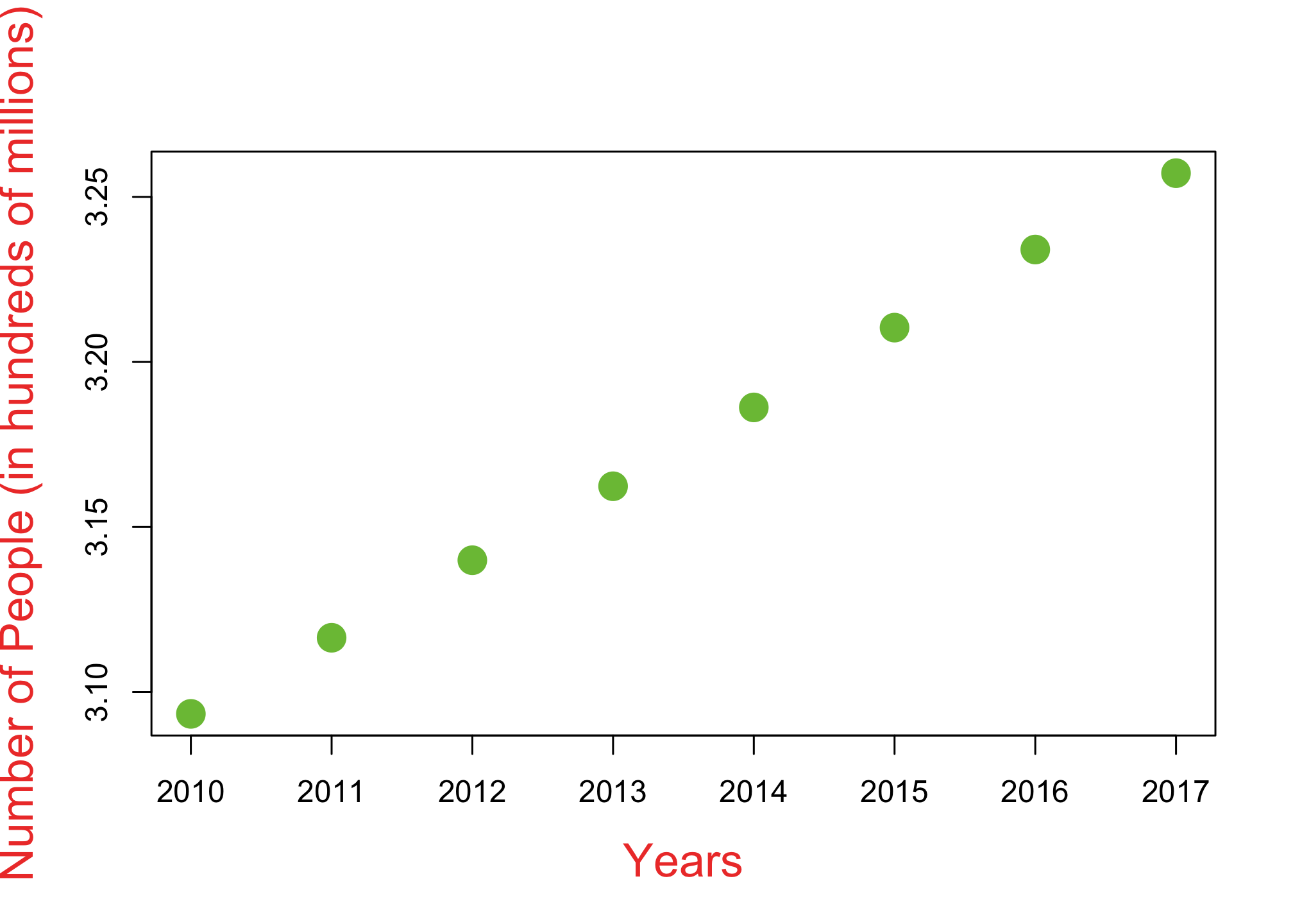
And without that annoying box
plot(year, tinytotal,
     xlab = "Years",
     ylab = "Number of People (in hundreds of millions)",
     cex.lab = 1.5,
     col.lab="#ee4035",
     col="#7bc043",
     pch = 19,
     cex = 2,
     bty = "n")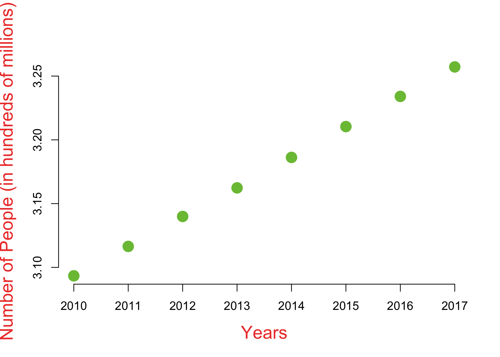
Maybe a colorful title?
plot(year, tinytotal,
     xlab = "Years",
     ylab = "Number of People (in hundreds of millions)",
     cex.lab = 1.5,
     col.lab="#ee4035",
     col="#7bc043",
     pch = 19,
     cex = 2,
     bty = "n",
     main = "United States Population Estimates (2010-2017)",
     cex.main = 1.5,
     col.main = "#0392cf")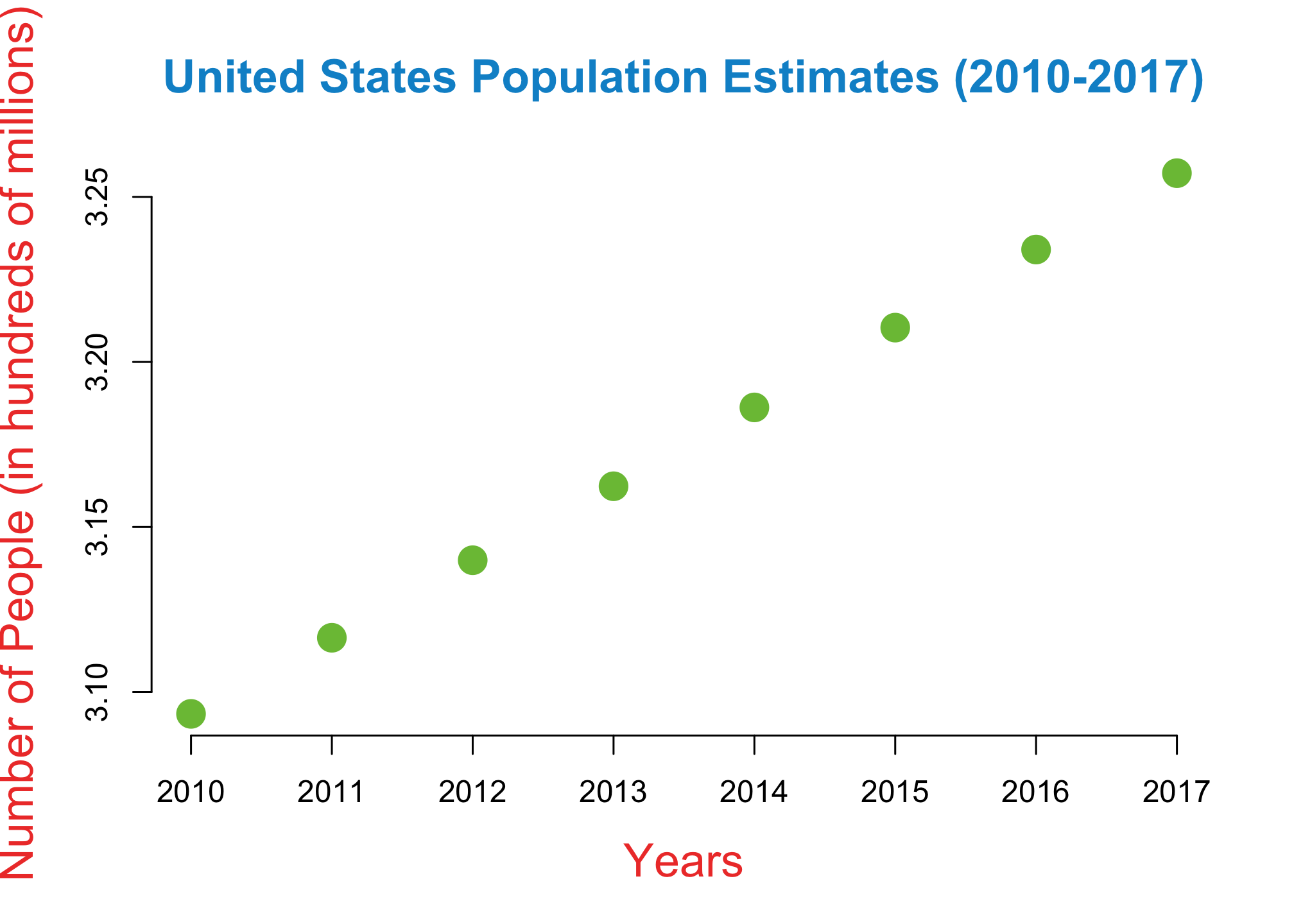
And a line
plot(year, tinytotal,
     xlab = "Years",
     ylab = "Number of People (in hundreds of millions)",
     cex.lab = 1.5,
     col.lab="#ee4035",
     col="#7bc043",
     pch = 19,
     cex = 2,
     bty = "n",
     main = "United States Population Estimates (2010-2017)",
     cex.main = 1.5,
     col.main = "#0392cf",
     type = "o")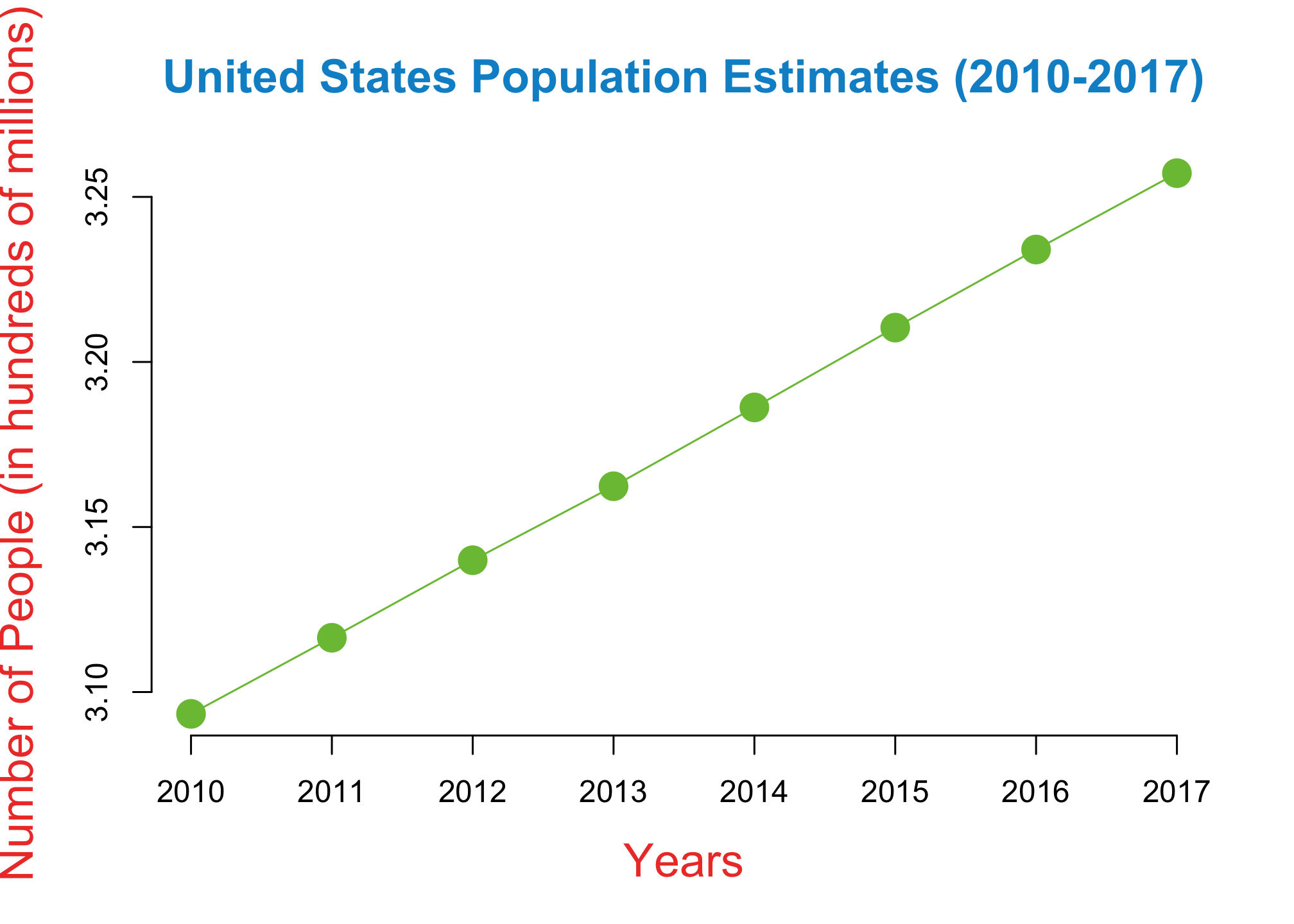
No that’s too skinny!
plot(year, tinytotal,
     xlab = "Years",
     ylab = "Number of People (in hundreds of millions)",
     cex.lab = 1.5,
     col.lab="#ee4035",
     col="#7bc043",
     pch = 19,
     cex = 2,
     bty = "n",
     main = "United States Population Estimates (2010-2017)",
     cex.main = 1.5,
     col.main = "#0392cf",
     type = "o",
     lwd = 3.5)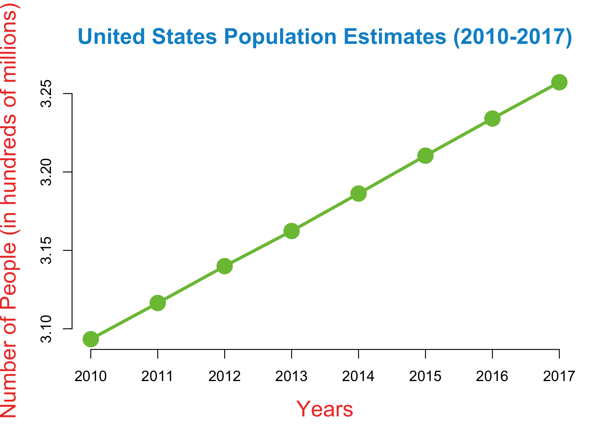
That’ll do for now but that is a ton of work and a lot of not so obvious commands to memorize. So what’s the big deal?
A Bit of Context
Well what you just went through is the OG R which was released publicly in 1995. While nowadays it is commonly known as Base R, a majority of its functionality, structure and syntax were derived from another piece of software called S-Plus which was a commercial product from 1988 primarily used only by statisticians. Regardless of the name, this would continue to be the case until the 2007 when Hadley Wickham officially released an R add-on, or package called ggplot2. Little did anybody know that this would alter the future of data visualization. Starting next week, we’ll move on from Base R to ggplot and its companion packages known as the tidyverse. If you want to get a preview, click on the image below
Now that’s not to say there isn’t value in knowing Base R. There are many commands that are quick and easy and don’t need add-ons. In fact, some of the syntax has survived the transition to the tidy format we’ll get to next week so for now, back to Base R!
Basic Visualizations
Histograms
For this part, we will use data on the number of users on facebook. Lets read the data into R like so
facebook <- read.csv("ActiveFacebookUsers.csv",
                       header = TRUE,
                       stringsAsFactors = TRUE)
Take a look at the first six rows and get some information about the columns
head(facebook)## Quarter Number.of.users.in.millions
## 1 Q3 '08 100
## 2 Q1 '09 197
## 3 Q2 '09 242
## 4 Q3 '09 305
## 5 Q4 '09 360
## 6 Q1 '10 431str(facebook) ## 'data.frame': 39 obs. of 2 variables:
## $ Quarter : chr "Q3 '08" "Q1 '09" "Q2 '09" "Q3 '09" ...
## $ Number.of.users.in.millions: int 100 197 242 305 360 431 482 550 608 680 ...# Alternatively, you can use glimpse()facebook$Quarter## [1] "Q3 '08" "Q1 '09" "Q2 '09" "Q3 '09" "Q4 '09" "Q1 '10" "Q2 '10" "Q3 '10"
## [9] "Q4 '10" "Q1 '11" "Q2 '11" "Q3 '11" "Q4 '11" "Q1 '12" "Q2 '12" "Q3 '12"
## [17] "Q4 '12" "Q1 '13" "Q2 '13" "Q3 '13" "Q4 '13" "Q1 '14" "Q2 '14" "Q3 '14"
## [25] "Q4 '14" "Q1 '15" "Q2 '15" "Q3 '15" "Q4 '15" "Q1 '16" "Q2 '16" "Q3 '16"
## [33] "Q4 '16" "Q1 '17" "Q2 '17" "Q3 '17" "Q4 '17" "Q1 '18" "Q2 '18"facebook$Number.of.users.in.millions## [1] 100 197 242 305 360 431 482 550 608 680 739 800 845 901 955
## [16] 1007 1056 1110 1155 1189 1228 1276 1317 1350 1393 1441 1490 1545 1591 1654
## [31] 1712 1788 1860 1936 2006 2072 2129 2196 2234Let’s rename the columns
users <- facebook$Number.of.users.in.millions
quarter <- facebook$Quarter
We’re going to use the hist() function to plot a basic histogram of the number of users and quarters
hist(users) 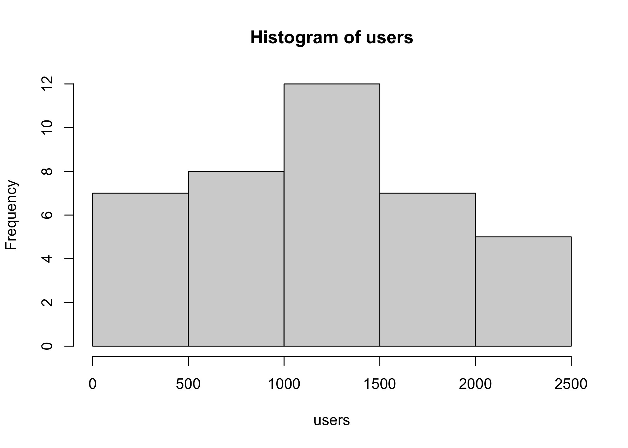
# Hey its a normal distribution!We can specify the number of cells for the histogram using the breaks option
hist(users,
breaks = 40) 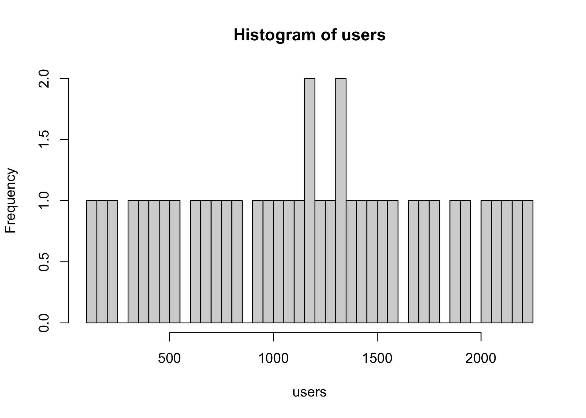
This essentially breaks up the default way that the histogram is constructed. You can also do it within the range of the data set. First to see the minimum and maximum, we use min() and max(), respectively.
min(users) ## [1] 100max(users) ## [1] 2234So if I wanted to see how this histogram looks say broken into bars of 300, we can do
(max(users) - min(users))/300## [1] 7.113333or better yet if we round up, we’ll get the actual number of bars we need. To always round to the next integer, we can use the ceiling() function
ceiling((max(users) - min(users))/300)## [1] 8Now you can count in 300s and get the output you want
hist(users,
     breaks = c(100,400,700,1000,1300,1600,1900,2100,2400))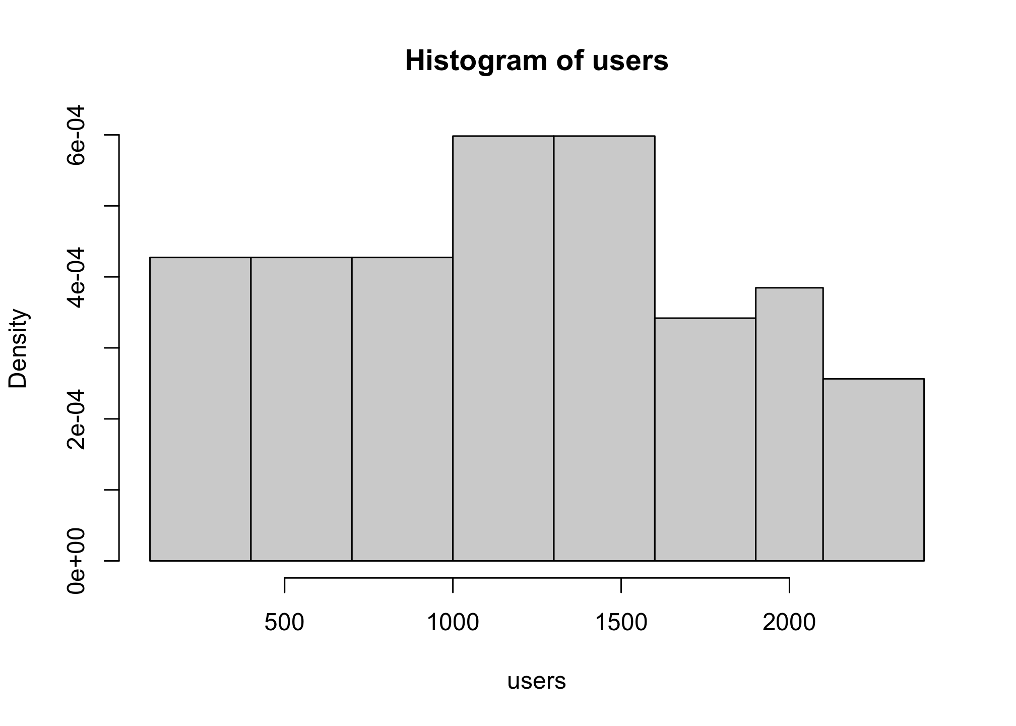
but that’s a lot of work and its a bit odd because our data aren’t greater than the the maximum. We can still get the eight bars we want of even width if we let R do it for us using the seq, or sequence option with length.out, or the number of desired bars
hist(users,
     breaks = seq(min(users),
                  max(users),
                  length.out=8))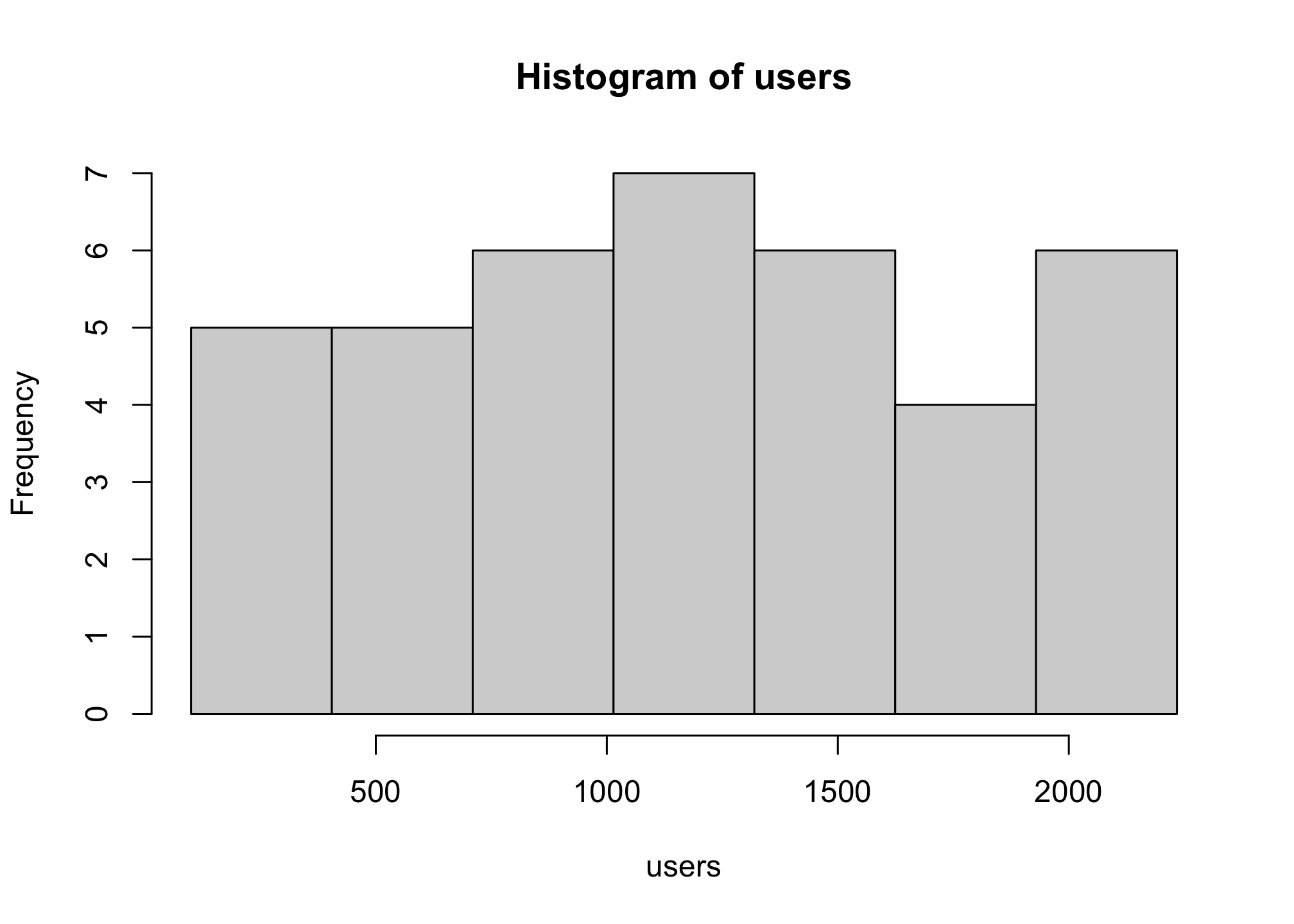
Let’s make it look decent
hist(users, breaks = seq(min(users),
                         max(users),
                         length.out=8),
     xlab = "Active Users (in millions)",
     main = "Facebook utility worldwide as of 2nd quarter 2018",
     col = c("#3b5998","#6d84b4", "#afbdd4", "#d8dfea", "#ffffff"),
     border = "#d8dfea",
cex.lab = 1.1) 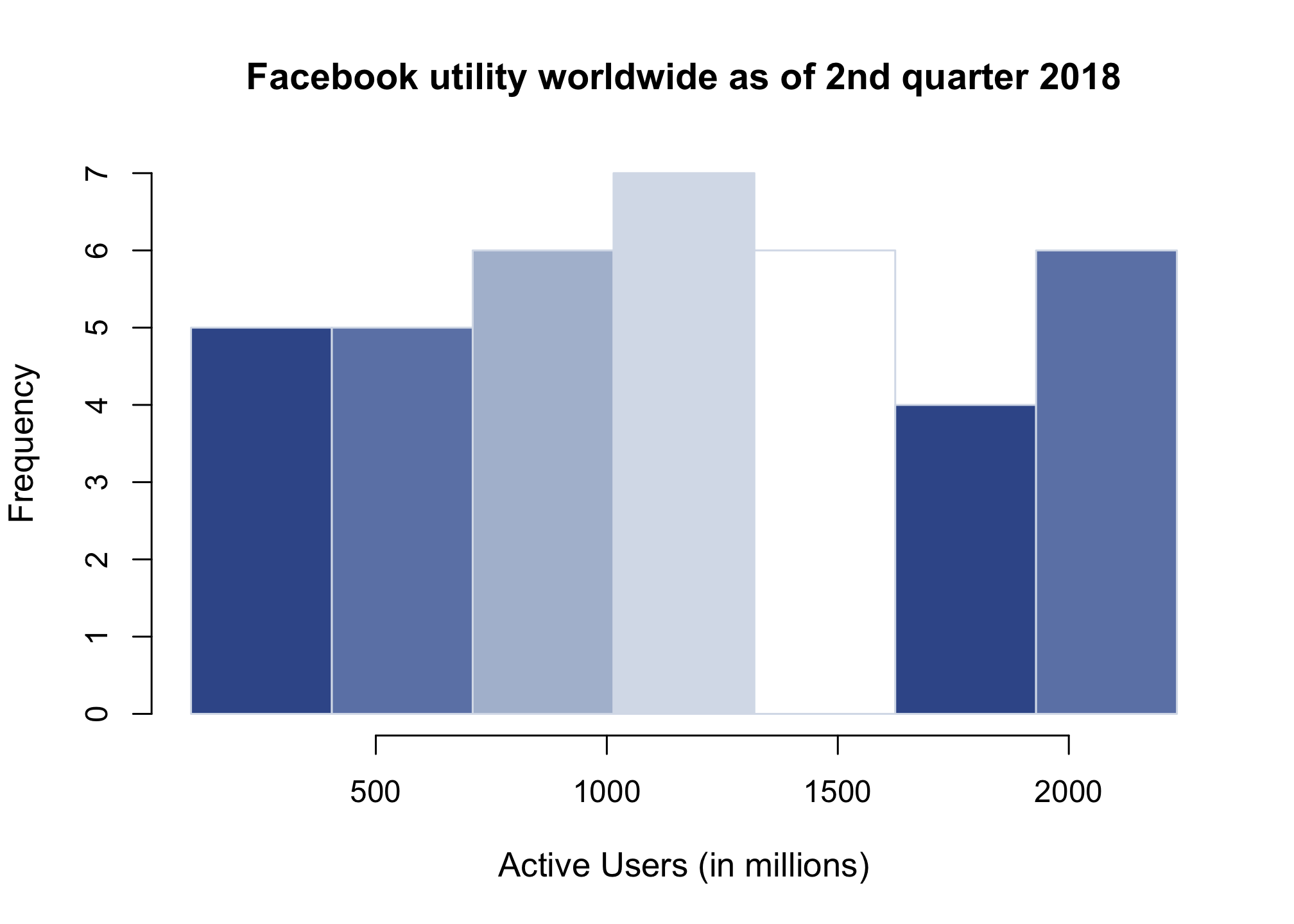
Notice that you can define colors in a vector and the plot will simply repeat that layout.
Line Graph2
Let’s look at another population, but this time we’ll use Twitter data
twitter <- read.csv("ActiveTwitterUsers.csv",
                       header = TRUE,
stringsAsFactors = TRUE) head(twitter)## Quarter Number.of.monthly.active.users.in.millions
## 1 20101 30
## 2 20102 40
## 3 20103 49
## 4 20104 54
## 5 20111 68
## 6 20112 85str(twitter)## 'data.frame': 37 obs. of 2 variables:
## $ Quarter : int 20101 20102 20103 20104 20111 20112 20113 20114 20121 20122 ...
## $ Number.of.monthly.active.users.in.millions: num 30 40 49 54 68 85 101 117 138 151 ...twitter$Quarter## [1] 20101 20102 20103 20104 20111 20112 20113 20114 20121 20122 20123 20124
## [13] 20131 20132 20133 20134 20141 20142 20143 20144 20151 20152 20153 20154
## [25] 20161 20162 20163 20164 20171 20172 20173 20174 20181 20182 20183 20184
## [37] 20191twitter$Number.of.monthly.active.users.in.millions## [1] 30.0 40.0 49.0 54.0 68.0 85.0 101.0 117.0 138.0 151.0 167.0 185.0
## [13] 204.0 218.0 231.7 241.0 255.0 271.0 284.0 288.0 302.0 304.0 307.0 305.0
## [25] 310.0 313.0 317.0 318.0 327.0 326.0 330.0 330.0 336.0 335.0 326.0 321.0
## [37] 330.0Let’s rename the columns
tweeters <- twitter$Number.of.monthly.active.users.in.millions
season <- twitter$Quarter
Let’s first create a basic plot
plot(season, tweeters)
There are several types of plot within the plot function which we can access by using the type option
plot(season, tweeters,
     type = "l")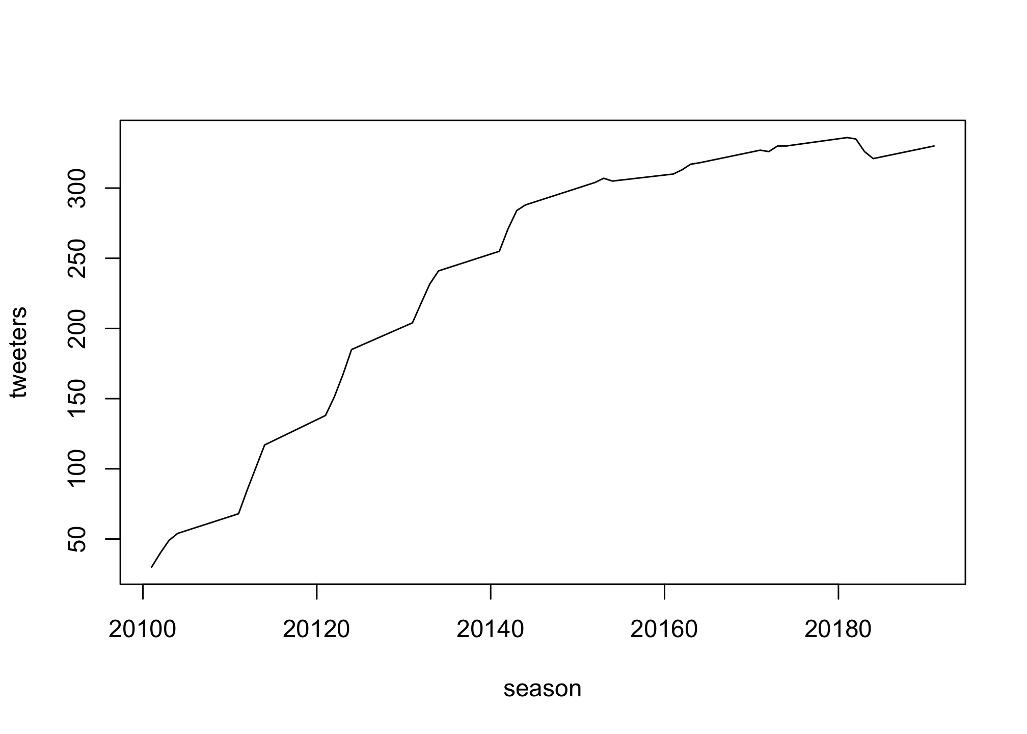
Now try options “o”, “p”, and “b” on your own. Check the solutions below to see if your plot rendered correctly
Solutions
plot(season, tweeters,
     type = "o")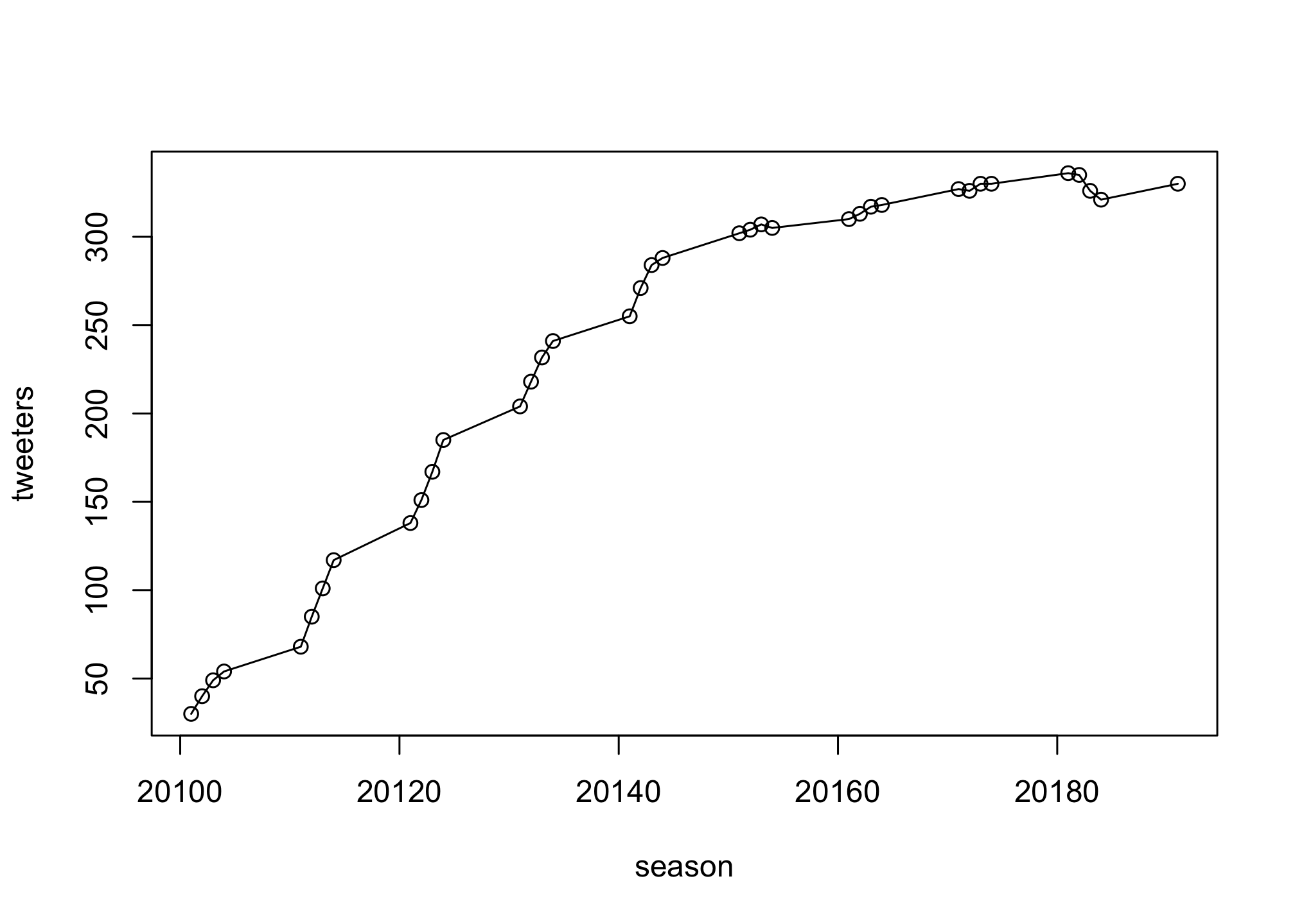
plot(season, tweeters,
     type = "p")
plot(season, tweeters,
     type = "b")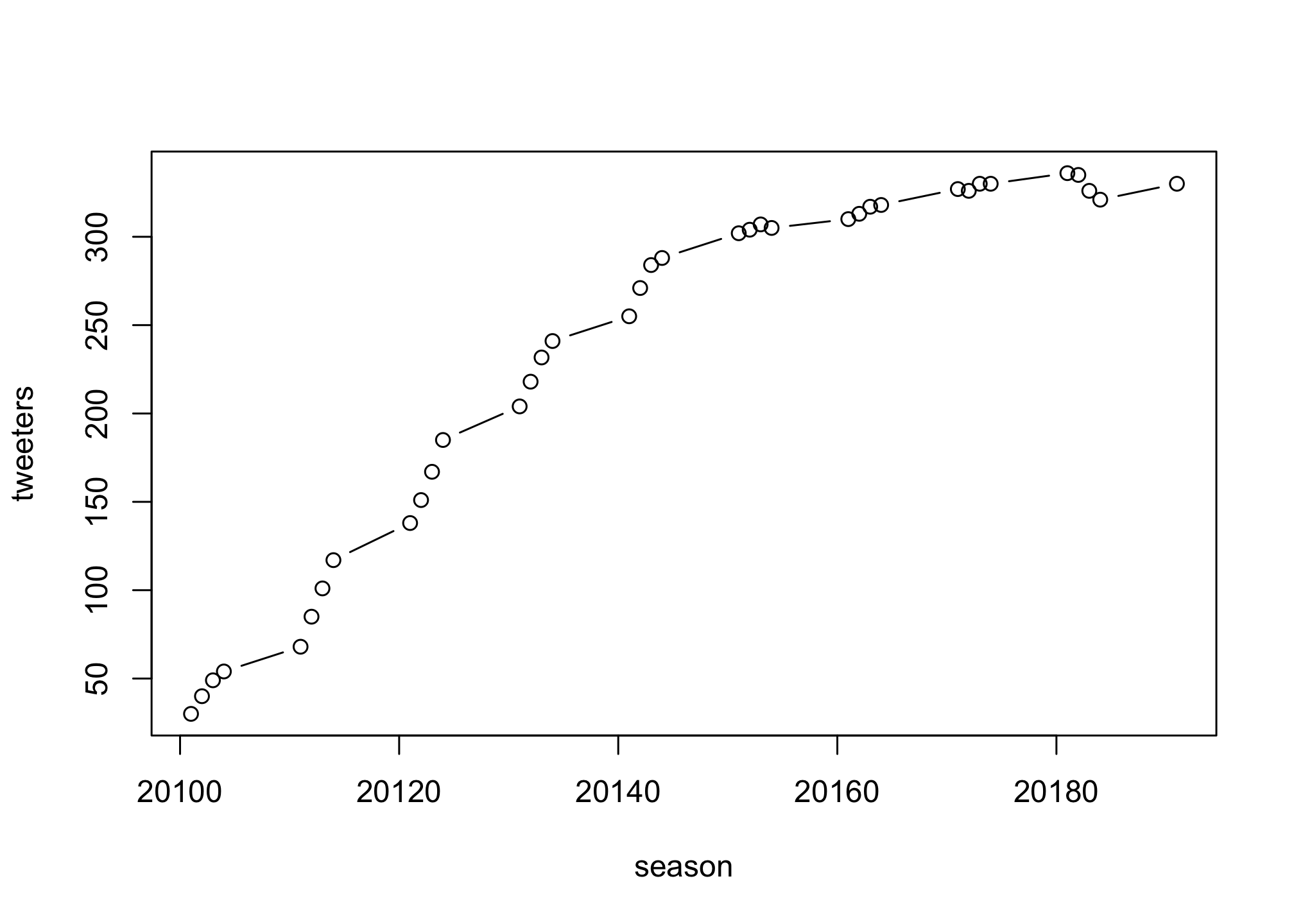
We can also change the line type using the lty option
plot(season, tweeters,
     type = "l",
     lty = "dashed")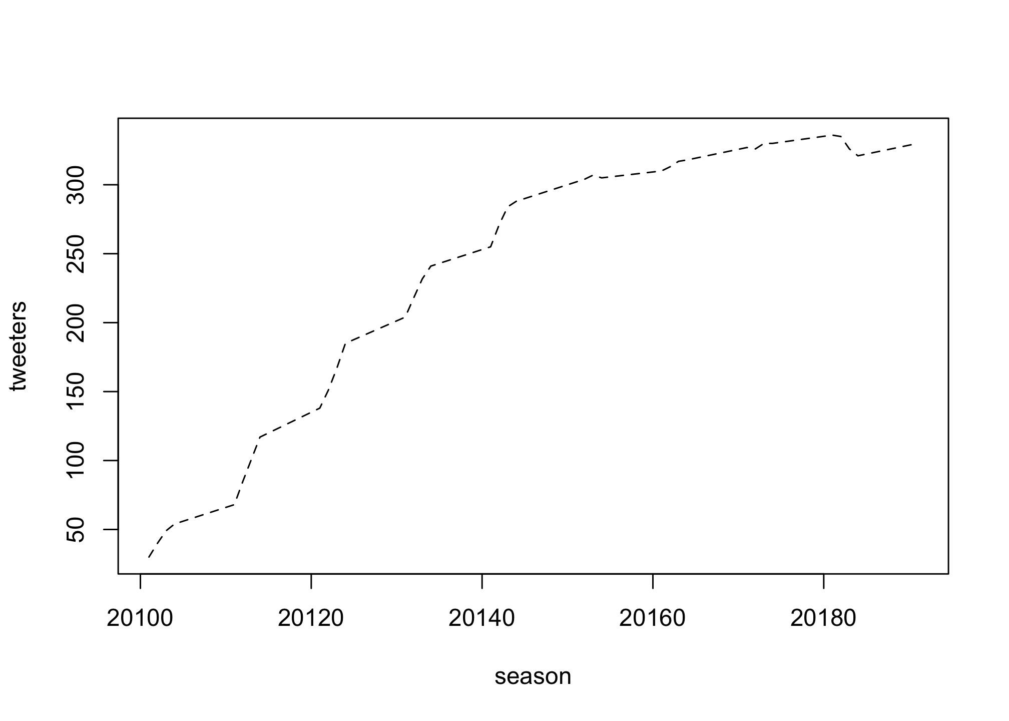
plot(season, tweeters,
     type = "l",
     lty = "dotted")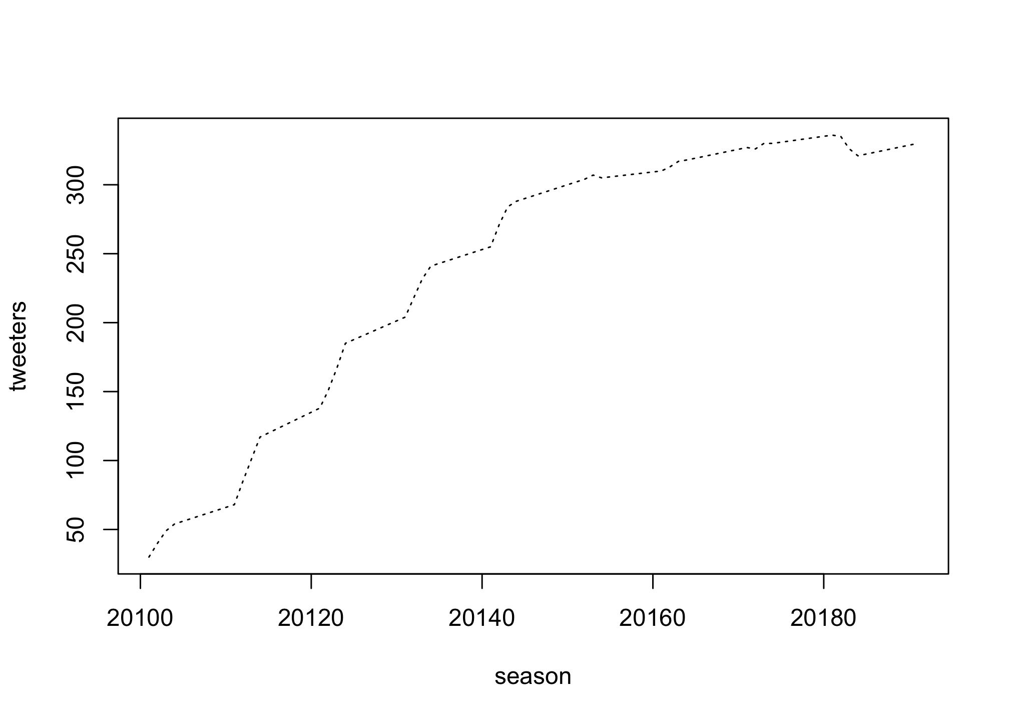
Well it looks like the solid line is likely the best so we’ll stick with it.
plot(season, tweeters,
     type = "l")
Black and white plots can be great but that’s rarely true for data with ore information than two dimensions.
plot(season, tweeters,
     type = "l",
     col = "#5cb85c")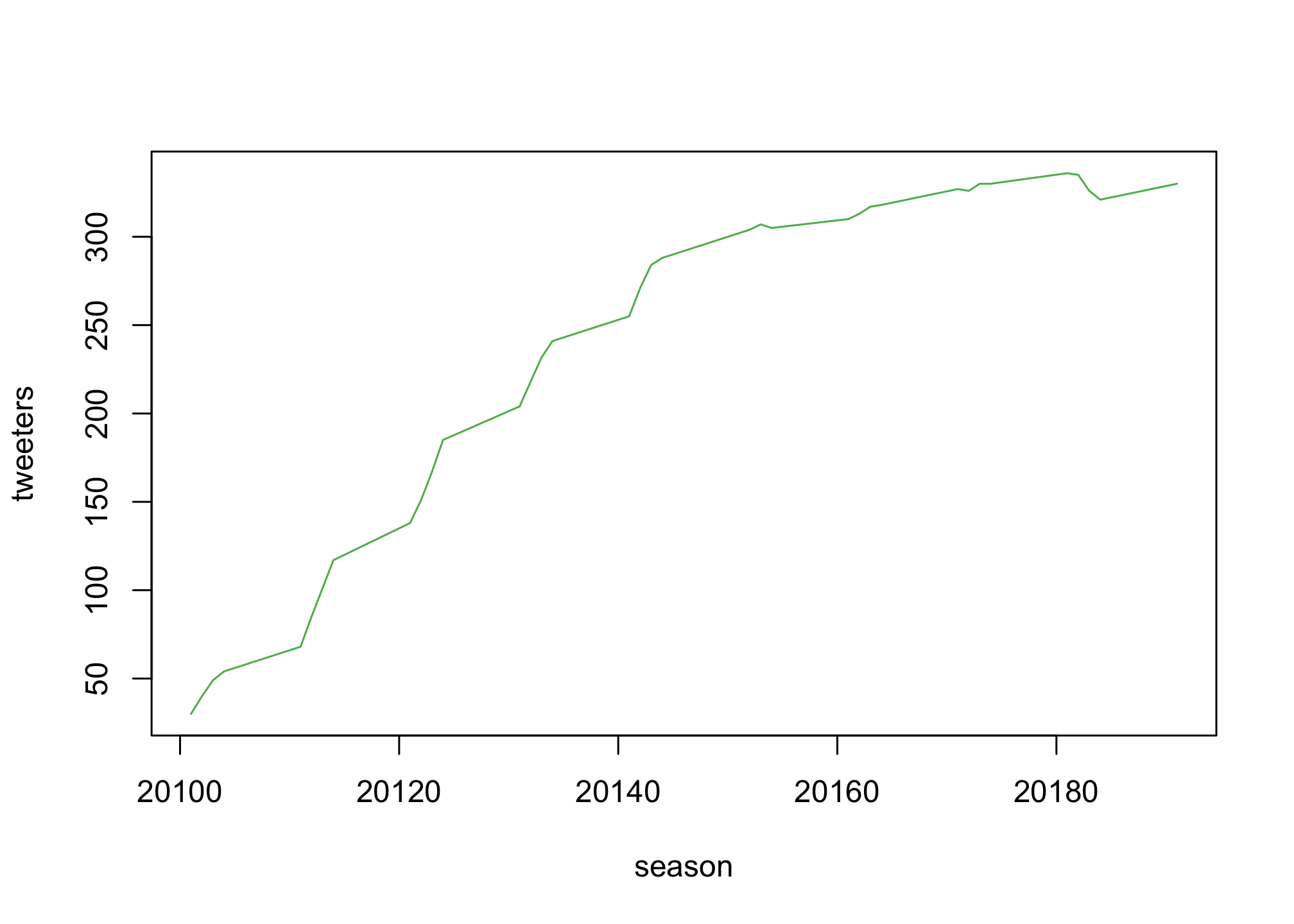
You can also use a standard palette in R by using numbers
plot(season, tweeters,
     type = "l",
     col = 3)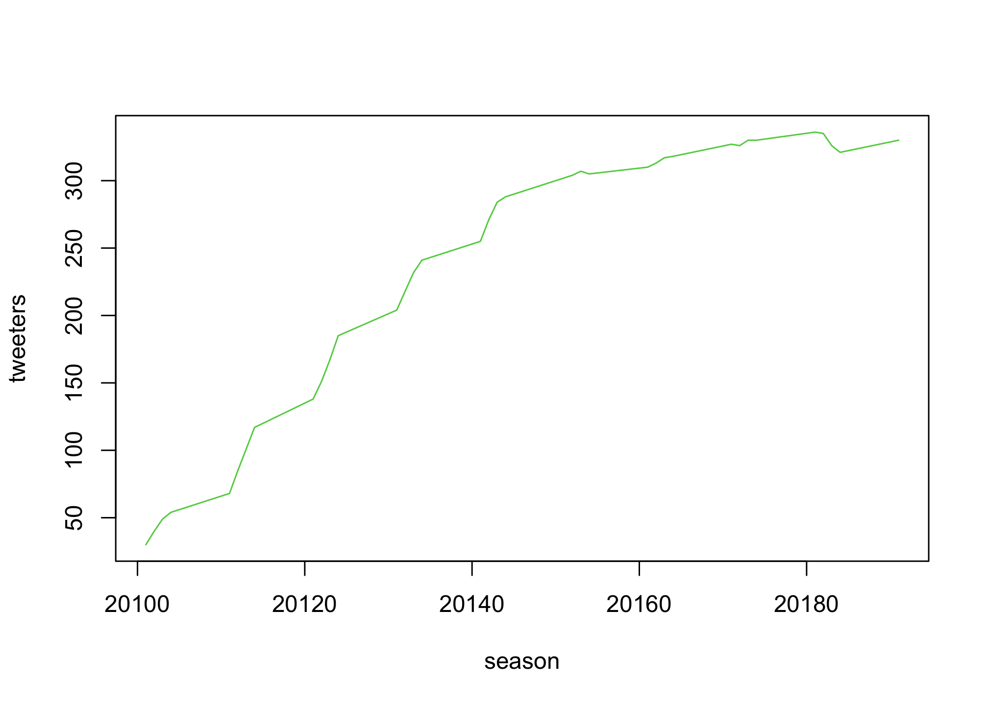
That line is just too thin. We can make it thicker by using the lwd option
plot(season, tweeters,
     col = "#5cb85c",
     lwd = 3)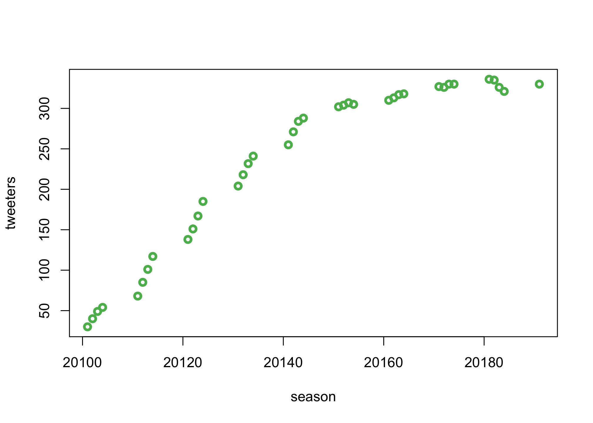
Finally, we can sort out the axes and plot titles
plot(season, tweeters,
     type = "l",
     col = "#5cb85c",
     lwd = 3,
     xlab = "Quarter",
     ylab = "Tweeters (in millions)",
     main = "Active Users on Twitter")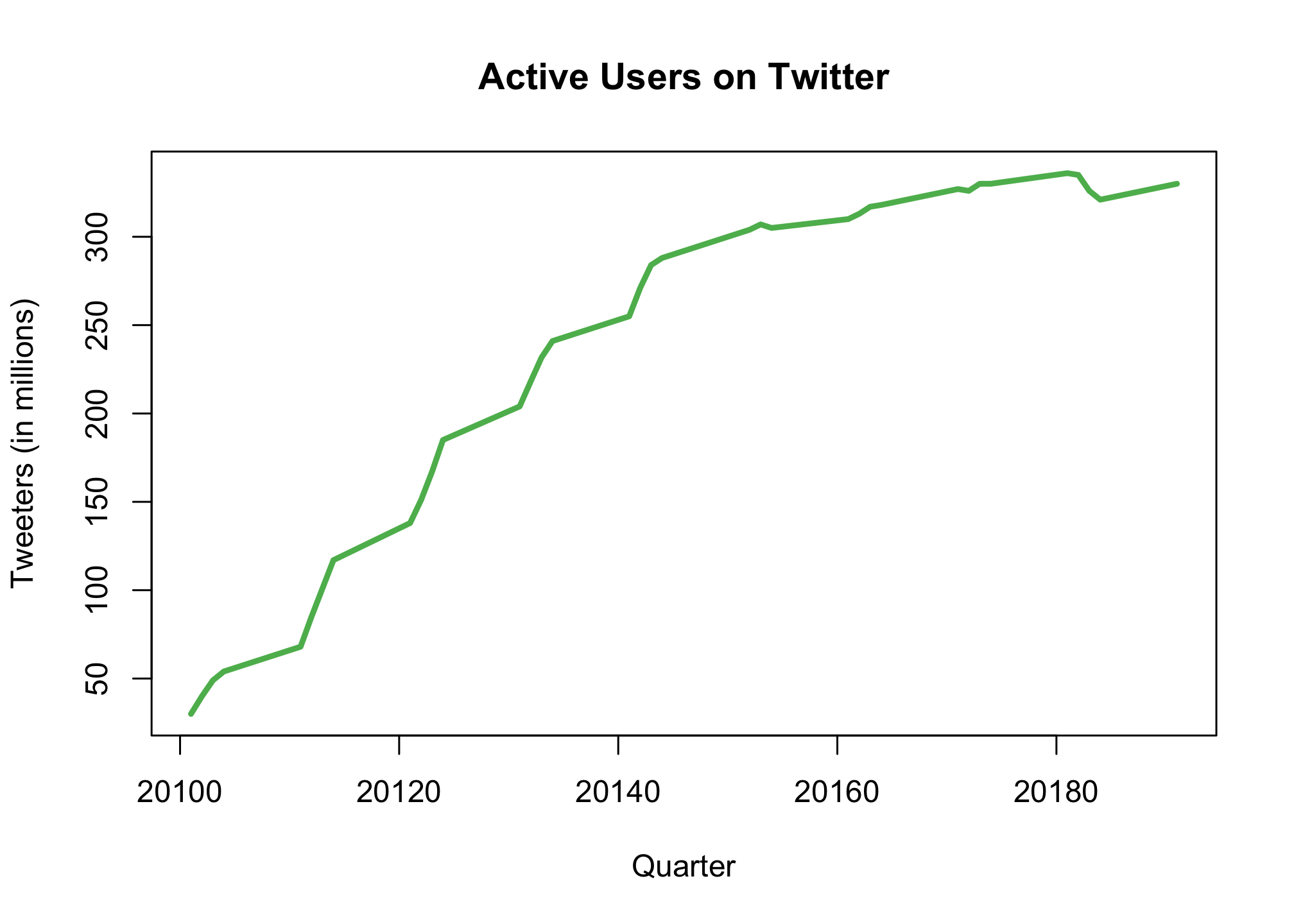
I did promise regression didn’t I? OK well what if we wanted to know the answer to the question: is the Twitter population increasing in size? Well we can add a basic linear regression to the plot to estimate if that’s true. First let’s calculate the regression line…
fit1 <- lm (tweeters ~ season,
            data = twitter)

summary(fit1)
##
## Call:
## lm(formula = tweeters ~ season, data = twitter)
##
## Residuals:
## Min 1Q Median 3Q Max
## -72.465 -33.476 -3.424 32.275 54.490
##
## Coefficients:
## Estimate Std. Error t value Pr(>|t|)
## (Intercept) -7.218e+04 4.468e+03 -16.15 <2e-16 ***
## season 3.595e+00 2.218e-01 16.21 <2e-16 ***
## ---
## Signif. codes: 0 '***' 0.001 '**' 0.01 '*' 0.05 '.' 0.1 ' ' 1
##
## Residual standard error: 36 on 35 degrees of freedom
## Multiple R-squared: 0.8824, Adjusted R-squared: 0.879
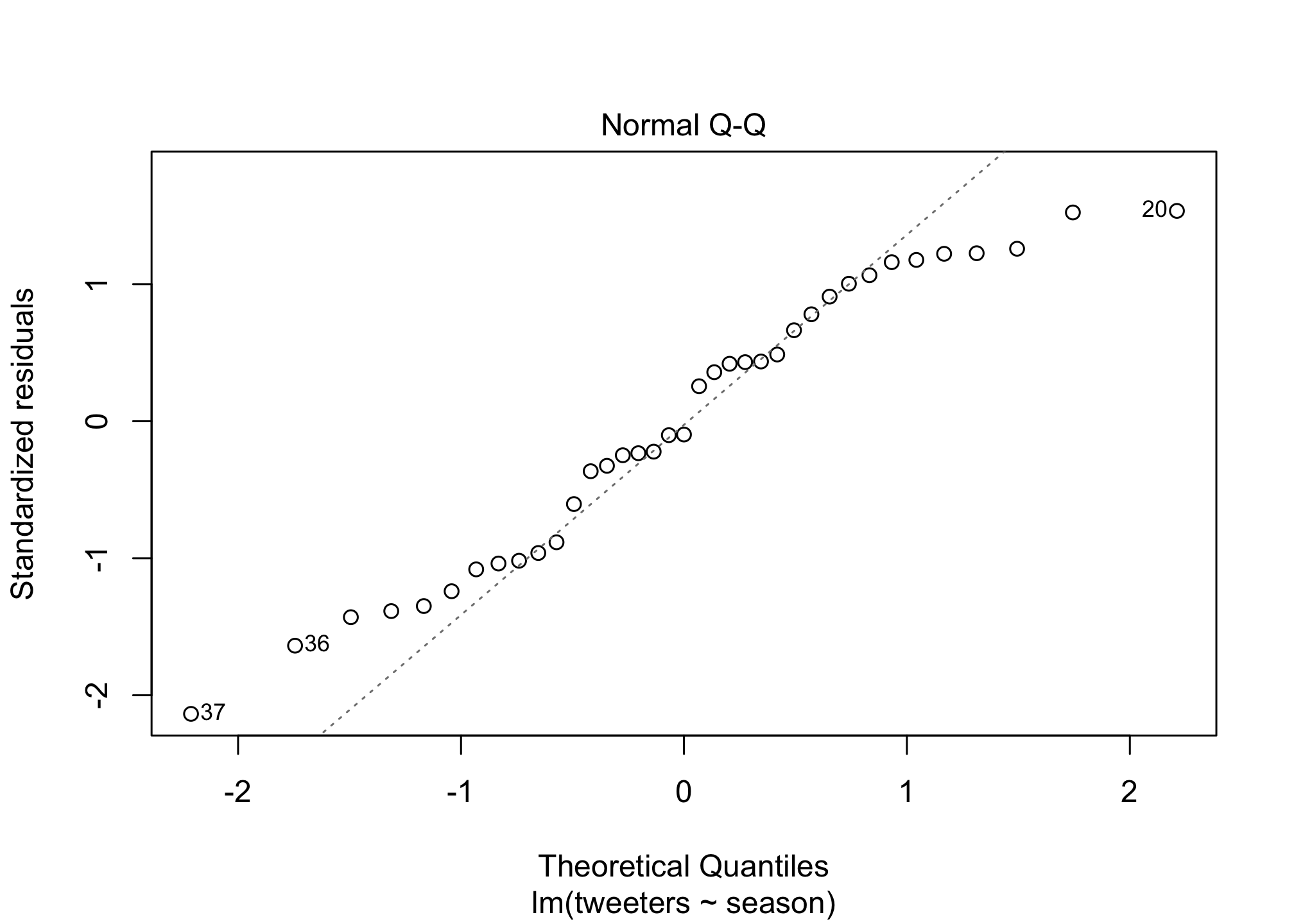
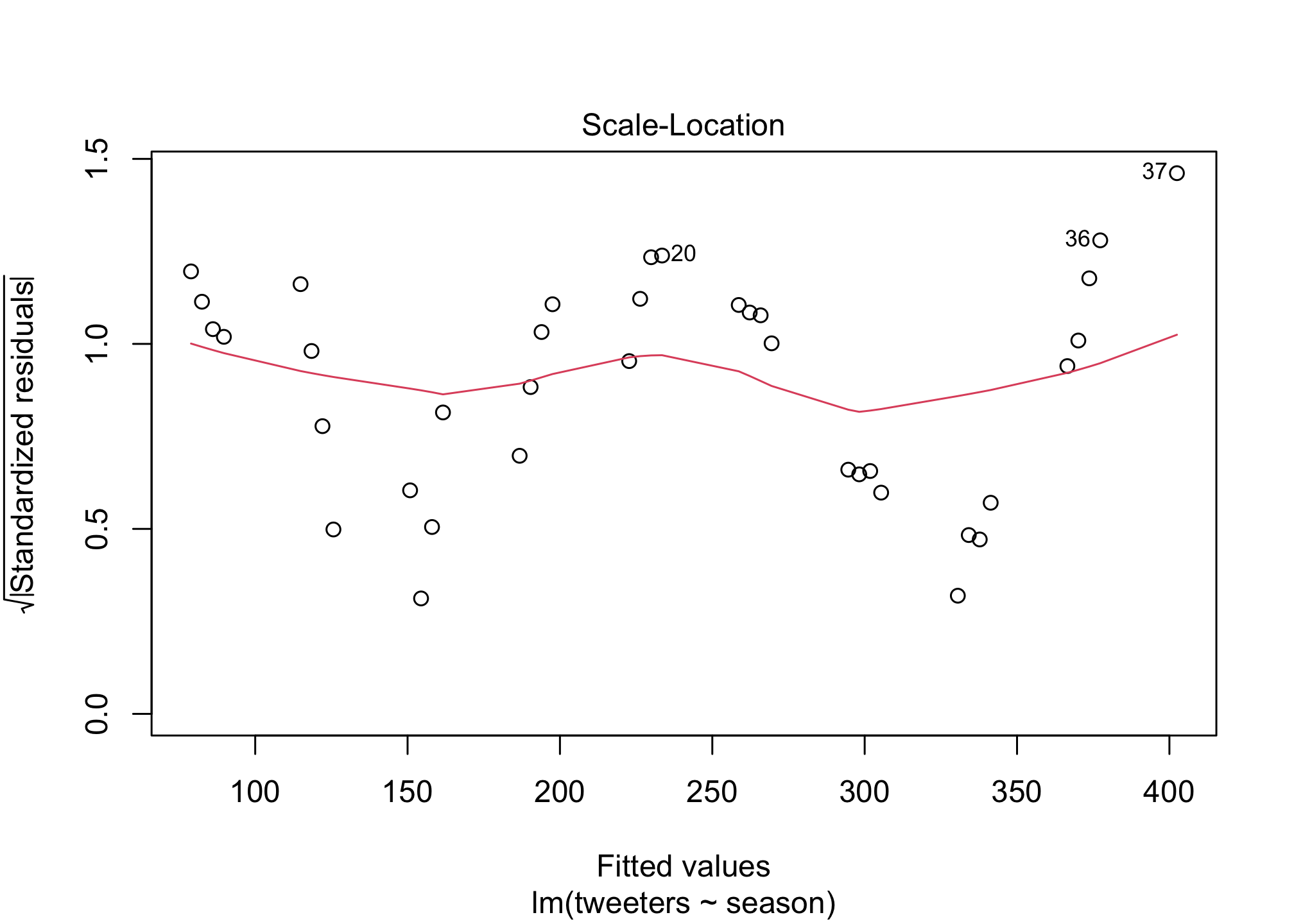
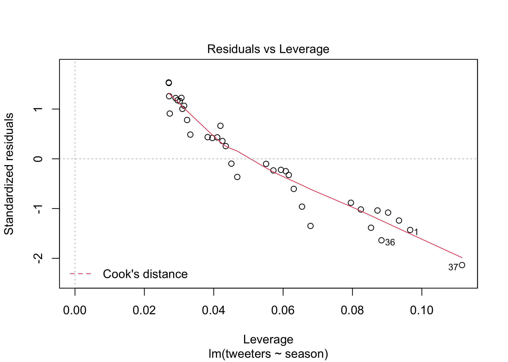
## F-statistic: 262.6 on 1 and 35 DF, p-value: < 2.2e-16plot(fit1)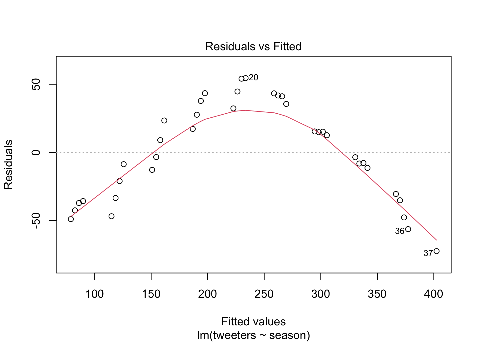
Scatterplots
Let’s load a dataset of Flower characteristics in 3 species of Iris.
data(iris)
head(iris)
## Sepal.Length Sepal.Width Petal.Length Petal.Width Species
## 1 5.1 3.5 1.4 0.2 setosa
## 2 4.9 3.0 1.4 0.2 setosa
## 3 4.7 3.2 1.3 0.2 setosa
## 4 4.6 3.1 1.5 0.2 setosa
## 5 5.0 3.6 1.4 0.2 setosa
## 6 5.4 3.9 1.7 0.4 setosaThere is a lot of data here! Let’s explore using the pairs() function
pairs(iris)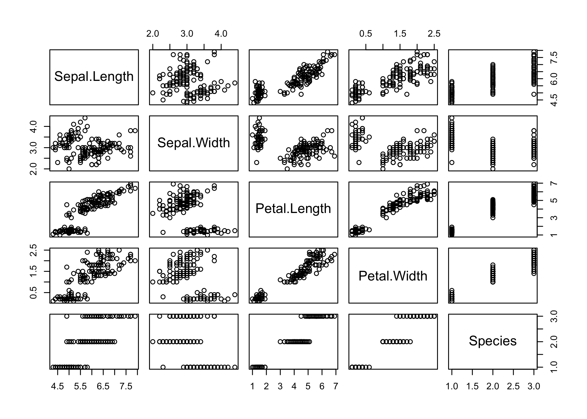
This doesn’t tell us much about the species differences. We can tell R to plot using a different color for the three species of iris
pairs(iris,
      col = iris$Species)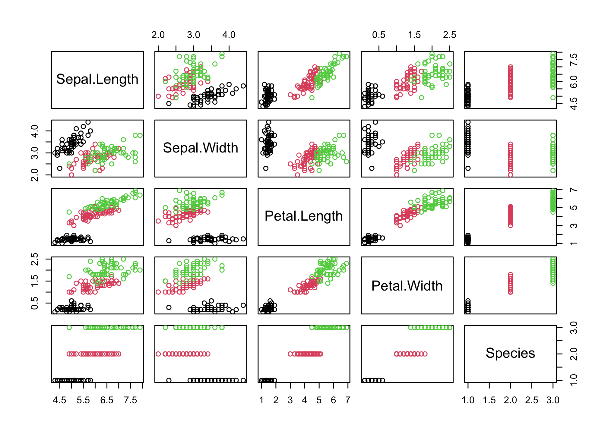
Sepal.Length and Petal.Length look interesting! Let’s start by looking at that
plot(iris$Sepal.Length,
     iris$Petal.Length,
     col = iris$Species)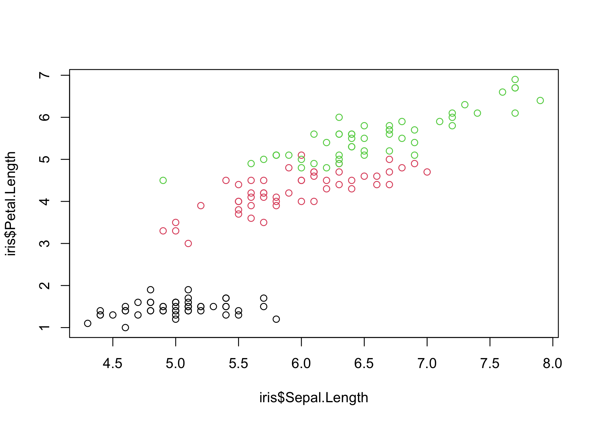
These points are difficult to see! Let’s pick some different ones using the pch option
plot(iris$Sepal.Length,
     iris$Petal.Length,
     col = iris$Species,
     pch = 15)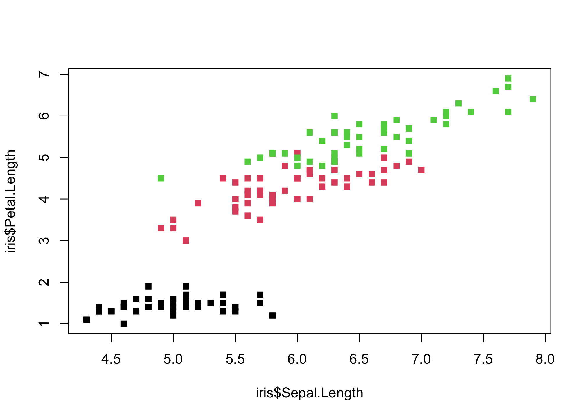
plot(iris$Sepal.Length,
     iris$Petal.Length,
     col = iris$Species,
     pch = "A")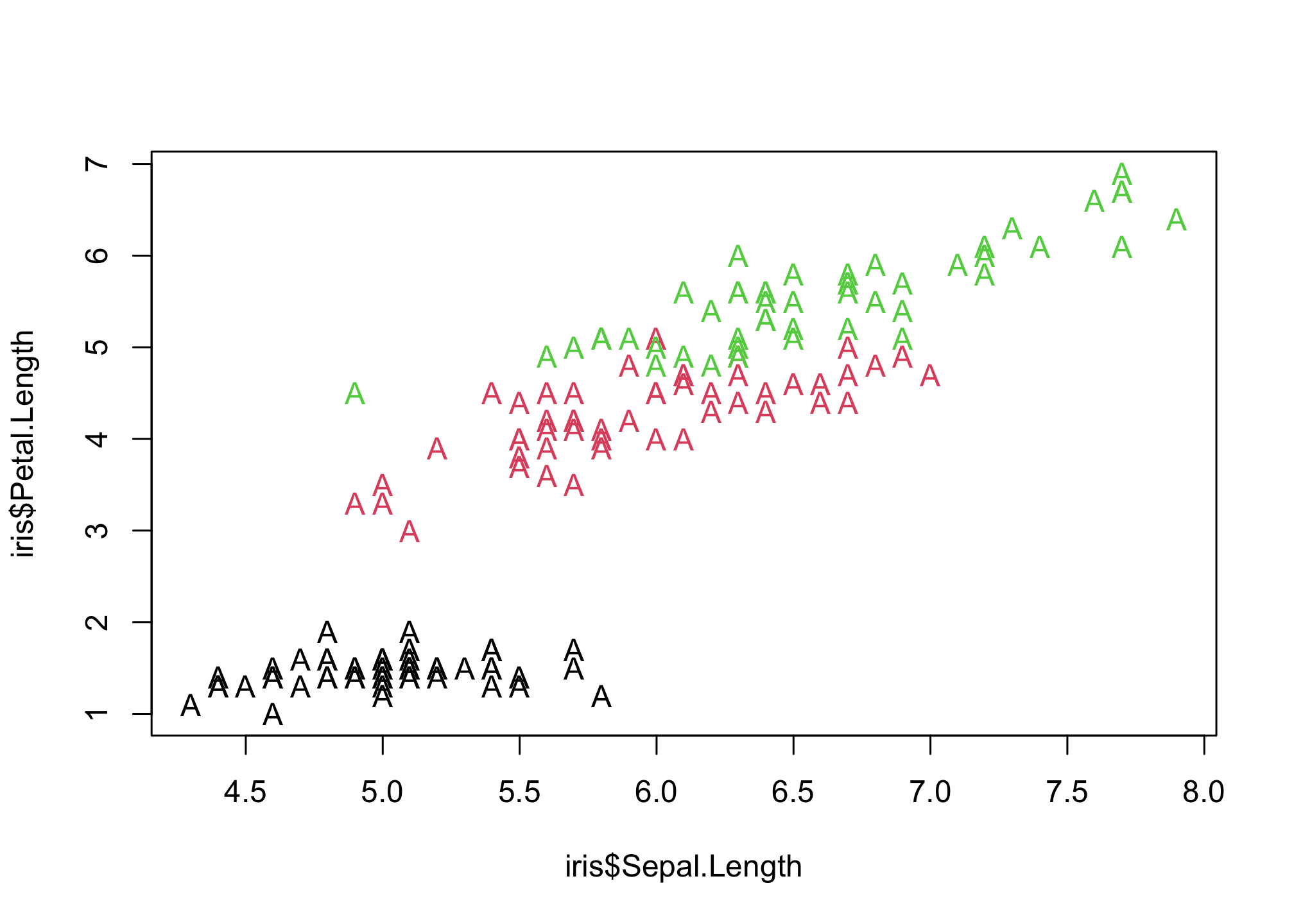
pch 21:25 also specify an edge color (col) and a background color (bg)
plot(iris$Sepal.Length,
     iris$Petal.Length,
     col = iris$Species,
     pch = 21,
     bg = "blue")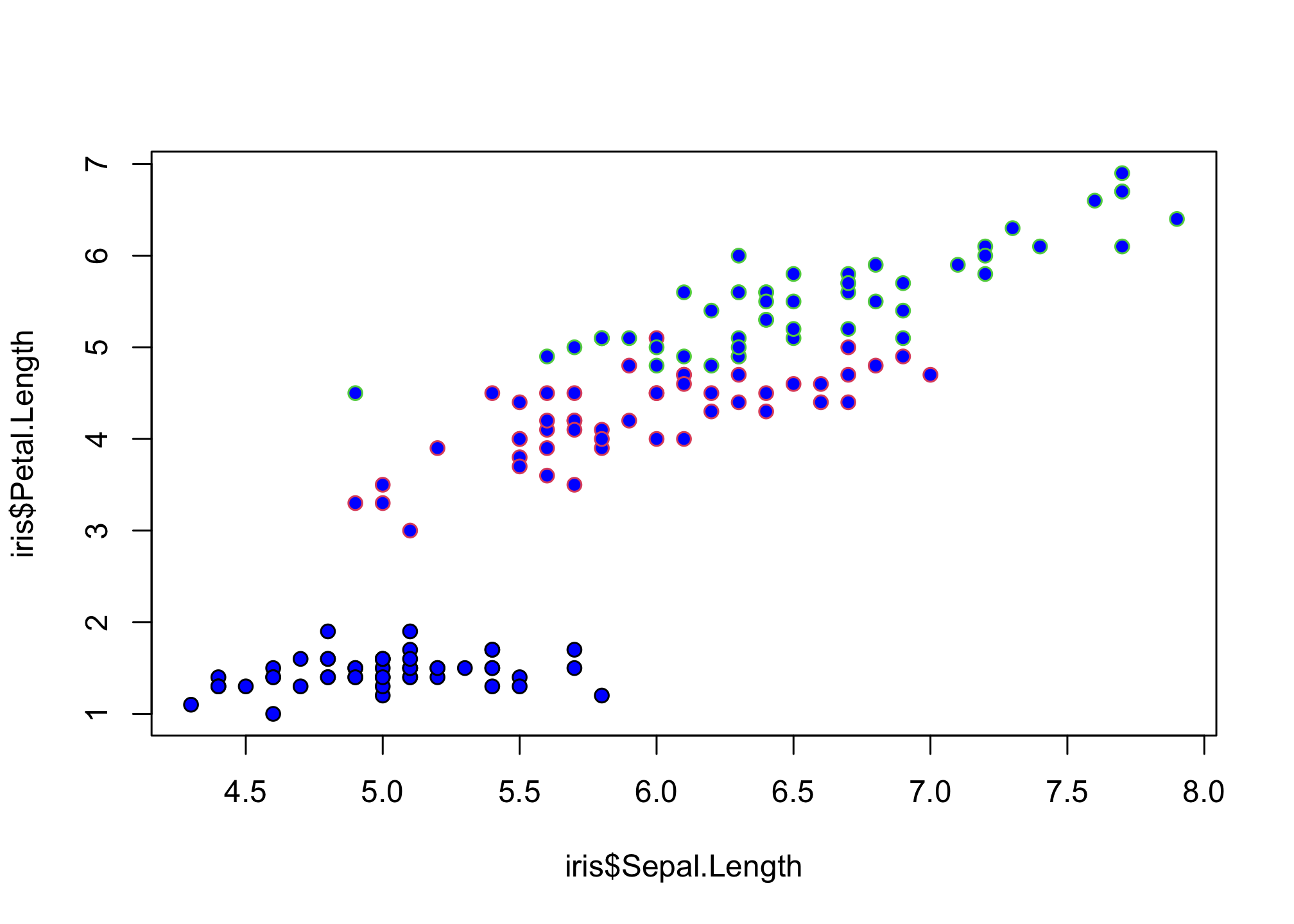
OK settling on solid circles…
plot(iris$Sepal.Length,
     iris$Petal.Length,
     col = iris$Species,
     pch = 16)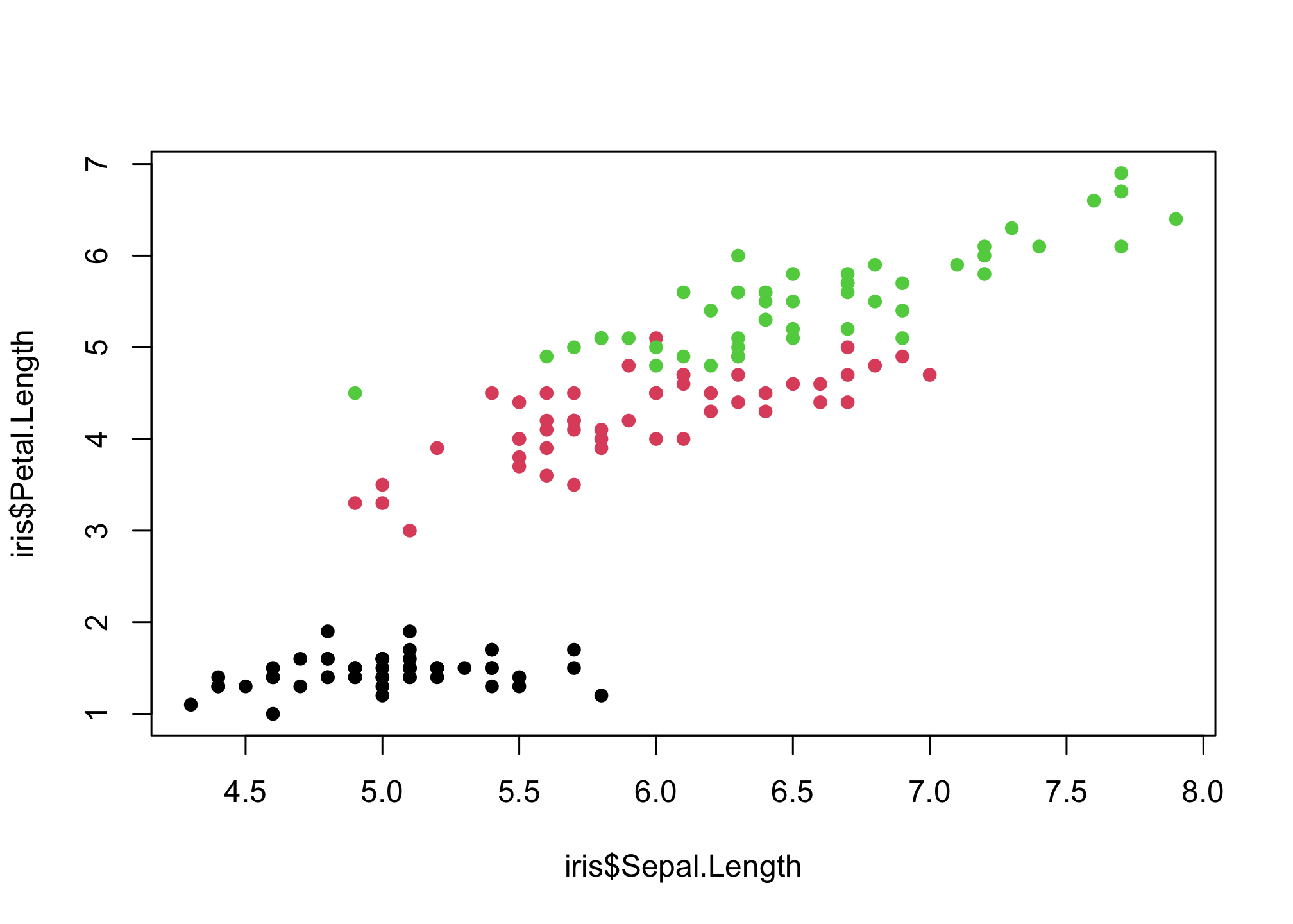
…that need to be bigger
plot(iris$Sepal.Length,
     iris$Petal.Length,
     col = iris$Species,
     pch = 16,
     cex = 2)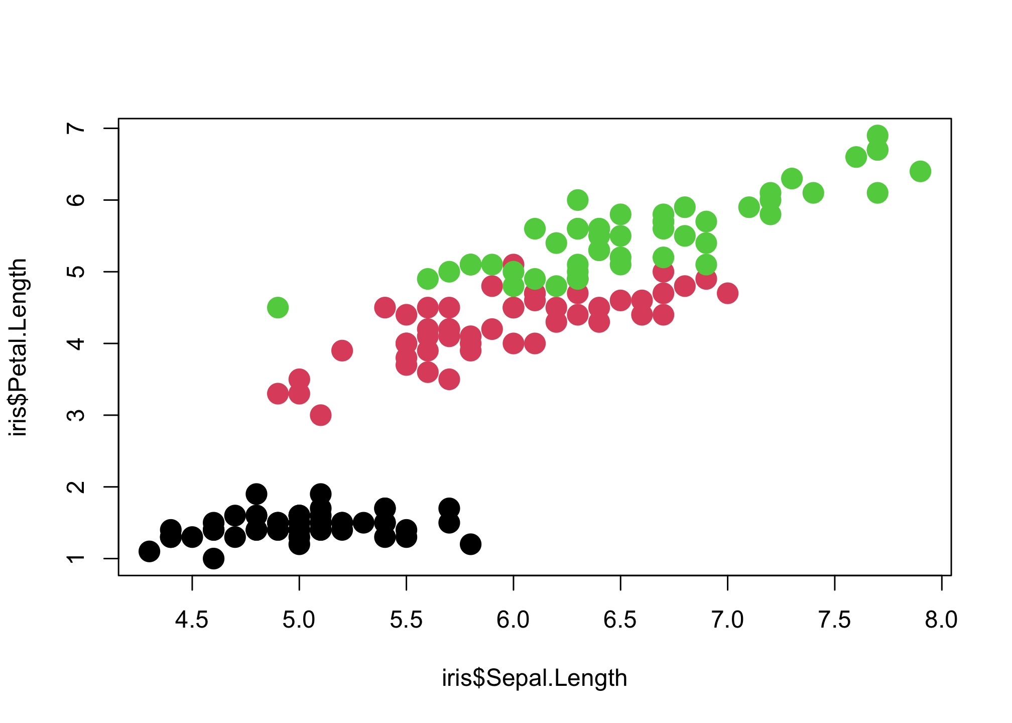
Boxplots
We’ll continue to use the Iris dataset for this section
head(iris)## Sepal.Length Sepal.Width Petal.Length Petal.Width Species
## 1 5.1 3.5 1.4 0.2 setosa
## 2 4.9 3.0 1.4 0.2 setosa
## 3 4.7 3.2 1.3 0.2 setosa
## 4 4.6 3.1 1.5 0.2 setosa
## 5 5.0 3.6 1.4 0.2 setosa
## 6 5.4 3.9 1.7 0.4 setosaLets first examine the distribution of Sepal Length for each species
boxplot(iris$Sepal.Length ~ iris$Species)
f you wish to compare the medians of the boxplot, you can use the function “notch”. If the notches of two plots do not overlap, this is ‘strong evidence’ that the two medians differ.
boxplot(iris$Sepal.Length ~ iris$Species,
        notch = T)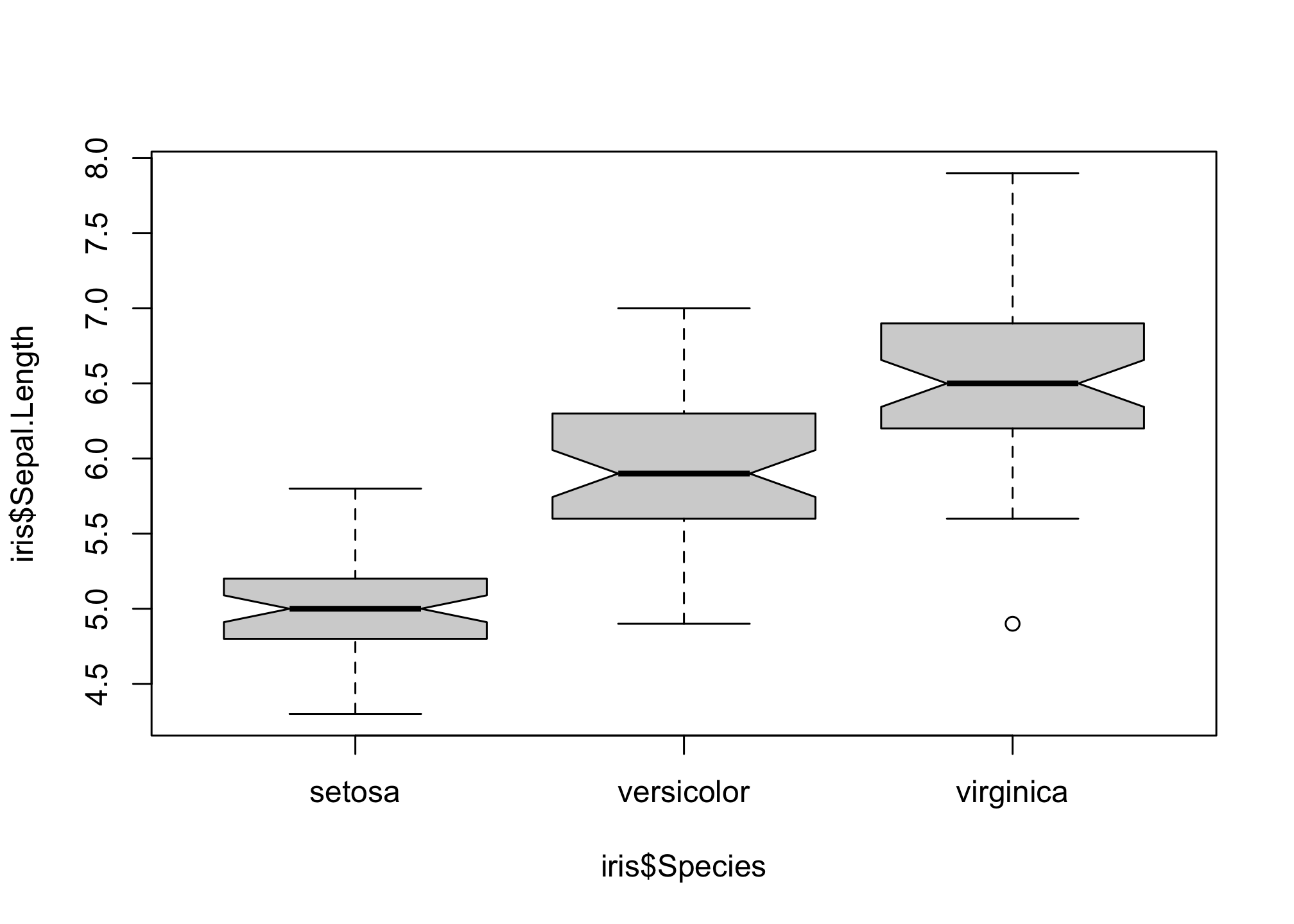
You may have noticed that the y-axis labels are always orientated to be perpendicular to the axis. We can rotate all axis labels using the las option.
boxplot(iris$Sepal.Length ~ iris$Species,
        notch = T,
las = 1) 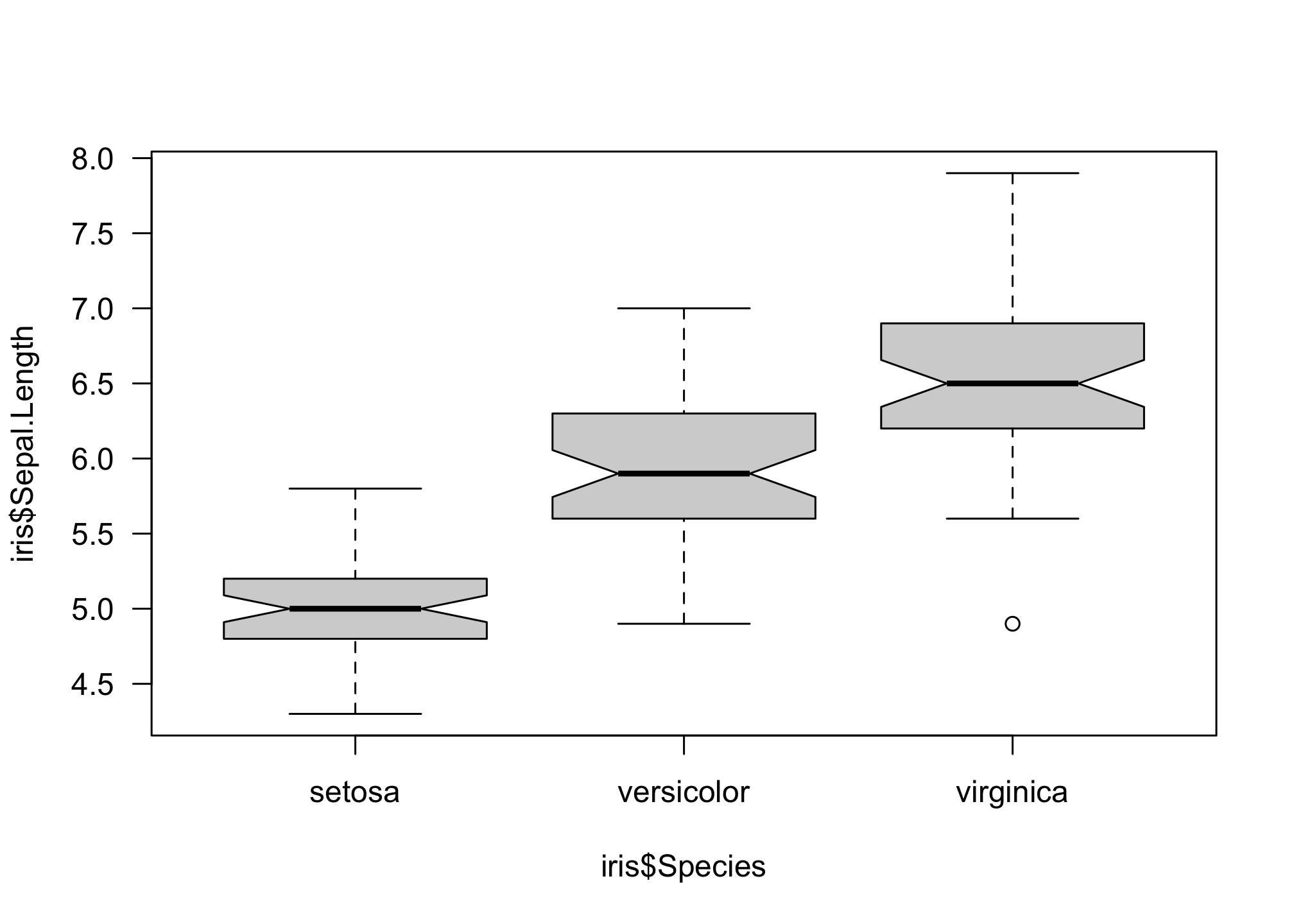
Now we can add in all the axis and plot labels…
boxplot(iris$Sepal.Length ~ iris$Species,
        notch = T,
        las = 1,
        xlab = "Species",
        ylab = "Sepal Length",
main = "Sepal Length by Species in Iris") 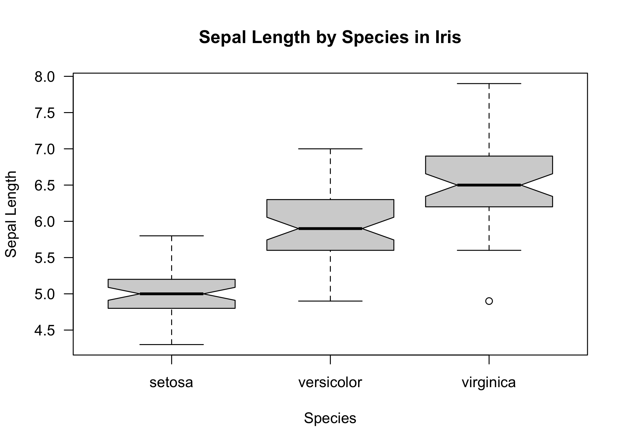
…and change sizes
boxplot(iris$Sepal.Length ~ iris$Species,
        notch = T,
        las = 1,
        xlab = "Species",
        ylab = "Sepal Length",
        main = "Sepal Length by Species in Iris",
        cex.lab = 1.5,
        cex.axis = 1.5,
cex.main = 2) 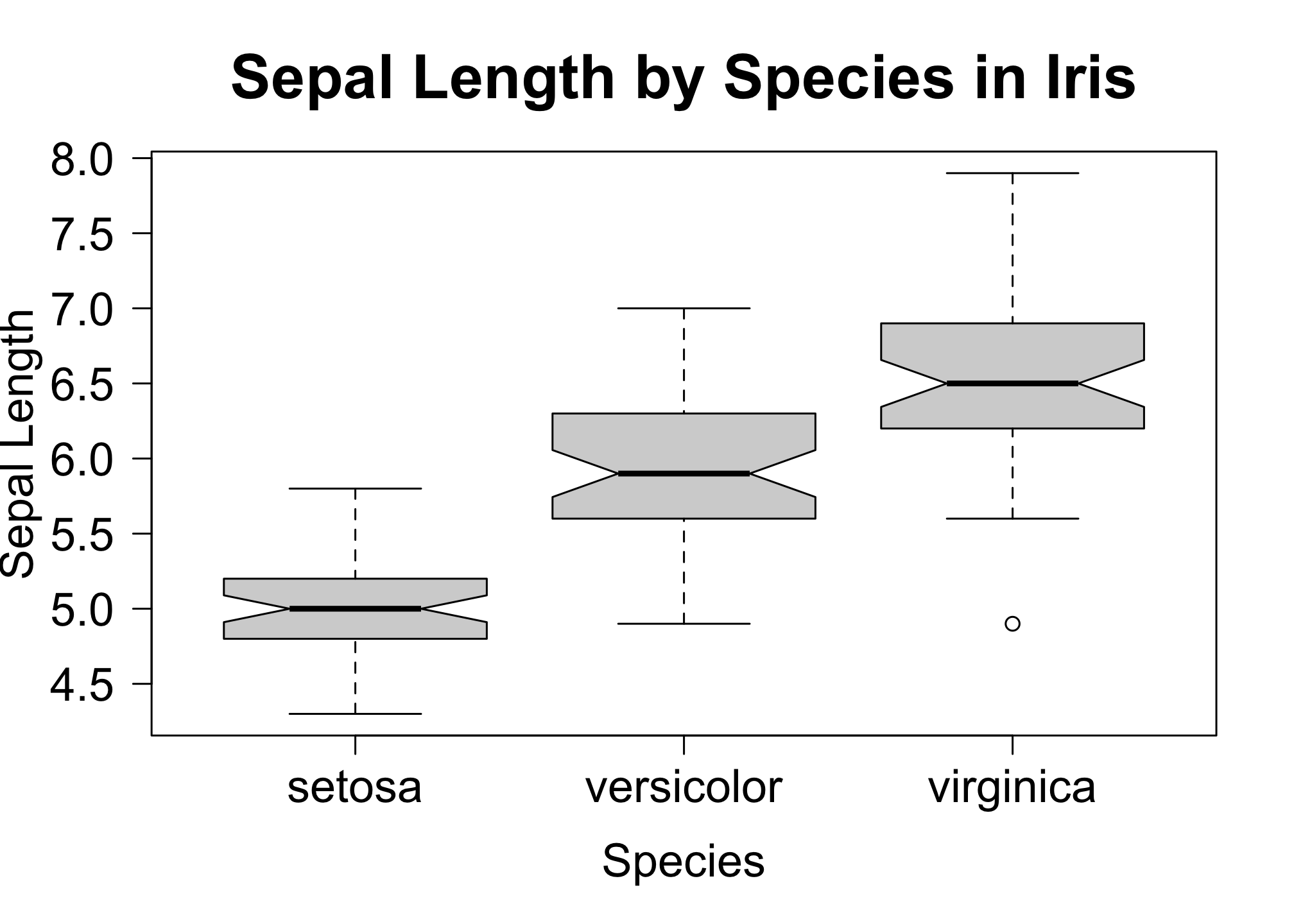
Plot Options
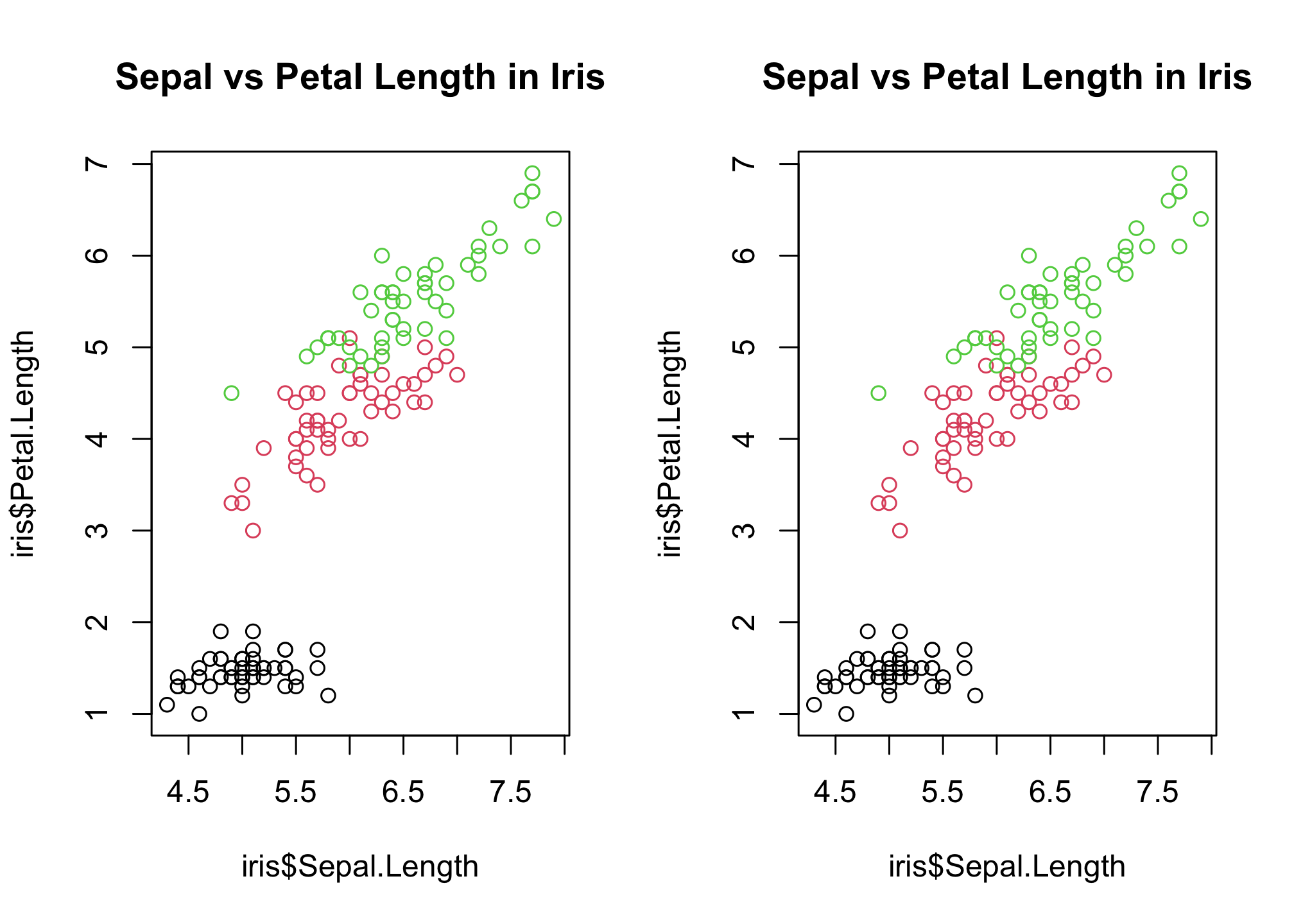
Rendering more than one plot in a window
# number of rows, number of columns
par(mfrow=c(1,2))

plot(
     # x variable, y variable
     iris$Sepal.Length, iris$Petal.Length,

      # color by species
     col = iris$Species,

     # plot title
     main = "Sepal vs Petal Length in Iris"
     )

plot(
    # x variable, y variable
     iris$Sepal.Length, iris$Petal.Length,

      # color by species
     col = iris$Species,

     # plot title
     main = "Sepal vs Petal Length in Iris"
) 
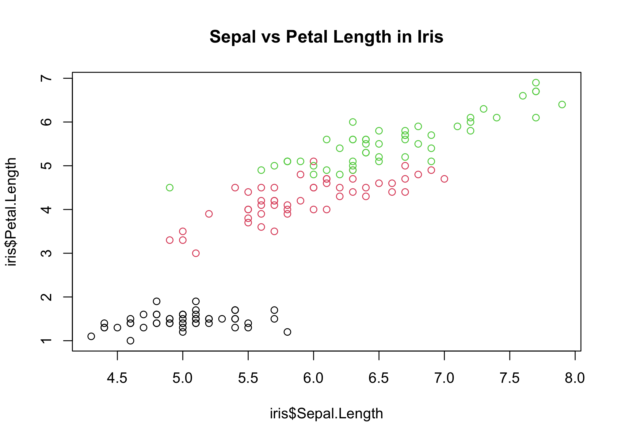
Adding the following sets the plot window back to normal
par(mfrow=c(1,1))

plot(
     # x variable, y variable
     iris$Sepal.Length, iris$Petal.Length,

      # color by species
     col = iris$Species,

     # plot title
     main = "Sepal vs Petal Length in Iris"
) 
or you can just clear the plot history by running
dev.off() ## null device
## 1