I'm the Map
- Getting Prepped
- First Things First! Set your Working Directory
- Download the script
- Read the Submission Directions
- Load Up Some Libraries
- What’s an API?
- API Credentials
- The Census API
- Selecting The Proper Census Data Sets
- PART I: The Map
- PART II: The US Census
- Getting the Data You Want
- PART III: Plotting
- Example: Tract Data
- Example: Alternate Projections
- Possible Solutions
Getting Prepped
First Things First! Set your Working Directory
Your working directory is simply where your script will look for anything it needs like external data sets. There are a few ways to go about doing this which we will cover. However for now, just do the following:
- Open up a new script by going to
File > New File > R Script. - Save it in a preferably empty folder as whatever you want.
- Go to the menu bar and select
Session > Set Working Directory > To Source File Location.
Download the script
Copying and pasting syntax from a browser can cause problems. To avoid this issue, please download a script with all of the needed code presented in this walkthrough.
Read the Submission Directions
Please submit a PDF out using an Rmarkdown file of five different maps using the Census data at the tract, county, state, region, and national levels to Slack for the out of class task.
Load Up Some Libraries
Please go ahead and download the libraries below you don’t have and load them up
library(ggmap)
library(maps)
library(mapdata)
library(rgdal)
library(tidyverse)
library(tools)
library(viridis)
There are a lot of mapping and support packages in R so we should first take a look at the ones being used here
| Library | Description | Repository | Example |
|---|---|---|---|
ggmap | Gives the ability to visualize spatial data | Github | Cheatsheet |
maps | Computes the areas of regions in a projected map | Github | Walkthrough |
mapdata | Provides both larger and higher-resolution databases | Github | Walkthrough |
rgdal | Bindings for the Geospatial Data Abstraction Library | Github | Walkthrough |
tidyverse | Nope | Github | Homepage |
tools | Used to manipulating R packages and their documentation | None1 | StackOverflow |
viridis | Viridis color and fill palette | Github | Vignette |
What’s an API?
API stands for Application Programming Interface which is essentially a fancy name for a program that acts as a middleman between two services with sets of instructions.

We’ll be using the U.S. Census API.
API Credentials
There are a few things you need to do when grabbing Census data.
You must have a key from https://api.census.gov/data/key_signup.html
Load up (or install and then load up) the library
censusapi
library(censusapi)##
## Attaching package: 'censusapi'## The following object is masked from 'package:methods':
##
## getFunction- Add key to the
.Renviron(the place in thecensusapiwhere your unique identifier, or key, is stored)
Sys.setenv(CENSUS_KEY="YOUR API KEY HERE")- Reload the
.Renviron
readRenviron("~/.Renviron") # You may get a warning...ignore it- Check to see that your key stored within R
Sys.getenv("CENSUS_KEY")## [1] "YOUR UNIQUE IDENTIFIER HERE"
The Census API
Let’s a list of all data sets associated with the US Census through their API.
availableapis <- listCensusApis()You can use the datatable() command from the DT package to see an better view of the output. Yours will look similar to what is shown below but with more functionality.
datatable(availableapis)| title | name | vintage | url | isTimeseries | temporal | description | modified | |
|---|---|---|---|---|---|---|---|---|
| 457 | Annual Economic Surveys: Annual Business Survey | abscb | 2017 | https://api.census.gov/data/2017/abscb | NA | unidentified | The Annual Business Survey (ABS) provides information on selected economic and demographic characteristics for businesses and business owners by sex, ethnicity, race, and veteran status. Further, the survey measures research and development (for microbusinesses), new business topics such as innovation and technology, as well as other business characteristics. The U.S. Census Bureau and the National Center conduct the ABS jointly for Science and Engineering Statistics within the National Science Foundation. The ABS replaces the five-year Survey of Business Owners (SBO) for employer businesses, the Annual Survey of Entrepreneurs (ASE), the Business R&D and Innovation for Microbusinesses survey (BRDI-M), and the innovation section of the Business R&D and Innovation Survey (BRDI-S). https://www.census.gov/programs-surveys/abs.html | 2020-04-30 00:00:00.0 |
| 541 | Annual Economic Surveys: Annual Business Survey | abscb | 2018 | https://api.census.gov/data/2018/abscb | NA | unidentified | The Annual Business Survey (ABS) provides information on selected economic and demographic characteristics for businesses and business owners by sex, ethnicity, race, and veteran status. Further, the survey measures research and development (for microbusinesses), new business topics such as innovation and technology, as well as other business characteristics. The U.S. Census Bureau and the National Center conduct the ABS jointly for Science and Engineering Statistics within the National Science Foundation. The ABS replaces the five-year Survey of Business Owners (SBO) for employer businesses, the Annual Survey of Entrepreneurs (ASE), the Business R&D and Innovation for Microbusinesses survey (BRDI-M), and the innovation section of the Business R&D and Innovation Survey (BRDI-S). https://www.census.gov/programs-surveys/abs.html | 2020-10-26 00:00:00.0 |
| 458 | Annual Economic Surveys: Annual Business Survey | abscbo | 2017 | https://api.census.gov/data/2017/abscbo | NA | unidentified | The Annual Business Survey (ABS) provides information on selected economic and demographic characteristics for businesses and business owners by sex, ethnicity, race, and veteran status. Further, the survey measures research and development (for microbusinesses), new business topics such as innovation and technology, as well as other business characteristics. The U.S. Census Bureau and the National Center conduct the ABS jointly for Science and Engineering Statistics within the National Science Foundation. The ABS replaces the five-year Survey of Business Owners (SBO) for employer businesses, the Annual Survey of Entrepreneurs (ASE), the Business R&D and Innovation for Microbusinesses survey (BRDI-M), and the innovation section of the Business R&D and Innovation Survey (BRDI-S). https://www.census.gov/programs-surveys/abs.html | 2020-04-30 00:00:00.0 |
| 542 | Annual Economic Surveys: Annual Business Survey | abscbo | 2018 | https://api.census.gov/data/2018/abscbo | NA | unidentified | The Annual Business Survey (ABS) provides information on selected economic and demographic characteristics for businesses and business owners by sex, ethnicity, race, and veteran status. Further, the survey measures research and development (for microbusinesses), new business topics such as innovation and technology, as well as other business characteristics. The U.S. Census Bureau and the National Center conduct the ABS jointly for Science and Engineering Statistics within the National Science Foundation. The ABS replaces the five-year Survey of Business Owners (SBO) for employer businesses, the Annual Survey of Entrepreneurs (ASE), the Business R&D and Innovation for Microbusinesses survey (BRDI-M), and the innovation section of the Business R&D and Innovation Survey (BRDI-S). https://www.census.gov/programs-surveys/abs.html | 2020-10-26 00:00:00.0 |
| 459 | Annual Economic Surveys: Annual Business Survey | abscs | 2017 | https://api.census.gov/data/2017/abscs | NA | unidentified | The Annual Business Survey (ABS) provides information on selected economic and demographic characteristics for businesses and business owners by sex, ethnicity, race, and veteran status. Further, the survey measures research and development (for microbusinesses), new business topics such as innovation and technology, as well as other business characteristics. The U.S. Census Bureau and the National Center conduct the ABS jointly for Science and Engineering Statistics within the National Science Foundation. The ABS replaces the five-year Survey of Business Owners (SBO) for employer businesses, the Annual Survey of Entrepreneurs (ASE), the Business R&D and Innovation for Microbusinesses survey (BRDI-M), and the innovation section of the Business R&D and Innovation Survey (BRDI-S). https://www.census.gov/programs-surveys/abs.html | 2020-04-30 00:00:00.0 |
| 543 | Annual Economic Surveys: Annual Business Survey | abscs | 2018 | https://api.census.gov/data/2018/abscs | NA | unidentified | The Annual Business Survey (ABS) provides information on selected economic and demographic characteristics for businesses and business owners by sex, ethnicity, race, and veteran status. Further, the survey measures research and development (for microbusinesses), new business topics such as innovation and technology, as well as other business characteristics. The U.S. Census Bureau and the National Center conduct the ABS jointly for Science and Engineering Statistics within the National Science Foundation. The ABS replaces the five-year Survey of Business Owners (SBO) for employer businesses, the Annual Survey of Entrepreneurs (ASE), the Business R&D and Innovation for Microbusinesses survey (BRDI-M), and the innovation section of the Business R&D and Innovation Survey (BRDI-S). https://www.census.gov/programs-surveys/abs.html | 2020-10-26 00:00:00.0 |
The Census APIs have over 550 different data repositories, each with numerous data sets within those.
nrow(availableapis)## [1] 552Trying to locate what you want can be difficult but there are ways to reduce the time needed. Say I wanted any data set where income is mentioned anywhere…
availableapis %>%
  filter_all(any_vars(grepl("income", .))) %>%
datatable()| title | name | vintage | url | isTimeseries | temporal | description | modified |
|---|---|---|---|---|---|---|---|
… or I could just narrow and search just the description
availableapis %>%
  filter(str_detect(description, 'income')) %>%
datatable()| title | name | vintage | url | isTimeseries | temporal | description | modified |
|---|---|---|---|---|---|---|---|
I could also arrange the set filtering the descriptions by geography and demographics. There are a lot of ways go about doing this. Here’s one
availableapis %>%
  filter(str_detect(description, c('geo'))) %>%
  filter(str_detect(description, c('demo'))) %>%
  drop_na(vintage) %>%
  arrange(-vintage) %>%
datatable()| title | name | vintage | url | isTimeseries | temporal | description | modified |
|---|---|---|---|---|---|---|---|
which translates to
refer to the data set we need %>%
we need geographic data but the description could also say geography, geographical, etc so we search by the term stem %>%
same idea as above for demographical information %>%
drop the rows that have NA for years %>%
arrange the years from most recent going backwards %>%
show this in a datatable() format
Assume I want to look at the 2018 American Community Survey: 5-Year Estimates which is described as an ongoing survey that provides data every year – giving communities the current information they need to plan investments and services. The ACS covers a broad range of topics about social, economic, demographic, and housing characteristics of the U.S. population. The Comparison Profiles include the following geographies: nation, all states (including DC and Puerto Rico), all metropolitan areas, all congressional districts, all counties, all places and all tracts. Comparison Profiles contain broad social, economic, housing, and demographic information. The data are presented as both counts and percentages.
There are over 2,400 variables in this dataset! You can find out more from the Census ACS API page.
Selecting The Proper Census Data Sets
We need to check for geographic data in the ACS because not everything in the Census API has geographical information
listCensusMetadata(name = "acs/acs5/profile",
                   vintage = 2018,
                   type = "geography") %>%
  as_tibble() %>%
  unnest(cols = c())
## # A tibble: 53 x 6
## name geoLevelDisplay referenceDate requires wildcard optionalWithWCF…
## <chr> <chr> <chr> <list> <list> <chr>
## 1 us 010 2018-01-01 <NULL> <NULL> <NA>
## 2 region 020 2018-01-01 <NULL> <NULL> <NA>
## 3 division 030 2018-01-01 <NULL> <NULL> <NA>
## 4 state 040 2018-01-01 <NULL> <NULL> <NA>
## 5 county 050 2018-01-01 <chr [1]> <chr [1… state
## 6 county sub… 060 2018-01-01 <chr [2]> <chr [1… county
## 7 subminor c… 067 2018-01-01 <chr [3]> <NULL> <NA>
## 8 tract 140 2018-01-01 <chr [2]> <chr [1… county
## 9 place 160 2018-01-01 <chr [1]> <chr [1… state
## 10 consolidat… 170 2018-01-01 <chr [1]> <chr [1… state
## # … with 43 more rowsGood! This API has a lot of geographies including: us, region, division, state, county, etc.
vars <- listCensusMetadata(name = "acs/acs5/profile",
                           vintage = 2018,
                           type = "variables")
vars %>%
as_tibble() %>%
datatable()| name | label | concept | predicateType | group | limit | attributes | required |
|---|---|---|---|---|---|---|---|
| DP02_0126E | Estimate!!ANCESTRY!!Total population!!Danish | SELECTED SOCIAL CHARACTERISTICS IN THE UNITED STATES | int | DP02 | 0 | DP02_0126EA,DP02_0126M,DP02_0126MA | NA |
| DP05_0050PE | Percent Estimate!!RACE!!Total population!!One race!!Asian!!Vietnamese | ACS DEMOGRAPHIC AND HOUSING ESTIMATES | float | DP05 | 0 | DP05_0050PM,DP05_0050PMA,DP05_0050PEA | NA |
| DP04_0047E | Estimate!!HOUSING TENURE!!Occupied housing units!!Renter-occupied | SELECTED HOUSING CHARACTERISTICS | int | DP04 | 0 | DP04_0047M,DP04_0047MA,DP04_0047EA | NA |
| DP02PR_0083PE | Percent Estimate!!RESIDENCE 1 YEAR AGO!!Population 1 year and over!!Different house in Puerto Rico or the U.S.!!In Puerto Rico!!Different municipio | SELECTED SOCIAL CHARACTERISTICS IN PUERTO RICO | float | DP02PR | 0 | DP02PR_0083PM,DP02PR_0083PMA,DP02PR_0083PEA | NA |
| DP02PR_0106PE | Percent Estimate!!WORLD REGION OF BIRTH OF FOREIGN BORN!!Foreign-born population, excluding population born at sea!!Africa | SELECTED SOCIAL CHARACTERISTICS IN PUERTO RICO | float | DP02PR | 0 | DP02PR_0106PM,DP02PR_0106PMA,DP02PR_0106PEA | NA |
| DP04_0046E | Estimate!!HOUSING TENURE!!Occupied housing units!!Owner-occupied | SELECTED HOUSING CHARACTERISTICS | int | DP04 | 0 | DP04_0046M,DP04_0046MA,DP04_0046EA | NA |
PART I: The Map
Country Level Data
Load some United States demographic data.
usa <- map_data("usa")Before you look at it by running usa, Census data sets are typically huge for obvious reasons. Let’s see how big the file actually is.
dim(usa)## [1] 7243 6With 43,458 entries, that’s pretty big! Maybe we shouldn’t load it up (even in View() it takes awhile). Let’s instead just see the first and last six rows to get an idea of what it looks like to get an idea.
head(usa) ## long lat group order region subregion
## 1 -101.4078 29.74224 1 1 main <NA>
## 2 -101.3906 29.74224 1 2 main <NA>
## 3 -101.3620 29.65056 1 3 main <NA>
## 4 -101.3505 29.63911 1 4 main <NA>
## 5 -101.3219 29.63338 1 5 main <NA>
## 6 -101.3047 29.64484 1 6 main <NA>tail(usa) ## long lat group order region subregion
## 7247 -122.6187 48.37482 10 7247 whidbey island <NA>
## 7248 -122.6359 48.35764 10 7248 whidbey island <NA>
## 7249 -122.6703 48.31180 10 7249 whidbey island <NA>
## 7250 -122.7218 48.23732 10 7250 whidbey island <NA>
## 7251 -122.7104 48.21440 10 7251 whidbey island <NA>
## 7252 -122.6703 48.17429 10 7252 whidbey island <NA>We have columns that can be used! The most obvious choice for map data is using the coordinates for longitude and latitude. So let’s plot using the longitudinal (long) and latitudinal (lat) columns.
ggplot() +
  geom_polygon(data = usa,
               aes(x=long, y = lat, group = group))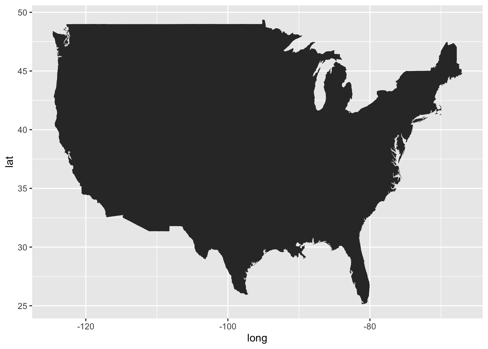
Well that looks terrible. So what’s happening here? In a nutshell, it’s plotting exactly how you would see the US if you flattened (aka projected) the coordinates from a sphere to a flat surface. Most maps account for this using a correction via an aspect ratio. In R, we use a command called coord_fixed
ggplot() +
  geom_polygon(data = usa,
               aes(x=long, y = lat, group = group)) +
  coord_fixed(1.3) # 1.3 is a decent standard estimate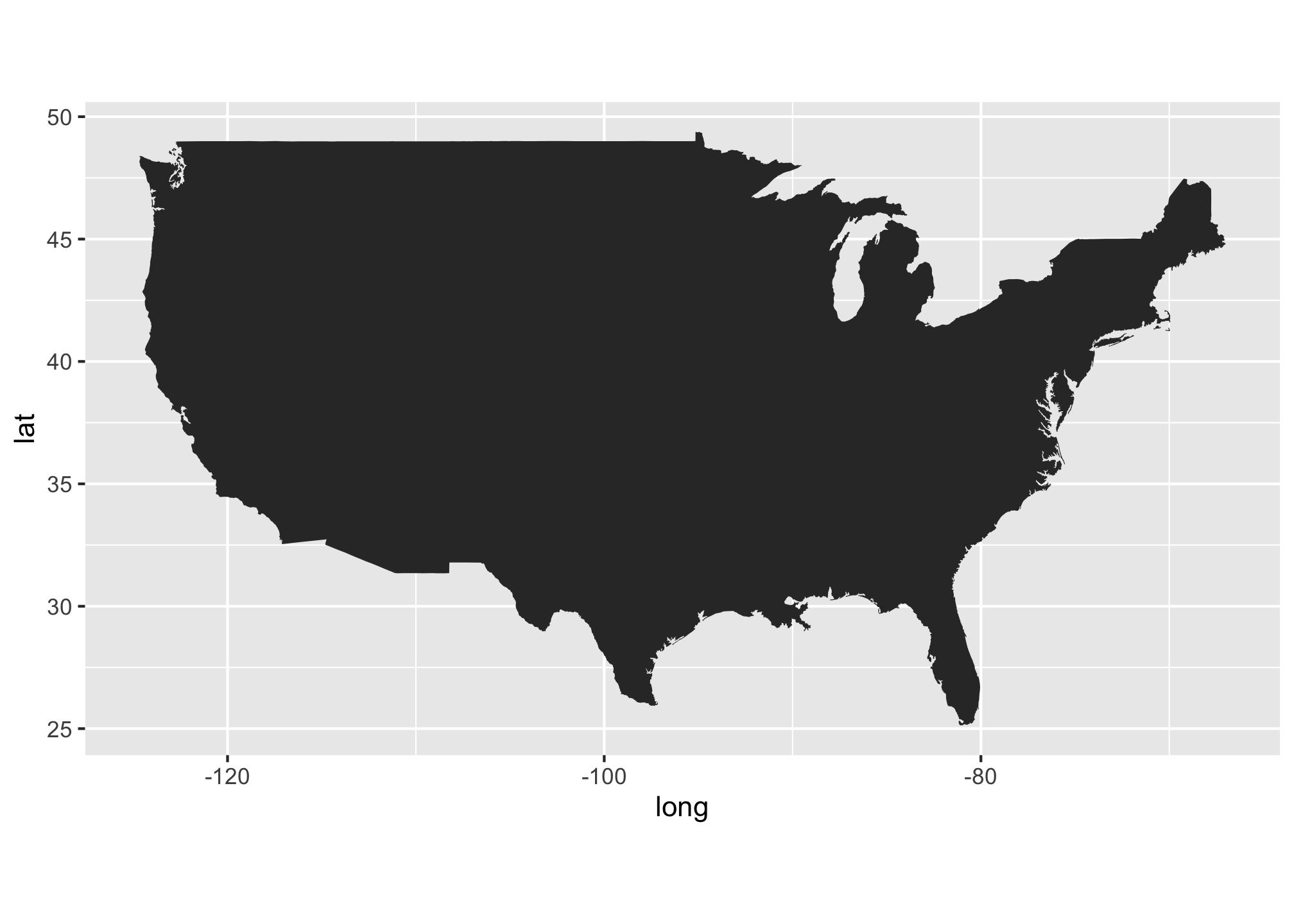
There we go. That looks better but of course its just a grey silhouette. Let’s first try adding some base color.
ggplot() +
  geom_polygon(data = usa, aes(x=long, y = lat, group = group), color = "#1b85b8",
               fill = "#559e83") +
  coord_fixed(1.3)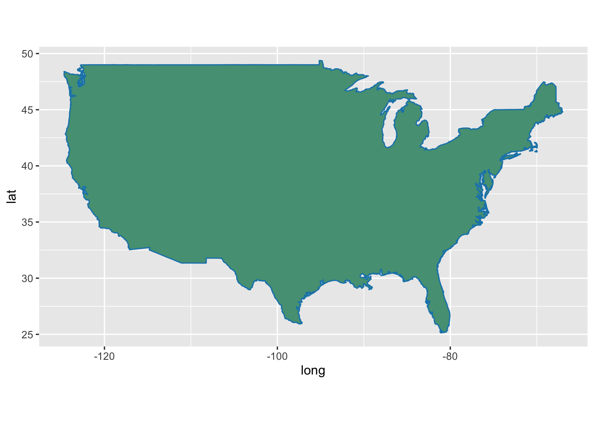
Its looking better but something is missing. Hmmm….Oh!…Its the “S” part of “USA” - To get that, we need to look at state level data.
State Level Data
We have two choices: we can either bring in a particular state or bring them all in and then filter later. Unless you specifically know which state you want, its a good rule of thumb to bring in all state level data.
state <- map_data("state")As a side note, if you know which state you want to look at, then just do the following. I’ll use California as an example.
California <- map_data("state", region = "CA")A good thing to note is that region = is a bit misleading. At first you may think that it is a state’s abbreviation but it is not. In fact, you can’t even use abbreviations in that field. For example, if we use the abbreviation for Kansas, you’ll get nonsense
Kansas <- map_data("state", region = "KS")## Error in map.poly(database, regions, exact, xlim, ylim, boundary, interior, : no recognized region names(Yes the output is going off the page and no I can’t do anything about it)
The command region = is actually a filter so you need to put as much information as you can to ensure that you only get the state you want. For example, let’s see what happens when I do the following
Michigan <- map_data("state", region = "MI")Well MI is certainly the standard abbreviation for Michigan but again, that is not what the command is doing. Other states have those letters:
unique(Michigan$region)## [1] "michigan" "minnesota" "mississippi" "missouri"That is not what we wanted so please make sure you use the region filter correctly. In a worst case scenario or if you don’t mind the extra effort, just type in the name of the state.
Michigan <- map_data("state",
region = "Michigan")unique(Michigan$region)## [1] "michigan"That’s much better! OK back to mapping. I’m actually going to stick with Michigan. Notice here that I am using the entire state data set and filtering Michigan out with the command subset and the == (double equals sign).
mi <- subset(state,
             region=="michigan")
For a basic plot, we do the following:
ggplot() +
  geom_polygon(data = mi,
                        aes(x=long, y = lat, group = group)) +
  coord_fixed(1.3)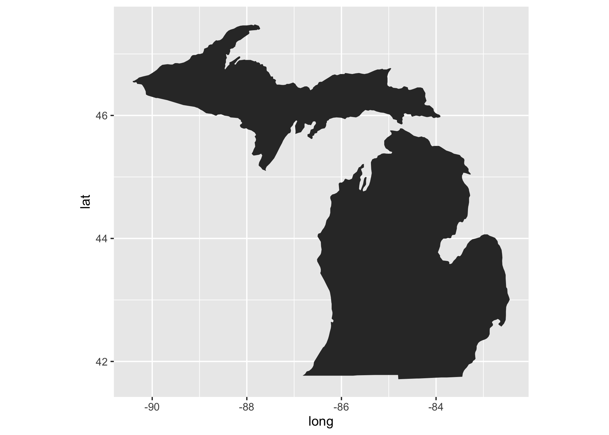
Michigan’s shape is pretty unique and that sure looks like it but the plot is pretty bland. Let’s give it some color and a legend.
ggplot() +
  geom_polygon(data = mi, aes(x=long, y = lat, group = group, fill=region)) +
  scale_fill_manual(values=c("#6A0032")) +
  coord_fixed(1.3)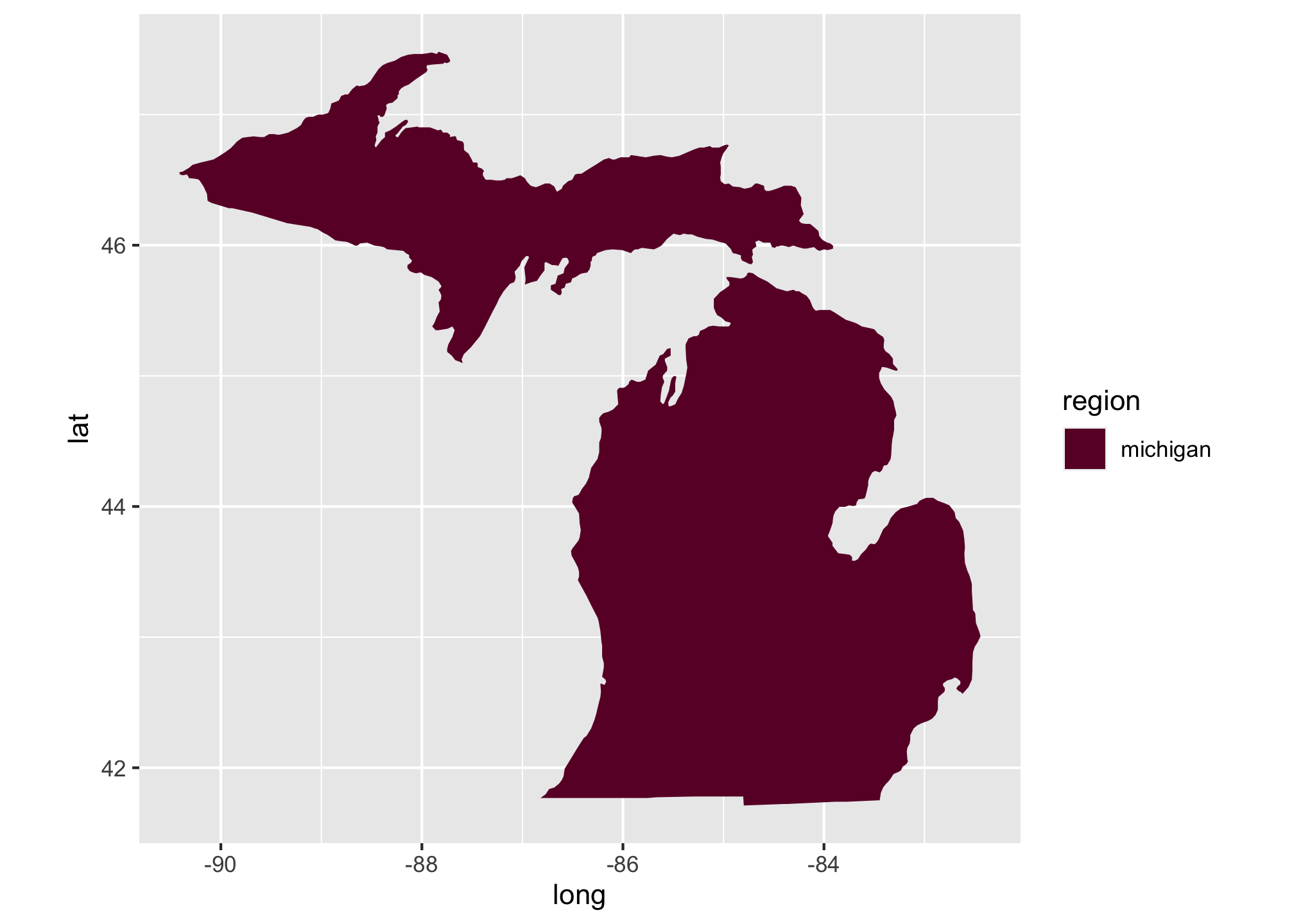
Not bad but we can get even more granular. Let’s look at county level data.
County Level Data
Much like before, we’re going to pull in all of the county level data,
county <- map_data("county")then we’ll filter it for Michigan,
mi_count <- subset(county, region=="michigan")and finally we’ll plot it.
ggplot() +
  geom_polygon(data = mi_count, aes(x=long, y = lat, group = group, fill=subregion),
               color = "#FFFFFF") +
  scale_fill_viridis(discrete = TRUE,
                     alpha=0.7,
                     option="inferno") +
  theme_bw() +
  theme(plot.title = element_text(size = 26, color ="#105456",  vjust = -1),
        legend.position ="bottom",
        legend.direction = 'vertical',
        legend.text = element_text(size=15, color = "#59595B"),
        legend.title = element_blank(),
        legend.title.align = 0.5,
        legend.spacing.x = unit(0.5, "cm"),
        legend.spacing.y = unit(0.5, "cm"),
        legend.background = element_rect(linetype = 0, size = 0.5, colour = 1),
        panel.background = element_blank(),
        axis.title.x = element_blank(),
        axis.title.y = element_blank(),
        axis.ticks = element_blank(),
        axis.text = element_blank(),
        panel.border = element_blank(),
        panel.grid.major = element_blank(),
        panel.grid.minor = element_blank()) +
  coord_fixed(1.3)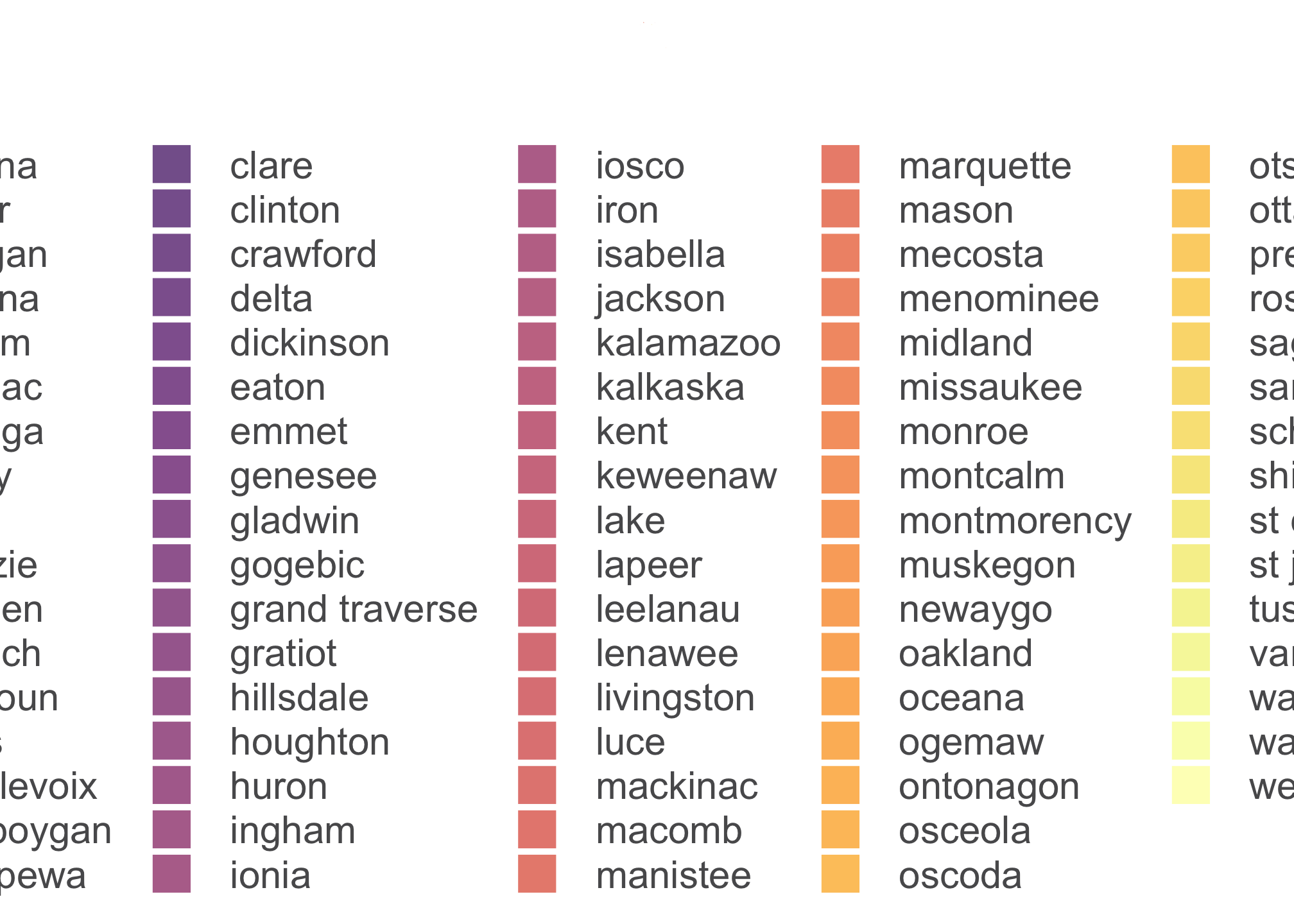
Your output may look a little different depending on your system settings.
That legend is taking up way too much space AND we don’t need the counties color coded by their names. Let’s get rid of it with guide = FALSE within scale_fill_viridis to get rid of that particular one or to turn all fill legends off, you can use guides(fill=FALSE) which is switch off in the plot above. In the example below, let’s try the one with guide = FALSE.
ggplot() +
  geom_polygon(data = mi_count, aes(x=long, y = lat, group = group, fill=subregion),
               color = "#FFFFFF") +
  scale_fill_viridis(discrete = TRUE,
                     alpha=0.7,
                     option="inferno",
                     guide = FALSE) + #HERE IT IS
  theme_bw() +
  theme(plot.title = element_text(size = 26, color ="#105456",  vjust = -1),
        legend.position ="bottom",
        legend.direction = 'vertical',
        legend.text = element_text(size=15, color = "#59595B"),
        legend.title = element_blank(),
        legend.title.align = 0.5,
        legend.spacing.x = unit(0.5, "cm"),
        legend.spacing.y = unit(0.5, "cm"),
        legend.background = element_rect(linetype = 0, size = 0.5, colour = 1),
        panel.background = element_blank(),
        axis.title.x = element_blank(),
        axis.title.y = element_blank(),
        axis.ticks = element_blank(),
        axis.text = element_blank(),
        panel.border = element_blank(),
        panel.grid.major = element_blank(),
        panel.grid.minor = element_blank()) +
  coord_fixed(1.3)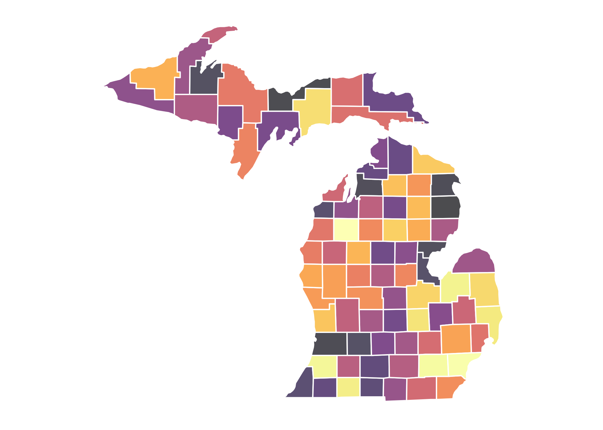
Well now we definitely have county level data for Michigan.
Please take a bit to review and play around with every layer. Many of the typical things you would want to change or amend about a plot are included.
OK now we should probably do something with this map. Let get some Census data.
PART II: The US Census
Gathering and Making Important Decisions
Choose an endpoint aka a set of data that you want.
At this point it is completely understandable if you are wondering what an API is. Without getting overtly technical, an API is the acronym for Application Programming Interface. This is essentially a text based software that allows two applications to talk to each other. Why text based? Well its really the only aspect that all computers share. In fact, each time you use an app like YouTube, send a text message, or check the weather on your phone, etc. from any device worldwide, you’re using an API. As an example, take a look at the Twitter API https://developer.twitter.com/en/docs/tweets/search/api-reference.html that we’ll be using later in the term to perform some network data visualizations.
Now when looking at our endpoint, what should we choose? As of 2018, there are over 200 Census API endpoints are available, including the Decennial Census, American Community Survey, Poverty Statistics, and Population Estimates. You can find a list here: https://api.census.gov/data.html. Please look them over!
The censusapi package is designed to let you get data from all of those APIs using the same main function getCensus and the same syntax for each data set. In this example case, let’s look at the 2017 Density Estimates (variables can be found here: https://api.census.gov/data/2017/pep/population/variables.html) for all states within the US. Alternatively you can get that information directly through the API we have been using:
apis <- listCensusApis()View(apis)Now certain repositories require certain basic variables to be run (for example if years are a factor). To get an idea, the 2017 American Community Survey which is used to update some data within the primary Census.
- Here are the available variables
acs2017_vars <- listCensusMetadata(name = "2017/pep/population/",
type = "variables")head(acs2017_vars)## name label concept predicateType
## 1 MDIV Metropolitan Division code Selectable Geographies int
## 2 COUSUB Minor Civil Division FIPS code Estimates int
## 3 SUMLEV Summary Level Estimates <NA>
## 4 STATE State FIPS code Estimates <NA>
## 5 GEONAME Geographic Name Estimates <NA>
## 6 DATE_ Date Estimates int
## group limit required
## 1 N/A 0 <NA>
## 2 N/A 0 <NA>
## 3 N/A 0 <NA>
## 4 N/A 0 <NA>
## 5 N/A 0 <NA>
## 6 N/A 0 default displayed- Here are the available geographies
acs2017_geos <- listCensusMetadata(name = "2017/pep/population/",
type = "geography")View(acs2017_geos)If you want to see which variables are required for mapping, then there is a problem and that is actually due to bad luck as a result of timing. The Census is going through a new update with a new API format that was supposed to go live two weeks ago. It has, however, been pushed back to October 31. Until then, you will have to utilize the website. However if you are adamant about using R for the whole process as I typically am, then you can get table, aka tabular data from any website. If this interests you, please seethe section below. Otherwise move on to the next section.
Scraping the Web using R
In order to grab data off of the web, you will need to several things. At first it may seem arduous but having lengthy tables as data within R can be very beneficial, especially when filtering or if you just don’t want to manually load or type in entries. Included are steps to get the data you need in a usable form within R.
- Download and run the
rvestpackage (though there are others like a package calledXMLthat may be useful in other circumstances)
library(rvest)## Loading required package: xml2##
## Attaching package: 'rvest'## The following object is masked from 'package:purrr':
##
## pluck## The following object is masked from 'package:readr':
##
## guess_encoding- Define the website you want to pull the data from
webpage <- read_html("https://api.census.gov/data/2017/pep/population/variables.html")- Tell
rvestthat you want the tables using the commandhtml_nodes. This does a lot of things but in a nutshell, it recognizes if a page is a webpage by scanning the HTML code and then finds what you need. In our case, we’re asking it to recognize the Census webpage from above and to identify the HTML codes where the termtableexists.
tbls <- html_nodes(webpage, "table") - See information regarding all of the tables
tbls # or if there are multiple tables, consider using head(tbls)## {xml_nodeset (1)}
## [1] <table>\n<caption>Census Data API: Variables in /data/2017/pep/population ...By the output, we only have one table which is indicated by [1].
- Now do some piping via
dplyrto get a list of everything within that table
tbls_ls <- webpage %>%
        html_nodes("table") %>% # Creates a multidimensional list (i.e. a list
                                # with layers and depth akin to folders within
                                # folders within folders, ect.)
        .[1] %>% # We only have table so we put.[1] here. If we had multiple
                 # tables and we wanted say the first three, we could have
                 # used .[1:3]
        html_table(fill = TRUE) # Convert the data to a table format and populate
# the entries- See the result
View(tbls_ls)Notice that its a list and can go pretty deep down the rabbit hole depending on how many tables you are looking at. In this case, we have one so ts pretty simple.
- Now narrow down the results. Say you only wanted the ones that were required. You can figure that out by filtering for the term
default displayedunder the column Required. To do this, we first run the following which splits up all of the tables and then attaches them together by corresponding entries.
tbls_ls <- do.call(rbind.data.frame, tbls_ls) # Concatenates a list of data frames
# into a single data frame- (Optional) Take a look to see that it looks like an actual table
View(tbls_ls)- Now we get rid of the rows that that don’t have
default displayedunder Required
filtered_tbls_ls <- tbls_ls[tbls_ls$Required == "default displayed", ]
                                                              # Filter out the rows that
                                                              # don't have `default
                                                              # displayed` under the
# column **Required**- Just show the names of the required variables
filtered_tbls_ls$Name # Just shows the Names of the required variables## [1] "DATE_" "UNIVERSE"So here we see that the variables DATE and UNIVERSE are required.
Alternatively and if you understand the above, you can simply use the following in one fell swoop using dplyr:
library(rvest)

read_html("https://api.census.gov/data/2017/pep/population/variables.html") %>%
html_nodes("table")  %>% # Creates a multidimensional list (i.e. a list with layers
                         # and depth akin to folders within folders within folders,
                         # ect.)
  .[1] %>% # We only have table so we put.[1] here. If we had multiple tables and
           # we wanted say the first three, we could have used .[1:3]
  html_table(fill = TRUE) %>% # Convert the data to a table format and populate the
                              # entries
  bind_rows() %>% # Concatenates a list of data frames into a single data frame
  filter(Required == "default displayed") %>% # Filter out the rows that don't have
                                              # `default displayed` under the column
                                              # **Required**
  select(Name) # Just shows the Names of the required variables
## New names:
## * NA -> ...9## Name
## 1 DATE_
## 2 UNIVERSELife is much easier with pipes! Note that this and the other method should work with many of the Census web tables but may not for all, especially for older tables that may have not been updated and do not have the column Required. Part of understanding what is going on in each line affords you the ability to change commands and variables as necessary.
OK now back to the mapping!
Getting the Data You Want
Backtracking on the two methods presented above, if we wanted to figure out which variables are available in general, we could
- Go back to step 9 and run
tbls_ls$Name## [1] "23 variables" "CBSA" "CONCIT" "COUNTY" "COUSUB"
## [6] "CSA" "DATE_" "DATE_DESC" "DENSITY" "DIVISION"
## [11] "for" "FUNCSTAT" "GEONAME" "in" "LASTUPDATE"
## [16] "MDIV" "NATION" "PLACE" "POP" "PRIMGEOFLAG"
## [21] "REGION" "STATE" "SUMLEV" "UNIVERSE"OR
- Rerun parts of the piping system
read_html("https://api.census.gov/data/2017/pep/population/variables.html") %>%
  html_nodes("table")  %>% # This is a multidimensional list (i.e. a list with layers)
  .[1] %>%
  html_table(fill = TRUE) %>%
  bind_rows() %>%
  select(Name)
## New names:
## * NA -> ...9## Name
## 1 23 variables
## 2 CBSA
## 3 CONCIT
## 4 COUNTY
## 5 COUSUB
## 6 CSA
## 7 DATE_
## 8 DATE_DESC
## 9 DENSITY
## 10 DIVISION
## 11 for
## 12 FUNCSTAT
## 13 GEONAME
## 14 in
## 15 LASTUPDATE
## 16 MDIV
## 17 NATION
## 18 PLACE
## 19 POP
## 20 PRIMGEOFLAG
## 21 REGION
## 22 STATE
## 23 SUMLEV
## 24 UNIVERSEAlternative if you are pretty sure that a variable is already in a Census table and want verification, you cab check for it. For example, let’s see if the variable DENSITY exists in the 2017 Density Estimates (I bet it does since the word Density is right in the title) for the state of Michigan.
getCensus(name = "2017/pep/population",
          vars = c("DENSITY"),
          region = "state:26")
## state DENSITY
## 1 26 176.139Yup its available but right now you may be wondering how I got that number 26. Well the Census assigns a number (called a FIPS state code) to every territory the US controls. You can find grouped listings here https://www.census.gov/geo/reference/ansi_statetables.html.
Well let’s get county and state level data and run it!
Tigers <- getCensus(name = "2017/pep/population",
                         vars = c("GEONAME", "COUNTY", "DENSITY"),
                         region = "county:*",
                         regionin = "state:26")
Now take a peek at the first 15 entries in the Michigan list.
head(Tigers, n=15L)## state county GEONAME COUNTY DENSITY
## 1 26 073 Isabella County, Michigan 073 124.088901
## 2 26 075 Jackson County, Michigan 075 226.080702
## 3 26 077 Kalamazoo County, Michigan 077 467.780995
## 4 26 079 Kalkaska County, Michigan 079 31.504614
## 5 26 081 Kent County, Michigan 081 765.161412
## 6 26 083 Keweenaw County, Michigan 083 3.897341
## 7 26 085 Lake County, Michigan 085 21.165346
## 8 26 087 Lapeer County, Michigan 087 136.875440
## 9 26 089 Leelanau County, Michigan 089 62.378722
## 10 26 091 Lenawee County, Michigan 091 131.575529
## 11 26 093 Livingston County, Michigan 093 335.585145
## 12 26 095 Luce County, Michigan 095 7.071703
## 13 26 097 Mackinac County, Michigan 097 10.482856
## 14 26 099 Macomb County, Michigan 099 1818.397780
## 15 26 101 Manistee County, Michigan 101 45.041218Notice that we can get rid of the columns state, county, and COUNTY since we only need the columns GEOMNAME and DENSITY. We can do this by running the following
drops <- c("state", "county", "COUNTY") # Assigns column names to be dropped
Tigers <- Tigers[ , !(names(Tigers) %in% drops)] # Drops those columns
This is actually one of the few times that Base R is easier to use than a tidy approach. Anyway now let’s take a look at the Census data set now.
head(Tigers)## GEONAME DENSITY
## 1 Isabella County, Michigan 124.088901
## 2 Jackson County, Michigan 226.080702
## 3 Kalamazoo County, Michigan 467.780995
## 4 Kalkaska County, Michigan 31.504614
## 5 Kent County, Michigan 765.161412
## 6 Keweenaw County, Michigan 3.897341Recall that our map data looks like this
head(mi_count)## long lat group order region subregion
## 38512 -83.88675 44.85686 1198 38512 michigan alcona
## 38513 -83.36536 44.86832 1198 38513 michigan alcona
## 38514 -83.33098 44.83968 1198 38514 michigan alcona
## 38515 -83.30806 44.80530 1198 38515 michigan alcona
## 38516 -83.30233 44.77665 1198 38516 michigan alcona
## 38517 -83.28515 44.72509 1198 38517 michigan alconaWe have to merge both of these sets so that the Census data and map data line up. We have a bit of work to do but its all about identifying what we need. Now I should note that the process below is just one way to get there. Steps are provided for convenience, but again they are contingent on your own table.
- The column
GEONAMEis a concatenation of county and state level data. Let’s split them up using the,(comma) as the delimiter…
Tigers <- Tigers %>%
  separate(GEONAME, into = paste0('thing', 1:2), sep = '[,]')
…and then take a look at the results.
head(Tigers)## thing1 thing2 DENSITY
## 1 Isabella County Michigan 124.088901
## 2 Jackson County Michigan 226.080702
## 3 Kalamazoo County Michigan 467.780995
## 4 Kalkaska County Michigan 31.504614
## 5 Kent County Michigan 765.161412
## 6 Keweenaw County Michigan 3.897341- Notice that the columns have been split and renamed
thing1andthing2. But we want the column names to be representative of what they are. So we can rename them in order of appearance from left to right
Tigers <- setNames(Tigers, c("County","State","Density")) …and then take a look at the results.
head(Tigers)## County State Density
## 1 Isabella County Michigan 124.088901
## 2 Jackson County Michigan 226.080702
## 3 Kalamazoo County Michigan 467.780995
## 4 Kalkaska County Michigan 31.504614
## 5 Kent County Michigan 765.161412
## 6 Keweenaw County Michigan 3.897341- Now notice that the term County appears perpetually with the County columns and does not appear in the
mi_countset. So we have a choice in that we can either leave it be here and add the term County tomi_countor drop the term from this set. I like to have less clutter so choosing the latter makes sense. However, you could just as well do the other and the intended outcome that columns look the same would work all the same.
Now there are many ways to attack this. Similar to the process above, you could just split the column again based on the space and then delete one of the resulting columns with the term County in it. However, since you have already been exposed to thestringrpackage, let’s use that.
Tigers$County <- str_replace_all(Tigers$County, " County", "")
# Find the term County in the County column and replace it nothing (given by ""). Notice
# that there is a space between the first quote and the term County to account for the
# space between the two words.- Finally we certainly know that we’re in Michigan so let’s get rid of that column
dropFromCensus <- c("State")
Tigers <- Tigers[ , !(names(Tigers) %in% dropFromCensus)] # Drops those columns- OK we are done with the Census data for now. Moving on the map data, lets compare both again
head(Tigers)## County Density
## 1 Isabella 124.088901
## 2 Jackson 226.080702
## 3 Kalamazoo 467.780995
## 4 Kalkaska 31.504614
## 5 Kent 765.161412
## 6 Keweenaw 3.897341head(mi_count)## long lat group order region subregion
## 38512 -83.88675 44.85686 1198 38512 michigan alcona
## 38513 -83.36536 44.86832 1198 38513 michigan alcona
## 38514 -83.33098 44.83968 1198 38514 michigan alcona
## 38515 -83.30806 44.80530 1198 38515 michigan alcona
## 38516 -83.30233 44.77665 1198 38516 michigan alcona
## 38517 -83.28515 44.72509 1198 38517 michigan alconaFirst thing here and because of personal preference, I want to get rid of the clutter. In this case, that means dropping columns we do not need. In this case, these are group, order, and region. Now the code down here is a bit tricky if you are not used to it. In the first line, we are just defining a column vector with column names so there’s nothing new here. The second line needs a bit more explanation because there is a lot going on. Foremost, the rows and columns for all data frames can be called using [row,column]. For example, I can tell R that I want to do something to the rows in mi_count by stating mi_count[some operation here , ]. Alternatively, I can also tell R that I want to do something to the columns in mi_count by stating mi_count[ , some operation here ] which is exactly what was done. I realize that may be confusing so think about it and ask questions. Now for the operation itself, we read those in parts:
names(mi_count)tells R the to look at the names of the columns inmi_count.names(mi_count) %in% dropFromMapDatatells R to take the names of the columns inmi_countand look for them in the vectordropFromMapData.!(names(mi_count) %in% dropFromMapData)tells R to take those names fromdropFromMapDatathat are also inmi_countand to not use them (aka to drop them).
dropFromMapData <- c("group", "order", "region")
mi_count <- mi_count[ , !(names(mi_count) %in% dropFromMapData)] # Drops those columns
head(mi_count)
## long lat subregion
## 38512 -83.88675 44.85686 alcona
## 38513 -83.36536 44.86832 alcona
## 38514 -83.33098 44.83968 alcona
## 38515 -83.30806 44.80530 alcona
## 38516 -83.30233 44.77665 alcona
## 38517 -83.28515 44.72509 alconaLooking at the code as whole is often overwhelming. Remember you are learning a new language so first view its most basic parts and then build up.
- Then rename the column we’re going to merge one which in this case means renaming
subregiontoCountywhile maintaining the others as is.
mi_count <- setNames(mi_count, c("long","lat","County")) …and take a look.
head(mi_count)## long lat County
## 38512 -83.88675 44.85686 alcona
## 38513 -83.36536 44.86832 alcona
## 38514 -83.33098 44.83968 alcona
## 38515 -83.30806 44.80530 alcona
## 38516 -83.30233 44.77665 alcona
## 38517 -83.28515 44.72509 alcona- And finally, let’s capitalize the column
county.
mi_count$County <- str_to_title(mi_count$County)…and take a look.
head(mi_count)## long lat County
## 38512 -83.88675 44.85686 Alcona
## 38513 -83.36536 44.86832 Alcona
## 38514 -83.33098 44.83968 Alcona
## 38515 -83.30806 44.80530 Alcona
## 38516 -83.30233 44.77665 Alcona
## 38517 -83.28515 44.72509 AlconaIn fact, let’s look it both to make sure they’re structurally similar
head(Tigers)## County Density
## 1 Isabella 124.088901
## 2 Jackson 226.080702
## 3 Kalamazoo 467.780995
## 4 Kalkaska 31.504614
## 5 Kent 765.161412
## 6 Keweenaw 3.897341head(mi_count)## long lat County
## 38512 -83.88675 44.85686 Alcona
## 38513 -83.36536 44.86832 Alcona
## 38514 -83.33098 44.83968 Alcona
## 38515 -83.30806 44.80530 Alcona
## 38516 -83.30233 44.77665 Alcona
## 38517 -83.28515 44.72509 AlconaYes! Now you might be thinking that mi_count is full of repeated county names. Well that’s good because (1) its the file that will inform ggplot of county borders and (2) we simply need the terms and column titles to look the same; they can differ in length (aka number of rows or how many times any entry repeats).
We’re going to use joins which is basically a fancy way of using logic derived from a computer language called SQL. Take a look at the data-wrangling-cheatsheet PDF file or go to http://stat545.com/bit001_dplyr-cheatsheet.html to see detailed examples.
In each situation, you have to think about the end product and the data set that will get you there. Foremost, we want a county map of Michigan with Census density data. Which one is more important? Well logic would dictate that I can’t really draw density data without a map, or in research (and Algebraic) terms, density data is dependent on the map. So with that idea, we need the map data (from mi_count) as our primary source to merge on. The command left_join will work here as long as mi_count is literally to the left of the other data set: Tigers. Below you can see this and also that we’re merging, or joining on the common column County.
total_thing <- left_join(mi_count, Tigers, by = c("County"))…and take a look.
head(mi_count)## long lat County
## 38512 -83.88675 44.85686 Alcona
## 38513 -83.36536 44.86832 Alcona
## 38514 -83.33098 44.83968 Alcona
## 38515 -83.30806 44.80530 Alcona
## 38516 -83.30233 44.77665 Alcona
## 38517 -83.28515 44.72509 AlconaNice! it worked! Now let’s try to plot it.
PART III: Plotting
Well let’s give it a go!
ggplot() +
  geom_polygon(data = total_thing, aes(x=long, y = lat, fill=Density, group=County),
               color = "#f8f8fa", size = 0.25, show.legend = T) +
  scale_color_viridis(alpha=1, option="viridis") + # color tells R to look for discrete data to color
  theme_bw() +
  theme(plot.title = element_text(size = 26,color ="#105456",  vjust = -1),
        legend.position ="right",
        legend.direction = 'vertical',
        legend.key = element_rect(size = 5, color = NA),
        legend.key.size = unit(1.5, 'lines'),
        legend.text = element_text(size=15, color = "#59595B"),
        legend.title = element_blank(),
        legend.title.align = 0.5,
        legend.spacing.x = unit(0.5, "cm"),
        legend.spacing.y = unit(0.5, "cm"),
        legend.background = element_rect(linetype = 0, size = 0.5, colour = 1),
        panel.background = element_blank(),
        axis.title.x = element_blank(),
        axis.title.y = element_blank(),
        axis.ticks = element_blank(),
        axis.text = element_blank(),
        panel.border = element_blank(),
        panel.grid.major = element_blank(),
        panel.grid.minor = element_blank()) +
  coord_fixed(1.3)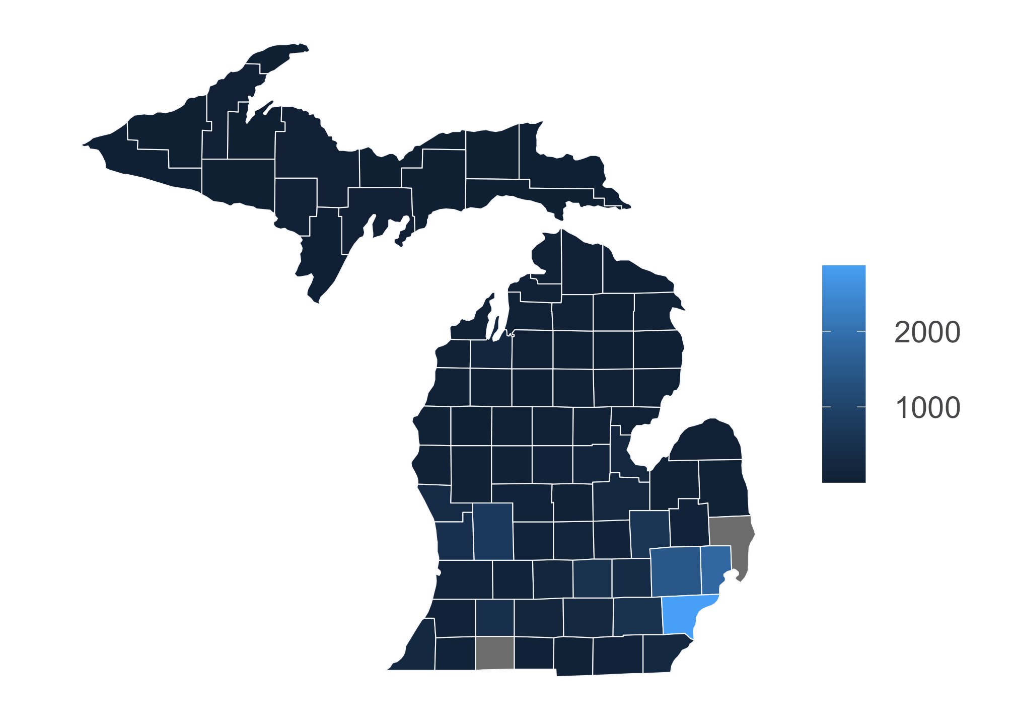
Clearly there’s a problem here. It looks like R is plotting the densities individually which means its treating the data as discrete. We don’t want this! Population data or any derivation thereof are typically given in ranges due to the massive variability in measures. This type of data is called continuous. So in this case, we need to change the form of the current data set from discrete to continuous. To do that, we must convert them to characters and then to generic numbers. While this sounds silly, R is not capable of this conversion directly (or it is possible that I am not aware of how to do it directly and would absolutely love to be proven wrong!)
total_thing$Density <- as.numeric(as.character(total_thing$Density))OK so let’s try again:
ggplot() +
  geom_polygon(data = total_thing, aes(x=long, y = lat, fill=Density, group=County),
               color = "#f8f8fa", size = 0.25, show.legend = T) +
  scale_fill_viridis(alpha=1, option="viridis") + # fill tells R to look for continuous data to color
  theme_bw() +
  theme(plot.title = element_text(size = 26,color ="#105456",  vjust = -1),
        legend.position ="right",
        legend.direction = 'vertical',
        legend.key = element_rect(size = 5, color = NA),
        legend.key.size = unit(1.5, 'lines'),
        legend.text = element_text(size=15, color = "#59595B"),
        legend.title = element_blank(),
        legend.title.align = 0.5,
        legend.spacing.x = unit(0.5, "cm"),
        legend.spacing.y = unit(0.5, "cm"),
        legend.background = element_rect(linetype = 0, size = 0.5, colour = 1),
        panel.background = element_blank(),
        axis.title.x = element_blank(),
        axis.title.y = element_blank(),
        axis.ticks = element_blank(),
        axis.text = element_blank(),
        panel.border = element_blank(),
        panel.grid.major = element_blank(),
        panel.grid.minor = element_blank()) +
  coord_fixed(1.3)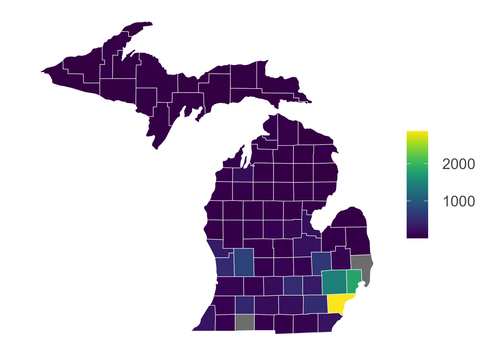
And we’ve got it! Was that a pain? Certainly! But you also have a powerful tool to grab a lot of demographic data and the knowledge to play and tweak aspects to fit other needs. In fact, some repositories only have their data within an API. If you are interested in pulling data from other government sites via APIs or otherwise, take a look at a running list here:
Example: Tract Data
For this example, you’ll need the following packages
library(tidycensus)
library(tidyverse)
library(tools)
library(sf)
## Linking to GEOS 3.8.1, GDAL 3.1.4, PROJ 6.3.1# For ore information on sf: https://r-spatial.github.io/sf/articles/sf1.html
library(DT)
library(ggthemes)
library(wesanderson)
options(tigris_use_cache = TRUE) Like before, let’s take a look at the packages so you get an idea what each does
| Library | Description | Repository | Example |
|---|---|---|---|
tidycensus | Another census package. You can actually use any of the others but this is included to give you variety | Github | Vignette |
tidyverse | Nope | Github | Homepage |
tools | Used to manipulating R packages and their documentation | None2 | StackOverflow |
sf | Package that houses spatial geometries and provides a relatively easy way to convert data frames to map objects | Github | Vignette |
DT | Nice package to see data frames in a more interactive display | Github | Vignette |
ggthemes | Additional ggplot themes you can use | Github | Walkthrough |
wesanderson | Palette based on Wes Anderson movies | Github | Walkthrough |
Getting Census Tract Level Data
Its not so obvious to get tract data sets. While there are multiple approaches, the easiest is to just ask for it. Here we’ll use the median household income from the 2015-2019 ACS in Monongalia County, WV.
mon <- get_acs(state = "WV",
               county = "Monongalia",
               geography = "tract",
               variables = "B19013_001",
geometry = TRUE)datatable(mon)| GEOID | NAME | variable | estimate | moe | geometry |
|---|---|---|---|---|---|
| 54061010101 | Census Tract 101.01, Monongalia County, West Virginia | B19013_001 | 16184 | 12299 | MULTIPOLYGON (((-79.95389 3… |
| 54061012000 | Census Tract 120, Monongalia County, West Virginia | B19013_001 | 75667 | 18721 | MULTIPOLYGON (((-79.97551 3… |
| 54061010102 | Census Tract 101.02, Monongalia County, West Virginia | B19013_001 | 13352 | 9778 | MULTIPOLYGON (((-79.96402 3… |
| 54061011300 | Census Tract 113, Monongalia County, West Virginia | B19013_001 | 58900 | 6618 | MULTIPOLYGON (((-80.17178 3… |
| 54061011900 | Census Tract 119, Monongalia County, West Virginia | B19013_001 | 88967 | 18567 | MULTIPOLYGON (((-80.08072 3… |
| 54061010901 | Census Tract 109.01, Monongalia County, West Virginia | B19013_001 | 43986 | 7240 | MULTIPOLYGON (((-79.96288 3… |
Here is the discrete scale with five colors…
wes_palette("Rushmore1")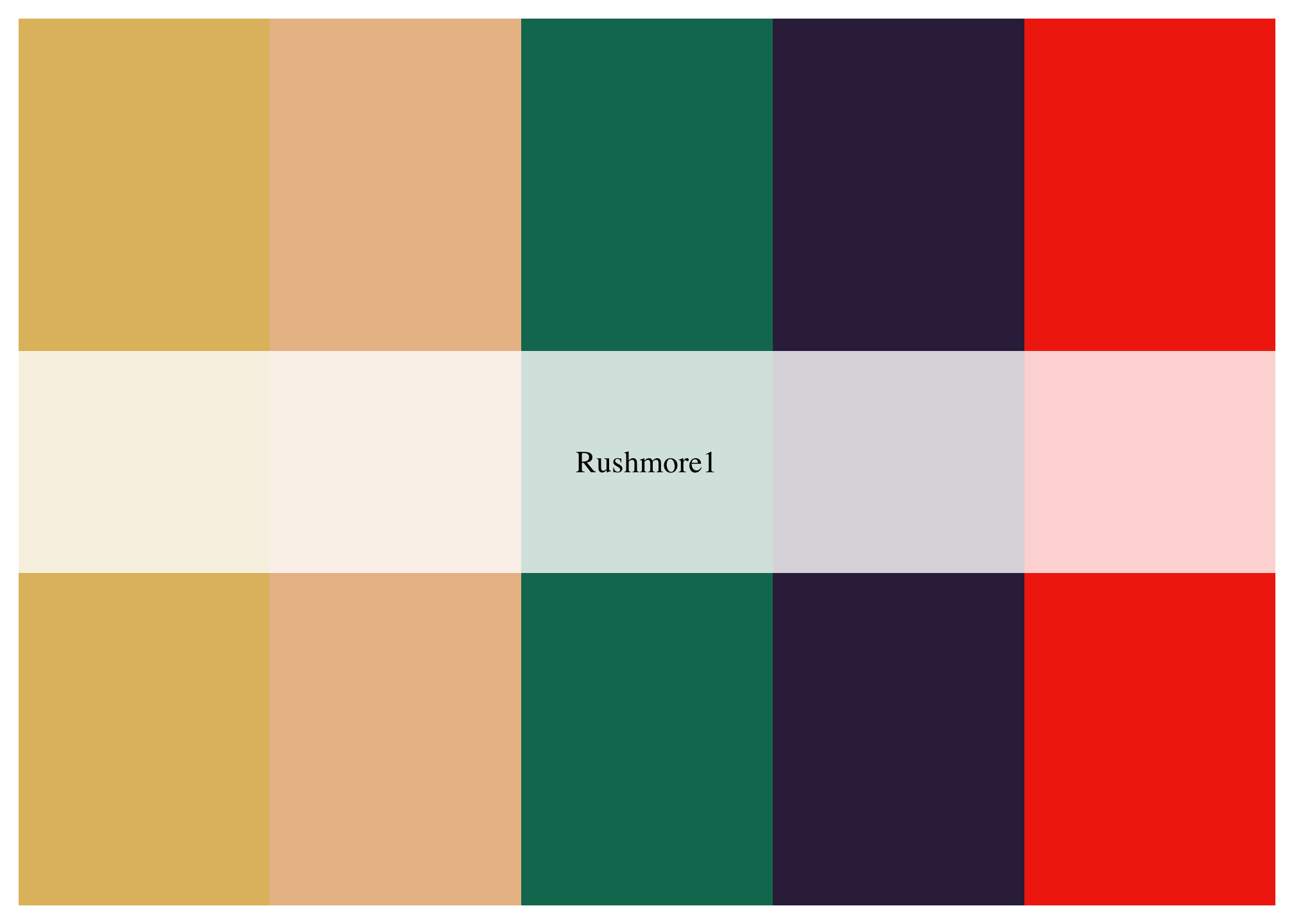
…that has been converted to a continuous scale with 105,474 colors.
pal <- wes_palette("Rushmore1",
                   max(mon$estimate),
                   type = "continuous")
Single Map
We can plot the median household income using
mon %>%
  ggplot(aes(fill = estimate)) +
  geom_sf(color = NA) +
  scale_fill_gradientn(colors = pal) +
theme_map() 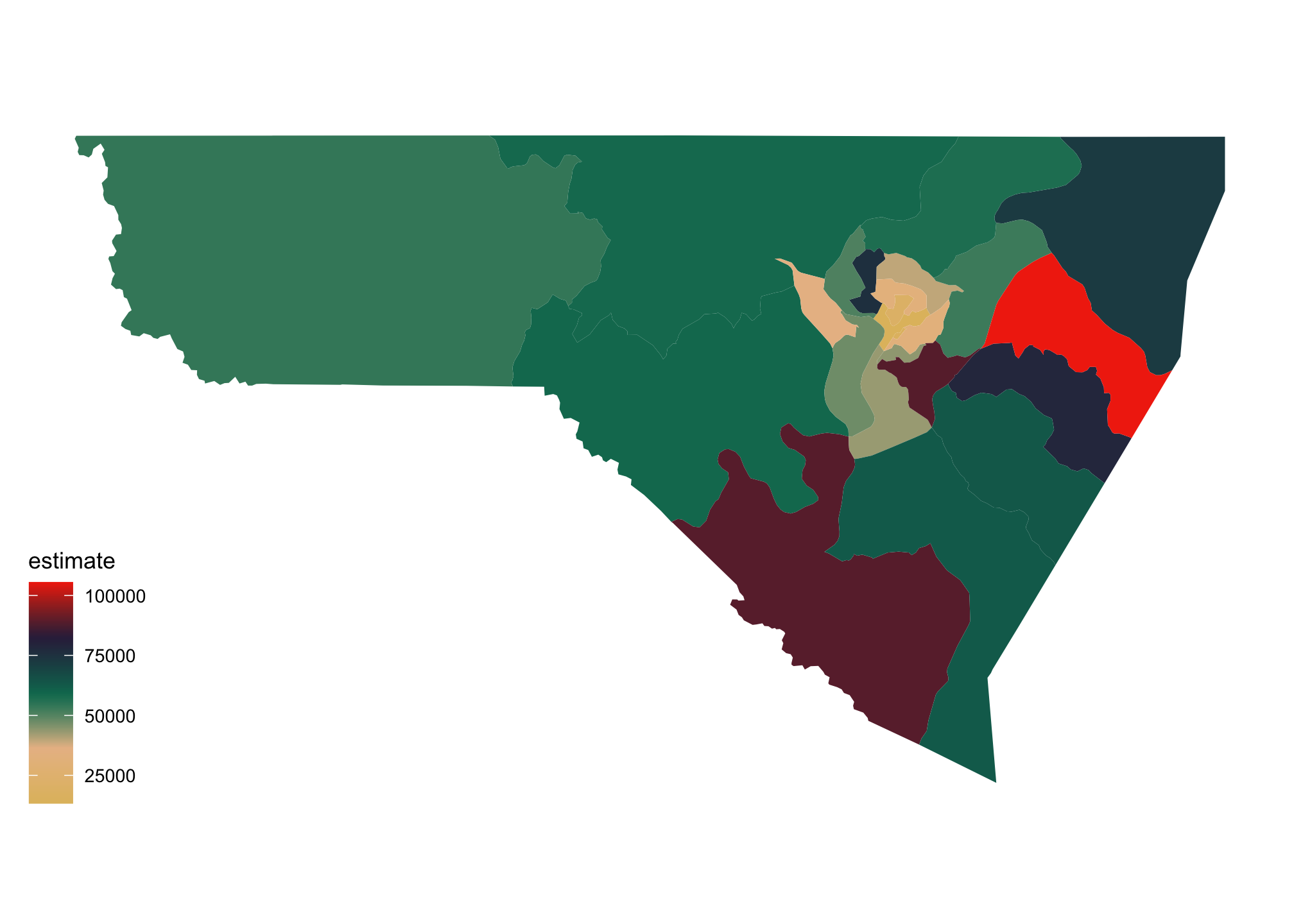
Faceting Map
We can also break down a map using facet_wrap(). For example, let’s pull data for race, in particular for White, Black, Asian and Hispanic Populations.
racevars <- c(White = "P005003",
              Black = "P005004",
              Asian = "P005006",
              Hispanic = "P004003")
mon_race <- get_decennial(geography = "tract",
variables = racevars,
state = "WV",
county = "Monongalia County",
geometry = TRUE,
summary_var = "P001001") Again we can use the datatable() command from the DT package to see an interactive view of the output
datatable(mon_race)| GEOID | NAME | variable | value | summary_value | geometry |
|---|---|---|---|---|---|
| 54061010101 | Census Tract 101.01, Monongalia County, West Virginia | White | 1257 | 1424 | MULTIPOLYGON (((-79.94987 3… |
| 54061010101 | Census Tract 101.01, Monongalia County, West Virginia | Black | 38 | 1424 | MULTIPOLYGON (((-79.94987 3… |
| 54061010101 | Census Tract 101.01, Monongalia County, West Virginia | Asian | 45 | 1424 | MULTIPOLYGON (((-79.94987 3… |
| 54061010101 | Census Tract 101.01, Monongalia County, West Virginia | Hispanic | 66 | 1424 | MULTIPOLYGON (((-79.94987 3… |
| 54061010202 | Census Tract 102.02, Monongalia County, West Virginia | White | 3424 | 3823 | MULTIPOLYGON (((-79.95593 3… |
| 54061010202 | Census Tract 102.02, Monongalia County, West Virginia | Black | 143 | 3823 | MULTIPOLYGON (((-79.95593 3… |
mon_race %>%
  mutate(pct = 100 * (value / summary_value)) %>%
  ggplot(aes(fill = pct)) +
  facet_wrap(~variable) +
  geom_sf(color = NA) +
  scale_fill_gradientn(colors = pal) +
theme_map() 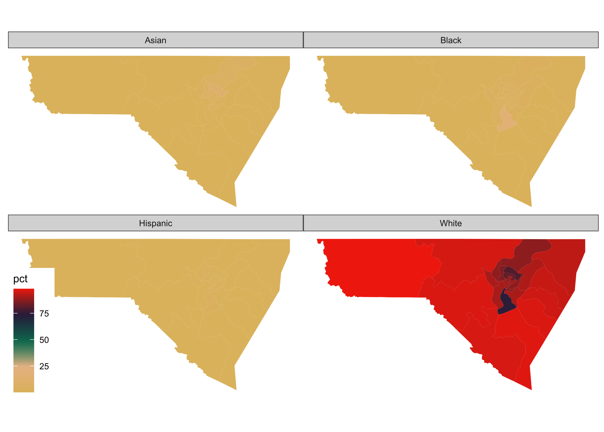
Well we know that West Virginia is primarily White resulting in a skewed distribution. To see how the other populations look proportionally by facet rather than overall, we can use a transformation in our scaling. In particular using a logarithmic transformation via trans="log10" when within a scale_ is sufficient. Remember that maps are generally considered to be approximations of the actual data, rather than an exact representation.
mon_race %>%
  mutate(pct = 100 * (value / summary_value)) %>%
  ggplot(aes(fill = pct)) +
  facet_wrap(~variable) +
  geom_sf(color = NA) +
  scale_fill_gradientn(colors = pal,
                       trans="log10") +
theme_map() 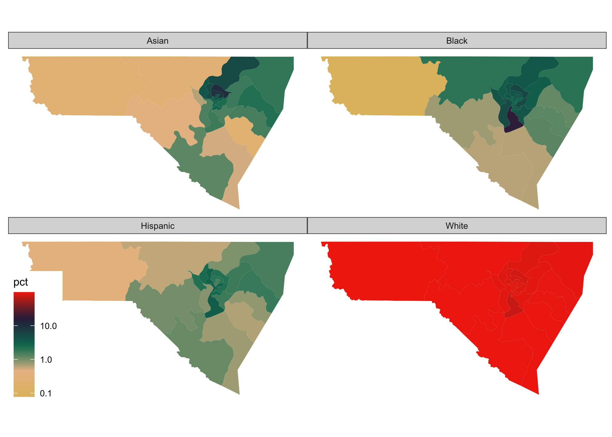
Example: Alternate Projections
We can use different representations, or projections of maps. To explore this, let’s take a look at the available variables. Hopefully one is interesting
vars <- listCensusMetadata(name = "acs/acs5/profile",
                           vintage = 2018,
                           type = "variables")
vars %>%
as_tibble() %>%
filter(str_detect(label, "relate"))| name | label | concept | predicateType | group | limit | attributes | required |
|---|---|---|---|---|---|---|---|
From that let’s use the variable DP03_0126PE, that is a 2014-2018 estimate of families with female householder, no husband present with related children of the householder under 18 years.
Getting Census State and County Level Data
We need to first grab the data set
poverty_data <- getCensus(name = "acs/acs5/profile", # same as above
                          vintage = 2018,
                          vars = c("NAME", "DP03_0126PE"), # column/variable name
                          key = Sys.getenv("CENSUS_KEY"), # using the census key from before
                          region = "county:*",# any county
                          regionin = "state:*") # any state
Wrangling
A majority of your time is spent actually wrangling data. This often includes cleaning and restructuring it into a form you can us. For this example, we’ll do just that
First we’ll clean the data set
poverty_data_cleaned <- poverty_data %>%
                        separate(NAME, into = paste0('thing', 1:2), sep = '[,]') %>%
                        mutate(thing1 = str_replace_all(thing1, " County", "")) %>% # Remove the term County (with a space in front)
                        mutate(thing2 = str_squish(thing2)) %>%
                        select(-c(state, county)) %>% # Get rid of these because we'll be using state and county names to merge
                        rename(county = thing1,
                               state = thing2,
                               poverty_percentage = DP03_0126PE) %>%
                        mutate(poverty_percentage = replace(poverty_percentage,
                                                            which(poverty_percentage <= 0),
                                                            NA)) %>%
                        arrange(state, county)
Let’s take a look
poverty_data_cleaned %>%
  head()
## county state poverty_percentage
## 1 Autauga Alabama 52.3
## 2 Baldwin Alabama 35.0
## 3 Barbour Alabama 60.6
## 4 Bibb Alabama 50.6
## 5 Blount Alabama 46.1
## 6 Bullock Alabama 66.5So now that we have the figures, we need data about the mapping.
county_data <- map_data("county") %>%
               rename(state = region, # rename because we'll use this to merge with the income_data_cleaned set
                      county = subregion) %>% # rename because we'll use this to merge with the income_data_cleaned set
               mutate(state = str_to_title(state)) %>% # make into a title case
               mutate(county = str_to_title(county)) # make into a title case
Again, let’s take a look
county_data %>%
  head()
## long lat group order state county
## 1 -86.50517 32.34920 1 1 Alabama Autauga
## 2 -86.53382 32.35493 1 2 Alabama Autauga
## 3 -86.54527 32.36639 1 3 Alabama Autauga
## 4 -86.55673 32.37785 1 4 Alabama Autauga
## 5 -86.57966 32.38357 1 5 Alabama Autauga
## 6 -86.59111 32.37785 1 6 Alabama AutaugaNow we can merge them together using joins
map_data <- left_join(county_data,
                      poverty_data_cleaned,
                      by = c("state","county"))
map_data %>%
head()## long lat group order state county poverty_percentage
## 1 -86.50517 32.34920 1 1 Alabama Autauga 52.3
## 2 -86.53382 32.35493 1 2 Alabama Autauga 52.3
## 3 -86.54527 32.36639 1 3 Alabama Autauga 52.3
## 4 -86.55673 32.37785 1 4 Alabama Autauga 52.3
## 5 -86.57966 32.38357 1 5 Alabama Autauga 52.3
## 6 -86.59111 32.37785 1 6 Alabama Autauga 52.3Mapping Using Estimated Curvatures
Let’s go ahead and map the data
estimate_map <-
  ggplot() +
  geom_polygon(data = map_data, aes(x = long,
                                    y = lat,
                                    fill = poverty_percentage,
                                    group = group),
               color = "#f8f8fa",
               size = 0.20,
               show.legend = TRUE) +
  geom_polygon(data=subset(map_data("state")),
               aes(x = long,
                   y = lat,
                   group = group),
               size = 0.5,
               color="white",
               fill = NA) +
  scale_fill_gradient(name="Estimates",
                      low = "#fa9fb5",
                      high = "#7a0177",
                      breaks = c(0, 25, 50, 75, 100),
                      limits = c(0,100),
                      na.value = "#c9d3d9",
                      labels = c(str_wrap("0.00% - 24.99%", 10),
                                 str_wrap("25.00 - 49.99%", 10),
                                 str_wrap("50.00% - 74.99%", 10),
                                 str_wrap("75.00% - 99.99%", 10),
                                 "100%"),
                      guide = "legend") +
  theme(plot.title = element_text(size = 13,
                                  color ="#4682b4",
                                  vjust = -1,
                                  hjust = 0.5,
                                  face = "bold"),
        plot.caption = element_text(size = 8,
                                    color ="#4682b4",
                                    face = "italic",
                                    margin = margin(t = 1,
                                                    unit = "cm")),
        legend.position = "bottom",
        legend.direction = "horizontal",
        legend.key = element_rect(size = 5,
                                  color = NA),
        legend.key.width = unit(2,
                               "cm"),
        legend.key.height = unit(0.3,
                               "cm"),
        legend.text = element_text(size = 8,
                                   color = "#4682b4"),
        legend.title.align = 0.5,
        legend.title = element_text(size = 10,
                                    color = "#4682b4"),
        legend.background = element_rect(linetype = 0,
                                         size = 0.5,
                                         color = 1),
        panel.background = element_blank(),
        axis.title.x = element_blank(),
        axis.title.y = element_blank(),
        axis.ticks = element_blank(),
        axis.text = element_blank(),
        panel.border = element_blank(),
        panel.grid.major = element_blank(),
        panel.grid.minor = element_blank()) +
  labs(title = str_to_title(str_wrap("2014-2018 estimate of families with female householder, no husband present with related children of the householder under 18 years", 50)),
       caption = "Source: 2018 American Community Survey: 5-Year Estimates") +
  guides(fill = guide_legend(title.position = "top",
                             label.position = "bottom",
                             label.hjust = 0.5))
estimate_map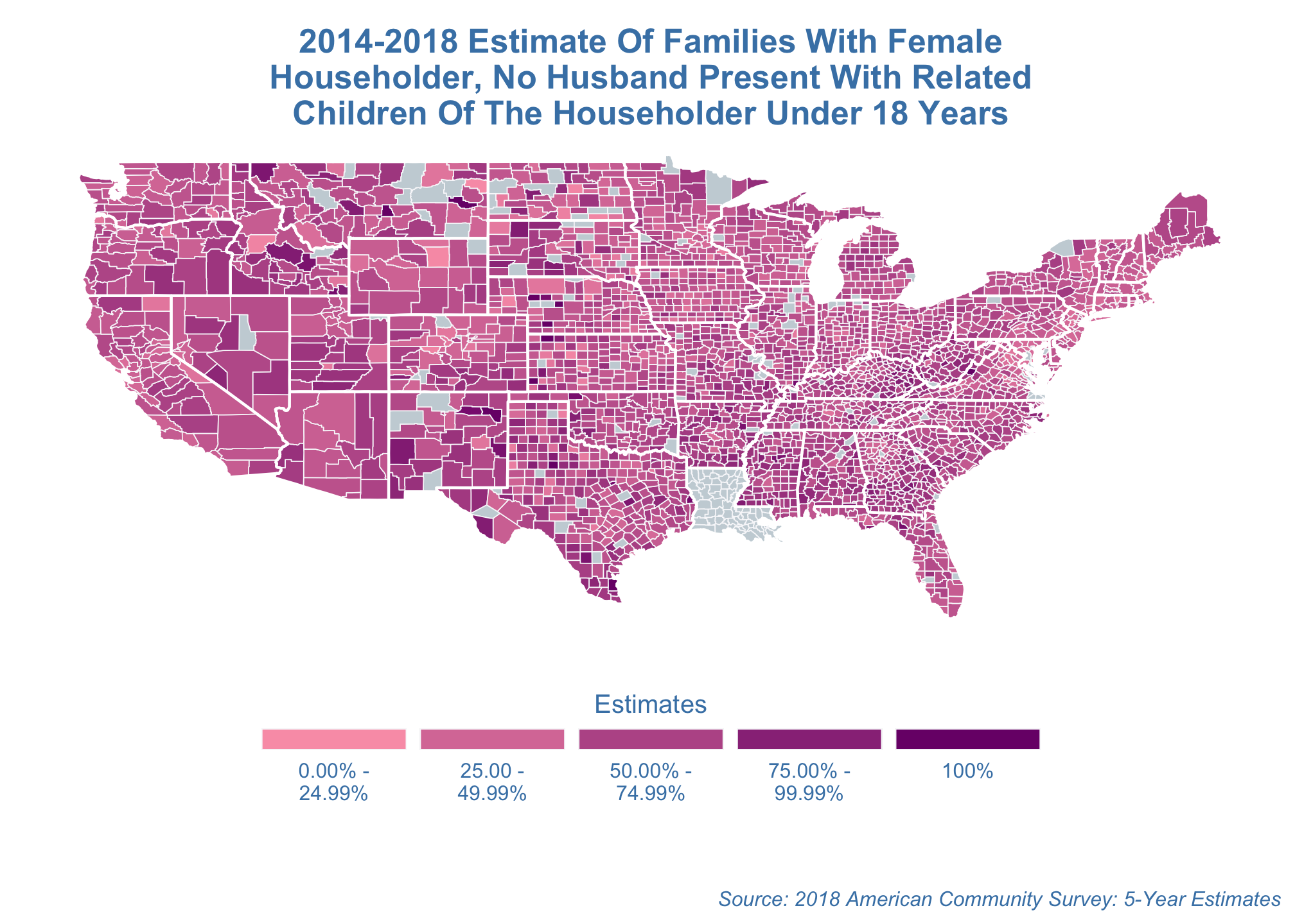
Well that’s the default map projection and its just terrible. You can fool around with the representation, or projection of the map using any number of coordinate systems via coord_map(). Below are just a few but a full list can be found on the mapproj CRAN site.
Albers projection
estimate_map +
  coord_map("albers",
            lat0 = 39,
            lat1 = 45)
projection with an approximated aspect ratio
estimate_map +
  coord_quickmap()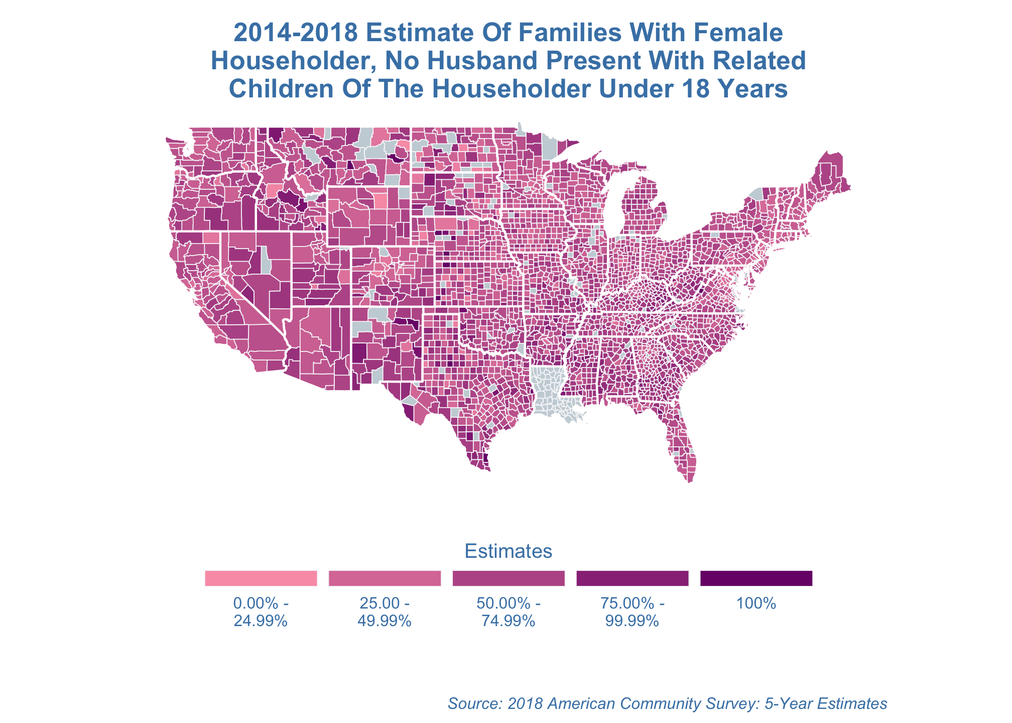
Lambert azimuthal equal-area projection
estimate_map +
  coord_map("azequalarea")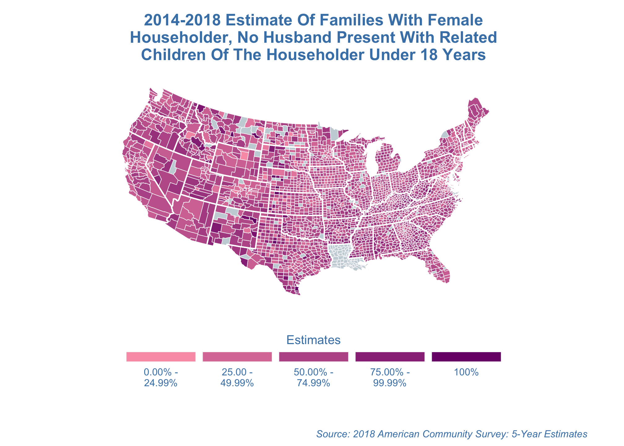
Bonne projection
estimate_map +
  coord_map("bonne",
            lat0 = 50)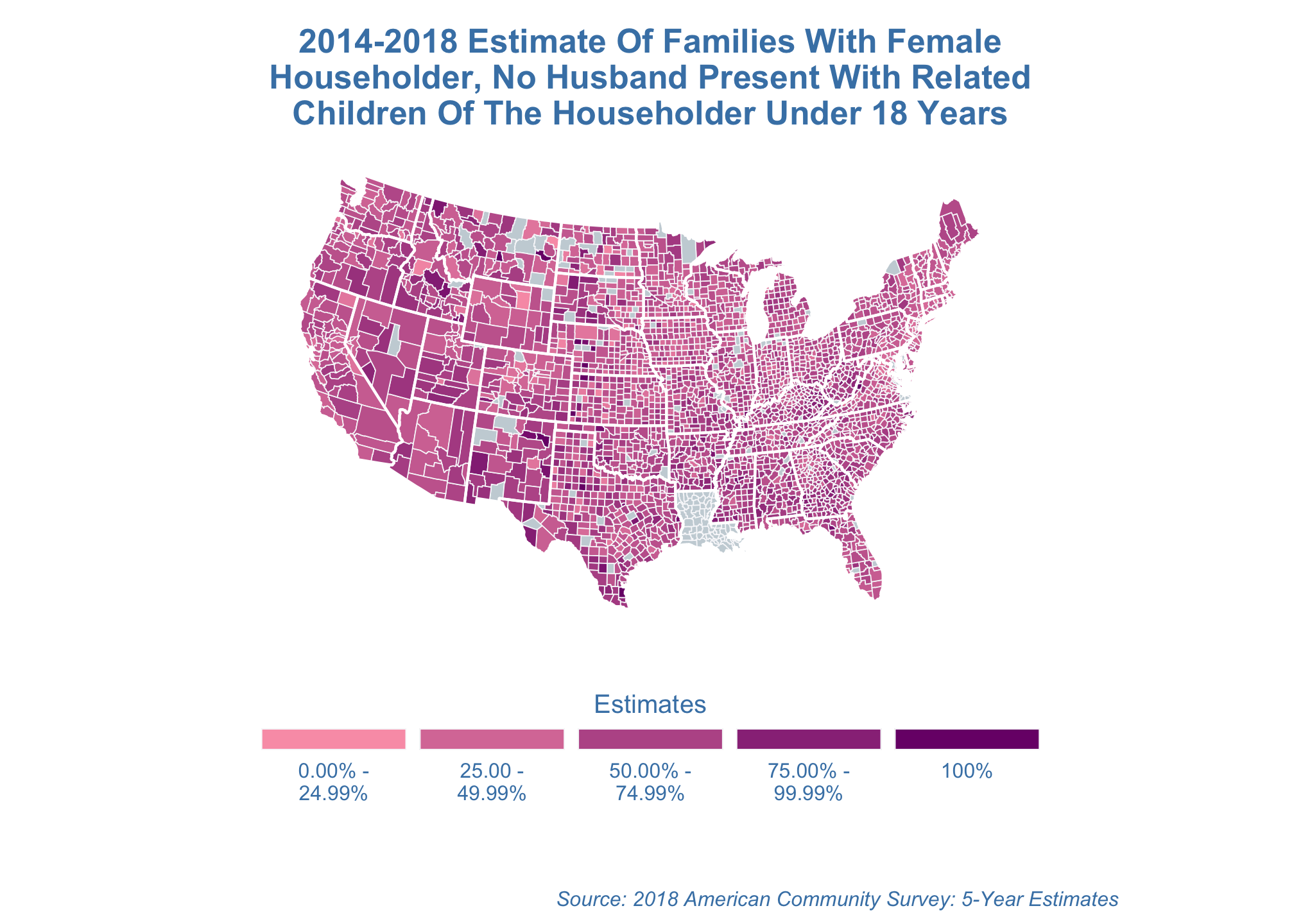
cylindrical projection
estimate_map +
  coord_map("cylindrical")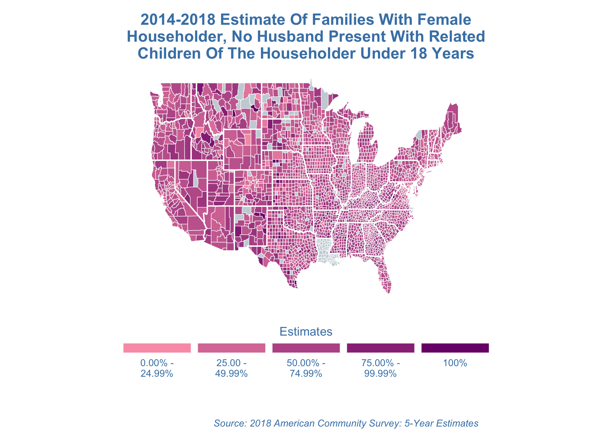
Gilbert projection
estimate_map +
  coord_map("gilbert")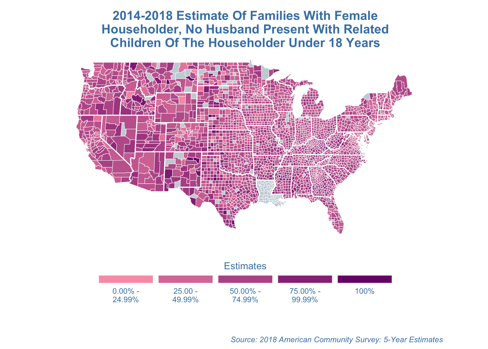
LaGrange projection
estimate_map +
  coord_map("lagrange")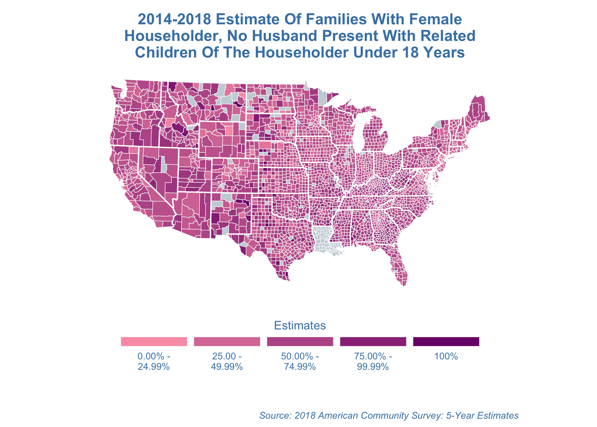
Mercator projection
estimate_map +
coord_map("mercator")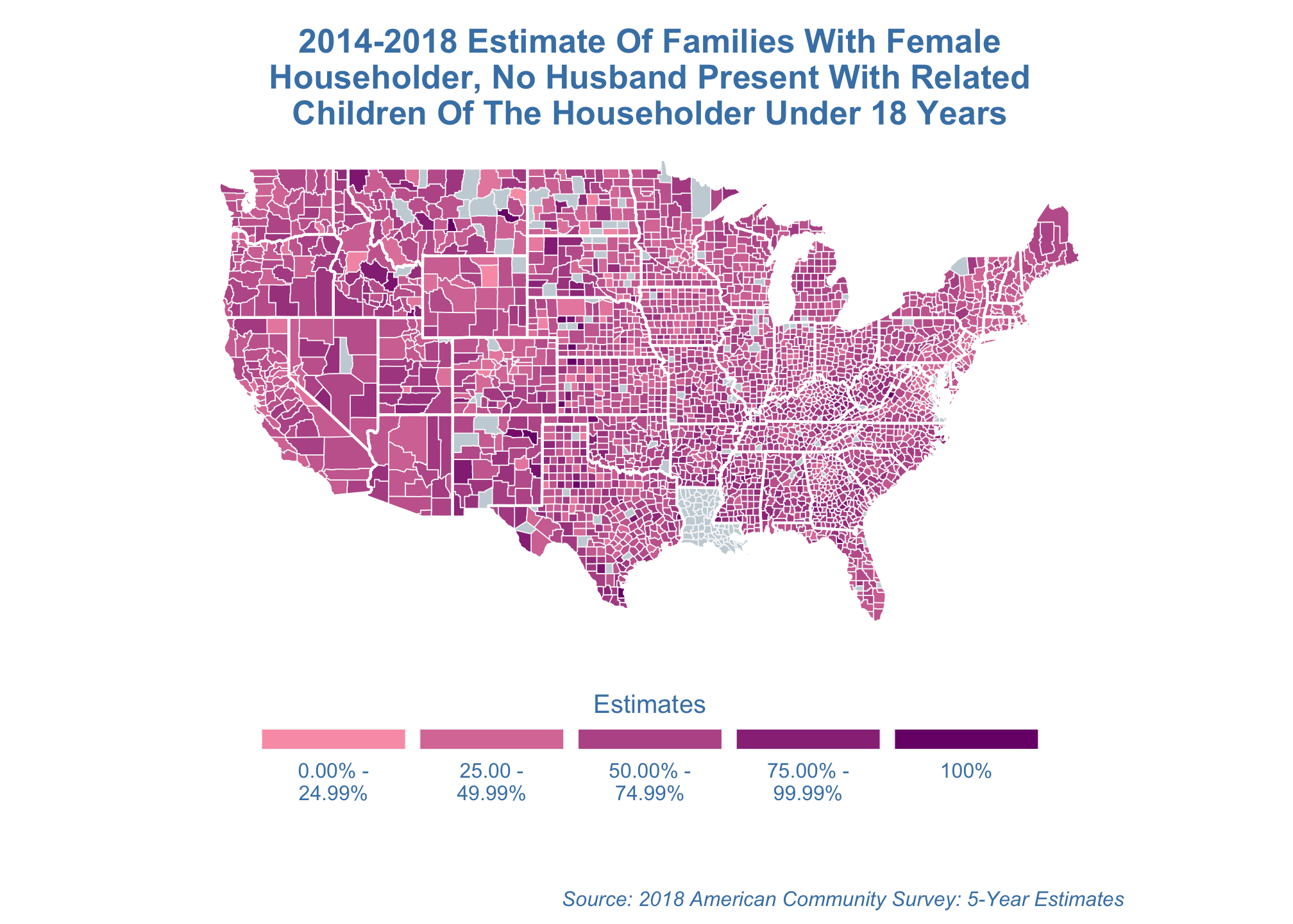 Note: This is the default projection so you can just run
estimate_map +
coord_map()orthographic projection
estimate_map +
  coord_map("orthographic")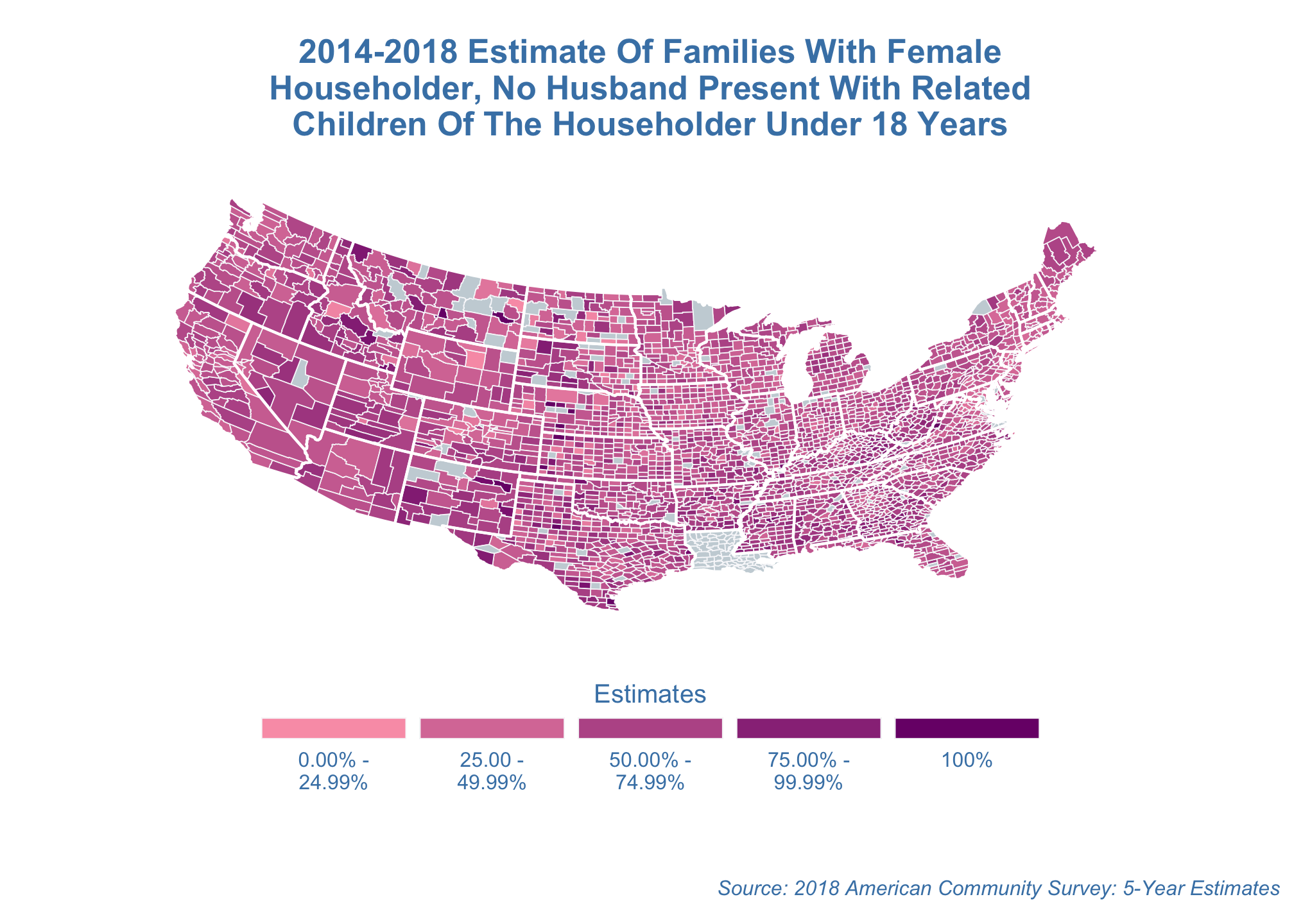
stereographic projection
estimate_map +
  coord_map("stereographic")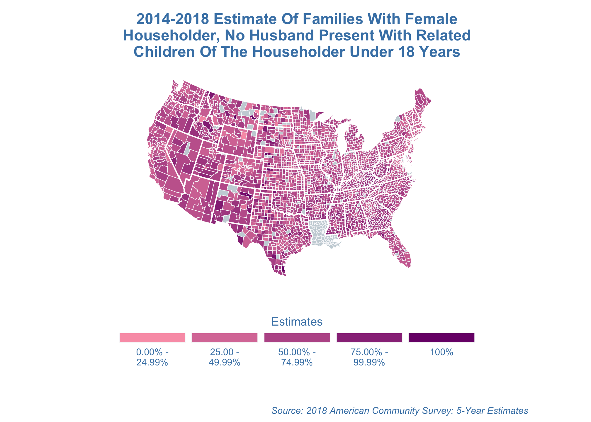
Saving
You can even save any of the plots as a pdf on standard A4 paper in landscape mode
poverty_estimates_albers <- estimate_map +
                            coord_map("mercator")
ggsave("poverty_estimates.pdf",
poverty_estimates_albers,
width = 297,
height = 210,
units = "mm")Possible Solutions
For a walkthrough covering one of many possible approaches that may be used in this task, please click here.