Making Copies
Getting Prepped
Download the script
Copying and pasting syntax from a browser can cause problems. To avoid this issue, please download a script with all of the needed code presented in this walkthrough.
Load the packages
library(tidyverse)
library(here)
library(cowplot)
library(nasaweather)
library(Lahman)
library(magick)
library(fs)
library(showtext)
font_add_google("Libre Franklin", "libre")
font_add("Arial", "/System/Library/Fonts/Supplemental/Arial.ttf")
font_add("Georgia", "/System/Library/Fonts/Supplemental/Georgia.ttf")
showtext_auto()
Possible Solutions
Remember just because your code doesn’t look like mine doesn’t mean anything and there’s no expectation that you were this detailed. Included are examples of approaches that can be used to complete this task, but there are so many more! Use the to study how the plots were formed rather than comparing the code below with yours.
Choice 1: Government Data
nyt_data <- read_csv("divided.csv") ##
## ── Column specification ────────────────────────────────────────────────────────
## cols(
## year = col_double(),
## status = col_character(),
## count = col_double()
## )Take a look
nyt_data %>%
head(n=5)## # A tibble: 5 x 3
## year status count
## <dbl> <chr> <dbl>
## 1 1938 Divided 10
## 2 1940 Divided 15
## 3 1942 Divided 9
## 4 1944 Divided 10
## 5 1946 Divided 8divided_shortish <- ggplot(nyt_data) +
geom_bar(aes(x = year, weight = count,
fill = relevel(factor(status), "Unified.R")), # Fill by factor. If you want to know more about factors, give this site a try: https://swcarpentry.github.io/r-novice-inflammation/12-supp-factors/
position = "stack") + # Stack the bars
scale_fill_manual(labels = c("Republicans", "Mixed", "Democrats"), # Rename the text within the legend
values = c("#A75653","#CCCBCA","#416E95"), # Fill in the red, grey, and blue respectively
name="CONTROL OF STATE CAPITALS",
guide = guide_legend(
direction = "horizontal",
title.position = "top")
) +
theme_minimal() +
theme(panel.grid.major.x = element_blank(), # remove the vertical grid lines
panel.grid.major.y = element_line(size = 0.5, linetype = 3, color = "#000000"), # set major intercept lines to a dotted black line
panel.grid.minor = element_blank(), # turn all minor intercept lines off
axis.title.x=element_blank(), # Get rid of the x-axis label
axis.text.x=element_text(size=10, margin = margin(t = -6, r = 0, b = 0, l = 0)), #Resize the x-axis text to 10 and move it up 6 units
axis.ticks.x=element_blank(), # Get rid of the x-axis ticks
axis.title.y=element_blank(), # Get rid of the y-axis label
axis.text.y=element_text(size=10, margin = margin(t = 0, r = 0, b = 0, l = 0)), #Resize the y-axis text to 10
axis.ticks.y=element_blank() # Get rid of the y-axis ticks
) +
theme(legend.position="top", # Move the legend above the plot
legend.justification = c(1, 1), # Equivalent to justify right
legend.box="horizontal", # Make the legend horizontal
legend.title.align=0.5 # Center the title (0 is left justify; 1 is right justify)
) +
guides(color = guide_colorbar(title.position="top", title.hjust = 0.5), # Here we moved the color in the legend to the top and centered them.
size = guide_legend(title.position="top", title.hjust = 0.5)) + # Here we moved the title to the top and centered it.
geom_segment(aes(x = 1937, xend = 2013, y = 10, yend=10), color ="#FFFFFF") + # Use the min and max year values to draw a line segment at y = 10: min(divided$year) and max(divided$year)
geom_segment(aes(x = 1937, xend = 2013, y = 20, yend=20), color ="#FFFFFF") + # Ditto except for y = 20
geom_segment(aes(x = 1937, xend = 2013, y = 30, yend=30), color ="#FFFFFF") + # Ditto except for y = 30
geom_segment(aes(x = 1937, xend = 2013, y = 40, yend=40), color ="#FFFFFF") + # Ditto except for y = 40
scale_y_continuous(breaks=c(10,20,30,40,50)) + # Limit the labels on the y-axis (called ticks)
scale_x_continuous(breaks=seq(1940,2010,10)) # Show labels in a sequence starting with 1940 and ending in 2010 in increments of 10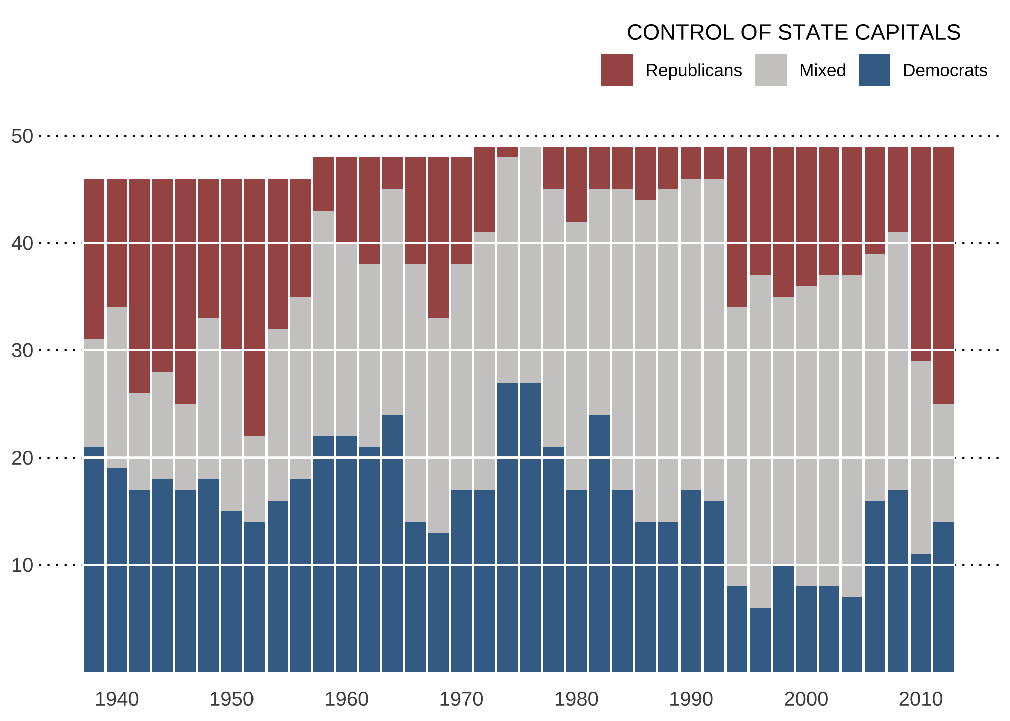
in comparison to the original
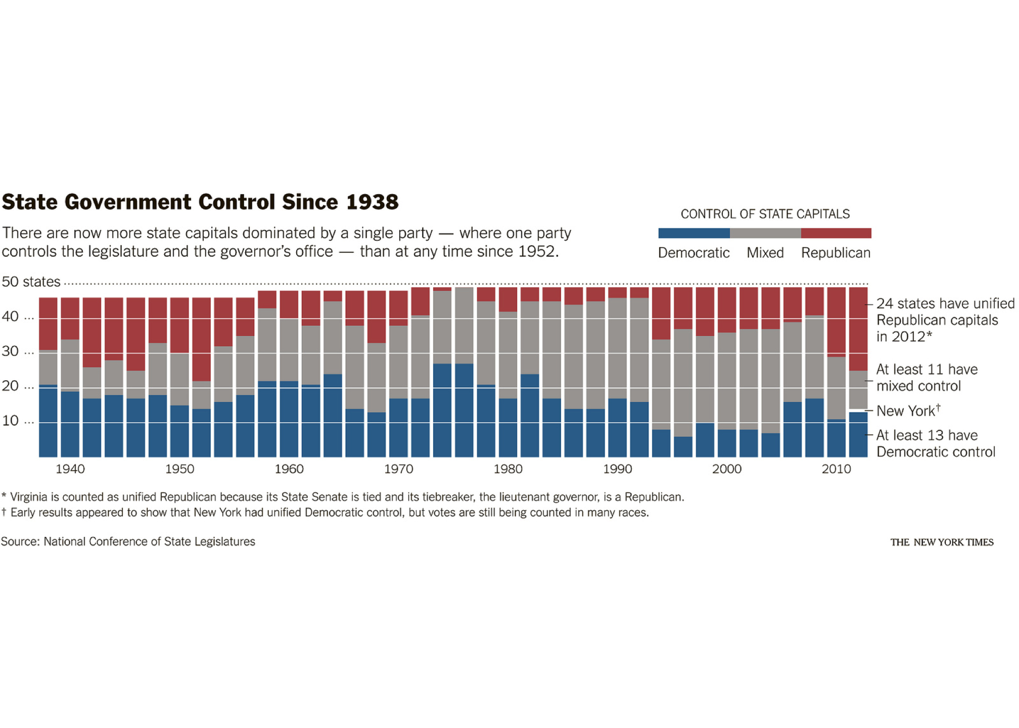
If you want something that is closer to the original but requires some coding you likely have not been exposed to
divided_longish <- ggplot(nyt_data) + # Assign this whole mess to the variable p
  geom_bar(aes(x = year, weight = count,
               fill = relevel(factor(status), "Unified.R")), # Fill by factor
           position = "stack") + # Stack the bars
  scale_fill_manual(labels = c("Republicans", "Mixed", "Democrats"), # Rename the text within the legend
                    values = c("#A75653","#CCCBCA","#416E95"), # Fill in the red, grey, and blue respectively
                    name="CONTROL OF STATE CAPITALS",
                    guide = guide_legend(
                      direction = "horizontal",
                      title.position = "top", # put the title of the legend above
                      reverse=TRUE, # reverse the default order of the legend
                      label.position = "bottom")
                    ) +
  theme_minimal() +
  theme(panel.grid.major.x = element_blank(), # remove the vertical grid lines
        panel.grid.major.y = element_line(size = 0.5, linetype = 3, color = "#000000"), # set major intercept lines to a dotted black line
        panel.grid.minor = element_blank(), # turn all minor intercept lines off
        axis.title.x=element_blank(), # Get rid of the x-axis label
        axis.text.x=element_text(size=10,
                                 margin = margin(t = -6, r = 0, b = 0, l = 0)), # resize the x-axis text to 10 and move it up 6 units
        axis.ticks.x=element_blank(),  # Get rid of the x-axis ticks
        axis.title.y=element_blank(), # Get rid of the y-axis label
        axis.text.y=element_text(size=10,
                                 hjust = 0), # resize the y-axis text to 10 and left justify the labels.
        axis.ticks.y=element_blank()  # Get rid of the y-axis ticks
  ) +
  theme(legend.position="top", # Move the legend above the plot
        legend.justification = c(1, 1), # Equivalent to justify right
        legend.box="horizontal", # Make the legend horizontal
        legend.title.align=0.5, # Center the title (0 is left justify; 1 is right justify)
        legend.key.height = unit(0.3,"cm"),
        legend.key.width = unit(2, "cm")
        ) +
  theme(text = element_text(family="Arial",
                            color = "#2F4F4F")) + # aka set the default font to Arial and use darkslategrey as the color
  theme(plot.margin = unit(c(1,10,1,1), "lines")) + # Set the plot margins so that the entire output can fit
  guides(color = guide_colorbar(title.position="top", title.hjust = 0.5), # Move the legend colors to the top of the legend
         size = guide_legend(title.position="top",
                             title.hjust = 0.5)) + # Move the legend title to the top of the legend
  geom_segment(aes(x = 1937, xend = 2013, y = 10, yend=10),
               color ="#FFFFFF") + # Use the min and max year values to draw a line segment at y = 10: min(divided$year) and max(divided$year)
  geom_segment(aes(x = 1937, xend = 2013, y = 20, yend=20),
               color ="#FFFFFF") + # Ditto except for y = 20
  geom_segment(aes(x = 1937, xend = 2013, y = 30, yend=30),
               color ="#FFFFFF") + # Ditto except for y = 30
  geom_segment(aes(x = 1937, xend = 2013, y = 40, yend=40),
               color ="#FFFFFF") + # Ditto except for y = 40
  scale_y_continuous(breaks=c(10,20,30,40,50),
                     labels = c("10", "20", "30", "40", "50 states")) + # Limit the labels on the y-axis (called ticks)
  scale_x_continuous(breaks=seq(1940,2010,10)) + # Show labels in a sequence starting with 1940 and ending in 2010 in increments of 10
  theme(plot.title = element_text(family = "libre",
                                  face = "bold",
                                  size = 12,
                                  color = "#000000",
                                  margin = margin(b = 10),
                                  vjust = 0), # Libre family with 20 pt black font and margin of 10 pt.
  plot.subtitle = element_text(size = 12,
                               color = "#333333",
                               margin = margin(b = 10),
                               vjust = -5), # Everything above but with grey20
  plot.caption = element_text(size = 8,
                              margin = margin(t = 10),
                              color = "#333333",
                              hjust = -2) # Pretty much everything from above
  ) +
  labs(title = stringr::str_wrap("State Government Control Since 1938",40), # Construct a title for the plot
       subtitle = stringr::str_wrap("There are now more state capitals dominated by a single party \u2014 where one party controls the legislature and the governor's office \u2014 than at any time since 1952.",80),
       caption = "\u2A Virginia is counted as unified Republican because its State Senate is tied and its tiebreaker, the lieutenant governor, is a Republican.\n\u2020 Early results appeared to show that New York had unified Democratic control. but votes are still being counted in many races.\n\nSource: National Conference of State Legislatures.",
       col.main = adjustcolor("#384458",1), cex.main = 2, line=-0.5) +
  annotate(geom ="text", x = 2012.6, y = 7, size = 3.5, color = "#333333", label = "\u2014", hjust = 0) +
  annotate(geom ="text", x = 2014.2, y = 7, size = 3.5, color = "#333333", label = "At least 13\nhave Democratic control", hjust = 0) +
  annotate(geom ="text", x = 2012.6, y = 14.2, size = 3.5,
           color = "#333333",
           label = "\u2014",
           hjust = 0) +
  annotate(geom ="text", x = 2014.2, y = 14.2, size = 3.5,
           color = "#333333",
           label = "New York \u2020",
           hjust = 0) +
  annotate(geom ="text", x = 2012.6, y = 22.2, size = 3.5,
           color = "#333333",
           label = "\u2014",
           hjust = 0) +
  annotate(geom ="text", x = 2014.2, y = 22.2, size = 3.5,
           color = "#333333",
           label = "At least 11\nhave mixed control",
           hjust = 0) +
  annotate(geom ="text", x = 2012.6, y = 44.2, size = 3.5,
           color = "#333333",
           label = "\u2014",
           hjust = 0) +
  annotate(geom ="text", x = 2014.2, y = 44.2, size = 3.5,
           color = "#333333",
           label = "24 states have\nunified Republican capitals\nin 2012 \u2A",
           hjust = 0)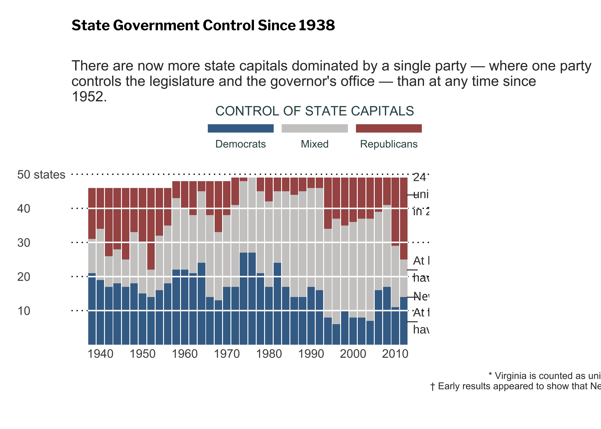
in comparison to the original

Choice 2: Temperatures
jan2001 <- subset(atmos, year == 2000 & month == 1) surface_shortish <- ggplot(jan2001) +
geom_tile(aes(x = long,
y = lat,
fill = temp)) +
scale_fill_continuous(limits = c(270, 310))We can use geom_tile() using fill to represent different temperatures
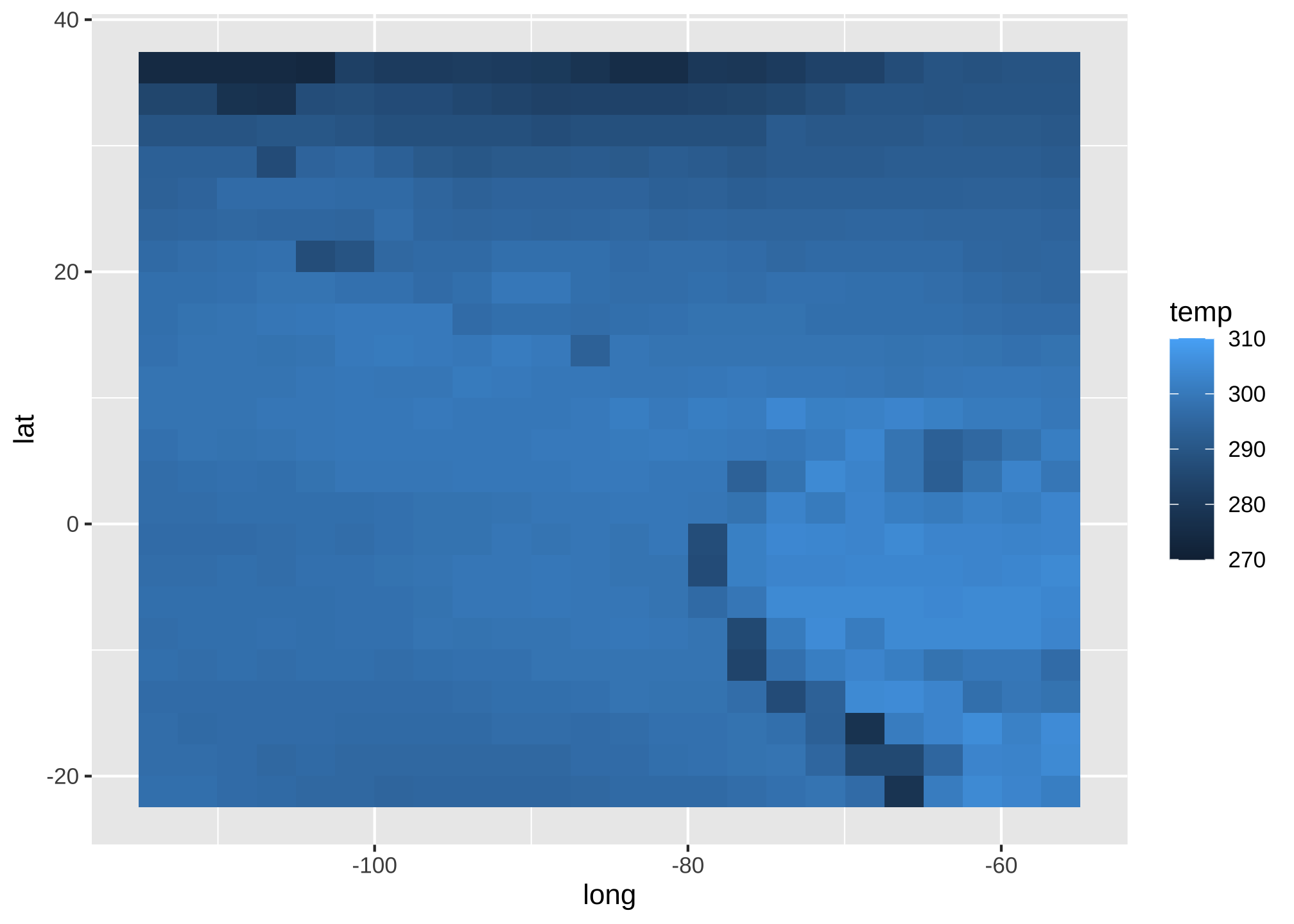
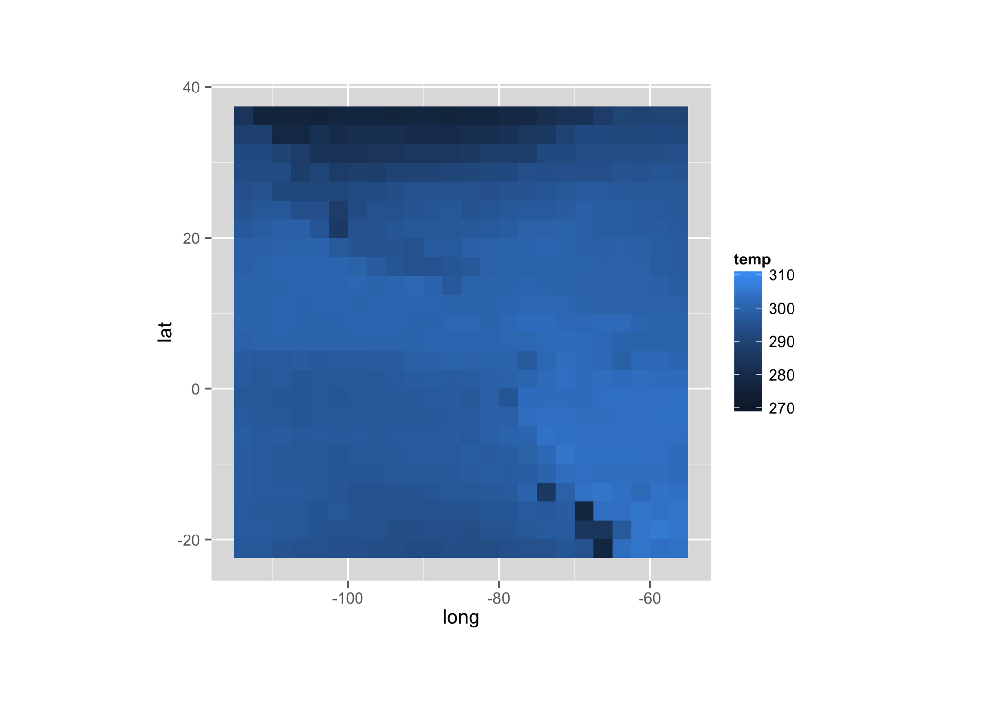
in comparison to the original
Choice 3: Average Temperatures
corv_data <- read_csv("corv.csv") ##
## ── Column specification ────────────────────────────────────────────────────────
## cols(
## yday = col_double(),
## min = col_double(),
## max = col_double(),
## mean = col_double()
## )To replicate the original plot, we can do
ggplot(corv_data) +
  geom_pointrange(aes(x = yday, y = mean, ymin = min, ymax = max)) +
  labs(x = "Day of Year", y = "Temperature (F)")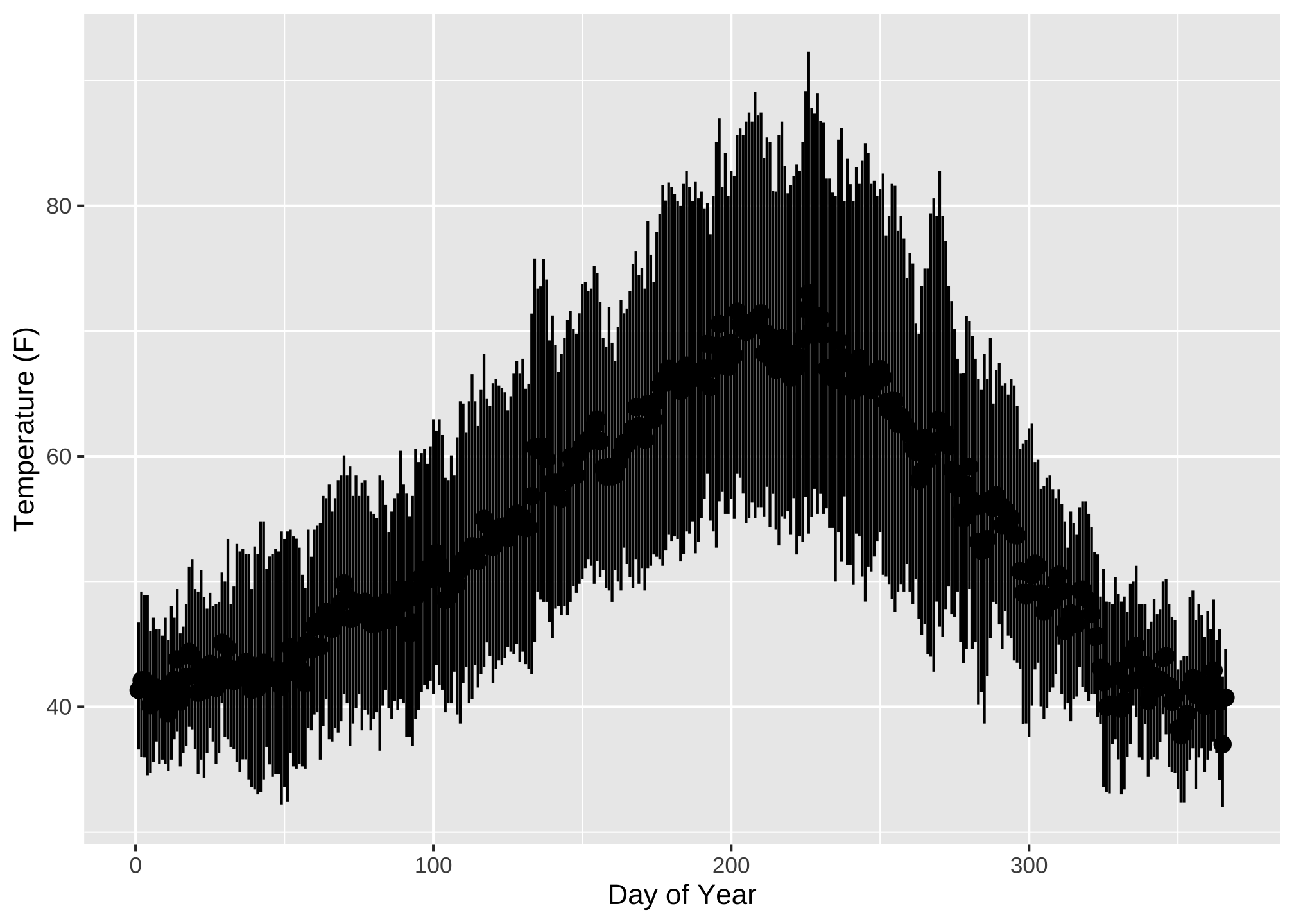
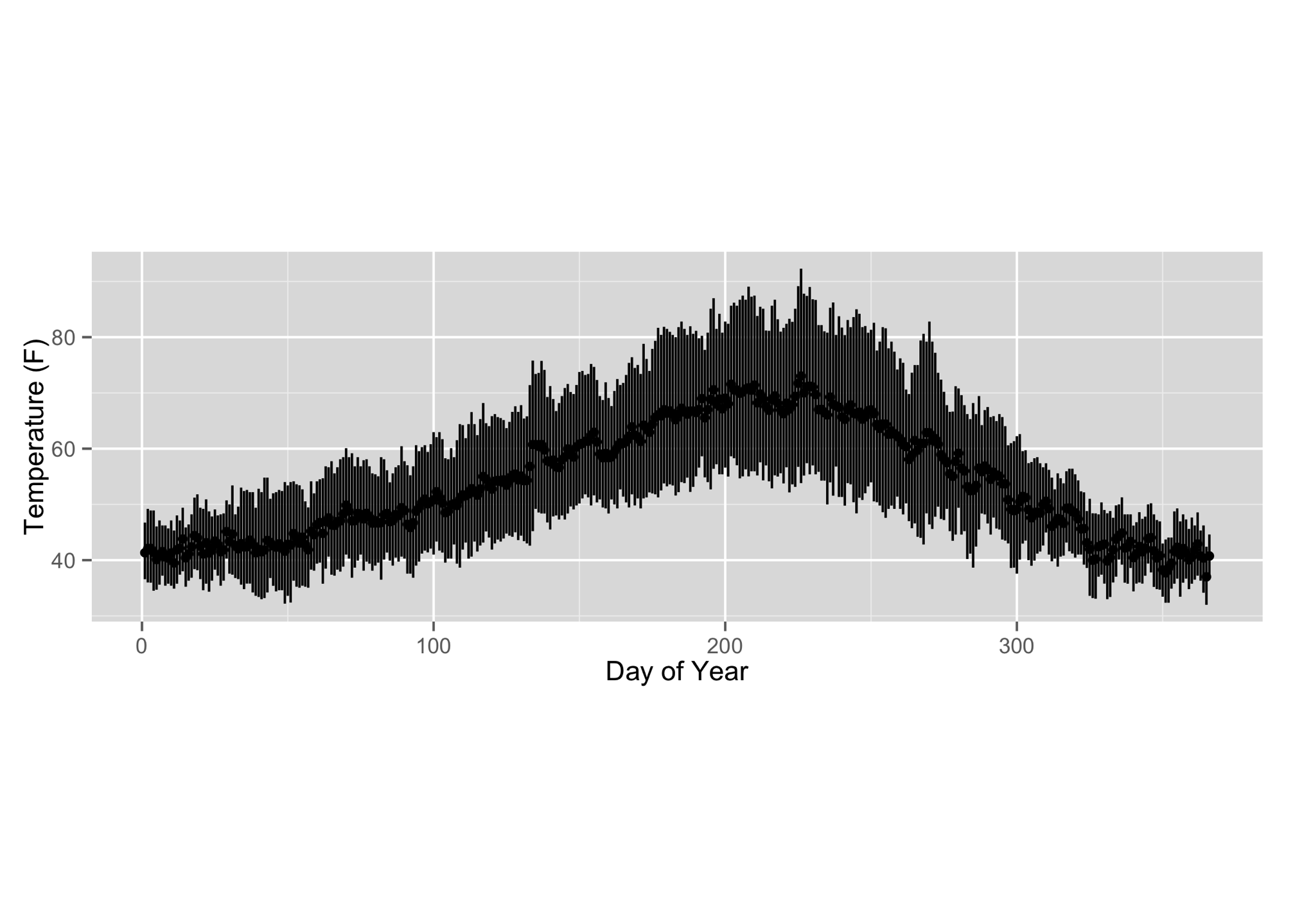
in comparison to the original
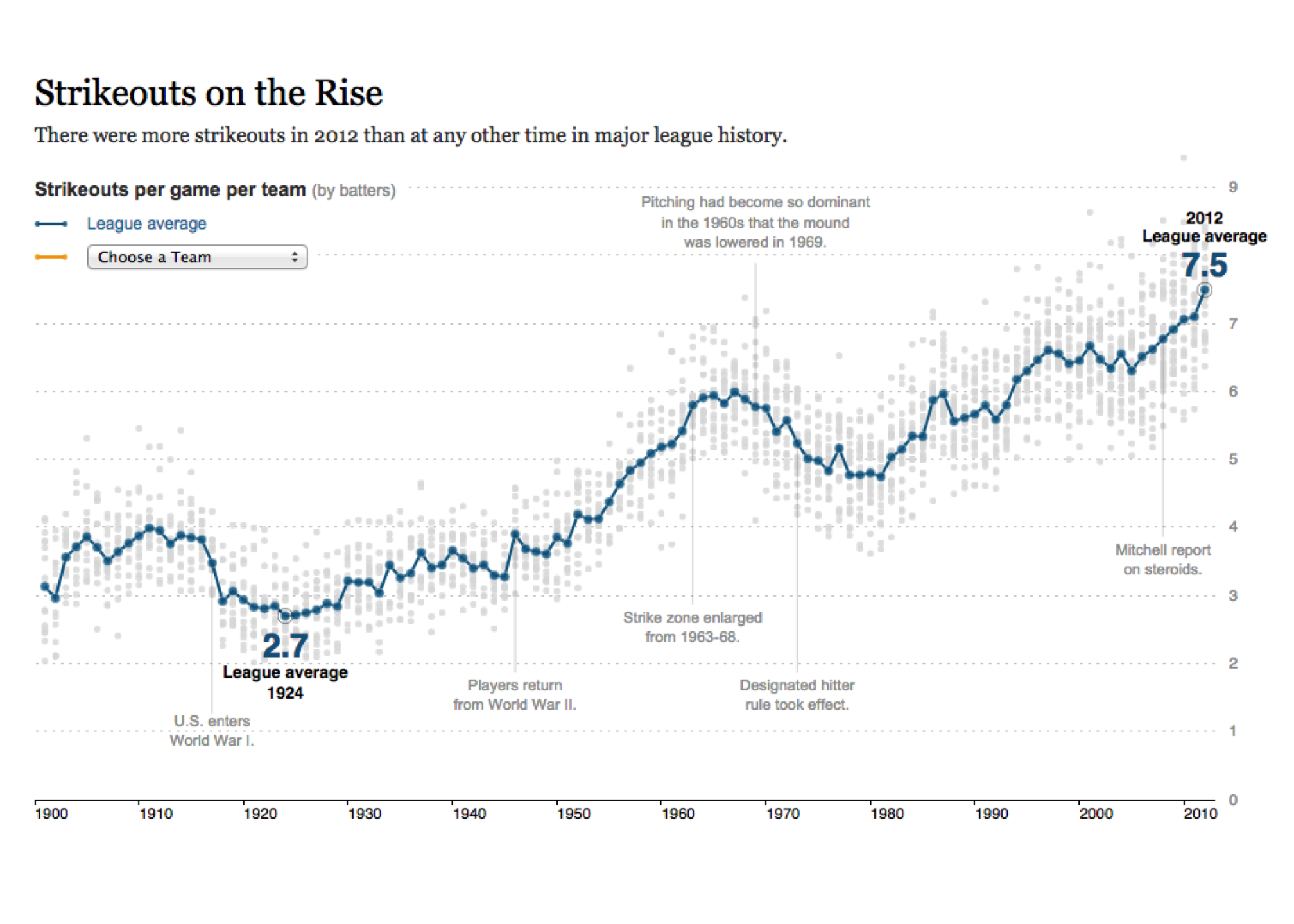
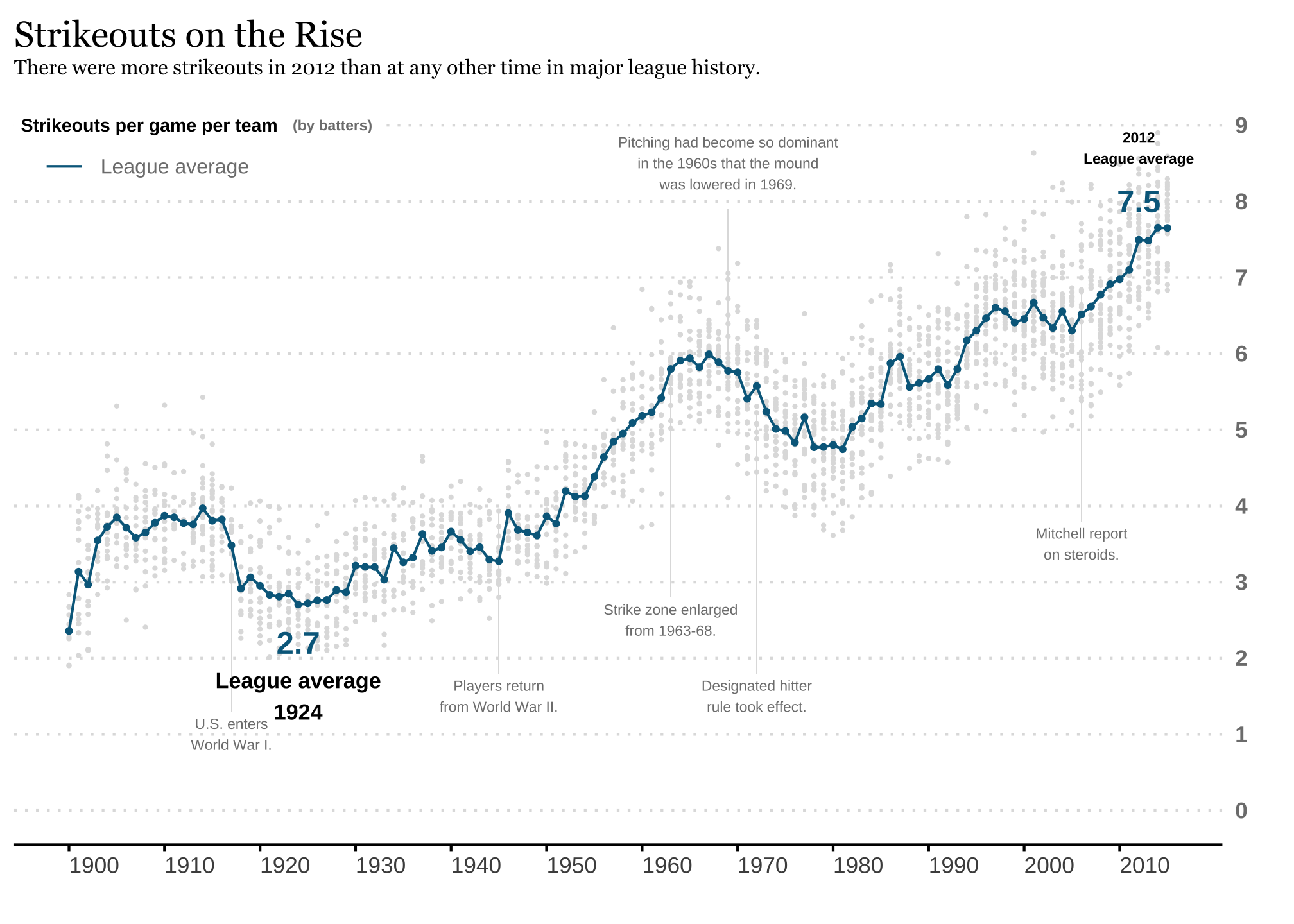
Choice 4: Baseball
You can either use both team_strikeouts & avg_so_by_year, or use only team_strikeouts which is shown below
ggplot(team_strikeouts,
       aes(yearID, strikeouts_per_game)) +
  geom_point (color="#dfdfdf",
              size = 0.3) +
  geom_segment(aes(x = 1917, y = 1.3, xend = 1917, yend = 3.5),
               color = "#dfdfdf",
               size = 0.1) +
  geom_segment(aes(x = 1945, y = 1.8, xend = 1945, yend = 3.9),
               color = "#dfdfdf",
               size = 0.1) +
  geom_segment(aes(x = 1963, y = 2.8, xend = 1963, yend = 5.8),
               color = "#dfdfdf",
               size = 0.1) +
  geom_segment(aes(x = 1969, y = 7.9, xend = 1969, yend = 5.8),
               color = "#dfdfdf",
               size = 0.1) +
  geom_segment(aes(x = 1972, y = 1.8, xend = 1972, yend = 5.2),
               color = "#dfdfdf",
               size = 0.1) +
  geom_segment(aes(x = 2006, y = 3.8, xend = 2006, yend = 6.8),
               color = "#dfdfdf",
               size = 0.1) +
  stat_summary(fun = 'mean',
               geom =c("point"),
               color = "#00688b",
               size = 0.75) +
  stat_summary(aes(shape="League average"),
               fun = 'mean',
               geom =c("line"),
               color = "#00688b",
               show.legend = TRUE) +
  annotate("text", x = 2012, y = 8.7,
           label = "2012\nLeague average",
           fontface = 2,
           size = 2) +
  annotate("text", x = 2012, y = 8,
           label = "7.5",
           fontface = 2,
           color = "#00688b",
           size = 4.3) +
  annotate("text", x = 1924, y = 1.5,
           label = "League average\n1924",
           fontface = "bold",
           size = 3) +
  annotate("text", x = 1924, y = 2.2,
           label = "2.7",
           fontface = 2,
           color = "#00688b",
           size = 4.3) +
  annotate(geom ="text", x = 1917, y = 1,
           size = 2.0,
           color = "#7e7e7e",
           label = "U.S. enters\nWorld War I.",
           hjust = 0.5) +
  annotate(geom ="text", x = 1945, y = 1.5,
           size = 2.0,
           color = "#7e7e7e",
           label = "Players return\nfrom World War II.",
           hjust = 0.5) +
  annotate(geom ="text", x = 1963, y = 2.5,
           size = 2.0,
           color = "#7e7e7e",
           label = "Strike zone enlarged\nfrom 1963-68.",
           hjust = 0.5) +
  annotate(geom ="text", x = 1969, y = 8.5,
           size = 2.0,
           color = "#7e7e7e",
           label = "Pitching had become so dominant\nin the 1960s that the mound\nwas lowered in 1969.",
           hjust = 0.5) +
  annotate(geom ="text", x = 1972, y = 1.5,
           size = 2.0,
           color = "#7e7e7e",
           label = "Designated hitter\nrule took effect.",
           hjust = 0.5) +
  annotate(geom ="text", x = 2006, y = 3.5,
           size = 2.0,
           color = "#7e7e7e",
           label = "Mitchell report\non steroids.",
           hjust = 0.5) +
  annotate(geom="label", x = 1925, y = 9,
           size = 2.0,
           fontface = 2,
           color = "#7e7e7e",
           fill="#FFFFFF",
           label = "(by batters)",
           label.size = NA,
           hjust = 0.22) +
  annotate(geom="label", x = 1900, y = 9,
           size = 2.5,
           fontface = 2,
           color = "#000000",
           fill="#FFFFFF",
           label = "Strikeouts per game per team",
           label.size = NA,
           hjust = 0.2) +
  scale_x_continuous("",
                   breaks=c(1900,1910,1920,1930,1940,1950,1960,1970,1980,1990,2000,2010),
                   limits=c(1900,2015)) +
  scale_y_continuous("",
                     breaks=c(0,1,2,3,4,5,6,7,8,9),
                     limits=c(0,9),
                     position = "right"
) +
  theme_minimal() +
  theme(plot.title = element_text(family = "Georgia",
                                  face = "bold",
                                  size = 14,
                                  color = "#000000",
                                  margin = margin(b = 0),
                                  vjust = 0),
        plot.subtitle = element_text(family = "Georgia",
                                     size = 8,
                                     color = "#000000",
                                     margin = margin(b = 10),
                                     vjust = -2)) +
  theme(axis.text.y.right = element_text(color = "#7e7e7e",
                                         face = "bold"),
        axis.text.x = element_text(hjust = 0),
        axis.line.x = element_line(),
        axis.ticks.x = element_line(),
        panel.grid.major.x = element_blank(),
        panel.grid.major.y = element_line(linetype = "dotted",
                                          color = "#dfdfdf"),
        panel.grid.minor = element_blank()) +
  theme(legend.position = c(0, 0.9),
        legend.background = element_rect(fill=NA,
                                         color=NA),
        legend.justification='left',
        legend.direction='horizontal',
        legend.text = element_text(color = "#7e7e7e",
                                   size = 8),
        legend.title = element_blank()) +
  labs(title = "Strikeouts on the Rise",
       subtitle = "There were more strikeouts in 2012 than at any other time in major league history."
    )
in comparison to the original
